
Column charts
This topic describes how to configure a Column chart. You will be working with a screen like the one below. At this point you will have already selected a report source, clicked New, and filled out a preliminary Basic Details screen.
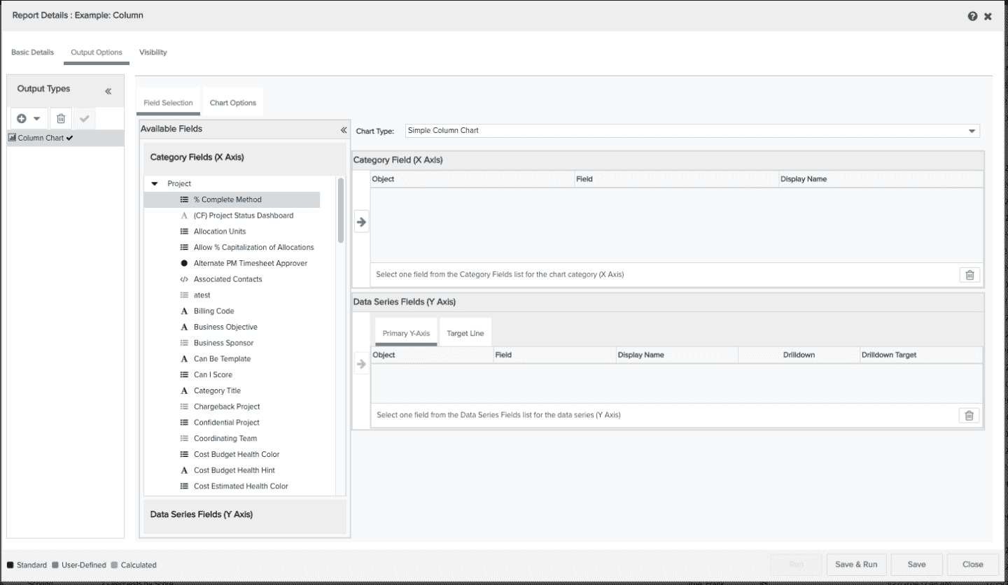
You can perform the following on the Output Options/Column Chart screen:
Field Selection tab
-
select the type of chart you want to configure
-
select the data for your report (X axis and Y axis)
-
configure a drilldown
-
configure a target line
Chart Options tab
There are a variety of settings you can use to configure chart labels, legends, size, text format, currency format and a variety of visual affects. See Column Chart Options.
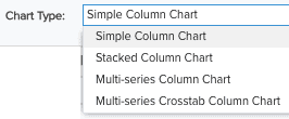
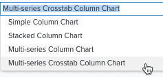
Select column chart type
Select one of the following chart types:
-
Simple Column Chart - uses one Category field for the X-axis and one Data Series field for the Y-axis (example)
-
Stacked Column Chart - uses one Category field for the X-axis and more than one Data Series field for the Y-axis (example)
-
Multi-series Column Chart - uses one category field for the X-axis, more than one Data Series field for the Y-axis, and is grouped by the X-axis data field (example)
-
Multi-series Crosstab Column Chart - uses up to 5 category fields for the X-axis, and up to 5 Data Series fields for the Y-axis (example)
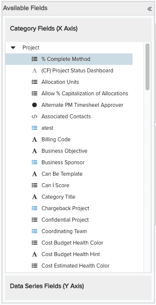
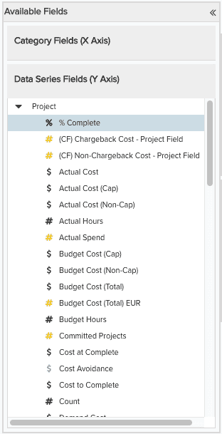
Select the data to be returned on the report
The Available Fields list shows all the Category fields and Data Series fields available for the report. These fields vary depending on the report source you are using.
To include fields in your report, locate them in the Available Fields list and drag them (or double-click them) to the Selected Fields table. If you include fields and then change your mind, simply select the field in Selected Fields table and click the Trash Can ![]() .
.
Note: Make sure that all Y axis fields and the target line are in the same unit (for example, all hours, dollars, percentage)
You must select fields for the X Axis from the Category Fields (X Axis) list: select fields for the Y Axis from the Data Series Fields (Y Axis) list.
 |
 |
Note: If you try to place a field in the Selected Fields table and cannot, then you are choosing the field from the wrong list.
The table below describes the columns of the Category Field (X Axis) table:
|
Column Name |
Description |
|---|---|
|
Object |
The name of the entity to which the field belongs. |
|
Field |
The name of the category field. Object:Field Name is default X-axis title. |
|
Display Name |
You can enter a name here for the X Axis title that will override the value in the Field field. If Display Name is left blank, the Object:Field name is used for the X axis label. |
The table below describes the columns of the Data Series Field (Y Axis), Primary Y Axis tab:
|
Column Name |
Description |
|---|---|
|
Object |
The name of the entity to which the field belongs. |
|
Field |
The name of the data series field. For simple column charts, Object:Field Name is default Y-axis title. Stacked column charts should have multiple data series fields. |
|
Display Name |
For Simple Column charts, you can enter a name for the Y-Axis title that will override the default value. If Display Name is left blank, the Object:Field name is used for the Y-axis label. The Display Name field is not applicable to Stacked and Multi-series Column charts; you specify the Y-axis label for those charts on the Chart Options tab, Basic Details section. |
|
Drilldown |
Configure a drilldown for the column by clicking |
|
Drilldown Target |
Displays the report name for the drilldown you configured in the drilldown column. |
Configuring Crosstab charts
A Crosstab report summarizes data across two or more variables. Data is grouped by Category; at least one Row and one Column field is required. The summary calculation is performed on and displayed in Data Series fields; at least one Data Series field is required.
-
The maximum number of Category fields is 5
-
The maximum number of Data Series fields is 5.
To configure a crosstab column chart, choose the Multi-Series Crosstab Column Chart type:
To include fields in your report, locate them in the Available Fields list and drag or double-click them to the Selected Fields table. If you include fields and then change your mind, simply select the field in Selected Fields table and click the Trash Can ![]() .
.
To configure a drilldown, choose the appropriate data series field, click the drilldown icon and configure the drilldown options. See Drilldown Links for more information.
Configure chart title, axis labels, legend
Many text options get their default values from the Output Options screen. This allows you to quickly get your report generated in a readable fashion. You can further fine-tune your report by overriding the default values and adjusting additional settings on the Chart Options tab. See Chart options for a list of all column chart settings. Below is a description of some common settings.
-
The default chart title is the name you entered on the Basic Details screen. You can enter a sub-title on the Chart Options tab, Basic Details section.
-
All X-axis titles display by default the object name and the category field name, separated by a colon. For example, if the category field name is Priority and the category object is Project, the default X-axis title is Project:Priority. For simple column charts, you can override this title in the Display field or on the Chart Option tab, Basic Details section.
-
All legend labels display the object name and the data series field name (for each data series field), separated by a colon. For example, if the data fields are Est Hrs and Hrs at Complete (both Project objects), then legend labels are Project:Est Hours and Project:Hrs at Complete. You can override these default values by entered new labels in the Display Name field for each data field.
-
By default, axis titles and chart legends are displayed. To suppress the display of those item, use the Chart Options tab, Advanced Formatting/General Chart Formatting section. You can also adjust the position and size of the legend in this section.
-
Y-axis titles for Simple Column charts display the object name and the data series field name, separated by a colon. For example, if the data field name is Est Hours and the data series object is Project, the default Y-axis title is Project:Est Hours. You can override this title in the Data Series Display field or on the Chart Option tab, Basic Details section.
-
For Stacked and Multi-series Column charts, you must set the Y-axis label on the Chart Options tab, Basic Details section.
-
For Stacked Column charts, totals are displayed for the stacked column. You can change this on Chart Options/Advanced Formatting, Numbers sub-section.
Create a target line
You can add a line to your chart for comparison purposes. For example, if you create a stacked column chart that shows estimated hours and actual hours, you can add a target line that show the target capacity of hours/week.
Note: The target line must be in the same units as the columns.
Here is the Target Line tab of the Data Series Fields section:
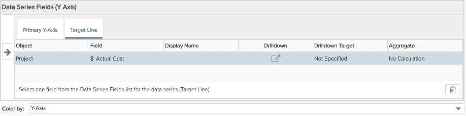
The table below describes the columns in the Data Series Field (Y Axis), Target Line table:
|
Column Name |
Description |
|---|---|
|
Object |
The name of the item/entity to which the field belongs. |
|
Field |
The name of the data field. This is default line legend text. |
|
Display Name |
Allows you to enter line legend text that is different than the Field name. If this field is blank, the Field name is used for the line legend text. |
|
Drilldown |
Configure a drilldown for the field by clicking |
|
Drilldown Target |
Displays the target for the drilldown you specified in the drilldown column. |
|
Aggregate |
Perform a standard calculation: sum, min, max, avg, no calculation |
| Color by | Specify the field |
What next?
You can edit chart options, save and run your column chart, change the default visibility, or configure other output types: