Adjusting System Colors
As described in Colors and Icons, you can configure specific colors for lookup list values. There are other areas in the application that use organization colors that are determined by the system. For example, any graphical chart, such as pie charts or donut charts, or bar/column charts that use color, as well as the request card/kanban view. You can adjust the organization colors to a preferred palette, although note that configured lookup list value colors always take precedence over organization colors.
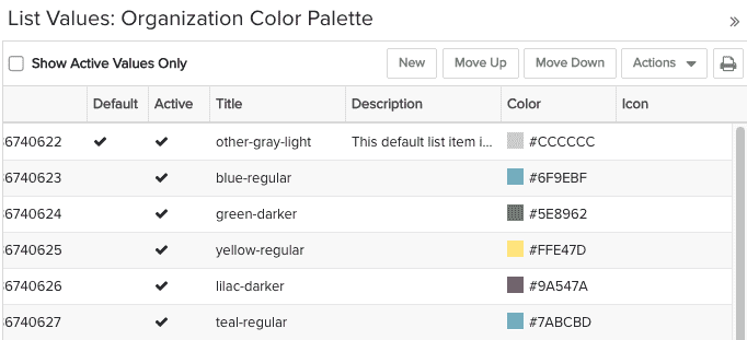
The standard lookup list Organization Color Palette allows you to rearrange and add/remove the colors used across the system. Colors are used in the order of the list, top to bottom. The color inventory and order are global settings and affect all places where color is used dynamically - for example: gantt charts (both from reports and the task/project views), the portfolio hierarchy chart (excluding the top square, which represents the class), request cards/kanban. The screenshot below shows a portion of the list:

Create new list values as you would any lookup list (see Creating a Lookup List).
Drag and drop rows to reorder, or use the Move Up/Move Down buttons.
Use the Default setting to indicate the color to use for null values. This is optional.
You cannot delete a color, but you can make it inactive (Actions > Make Inactive) to prevent that color from being used.
You can reorder the list by the Title (ascending/descending) or the ID. We recommend you avoid doing any sorting as it will blow away your current order and there is no way to get it back outside of repositioning the colors manually.

