
Data Tab
This training video reviews the Report Designer's Data tab.
The Data tab is where you select fields from the Available Fields list to add to your report. Duration 6.5 min.

You might want to take a look at Understanding the Field Path before you start building your report. The field path is the metaphor we use to describe how to navigate through the list of potential fields.
The report designer's Data tab is where you
- Add fields to your report definition. The specific available fields and additional settings on the tab itself vary based on the selected report Type. For example, List reports simply require a list of fields. Bar charts and Line charts require fields for the X and Y axes. Crosstab reports require fields for the Top and Left axes, and for Values. Gantt charts have a combination of fields for a list report and dates for the graphical bars.
- Edit the field display names and format data values - similar to how you format data values for list reports. See the Field Options modal.
- Apply field-level filters
- Add background color to numeric fields - see Configuring Conditional Background Colors.
If you are looking at the Data tab then you have already chosen your report Topic (and sometimes a specialty field) - a "topic" is the primary entity for your report, meaning that any fields you want for the report will be related in some way to this entity. It might be useful to take a look at this entity hierarchy to start to understand the relationship between PPM Pro entities.
You can move to any of the other tabs by clicking General, Display, Variable Settings, or Team. See Reports Cookbook for a set of report examples.
Adding Fields to a Report Definition
The following are the mechanics for adding fields to a reports. Read Understanding the Field Path to learn how to traverse the list of Available Fields to find the data you need.
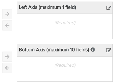
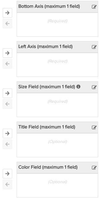
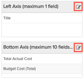
The Data tab for every report type has one Available Fields section, plus at least one other "field" section (usually multiple sections). You can think of the sections as buckets that hold the fields to use in a report - depending on the report type, there might be multiple buckets to hold different types of fields. For example, List report types have only one section called List Fields; Bar chart report types have 2 sections: Left Axis and Bottom Axis; Bubble charts have two axes plus sections for Size, Color, and Title.
Below are examples of the field sections for different report types.
|
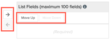
List Report
|
Bar Chart
|
Bubble Chart
|
You can move fields in/out of sections by:
- selecting the field and clicking the right/left arrow
- double-clicking a field to add it to the report (double-click field to toggle it back to Available Fields). For reports that use multiple buckets, we made the report designer choose the logical bucket .
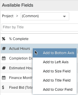
- right-clicking the field to display the list of sections and then choosing the appropriate section to drop the field into - see screenshot below:
Re-position fields up/down by selecting a field and using the Move Up/Move Down button, or by dragging/dropping the field (also see Options Modal for Non-List Reports below). Note that for List and Gantt reports, the order of the fields in the sections determines the order of the columns in the report - you can change the order from the Preview Pane by dragging/dropping columns, and the new location will be reflected in the field section.
Remember that the Preview Pane will reflect the fields you add as you configure them. So if you're not sure what field to add to what section, just give it a try and check the Preview Pane to see if you get the result you expected.
Field Options Modal
Each "bucket" of fields on the Data tab has a Field Options menu control  that when clicked displays the Field Options modal populated with all the fields from that bucket. You can reorder the fields by dragging/dropping or using the Move Up/Move Down buttons (or reorder them in their bucket). You can also remove a field from the modal (which also removes it from its bucket). For List reports, this modal provides another way to access the column header formatting settings but displayed all at once (see Formatting List Reports and Formatting Column Values).
|
Data "buckets" - click icon to display modal
|
Displays data formatting option
|
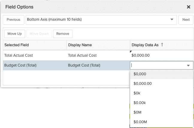
Similar to using the Display Data As menu option, the Field Options modal is where you can edit/format the actual data elements (other formatting controls for the various labels that accompany charts are on the Display tab). For example, use the Display tab to format the font and size of the axis labels on a bar chart, and us the Field Options model to format the values that appear in the chart. You can also use this modal to rename, reorder, and delete fields.
Editing Field Display Labels
You can edit any field title by simply double-clicking into the Display Name field and making your edits. The Selected Field title remains unchanged so you can always see the origin of the field. For example, imagine you chose a field from deep into the field path and the field title contains several ">" characters - you can edit those out and replace with a shorter, cleaner field name.
Setting Field-Level Filters
As mentioned in Time Series Reports, PPM Pro offers a set of filters that you can use to segment your Time Series data (Staffed/Unstaffed, Capitalized/Uncapitalized, for example). In addition, in the Variable Settings tab of your report definition you can create filters that are based on the report Topic and/or any field path (stepping stone) configured in your report. And finally, as discussed in this topic, you can use field-level filters, which allow you to segment your report data by any aggregatable/numeric value.
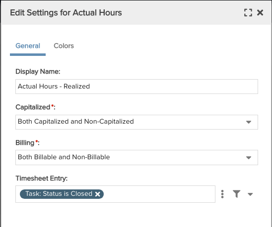
The screenshot below shows the same field - Actual Hours - represented multiple times in the data bucket of one report. Both the Time Series filters and the field-level filters are configured under the gear icon.
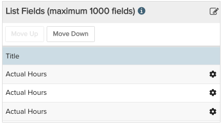
Field-level filters allow you to configure the exact breakdown of data you want to retrieve by applying a filter to the same field in different ways in one report. This essentially allows you to "split data" much like you can do today with the Time Series properties ("Staffed/Unstaffed", "Capitalized/Uncapitalized"), but you are not limited to the filters we provide.
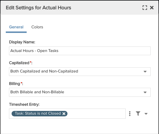
In the screenshots below, the first 2 filters are out of the box and filter very specific things. The Timesheeet Entry filter represents the meta data around the Actual Hours field, and as a result is served up as a filter to use to segment Actual Hours. In the example below, you can report on realized costs by splitting out the cost of closed items (Task:Status is Closed) vs not Closed. This is a very simple example, but hopefully gets the point across. Notice the Display Name for each field is edited to reflect the corresponding filter.
Configuring Conditional Background Colors
The Edit Settings dialog has 2 tabs: General and Colors. The Colors tab is available only for percent and numeric fields.
- The General tab is where you edit the Display name of the field and configure field-level filters.
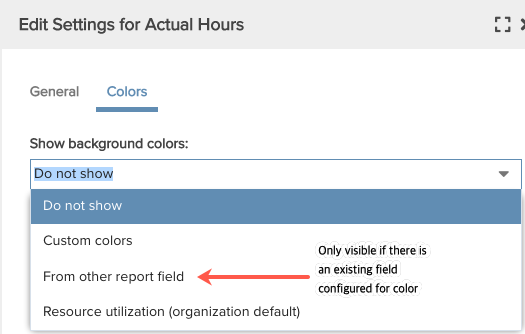
- The Colors tab is where you create a conditional background colors for numeric fields. If a custom color already exists, you can reuse it. When you click the color tab, you'll see three or four menu options (see below) - by default, background colors are not displayed (Do Not Show).
Setting Up a Custom Conditional Background Color
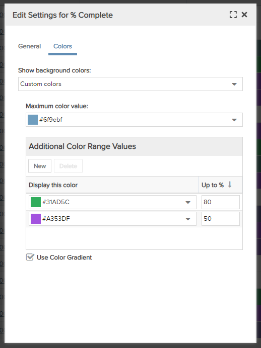
When you select Custom colors from the drop list, the following modal appears. Configure the color as described below:
 |
Show background colors: Determine if and how to use color.
Maximum color value: This color initially defaults to the first color in the Organization Color Palette lookup list normally used when a field has a value. The color displays when the highest value in the Additional Color Range Values is exceeded. If no Additional Color Range Values are configured, this color will always be displayed. Additional Color Range Values: This component allows you to configure one or more percent ranges, each of which is associated with a color.
Measurement Field: For non-percent numeric fields, provides the denominator for the calculation on the field that will result in a percentage for the color range. Use Color Gradient: Check this box to to use a color gradient in the field background. |