
Designing Cards for Requests
There are two view options for requests: the List view, which is similar to other entity views, and the Card view. The Card view is a "kanban" board that allows users to move cards (requests) from lane to lane, and generally provides a visual workflow that some users prefer. The lane content is determined by the end user's selections for the Group By field and the Show field.
- For gated requests, the Group By field is populated with the standard Gate Status and Current Gate fields, plus any lookup lists that are available to be displayed on the Requests grid (fields must be in the Grid Columns Default/Other list). If using gateless requests, the Group By field will use the simple request Status field.
- The Show field lets users select the list values (from the selected Group By field) to display as lanes.
Note that the fields available for cards are limited to the fields configured for the Details tab for the same category - so you should design your request form before configuring the card. See Designing Request Forms (Details).
Laying out the Cards
You use the Admin/Setup/All Entities/Requests/Cards page to configure layout of the card representation of a request. A card can display up to 8 fields - the available fields are drawn from the fields on the corresponding request form (Details tab). The ID, Title, Requester, and Status fields display on the card by default - only the Title field is required. When the end user double-clicks on a card, the request is opened and all of the fields that are configured for the request Details appear. You can apply limited formatting to the card fields, including:
- show field label
- italicize
- bold
- add spaces or padding between fields
Plus, you can add photos for resource fields.
The Requests/Cards page includes a representation of the card that reflects your field choices and formatting options. The screenshot below shows a card with four fields - the Requester field is displayed in bold italic font with its field label, and 10 pixels of padding has been added below the field:
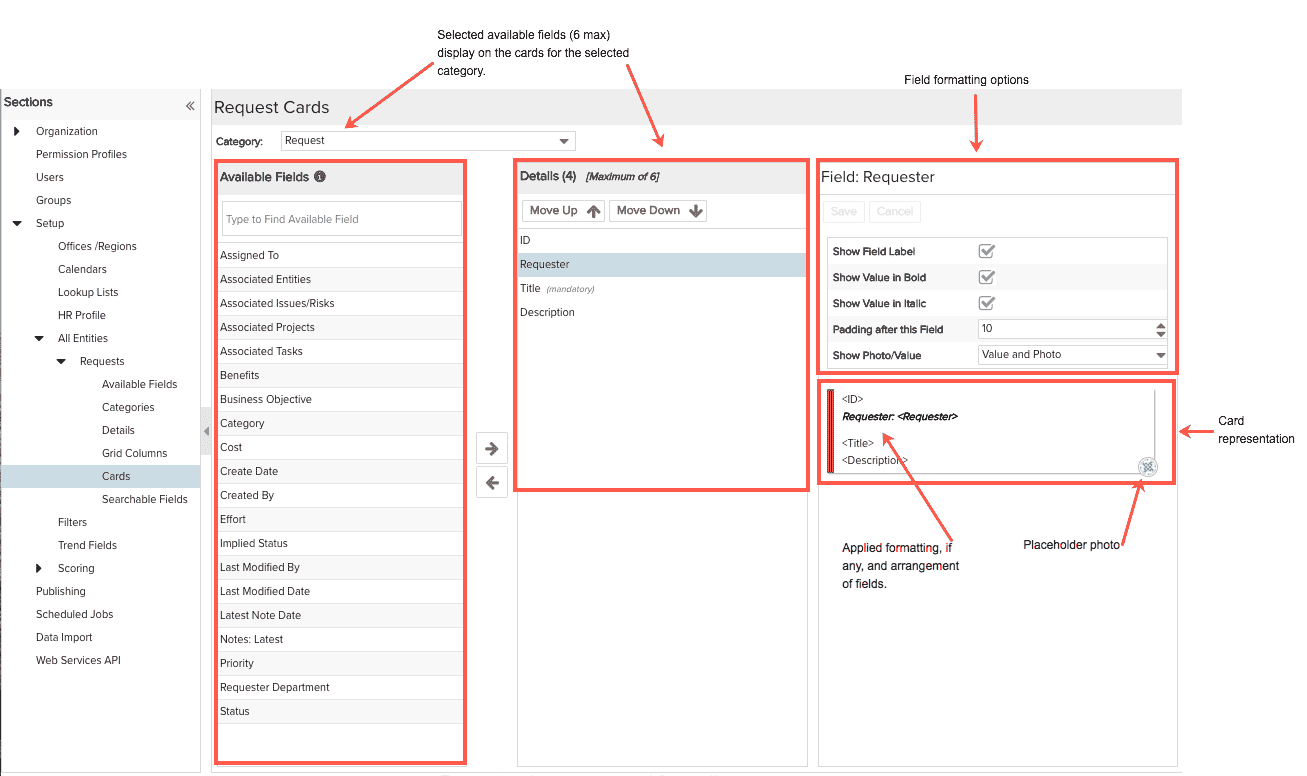
You choose the fields to display in on a card from the Available Fields panel. This list includes all Available Fields that appear on the same request category's Details and excludes any fields that were hidden on the Admin/Setup/All Entities/Requests/Available Fields page.
When you build out your cards, you associate them with a category. This allows you to provide different combinations of card fields for different categories. You pick the category you want to associate with the card by choosing it from the Category droplist near the top of the screen. Note that if you have configured only one category, the droplist will be disabled. If you have multiple categories, select a category and then lay out the card fields. You can configure different cards for each category.
Any restrictions you configured on the Available Fields page will apply to those fields on the Cards page. You can override the restrictions or change them per category on the Details page.