
Working with the Portfolios List page
Note: This topics uses "Portfolios" as an example class type. Your organization can create as many classes as it needs, and name them accordingly.
The Portfolio List page (click the "Portfolios" navigation icon) is the launching point for portfolio activity, including creating, viewing, and editing portfolios. You can format portfolio grid data (for example, add color, format dates, time, and currency) using the "Display Data As..." feature - see Formatting Column Values below.
This topic covers the following:
-
customizing the Portfolio List page
See Creating Portfolios for instructions about creating a portfolio.
Anatomy of the Portfolio List page
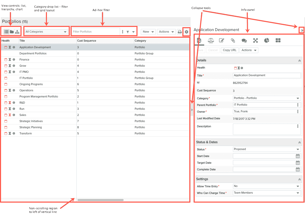
This Portfolios List page displays a list of portfolios on the left-hand side (often referred to as the "grid"), and the Portfolio Info pane on the right-hand side that houses multiple tabs you can use to manage different aspects of a portfolio. When you select a portfolio in the Portfolios list, the relevant information for that portfolio for whatever tab is active is displayed in the Portfolio Info pane. You can expand/collapse the panes to display only the Portfolios list, or only the Info pane, by clicking any of the collapse tools (shown below). You can also use the splitter to resize the two panes. Any changes you make to the layout (resizing panes, for example) will be retained when you return to this page.
Below is a screenshot of the Portfolios List page. You can display the page as a List, Hierarchy, and Chart. Examples below.
Customizing the List Contents by Category
Editing
To edit grid values, select the row and make edits in the Details panel, click Save.
Newly Created or Edited Records
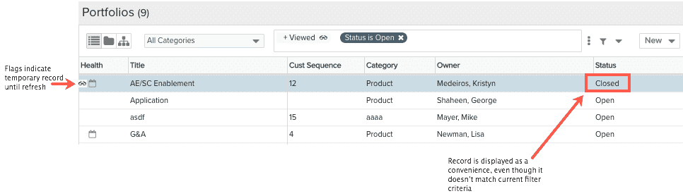
Note that you might find yourself in a situation where you have set up some filter criteria to populate the grid. Then you create a new record, or modify an existing record in such a way that it does not meet the current criteria (or might fall outside the scroll region). For example, your filter might specify "Status is Assigned," but the new entity you created has a status of "In Progress." Because we assume that you still might want to make additional edits, rather than immediately filter it out of the list, PPM Pro keeps the record in the list and labels it with a temporary "spectacles" flag  . In addition, a this temporary indicator will also be placed in the ad hoc filter field to remind you that you might be displaying some records that don't meet the current criteria. Both of these flags, as well as any records that don't meet the current filter criteria, will be removed after refreshing the screen.
Portfolio Views
Hierarchy View
When you view the portfolios in a hierarchy, the Expand/Collapse Actions menu options become active so you can manipulate the view.
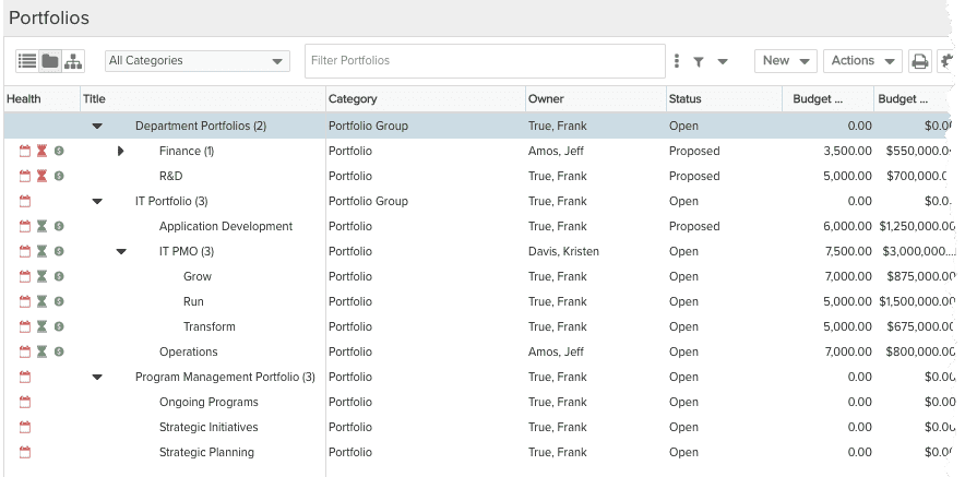
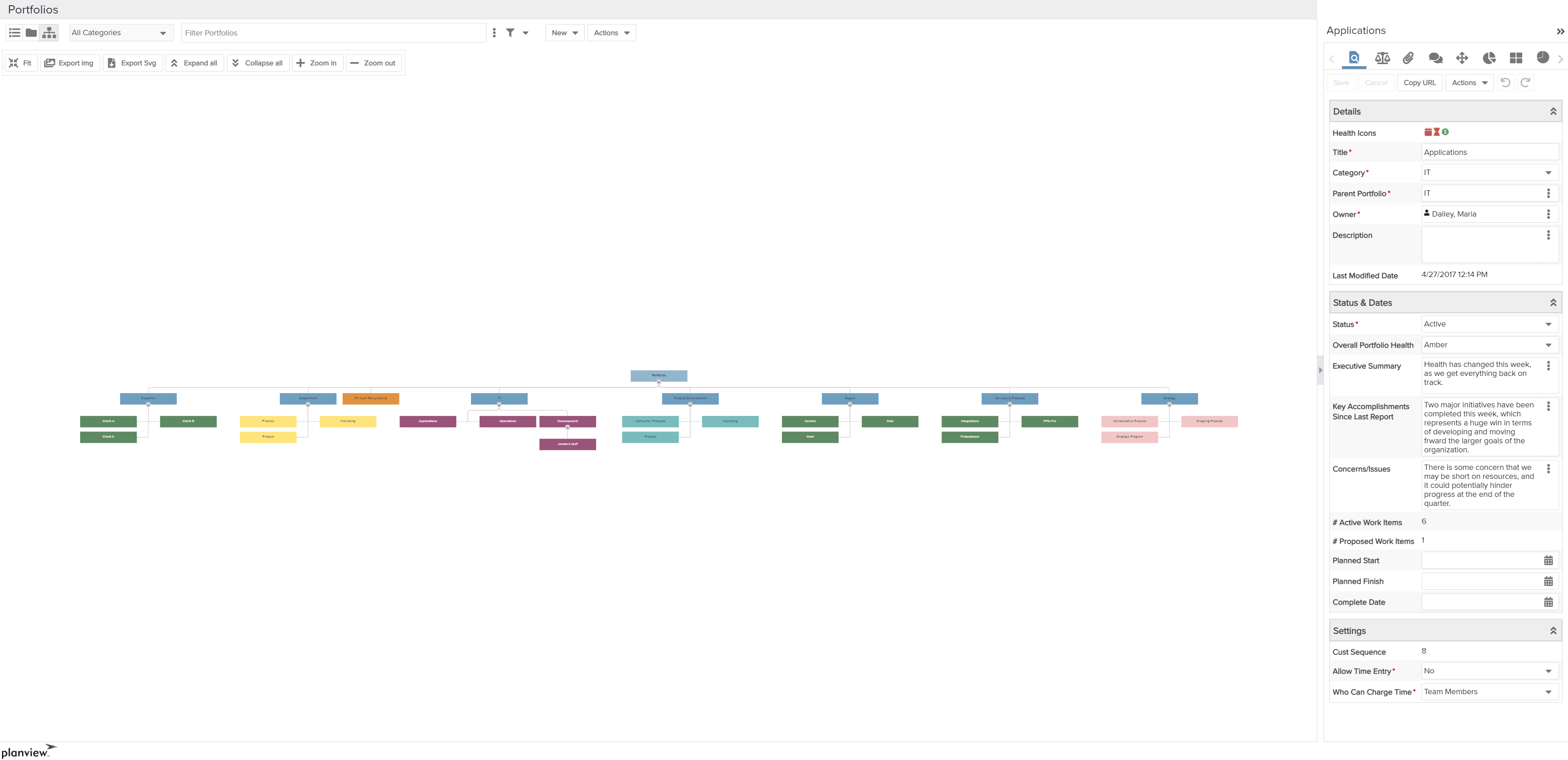
Chart View
The chart view presents a graphic representation of your portfolios and their relationship to each other. View, print, and download options are provided at the top of the screen. Use the New button to create a new portfolio.
Chart View Controls
| Control | Description |
|---|---|
| Fit | Automatically zoom to fit the entire chart in the usable space. |
| Export img | Exports a PNG image of the Portfolio chart. The exported image is an exact match of what is visible on the screen. If you are zoomed in, some parts of the chart may be cut off. |
| Export Svg | Export an SVG formatted image of the Portfolio Chart. The exported image is an exact match of what is visible on the screen. If you are zoomed in, some parts of the chart may be cut off. |
| Expand all | Makes all branches in the chart visible. |
| Collapse all | Hides the branches of the chart. |
| Zoom in | Zoom in on an area in the chart. |
| Zoom out | Zoom out to see more of the chart. |
Formatting Column Values
NOTE
The ability to format column values is available for list reports and entity grids (Issue/Project Log List, Portfolio List, Project List, Request List, and Task List). Since this feature works the same way in either context, we are covering it in one topic. You might see references to both entity grids and list report columns.
For entity grids, the formatting is specific to each user - there is not currently a way to specify global formats. Note that if you choose Reset To Default Settings from the resource menu, you will lose your formatting entity grid formatting.
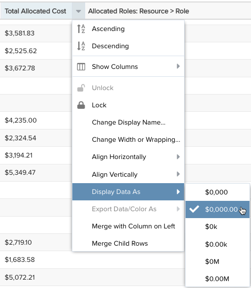
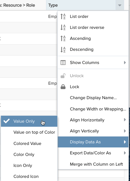
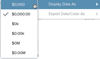
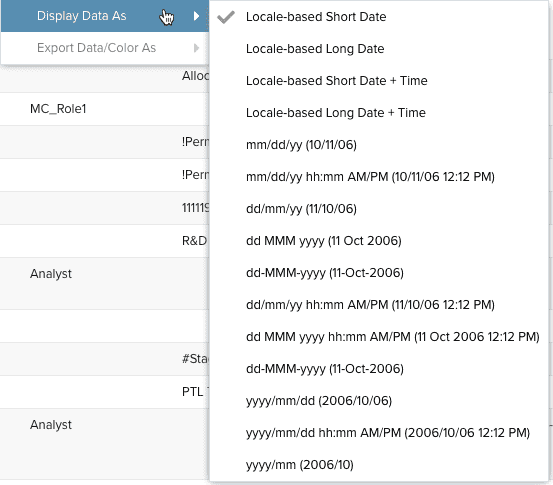
In the context of a List report or the entity grids mentioned above, an extensive header menu option called "Display Data As" is available for applying formatting to list fields, number fields, and date/time fields. The screenshot below (left) shows the Display Data As menu for a numeric fields with a currency data type; the screenshot below (right) show the Display Data As menu option for a list field:
|
Display Data As for numeric (money) fields
|
Display Data As for list fields
|
Formatting Data - "Display Data As"
The Display Data As menu header item is dynamic - it displays different menu items depending on the type of field you have selected. For example, select a lookup list and choose Display Data As to apply color to the value in the field, or the background, or both. If you select a numeric field, you'll get various options to specify things like the number of decimal places or currency indicator, whether to format percent fields to display whole numbers or decimals...and so on.
The Display Data As menu options for the different fields types are described below. Note that this menu is also available for entity grids, such as the Projects List, the Requests List, and the Tasks list.
Fields Types:
The formatting options for the above field types are described below:
| Menu Item | Description |
|---|---|
|
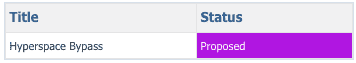
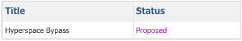
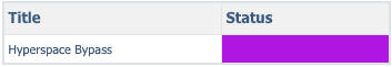
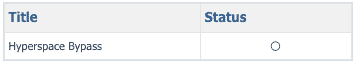
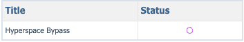
Lookup lists can be assigned a color and/or an icon for each list value. When using a lookup list in a report/grid that is configured to use color/icon, you can choose the visual treatment to apply to the list field value by configuring the "Display Data As" setting. Note that Pie charts and Column charts automatically use any lookup list color assignment.
|
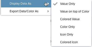
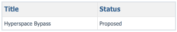
Lookup List Examples: The Display Data As list field options are shown below, along with an example of each:
|
|
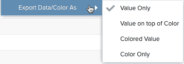
Export Data/Color As If you plan to export a report/entity grid that makes use of lookup list values that render color and/or icons, this options lets you specify how to treat the value/color when exporting. Note that icons cannot be exported as they only exist within PPM Pro.
|
Options are (see Display Data As, above, for examples):
|
|
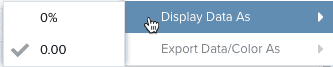
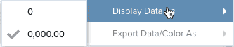
Note: You can format numeric data values of non-list reports by using the Field Options modal. The following number types can be formatted with the Display Data As menu item: Percent Choose to show decimals or round to whole number.
Float Choose to show decimals or round to whole number.
Money Choose no decimals, 2 decimal places, thousands (k) and millions (M) representatives.
Choose from a large variety of date and date/time formats. Remember that as you choose a format it renders immediately in the Preview Pane, so try out different options. The date format examples are represented in each option label.
|
Values round up using conventional rounding standards - round up at a value of 5 or higher. Understanding the rounding is important when choosing the level of precision you want to use.
Percent Example: 32% or 32.36%
Float Example: 432 or 432.05
Money Examples: $0k $0.00k $0M $0.00M
|
Info Panel/Tab Icons
The Info panel displays one or more tabs where you can configure different aspects of a portfolio. The exact tabs you see depends on how your organization has configured portfolios, as well as the current user's permissions. The following is the list of all possible tabs and a short description of each:
|
Tab/Icon |
Description |
||
|---|---|---|---|
|
|
Most entities have Details tabs/pages (older style pages are called Basic Info). The Details page is where you enter general information about the entity. The fields that appear on Details depends how your organization has configured the page. |
||
|
|
The Finances page displays roll-up information of child components - projects and sub-portfolios. Also displayed is to-date information based on the roll-up date ranges (earliest start to latest target of all child projects or portfolios). |
||
|
|
The Notes tab lists all the notes that have been created in the currently selected portfolio. You can add notes to entities from the Notes tab (for projects, navigate to the Notes section). |
||
|
|
The Attachments page for any entity lists the attachments for that entity. You can add document and hyperlink (URL) attachments for each entity. The maximum size for any single file attachment is 10MB. |
||
|
|
The Team tab lists the users who have permissions on the specific instance of the entity. You can add/remove users, or change their permission profile. See About Profile-Based Permissions for more information. |
||
|
|
The Assets tab lists the assets that belong to the portfolio. A portfolio can have multiple asset tabs that represent different types of assets. Hover the cursor over the tab to see the name of the asset. |
||
|
|
The Associations tab lists the entities linked to the current entity. The following are supported associations:
|
||
|
Reports |
The Reports tab lists all the existing reports filtered for the current entity type. |
||
|
|
The Dashboards tab lists all the existing dashboards filtered for the current entity type. |
The Actions menu
The Actions menu contains a set of common actions that you can perform on portfolios.
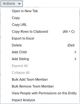
The Actions menu is always displayed in toolbar. When you use the Actions menu from the toolbar, you must first select the portfolio you wish to act on, and then select Actions >your action. You can also right-click on any portfolio and display the Actions menu.
The Actions menu commands are described in the table below. Note that most operations are dependent on the user performing the action having the appropriate permissions. For example, users must have Create permission in order to make a copy of a portfolio. If the user does not have permission, the menu option will not be active. See About Profile-Based Permissions for more information.
| Action | Description |
|---|---|
|
Open in New Tab |
Opens the selected portfolio in a new tab for viewing or editing, depending on user profile permissions. |
|
Copy |
Makes a copy of the portfolio definition and opens it. By default the portfolio definition Title is prefixed with "Copy of:" You can make a copy of any portfolio visible to you. |
| Copy URL | Copies the URL to the current portfolio. |
|
Copy Rows to Clipboard |
Copy the selected rows to the clipboard. (Shift-click or Ctrl-click to select multiple rows.) |
| Export to Excel | Export a maximum of 5000 list rows to Microsoft Excel. If you export 5000+ rows, you will be notified that your export will be truncated and encouraged to run a report to accommodate the large number of rows. Reports can handle up to 50,000 rows. See Printing the Issues List. |
|
Delete |
Deletes the selected portfolio. You must have the appropriate permissions to delete a portfolio. |
|
Add Child |
Creates a new portfolio as a child to the selected portfolio. |
|
Add Sibling |
Creates a new portfolio at the same level as the selected portfolio. |
|
Expand All |
Expands the hierarchy for the selected node. |
|
Collapse All |
Collapses the hierarchy for the selected node. |
| Bulk Add Team Member | Use to add users, groups, or units to the teams of multiple portfolios to quickly provision portfolio permissions. See Bulk Sharing Permissions. |
| Bulk Remove Team Member | Use to remover users, groups, or units from the teams of multiple portfolios. See Bulk Sharing Permissions. |
|
View People with Permissions on this Entity |
Displays the Permissions Explorer with the focus on the current portfolio. See Using the Permissions Explorer. |
|
Impact Analysis |
Invokes the Impact Analysis tool in a new window with the currently selected project as the focal point. See About Impact Analysis. |
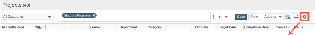
Add/Remove/Rearrange and Sort Columns
You can determine the columns that appear in an entity grid using the Configure Column Settings dialog. Click the Configure Columns gear icon to display the dialog.
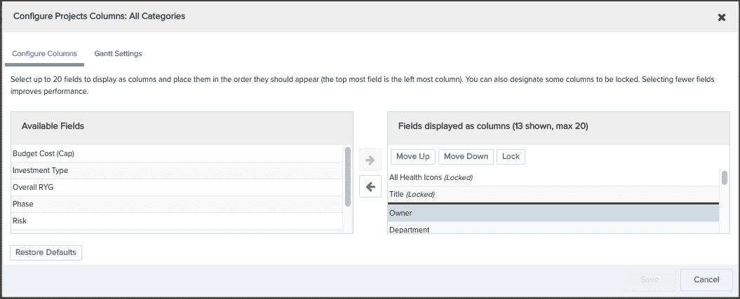
- To add columns to the grid, select them in the Available Fields pane and then click the right-arrow. To remove columns, select them in the right-hand panel and click the left-arrow. You can display 20 columns max. The list of fields available in this dialog is determined by the project category, which is configured by an PPM Pro administrator.
- You can select one or more columns to remain "locked" to the left of the screen in the non-scrolling region, preventing them from scrolling out of view. The Title field for an entity is locked by default. To lock an additional column, select the field and click the Lock button. To move a column into the scrolling section of the grid, select it and click the Unlock button (on appears once you select a locked column other than Title).
- You can move columns to any position in the grid by simply dragging the column header in the grid. Or, you can change their position by clicking the Configure Settings icon and using the Move Up/Move Down buttons to reorder the columns.
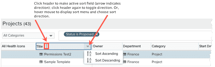
Sorting
To sort a list, simply click on a header. An arrow pointing up indicates ascending sorting; down indicates descending. Alternatively, click your cursor in the header to display the sort menu and choose the sort order - ascending or descending.
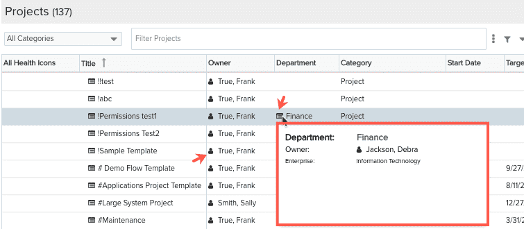
Entity Info Quick View
You can quickly display important information about other entities related to a project without having to navigate away from the Projects lists. Click the  icon next to the name of any entity (such as business unit, department - the resource icon looks like
  ) to display a snapshot for the selected entity. Click the entity name link to navigate to the Info screen of the entity.
Filtering Portfolios
Use the "ad-hoc" filter just as you would on any on page. See Ad-Hoc Filters for more information.