
Display Tab
The report designer's Display tab contains settings for configuring report appearance. Depending on the report type, you can display, format, and position various pieces of text, such headings and legends and labels. You can also configure drilldowns, sorting and grouping, and showing sub/grand totals for relevant report types.
Most report types have controls on the Display tab for formatting. List reports, while strictly textual, have many options for controlling column values - these settings can be found in the column header menus instead of the Display tab (see Formatting List Reports and Formatting Column Values). See Creating Stacked List Reports to see how to add color to your labels. In addition, List reports have Grouping, Sorting, and Aggregation sections, where you can select grouping and sorting fields, as well as apply calculations to numeric fields. See Grouping/Sorting for List Reports.
This topic covers:
- Changing Field Display Labels
- Creating and Positioning Headings
- Auto-sizing List/Gantt/Crosstab reports for use in dashboards
- Wrapping List report column headings
- Positioning and Formatting Data Values, Axis Labels, and Quadrants
- Gantt zoom settings
- Sorting for non-List report types (see Grouping/Sorting for List reports)
- Configuring Drilldowns to Reports and Entities
- Legends
If you are looking at the Display tab then you have already chosen your report Topic and Type - as mentioned above, the report Type drives the options on the Display tab. Continue reading below to learn about common settings in the Display tab. Most of the settings are self-explanatory, and remember that the Preview Pane will reflect the settings as you configure them. So by all means, trial and error will be much more satisfying than a tome of documentation! You can move to any of the other tabs by clicking General, Data, Variable Settings, or Team.
Note about color: While there are no report-specific settings for color, you can adjust the inventory of colors and the order in which they are used, the results of which can be seen on graphical reports such as pie, donut, gantt, bar/column. This is a global setting and any changes will affect all areas of the application that use color. See Adjusting System Colors.
That's A Lot of Formatting Options!
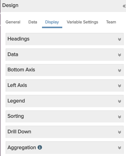
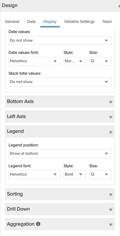
We do give you a lot of bells and whistles for formatting reports. To simplify things, we have grouped the settings into collapsible sections so you can maneuver between the sections you are interested in while collapsing others. For example, the screenshot below on the left is the Display tab for chart types that use axes - all sections collapsed. The screenshot on the right shows the same tab but with the Data and Legend sections expanded. Best practice is to only open what you need when you need it :)
|
All sections collapsed:
|
Data and Legend sections expanded
|
Changing Field Display Labels
Note: This happens on the Data tab, but just covering our bases and "feels" like it should be in the Display tab, since it seems like a display feature.
The "buckets" on the Data tab where you drop fields to include in a report have an edit toggle that opens the Field Options "float-on-top" modal (see screenshot below). Open this modal to reorder fields, delete fields, and edit field display labels. The example below shows how to click the edit control for the List Fields "bucket" to open the Field Options modal and edit the label there. In addition, you can edit list report fields right in the Preview Pane, but sometimes that gets awkward if there are a lot of columns, so we offer this alternative for all report types.
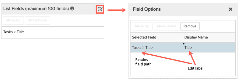
Note that any changes you make to field display labels are reflected in the Data tab buckets. A downside of this is that if you edit the field path (say change Tasks > Title to just Title), you might not remember how the field was derived. However, if you check the Field Options modal, you'll see that the value of the Selected Field will never change - it displays the field path even if you have edited the display label. This public service announcement was brought to you by our fabulous dev team :)
Creating and Positioning Headings
The Headings section is where you can add/format report headings/subheadings. You can optionally add a heading to the report Container (the area in which the report is displayed), as well as 2 levels of headings just above the report content.
Other formatting options include the ability to auto-size List/Gantt/Crosstab reports used in dashboards to fit their real-time contents in a dashboard component
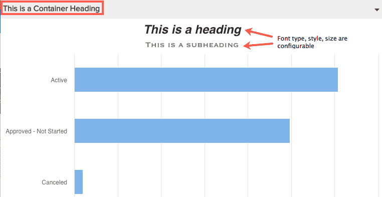
Below is a screenshot that illustrates the different heading types/locations; a sample Headings section is shown below that, along with descriptions of all the settings. Note that List/Crosstab/Gantt charts offer only a Container Title in the Headings section.
 |
|
|
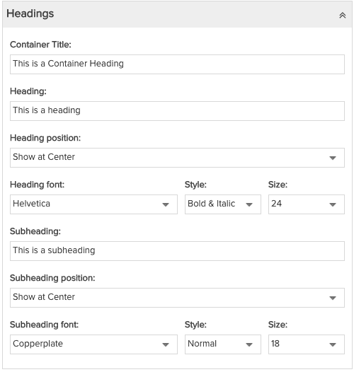
Configuring headings for non-list reports
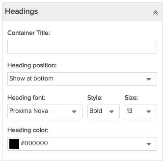
Configuring headings for Tile reports
|
Note that the preview pane will reflect the settings as you configure them. Container Title - Left-justified text displayed in the shaded area at the top of the report output (looks like a title bar). There are no additional options for Container Title placement, simply enter the text you want displayed, or leave blank. Note that List/Crosstab/Gantt reports offer a Container Title only - no other headings. Heading - Text displayed directly above the chart. To suppress the subheading, delete the text. Heading position - Where to display the heading text: Show at Left, Show at Right, Show at Center. Heading font - Choose Heading font type, Style, and Size. Heading color - (Tile reports only) Select a heading color (can set value color in Data section). Subheading - Text that is displayed directly above the chart and below the heading (if there is a heading). To suppress the subheading, delete the text. Subheading position - Where to display the subheading text: Show at Left, Show at Right, Show at Center. Subheading font - Choose Subheading font type, Style, and Size. |
|
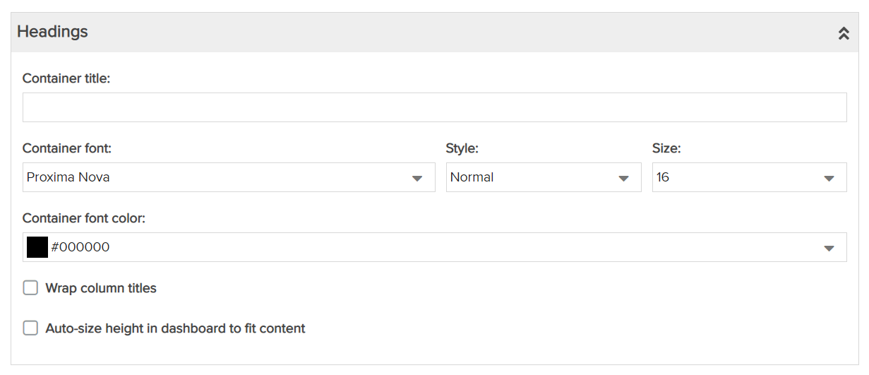
Configuring headings for List Basic/Stacked/Time Series, Crosstab and Gantt reports
|
Container Title - Left-justified text displayed in the shaded area at the top of the report output (looks like a title bar). There are no additional options for Container Title placement, simply enter the text you want displayed, or leave blank. Container font - Choose Container font type, Style, and Size. Container font color - Select a Container font color (can set value color in Data section). Wrap column titles - List reports only. Wraps the column header text for all columns. To wrap the column values, see Change Width or Wrapping... . Auto-size height in dashboard to fit content - Applies to report that is included in a dashboard. If the current report is not included in a dashboard, this setting is ignored. Configures the report to automatically reduce vertical white space when rendered results are smaller than the allotted space, and expands the area if the results take up more room than the allotted space. For example, if your list report is sized to display 100 records but only 50 are returned, then the white space following the 50th record will be collapsed. Similarly, if the report is sized to display 100 rows and returns 200, the component will expand vertically to display all 200 rows. Note: There is a height limit of about 1400 pixels, at which time a scrollbar will be added to the report component. You can also set this feature on the component itself in the dashboard. In the Preview Pane, select the Edit menu on a component and choose Edit Headings. In the dialog that appears, enable the checkbox for auto-size. Setting this in the dashboard overrides the setting in the report definition. |
|
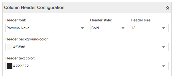
Column Header Configuration for List: Basic/Stacked/Time Series and Gantt Reports
|
Header font - Choose Header font type, Header style, and Size. Header background-color - Choose a background color for the headers. Header text color - Choose a Header font color. |
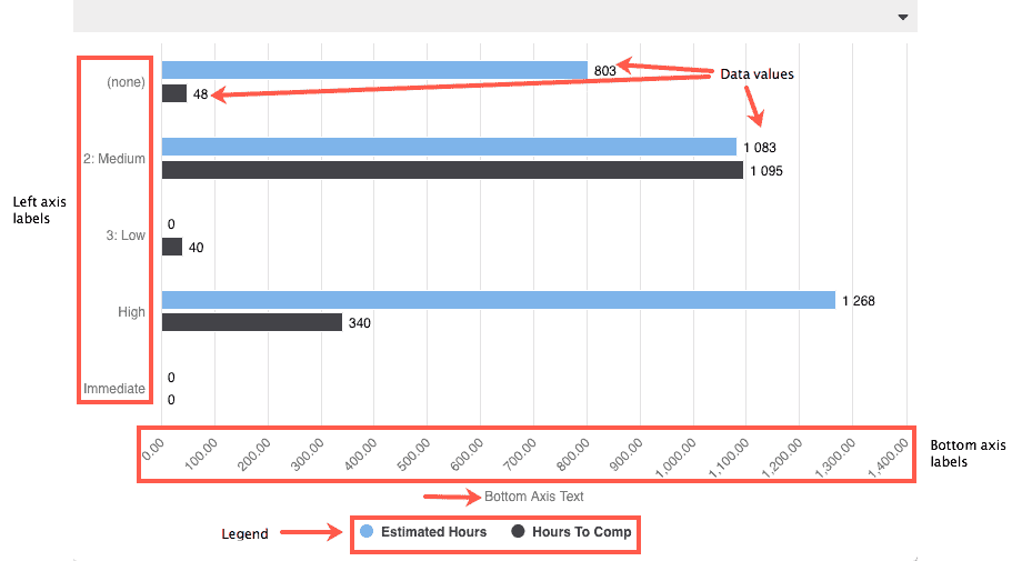
Positioning and Formatting Data Values, Axis Labels
The Display tab's Data section is where you can determine if and how the data values are displayed, and configure other chart attributes, such as axis labels. Different report Types have different options for preparing data for display.
Below is a screenshot that illustrates the different elements that can be configured for charts that have axes; a sample screenshot of a Data section is shown below that, along with descriptions of all the settings.
 |
|||||
Formatting data values for charts w/out axes:Spiderweb, Gauge
Pie, Donut Charts
Tile
|
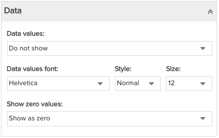
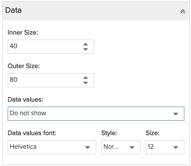
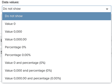
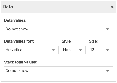
Data values - For charts where data is represented graphically, by a bar or a point or a bubble, you can choose to also display the actual (textual) value. Choose from the following, otherwise choose Do Not Show.
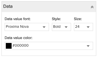
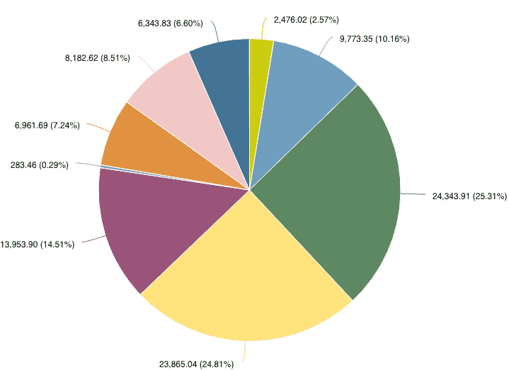
Data values font - If you choose to display data values, select the Data value Font, Style, and Size (or use the defaults). Data value color - (Tile reports only) Select a data value color (can set heading color in Headings section). Show zero values - For reports that return data values of 0, you can choose how to represent a value of 0: choose Show as zero, Show as blank, Do not include in report Inner Size, Outer Size - For Donut charts, the Inner Size and Outer Size settings set the proportion of the "donut hole" to the outer diameter. Both are limited to 100. News flash: if you set both the 100 you will see nothing! If you set the Inner Size to 0 and the Outer Size to some value, then you will have no hole (donut now looks like a pie!) Play around with it in the Preview Pane! (shown below: Value 0,000.00 and percentage (0.00%) |
||||
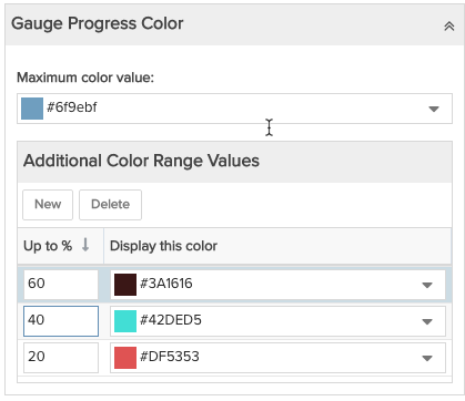
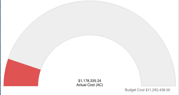
Gauge Reports OnlyMinimum/Maximum Boundaries Gauge Progress Color
|
Maximum color value - Select the color to display when no additional colors values configured. In addition, this color displays when the gauge progress goes beyond the highest additional color range. Additional Color Range Values - Can be used in conjunction with the maximum color value to designate different colors for different levels of progress. In the example to the left, the percentages work as follows: if % is > 0 and <= 20 color value red if % is > 20 and <= 40 color value turquoise if % is > 40 and <= 60 color value black if % is > 60 color value blue (maximum color value) Minimum/Maximum Boundaries - The Minimum/Maximum labels are the names of the fields you selected on the Data tab.
|
||||
Formatting data values for charts with axes:Area, Bar/Stacked, Bubble, Column/Stacked, Combo, Heatmap, Line
Bubble Charts - can place in/outside bubble, use leader line
|
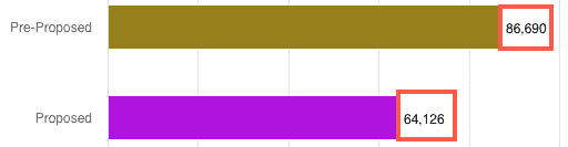
Data values - For charts where data is represented graphically, by a bar or a point or a bubble, you can choose to also display the actual value. Choose Show Value to display, otherwise choose Do Not Show.
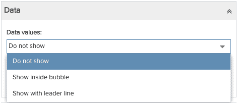
Stack total values - For stacked bar or column chart reports, select choose Show Value to display at end/top, otherwise choose Do Not Show. For bubble chart reports, 2 extra options: Show inside bubble and Show with leader line, shown below:
|
||||
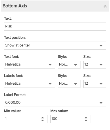 |
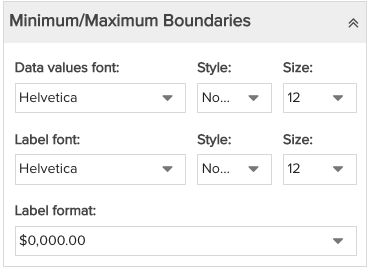
Text - Enter the text that appears below the chart labels. You can position the text left, center, or right, as well as choose a font, font style, and font size. Text position - Choose to Show at Center, Show at Left, or Show at Right. If you don't want to show any text, be sure the Text field is empty. Text font - Select the Font, Style, or Size (or use the defaults). Labels font - The Bottom Axis labels are the values that display across the bottom access. Choose the Font, Style, and Size, for the labels or use the default. Axis labels are not optional. Label Format - Format options vary depending on field type. Display numeric values with (0,000.00) or without (0) decimals; if money field, additional formatting options available, including "k" and "M". See Display Data As for a complete list of data format options used throughout the report designer. Min/Max value: If you want to prevent data from appearing below the bottom axis, enter a Min Value of at least 0. If you want to limit the maximum value, enter a Max value. This setting is not applicable for Combination charts, which have 3 axes. |
||||
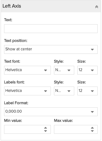 |
Text - Enter the text that appears on the left axis to the left of chart labels. You can position the text left, center, or right, as well as choose a font, font style, and font size. The rest of the settings are the same as for Bottom Axis, above.
|
||||
|
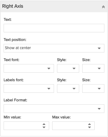
Right Axis - Combination charts only
|
Text - Enter the text that appears on the right axis to the right of the chart labels. You can position the text left, center, or right, as well as choose a font, font style, and font size. The rest of the settings are the same as for Bottom Axis, above. |
||||
|
|
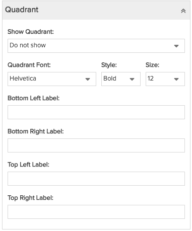
Show Quadrant - Select Show to display vertical and horizontal axes in a "crosshair" that divides the viewing area into four equal sections. You can label each section to identify the characteristic you are measuring. For example, a common situation is a risk vs reward comparison, where the left axis is risk and the bottom axis is value, and you label the top right quadrant as "Aggressive". Note that the quadrant is always symmetrical - will always bisect the middle of each axis. Quadrant Font - Select the Font, Style, or Size (or use the defaults) for the quadrant labels. Enter text for each quadrant label in the following fields:
|
||||
|
Gantt charts only - Zoom settings
|
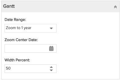
These settings determine the default date range for the Gantt chart range. You can also configure these settings in the Preview Pane, and they will stay in sync with the settings on the Display tab. However, once a user changes these settings on the rendered report, the defaults are longer enforced and the current settings become "sticky". You can choose a specific range, a range relative to the current date, or a range centered over a specific date. The Zoom Center Date is offered only when one of the Zoom to N years is selected. Otherwise the zoom is centered over the current date.
Hiding the columns Note that if you wish to just show the Gantt chart and not view the columns, specify a Width Percent = 100% and the columns will not display. |
||||
|
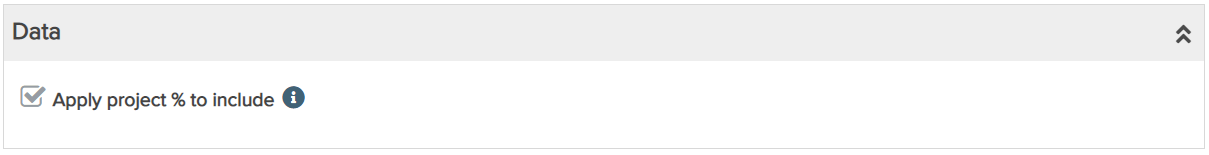
Portfolio reports only - Apply project % to include
|
This setting determines how data is displayed in numeric portfolio fields. Apply project % to include only appears in reports that have numeric portfolio fields. The setting is a checkbox that works like this:
|
||||

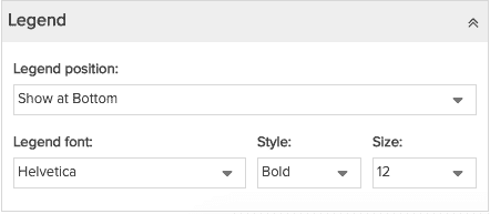
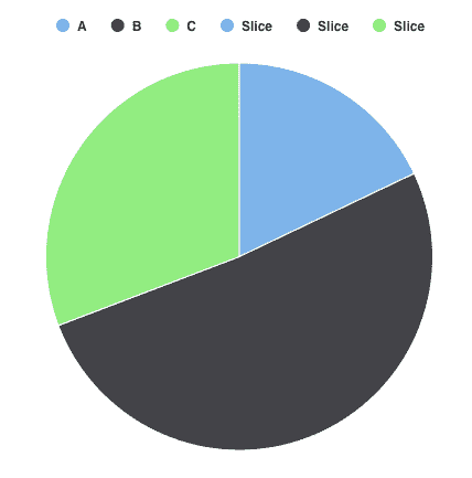
Legend
A Legend is available for non-list reports that use color to differentiate report characteristics, such as pie, donut, and bubble charts. You can include a legend to identify what the colors mean; position the legend to appear at the top, bottom, right, or left of the report data. Note that if there is only one value field used in a report, no legend will be available.
 |
|
Examples of different legend positions: left (below)...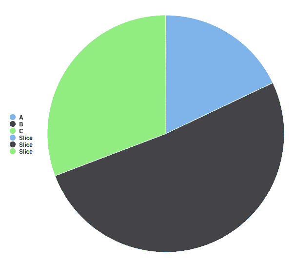 |
...and Top
|
Sorting
Extensive sorting/grouping controls are available for List reports - see Grouping and Sorting for List Reports. Most other report types have simple sorting controls (limited to one sort field) that allow you to control the order of axis values and graphical elements, such as bars. On chart types, axis values are auto-grouped. Below shows the simpler Sorting section for non-list report types
|
Non-List Report Types
|
|
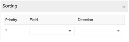
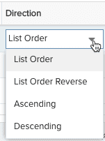
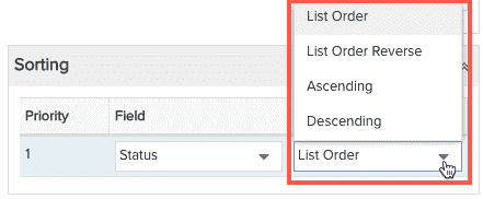
For example, the Sorting section for a bar chart using the fields Count and Status is shown below; there are two available sort fields, which correspond to each axis:
Choose sort field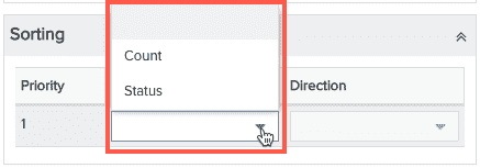 |
Choose sort direction
|
Configuring Drilldowns to Reports and Entities
A drilldown is a link in the report output that the end user clicks to display another report, a PPM Pro entity Details page, a "data dump" (charts only), or a dashboard. Drilldowns provide away to get more information about an entity. The target report list will always contain reports that are the same Topic or children of the Topic. For example, if you drilldown from project title, you'll see all project topic reports, as well as task reports, issues, reports, and so on, a sibling or an ancestor to the drilldown field.
You can create a drilldown link from most field types. Drilldown links are active even when the report in which they are defined in is included in a published dashboard. Drilldowns retrieve current data, which can be inconsistent with the information on the dashboard. A published dashboard is a snapshot in time, but drilldowns pull in live data. For more information, see Dashboards Overview.
Drilldown links are not active in the Preview Pane. To test, click Save & Run and click the links in the report output.
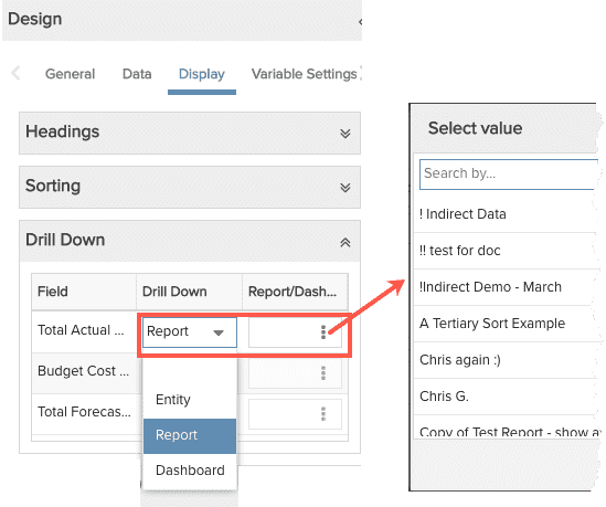
Drilldown Targets
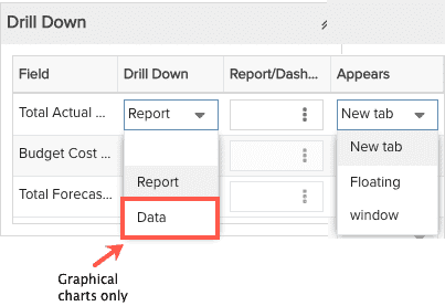
There are four targets a drilldown link can draw from:
- Report - You can configure a field to drill down to a report you specify. Click the vertical ellipsis in the Report/Dashboard column display the Select modal, where you can search for a report. The target report list will always contain reports of the same Topic or a child Topic for that drilldown field. For example, if you have a project Topic report and configure a drill down from the project Title field, your target report list will contain all project Topic reports, as well as task Topic reports, issue Topic reports, financial entry Topic reports, and so on. If you have a project Topic report and configure a drill down from the project Associated Requests > Title field, your target report list will contain all request Topic reports.
- Dashboard - You can configure a field to drill down to a specific dashboard. Select the "Dashboard" drill down type, then choose a dashboard by selecting directly from the list or by clicking the vertical ellipsis in the Report/Dashboard column to display the Select modal, where you can search for a dashboard. The Dashboard you select must be available on the entity grid that matches the report drilldown field. For example, if the report Topic is Project, then the dashboard you configure to drill down to must be available on the project Dashboards grid. In fact, the list of dashboards in the target droplist will only be dashboards that are on the matching grid; if you create a Resource report but have no dashboards available on a resource Dashboards grid, the droplist will be empty. So if you don't see the dashboard you are looking for in the list, check that it is accessible on the correct entity grid.
- Entity - You can configure a field to drill down to the Details section of the entity the field belongs to. For example, if you have a list report that includes project Title and task Title, and both are Entity drilldowns, the project title will invoke the project Details section, and task Title will invoke the task Details tab.
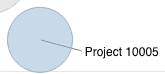
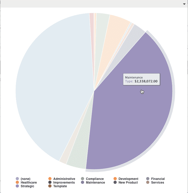
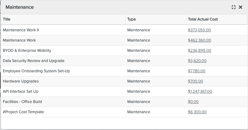
- Data - The Data drilldown target results in a textual representation of the values depicted by the graphical chart. For example, imagine you have a Pie chart that shows Total Actual Cost for a project, grouped by project Type, configured to drilldown to Data. Click on a slice and you'll drill down to a set of columns - all projects of the type represented by the pie slice - and the Total Actual Cost for each. See example below:
|
Pie chart, Value field: Total Actual Cost, Group By field: Type. Click on Maintenance wedge... |
..."Data" report displays, showing project Title and Total Actual Cost of each project of type Maintenance. |
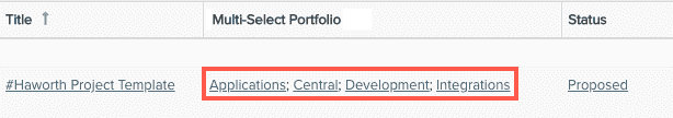
Drill Down links from Multi-Select Fields
Drilldowns to multi-select fields are implemented like single-select drilldowns - each value will have its own link (elements are semi-colon delimited). For Entity drilldowns, each list element will have its own link to its entity Details. For example, if the multi-select list contains the resources Joe, John, and Jim, an Entity drilldown would result in a link for each list element (Joe, John, Jim) that opens the corresponding resource Info page. For Report drilldowns, each list element has its own link to the report.
For example, in the screenshot below you can see how each list element has its own link:
To configure a drilldown:
- After setting topic and type, and adding fields to the report, navigate to the Display tab.
- Expand the Drill Down section if not already visible.
- The fields in your report are listed in the Field column. For each field you want to configure with a drill down, choose the Drill Down type and select where it should appear - in a New tab or a Floating window.
- Click Save or Save & Run.
Learn More...
Visit How To Build... for information about building various reports.