
Intake Request Risk vs. Value
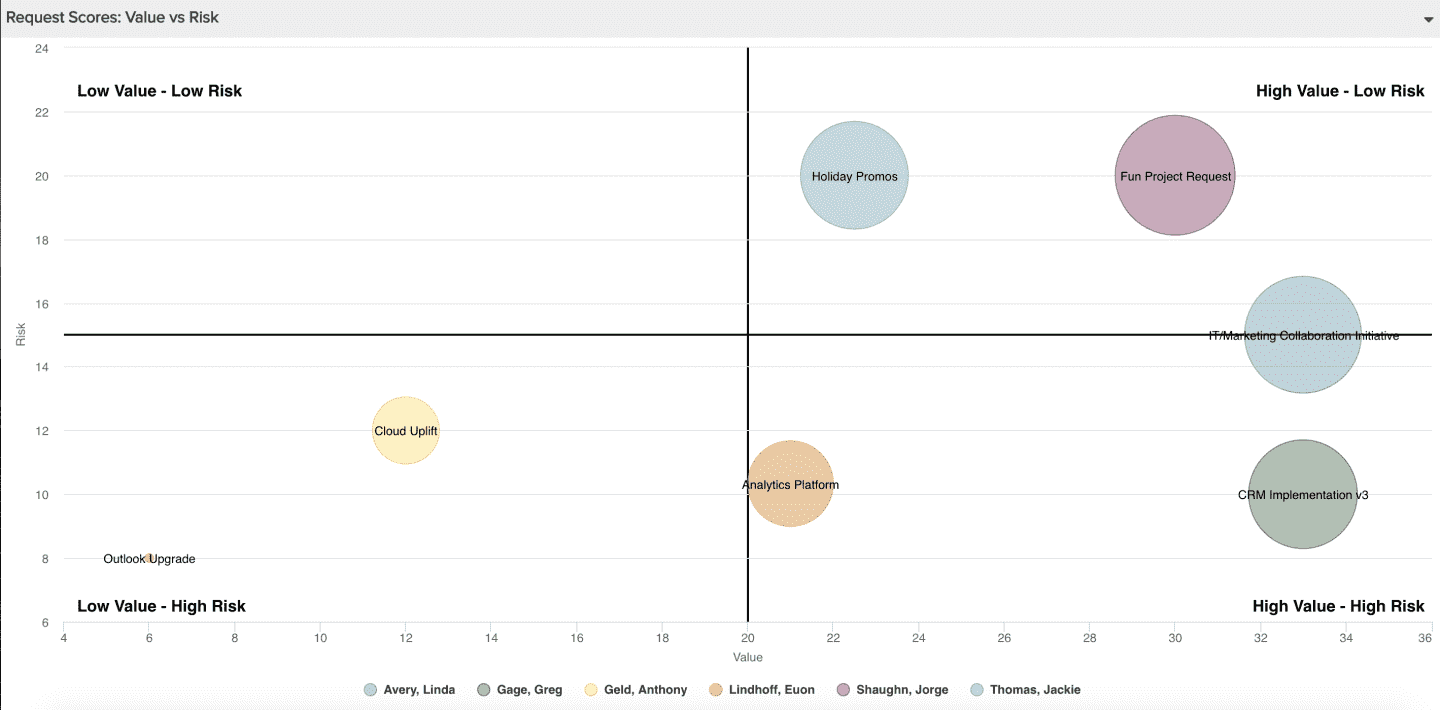
This report gives you a visual picture of work intake request scores broken down by two scoring categories, risk and value. It does rely on your using a PPM Pro Scoring model (as in this example) or calculated fields. For the quadrants to work well, make sure they are labeled such that the scale matches the relative value for the scoring model or calculated field. For the example below, a large category score for Value indicates "High Value" whereas a large category score for Risk indicates "Low Risk"; the scores assigned to Risk option selections are higher when the risk is lower. You can build this report using the design settings in the table below. Alternatively, you can download this report definition and upload it to your PPM Pro instance. Please note that if you use the report definition file to create this report in your instance, the scoring model category fields used in this example recipe will not be in your instance and you will need to select alternative fields from your instance for the resulting report. You'll also likely want to update the chart text and labels.
| Design View | Selection | Comments |
|---|---|---|
| General |
Topic: Request Specialty: Scoring Type: Bubble Title: <enter a meaningful title>
|
You can easily create a similar report for Projects that have scoring, just select 'Project' as the Topic. |
| Data |
Bottom Axis: Request > Scoring Category: Value (Specialty) > Calculated Score Left Axis: Request > Scoring Category: Risk (Specialty) > Calculated Score Size Field: Request > Score Title Field: Request > Title (or some other field that you want to show as a label for each bubble) Color Field: Request > Requester (or some other field that you want to use as a color for each bubble) |
Use the Available Fields field path control to access category scores. Because Scoring models can differ and depend upon their configuration, use whichever two scoring model categories make sense. If you are not using a scoring model, you can still select two fields that have values meaningful to the overall score as the bottom and left axes. The key is just to choose two meaningful score contributing fields. Please note that if you download the report definition file, the Scoring Model categories will likely differ and will not be in your instance; you will need to select appropriate replacements in the resulting report. |
| Display |
Set desired Display options, such as: Data - Data values: Show inside bubble, or, Show with leader line Bottom Axis - Text: Value (or the scoring model category name you want on the bottom of the bubble chart) Left Axis - Text: Risk (or the scoring model category name you want on the left of the bubble chart) Quadrant: Various labels to indicate high/low category values Drill Down: Entity (if you'd like clicking on a bubble to open the relevant request) |
Be careful when labeling quadrants to ensure the scale matches the relative value for the scoring model or calculated field. For example in the example report screenshot at the top of this page, a large category score for Value indicates "High Value" whereas a large category score for Risk indicates "Low Risk"; the scores assigned to Risk option selections are higher when the risk is lower. Please note that if you download the report definition file, the Scoring Model categories will likely differ and you will want to update with more appropriate text and labels. |
| Variable Settings |
Filter: Request: Scoring Profile is <name of relevant profile>
|
Provide relevant filters, for example if you only want to see scoring for certain request categories or for a specific scoring profile (if you have more than one across request categories). If you want to allow the user to change to a different Filter before running the report or when viewing the report, select the relevant checkboxes for Allow changing. |