
Stepping into Reports and Dashboards
Reports provide a powerful way to visualize relevant and key information. A dashboard is an impactful collection of one or more reports that work together to meet the needs of a targeted audience. Both reports and dashboards are essential for getting the most out of PPM Pro, allowing you to:
- Provide data insights and analysis of:
- Key performance indicators and statistics
- Work progress at portfolio, program, project, and other levels
- Trends and interdependencies
- Strategic and financial initiatives
- Incoming work requests, role and people capacity, and other situations that may need balancing
- Quickly inform and support a diverse set of stakeholders in making decisions
- Showcase data that reflects your positive impact on the organization
- Help drive adoption, as your users realize their entered data is both visible to company leaders and critical for driving business decisions
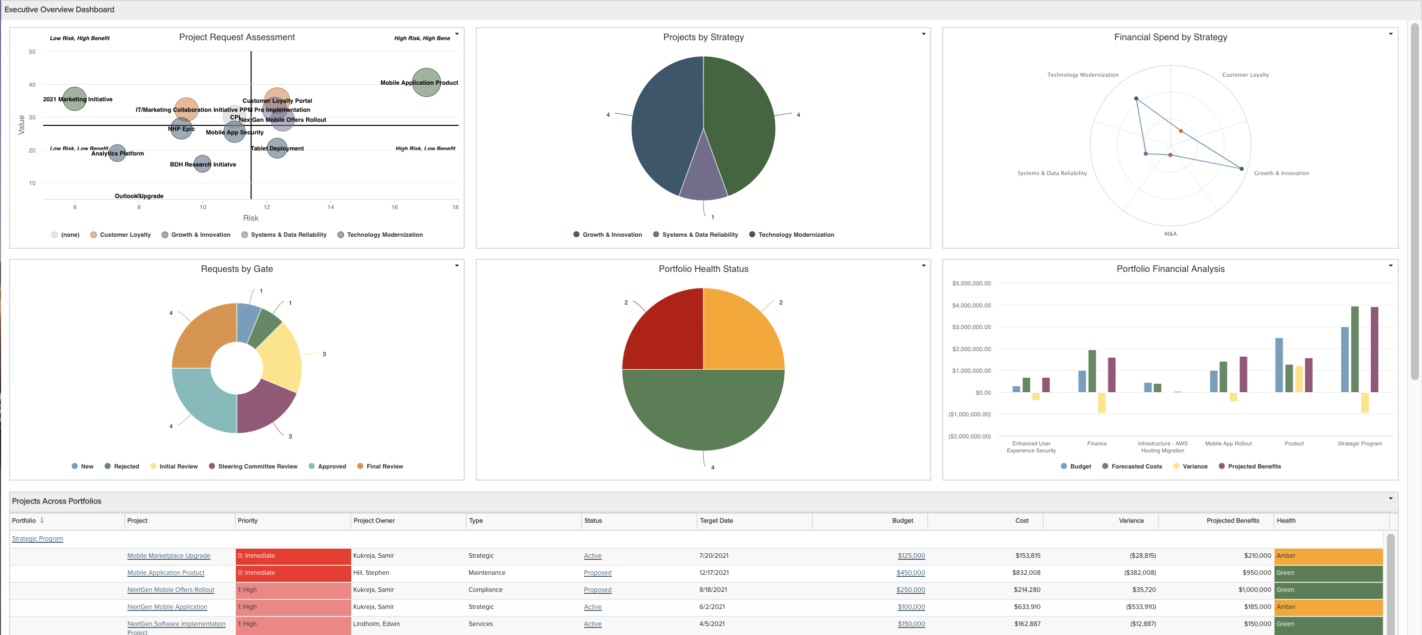
Example of an Executive Overview Dashboard with Bubble, Pie: Basic, Spiderweb, Donut, Column: Basic, and List: Basic report Types:
The purpose of this topic is to provide an example set of steps for how you can design, create, and manage effective reports and dashboards to help achieve your company's objectives. Are you starting from an existing or Legacy report or dashboard? These steps still apply and the process will likely go faster, just use the existing as a starting point for discussion (be sure to check out Transitioning to New Reports if the existing is Legacy). Need inspiration in general or examples? Check out the recipes in the Reports Cookbook and Dashboards Cookbook. If you have any questions about any of the following or other reporting and dashboard needs not addressed here, please contact Customer Care or Consulting Services. If you have another example or a helpful tip not portrayed below that you would be willing to share, please email productmanagement-ppmpro@planview.com and we will gladly add it!
The steps covered in this topic include:
Step 1: Know your audience and identify goals
Step 2: Determine best way to satisfy goals
Step 4: Creating and organizing a dashboard
Step 5: Reviewing and iterating with your audience
Step 6: Distributing and granting access to reports and dashboards
Step 7: Managing, monitoring and retiring reports and dashboards
Step 1: Know your audience and identify goals
An effective report or dashboard should always be centered on the needs and expectations of its audience:
- Displaying relevant and actionable data
- Tracking key statistics and performance indicators
- Presenting and communicating data “at a glance” in a clear and efficient way
- Helping viewers to quickly understand complex information and see patterns
- Showing only essential information up front, with secondary information made accessible through drilldowns
Know Your Audience
People in varying roles and with diverse backgrounds and experiences will judge the effectiveness of a report or dashboard differently. Therefore the very first step in designing any report or dashboard is to identify your target audience and their goals in viewing the report or dashboard. Find out:
- Is the audience a single person or multiple people?
- If multiple people, will they be viewing the dashboard together or apart (or both)?
- What roles does the audience have?
- What knowledge do they have?
- What are their general needs and expectations?
If the report or dashboard is for an audience of one, your design just got so much easier (especially if that audience is you!)...skip on down to Step 2 below! If multiple people and they have very different roles, knowledge, needs, and expectations, plan to create different reports and dashboards for those audience members that differ; it's almost impossible to create an effective report or dashboard for an audience that varies wildly in their backgrounds and goals. If you must create a single report or dashboard for a varying audience, realize that it will be unlikely to create an effective dashboard that satisfies all the audience. You will need to identify the key audience members and target them for the primary design content and organization, followed by other audience members.
Identify Goals
Once you understand who the audience is you can get down to identifying what goals the report or dashboard needs to fulfill. Interview your audience, singly or in a group(s) based on how much they differ in background and needs, to answer the following and other relevant questions:
- What problems do you think the report or dashboard might solve?
- What questions do you need answered?
- What else are your current pain points?
- What other info can you not get your arms around?
- What are you currently using to obtain answers to the above, where is it successful or failing, and may I have a copy or get access to it?
- What of the above is the most important, second most important, and so on...what is the priority?
- Do you need to "slice and dice" information and to what detail levels?
- What else is missing or questions I haven't asked you that I should have?
At the end of each interview, be sure to set expectations with your audience that this will be an iterative process and that you'll be back again to discuss, refine, and review (and do so!).
Example:
Suppose that your Chief Financial Officer has asked your boss for a better way to keep apprised of the financials for the work being done in your organization. She doesn't currently have a dashboard and has been relying on presentation reports and diverse spreadsheets that her financial team provides in monthly meetings. Your boss would like you to create a dashboard to meet her needs and also wants to be kept in the loop for what is shared with the CFO.
An initial approach is to focus on creating one dashboard for the CFO and her team. You'll want to involve her and at least a few of her team, keeping them in the design process throughout. Perform the first interview, asking the questions above. Let's pretend they provide the following to you as a result:
- It is very important to track portfolio costs broken out by capex vs. opex and forecasts vs. actuals, which are currently tracked via spreadsheets which her team provided you
- It is good to track by spend category the forecasts vs. actuals costs, yet another spreadsheet
- Something they don't have today that they would like to see is forecasts vs. actuals costs broken out by corporate strategy
- They would like to be able to see project budget vs. forecast vs. actuals, month-over-month, including ETC and EAC for each
- today they have to go into each project to see; it is a pain to have to go in and out of each project
- when they do notice a red flag or a problem, they would then like to go into individual projects to see more details and analyze, to facilitate or make course corrections
Keep your boss informed and show him the final dashboard once the process is completed. If your boss wants further changes to it, offer to create a separate dashboard with tweaks and visualizations he cares about as well as any other additional visualizations, just for him.
Step 2: Determine best way to satisfy goals
Now that you understand your audience and have their initial goals, you can determine how best to meet them. A first important rule of thumb: only provide the data that will meet the goals, no more and no less. Doing so enables your audience to focus on what is important and eliminates distractions and clutter. Even though you might think it a good idea, do not include extra data that your audience did not communicate as a need or goal. Save such potential data for a question over at your next meeting when you review the initial design; your audience will request any additional needs and data once they have the visualization in front of them, no worries about that!
Not sure whether you need to create just a report or an actual dashboard? No worries, follow these steps and it should become clear; if you are able to satisfy your audience's goals with a single visualization, you just need a single report (though see the Distributing and granting access to reports and dashboards step below in case it needs to be added to a dashboard to meet audience access needs). If you need more than one visualization, likely you'll want to create a dashboard. Tackle one report at a time given your audience's expressed goals and you'll be fine. Do they simply want to see a total or average value? That should be one report. Do they need to compare data? That should be one report. Do they need to see multiple data properties next to each other or at the same time? That should be one report. Do they need to primarily see one of these reports just mentioned, and secondarily see related data? The secondary related data should be in a second report (or perhaps just the entity itself) accessed via a drilldown.
Once you determine how the goals map to individual reports, you can identify the specific entity field(s) that will provide the report data. Bonus if your audience already gave you specific fields, though you'll want to evaluate them to consider if other fields might be even better. The choice of these specific fields, along with other considerations such as drilldowns and sorting, will inform your choice of topic when you actually create a report. The format or type of these fields will inform your choice of visualization when you create the report. The importance and relative priority between the reports will inform drilldowns when you create the report(s) or organization when you create a dashboard.
Keep in mind that a report created for a particular topic usually can be viewed at higher level entities; create the report at the appropriate level given field choices as it can usually be rolled up simply by viewing at a higher level scope. For example, a report displaying task or financial entry level data fields can be viewed at the project, portfolio, and other higher levels. So make sure you choose the data fields that makes sense for the report because scope can come later.
Are you missing data in the system that is needed to satisfy a goal? See if you or your Admin can start capturing it via user-defined fields on entities, taking advantage of bulk edit and data import to help initially add the data. There may also be some product capabilities that are not yet in use that could make data collection and visualization much simpler in the long run. You or your Admin could explore setting up portfolio management, resource management, work intake request management, possibly even project financial summary...all likely beyond what you need to do now for your current report and dashboard design, but something that could be added when the time is right.
Example:
For the CFO and her team's goals, below are the reports to be created and the data fields needed for each:
| Report 1: Capex vs. opex, forecasts vs. actuals, costs broken out by portfolio | Report 2: Forecasts vs. actuals costs broken out by spend category | Report 3: Forecasts vs. actuals costs broken out by corporate strategy | Report 4: Project budget vs. forecast vs. actuals, month-over-month, including ETC and EAC |
|---|---|---|---|
|
Project data fields:
|
Financial entry data fields:
|
Project data fields:
|
Project simple data fields:
Financial summary data fields:
|
Step 3: Creating a report
Now that you have an idea for the reports and their date fields, it's time to get down to building. Permitted users can create a report within the top-level Reports grid or from within an entity Reports grid. If you know that you will be running a report for a specific entity, like a portfolio or project, creating from within one of those entity's Reports grids will automatically select that scope so that the report will show up in that grid going forward; it's just a time saver for you, but not essential because you can still select entity scopes when creating a report from any Reports grid.
The mechanics of creating a report are detailed in the Creating, Editing, and Deleting Reports topic. From a Reports grid choose the New > New Report, then make various selections on each of the report Design pane's tabs, using the Preview pane to see the results of your selections. Below are some design considerations to help you decide what report selections to make.
- Within the General tab, the report Topic you select should be based on the key data fields you want to visualize, what secondary data you want to drilldown to, what field(s) you might be sorting or grouping on, if you need to show a hierarchy, if you need to show progress between two dates (Gantt), and/or if you need to show specialty data fields:
- Most of the time - Usually you should pick a topic that is the highest level entity for the report data fields. For example, if your report will visualize project, task, and project log fields, you usually would pick Project as the Topic.
- Sorting, grouping, or hierarchy - If you need to be able to sort or group the report data on a particular field, or show hierarchy based on a particular field, you likely should pick that field's entity as the Topic. For example, if your report will visualize project, task, and project log fields, and you want to sort on or show hierarchy based on the Task 'Task Number', you should pick Task as the Topic. Or, if your report will visualize project, task, and project log fields, and you want to group by project and sort on or show hierarchy based on the Task 'Task Number', you should pick Project as the Topic.
- Progress between two dates (Gantt) - If you need to show progress between two dates, such as what a Gantt provides, you should pick the date fields' entity as the Topic. For example, if your report will visualize portfolio and project field, but you want to display progress based on project Start and Target Dates, you will need to pick Project as the Topic.
- Drilldowns - If you need to be able to drilldown to another report that shows secondary information (for example, a report that is not important enough to show directly on a dashboard), you should pick a topic that will be the same entity as the report you are drilling down to or at a higher level than that entity. For example, if you need to be able to drilldown to a report of Task or Timesheet fields, then the report you are creating should have a Topic of Project or Task, not Role. 'Drilldown' truly means to open a secondary report (or an entity or dashboard) that has the same or lower level of information, because the same filters will be applied to the content of the secondary report; there is no way to 'drillup'. Therefore you need to choose a report Topic that will allow you to drilldown to the secondary report Topic.
- Specialty fields - Certain data fields related to Permissions, Scoring, and Time Series only apply to certain entities. For example, certain Scoring model fields are only reportable when Project or Request is selected as a Topic. These fields become accessible for reporting when the corresponding Specialty is selected. If a report needs to visualize one of these data fields you will need to select a Topic that has the Specialty option for the data fields (and then also select that Specialty!).
- Within the General tab, the report Type you select should be based on a number of factors, including the format or data type of the fields, how many fields there are, how many values a field might have, the size of the device accessing it, and ultimately the purpose of the report visualization - comparison, aggregation, progress or time series, number of dimensions, trending, pattern recognition, and/or detailed data. See the Report Type Characteristics table below for guidelines on what report Type generally works best given these factors. Note that as you create a report, you can switch between similar report Types to see which work best or copy a report and change the Type to show alternatives. NOTE: For financial summary and financial entries reports, the List: Time Series type works best (avoid the Crosstab).
Report Type Characteristics:
|
Type |
Image |
# of Fields or Field Options |
Purpose |
Screen Size |
Data Type |
Comments |
|---|---|---|---|---|---|---|
|
Tile |
 |
One |
Aggregation |
Any |
Numeric |
See example: Tiles |
|
Gauge |
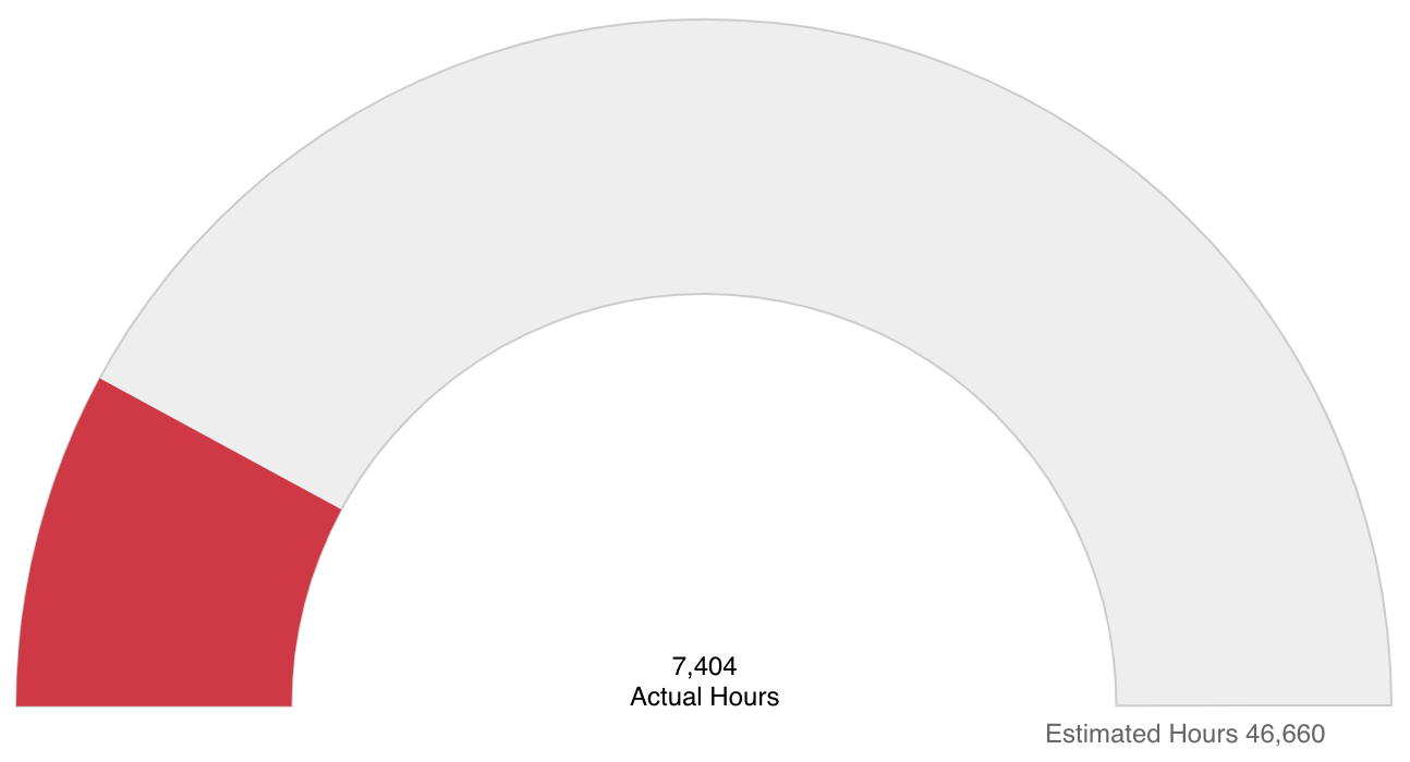 |
One or two |
Progress, simple comparison |
Any |
Numeric |
See examples: Project % Complete, Project Actuals vs. Estimated Hours |
|
Donut |
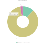 |
Some |
Percentage breakout, multi-dimensional comparison |
Any |
Numeric + Grouping/Discrete |
Similar type: Pie See example: Project Logs |
|
Pie: Basic |
 |
Some |
Percentage breakout |
Any |
Numeric + Grouping/Discrete |
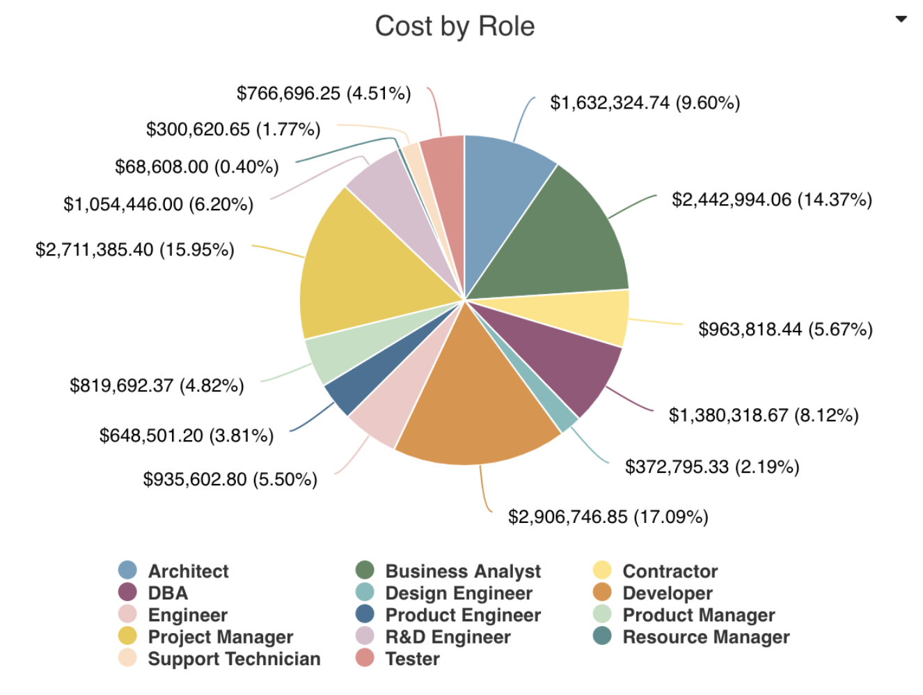
Similar type: Donut See example: Allocated Cost by Role |
|
Pie: Crosstab |
 |
Some |
Percentage breakout, multi-dimensional comparison | Any |
Numeric + Grouping/Discrete |
Similar type: Donut |
|
Line |
 |
Few to several |
Time series, trending, patterns, simple comparison |
Medium or large |
Numeric + Grouping/Discrete |
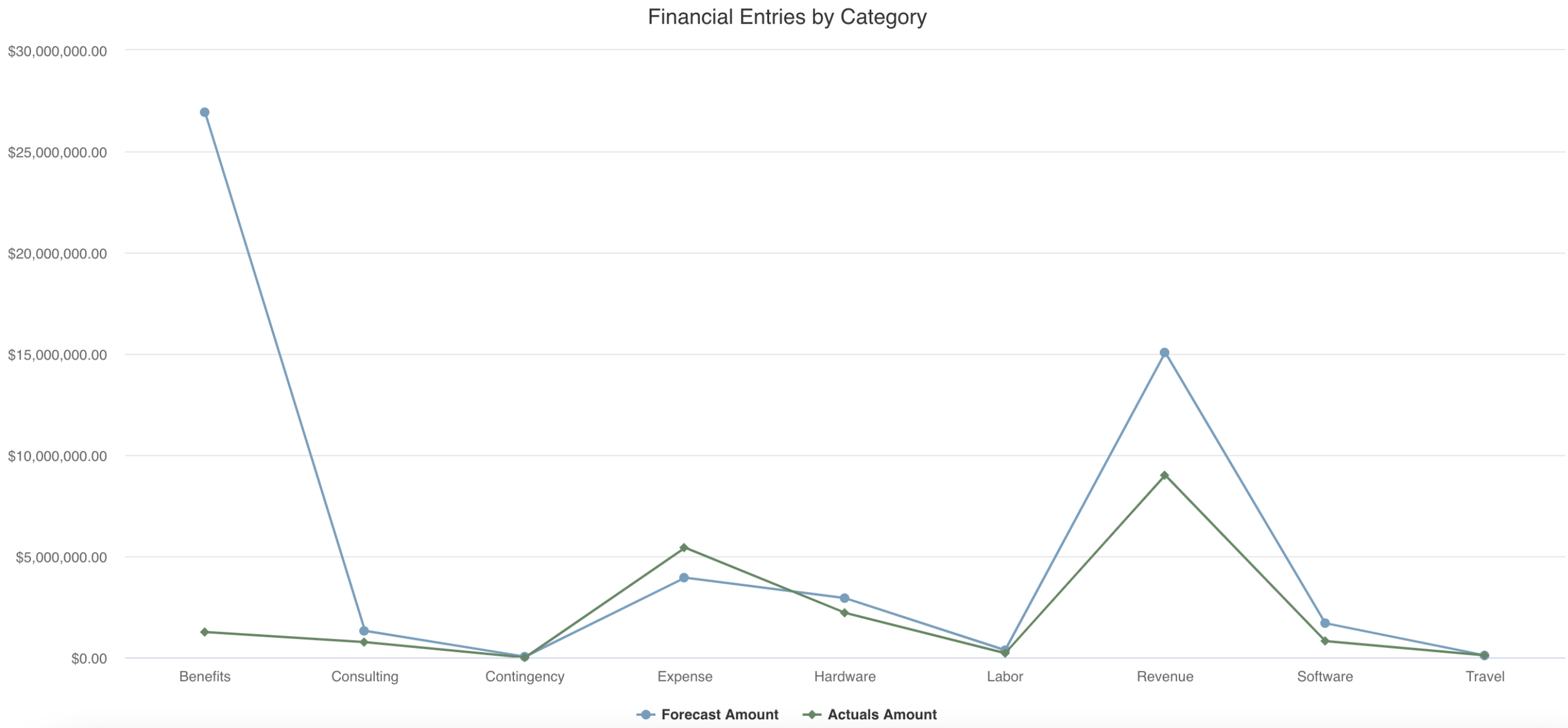
Similar type: Area See example: Financial Entries by Category |
|
Area: Basic |
 |
Few to several |
Time series, trending, patterns, volume, simple comparison |
Medium or large |
Numeric + Grouping/Discrete |
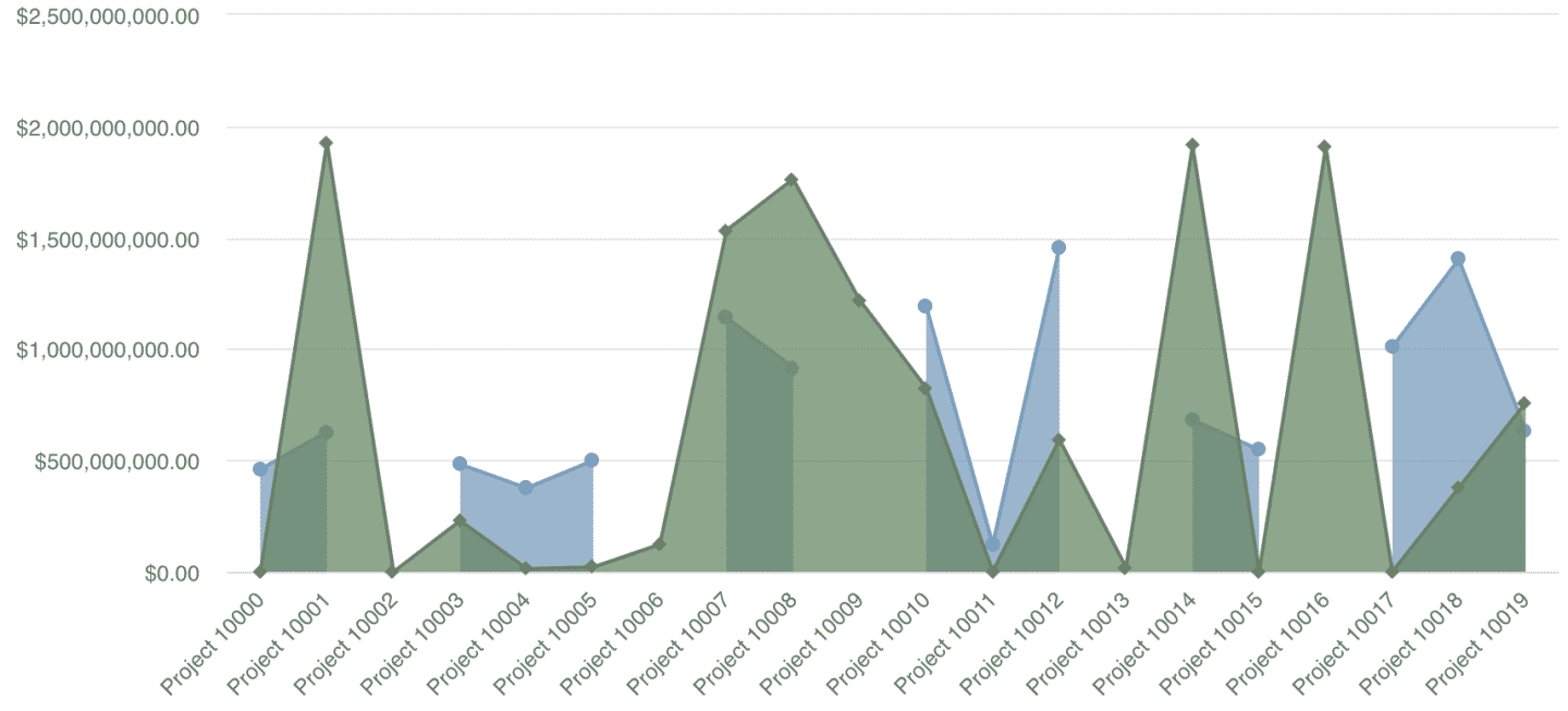
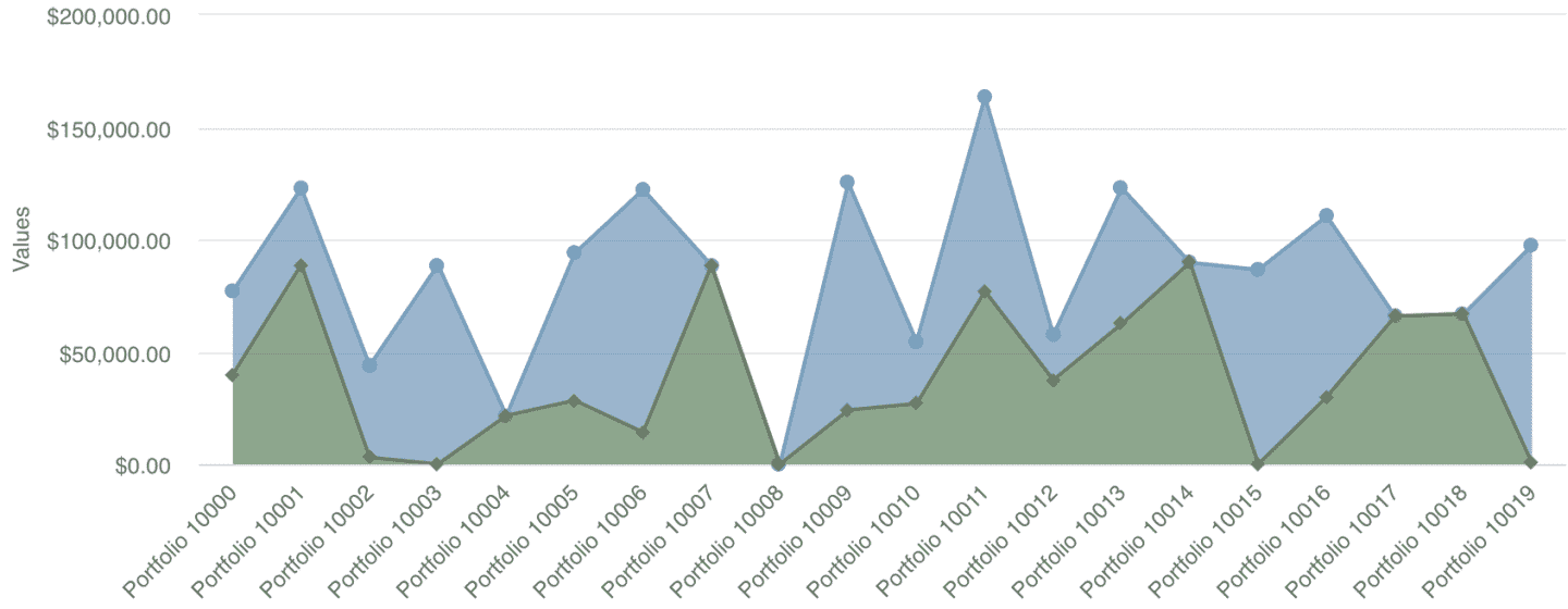
Similar type: Line See example: Simple Project Financials Comparison |
|
Area: Stacked |
 |
Few to several | Time series, trending, patterns, volume, aggregation |
Medium or large |
Numeric + Grouping/Discrete |
Similar type: Line |
|
Spiderweb |
 |
Few to several |
Patterns, multi-dimensional comparison |
Any |
Numeric + Grouping/Discrete |
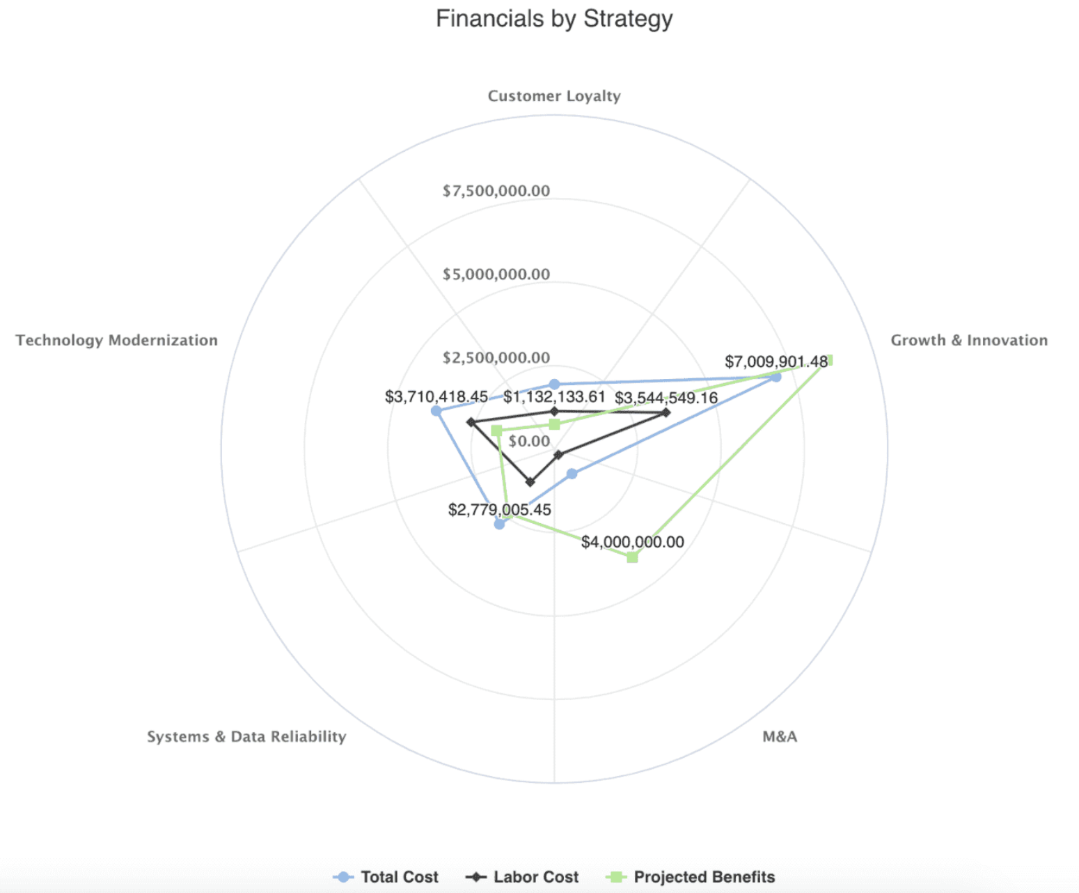
Similar type: Line See example: Project Financials by Business Objective |
|
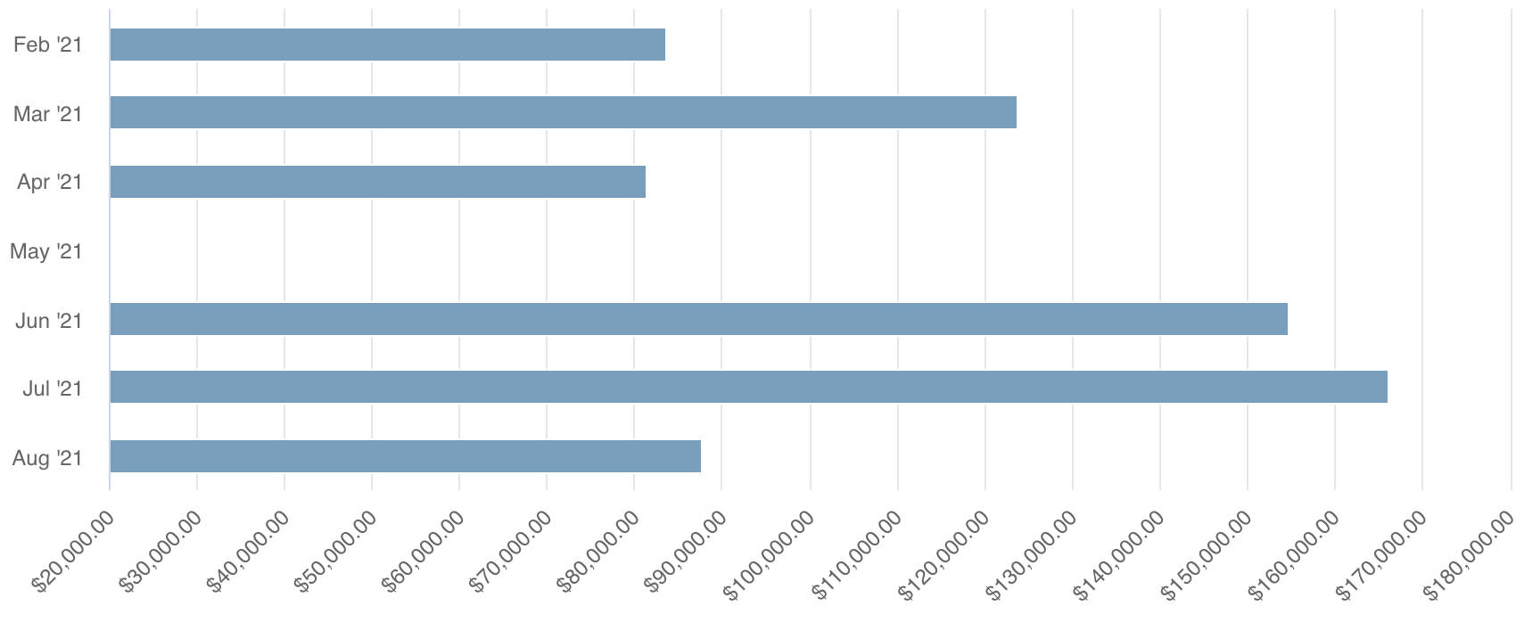
Bar: Basic |
 |
Few to several |
Simple comparison |
Any |
Numeric + Grouping/Discrete |
Similar type: Column See example: Allocated Hours by Project |
|
Bar: Stacked |
 |
Few to several |
Simple comparison, aggregation | Any |
Numeric + Grouping/Discrete |
Similar type: Column |
|
Column: Basic |
 |
Few to several |
Simple comparison |
Medium or large |
Numeric + Grouping/Discrete |
Similar type: Bar See example: Planned vs. Actuals |
|
Column: Stacked |
 |
Few to several |
Simple comparison, aggregation |
Medium or large |
Numeric + Grouping/Discrete |
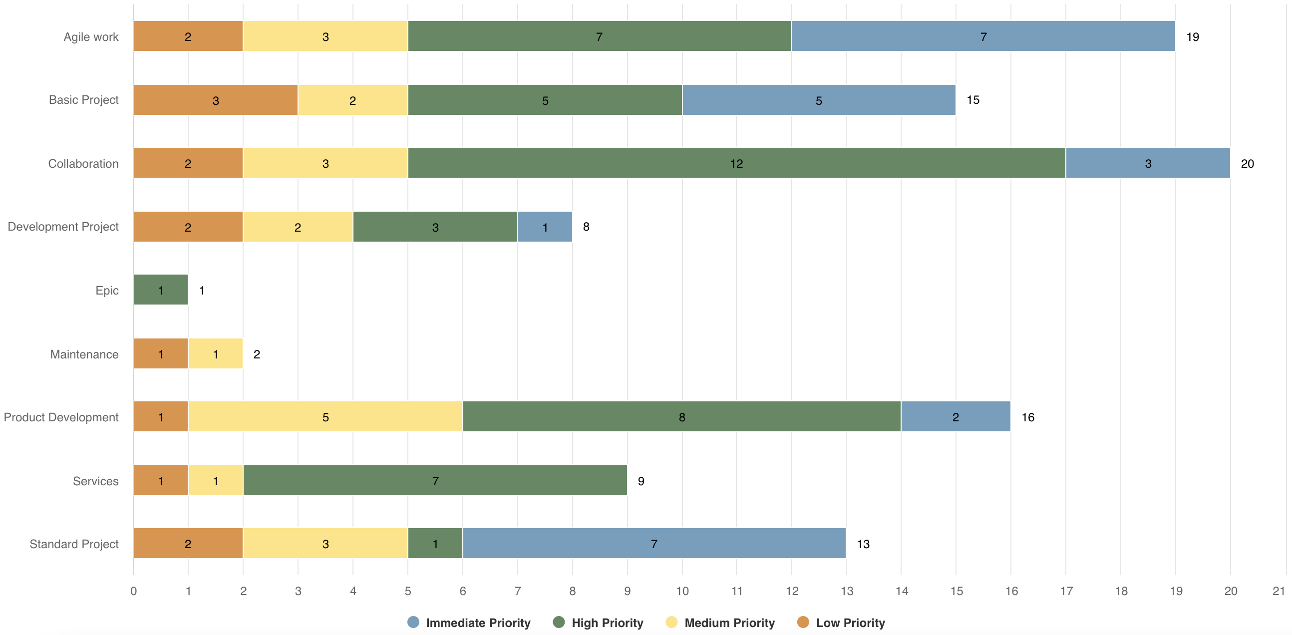
Similar type: Bar See example: Projects by Category with Priority Stacks |
|
Heatmap |
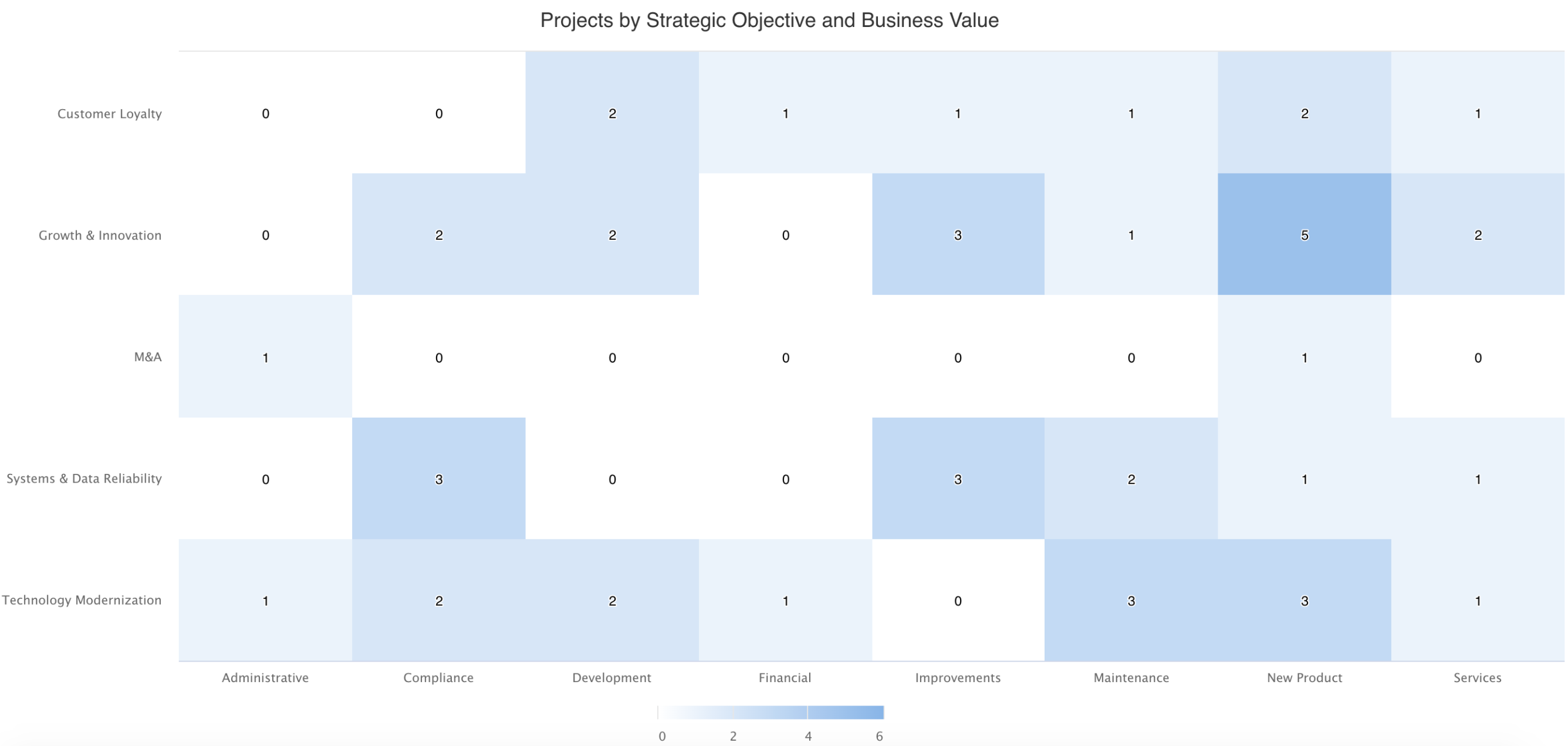 |
Three |
Hot spots, patterns, two-dimensional comparison |
Medium or large |
Numeric + Grouping/Discrete |
See example: Projects by Type and Business Objective |
|
Bubble |
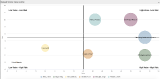 |
Three to five |
Multi-dimensional comparison |
Medium or large |
Numeric + Grouping/Discrete |
See example: Intake Request Risk vs. Value |
|
Combination |
 |
Few to several |
Multi-dimensional comparison |
Medium or large |
Numeric + Grouping/Discrete |
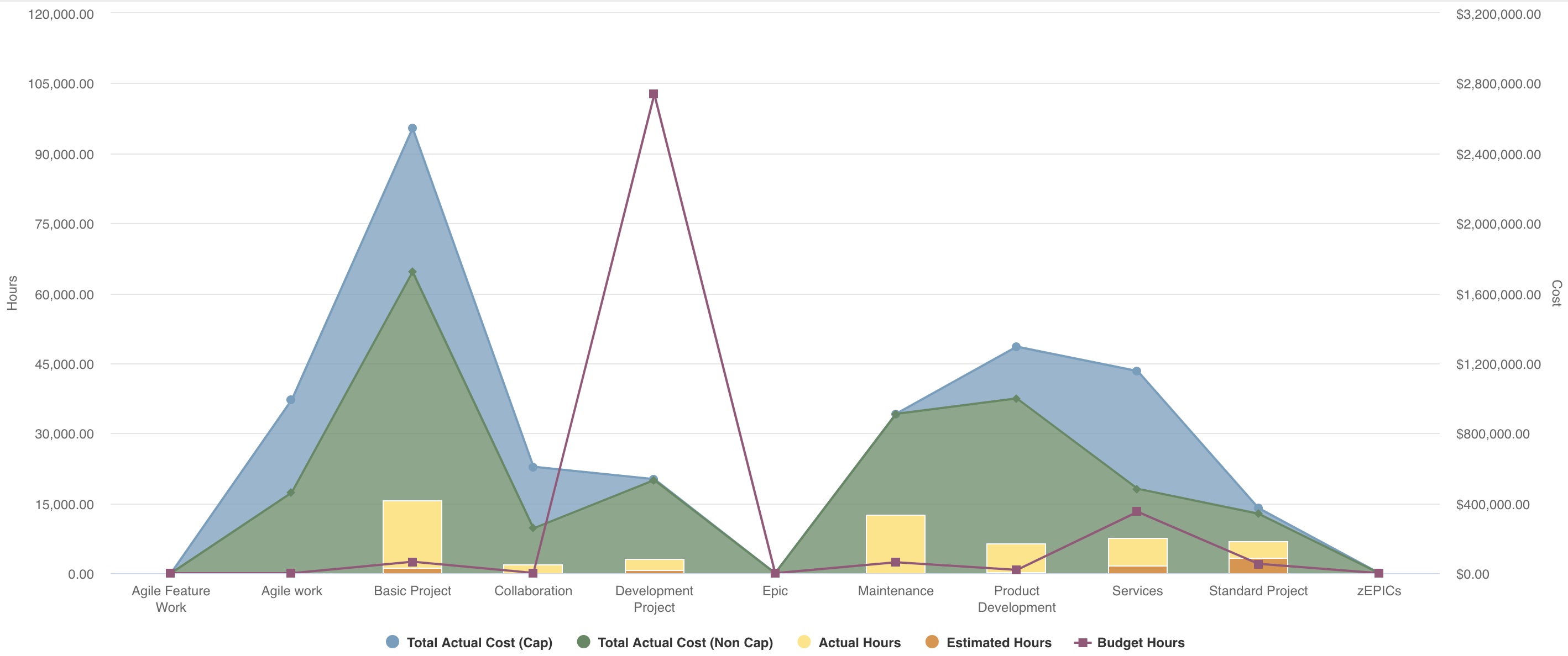
Similar types: Area, Line, Column See example: Portfolio Budgets and Projects |
|
Combination: Stacked |
 |
Few to several |
Multi-dimensional comparison, aggregation |
Medium or large |
Numeric + Grouping/Discrete |
Similar types: Stacked Area, Line, Stacked Column |
|
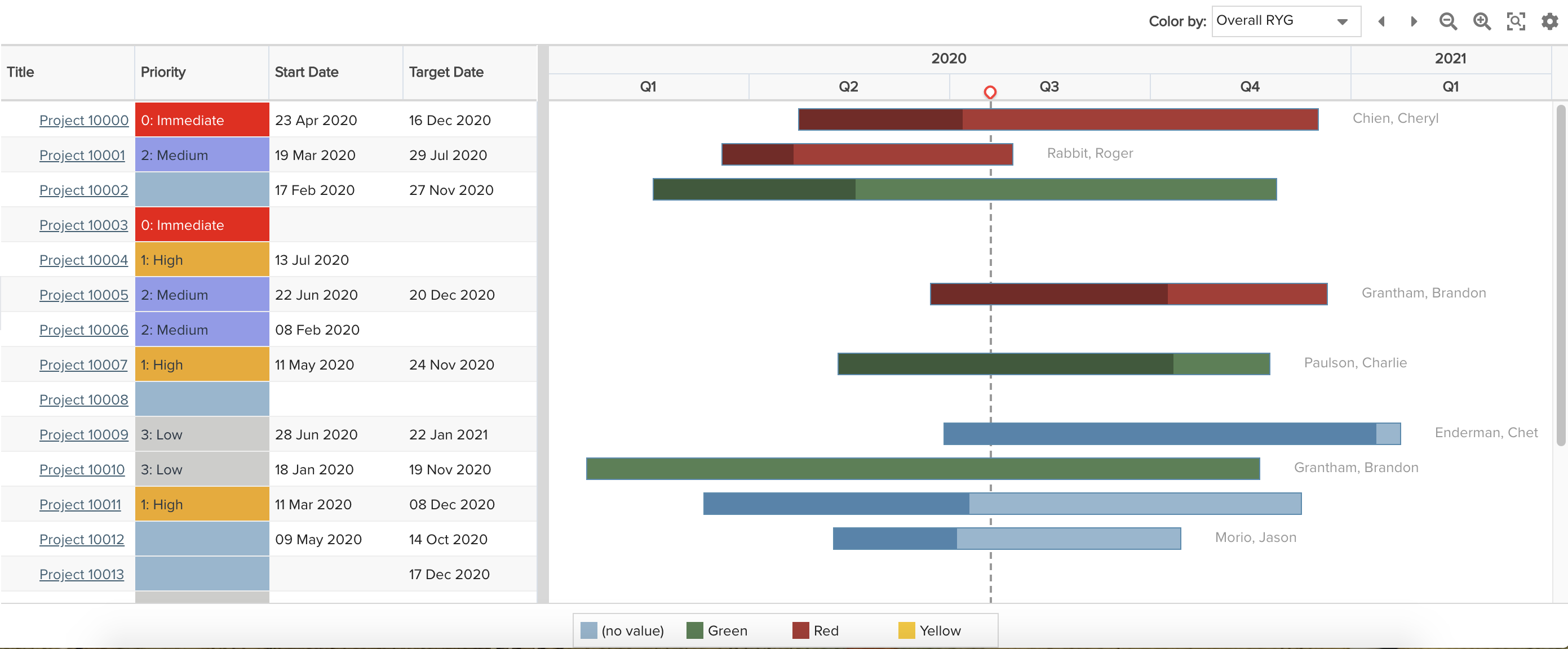
Gantt |
 |
Few to several |
Detailed data, progress over time |
Medium or large |
Dates + Any |
Similar type: List: Basic See example: Portfolio Roadmap |
|
List: Basic |
 |
Few to several |
Detailed data, aggregation |
Medium or large |
Any data type |
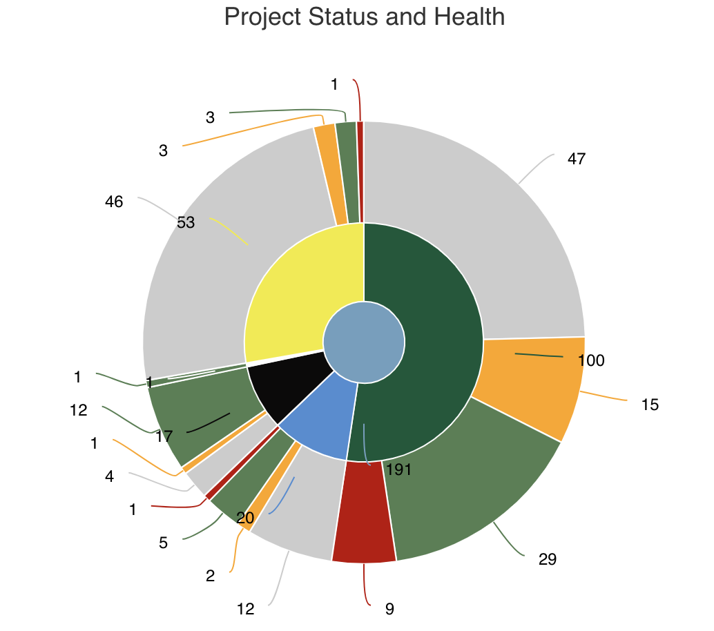
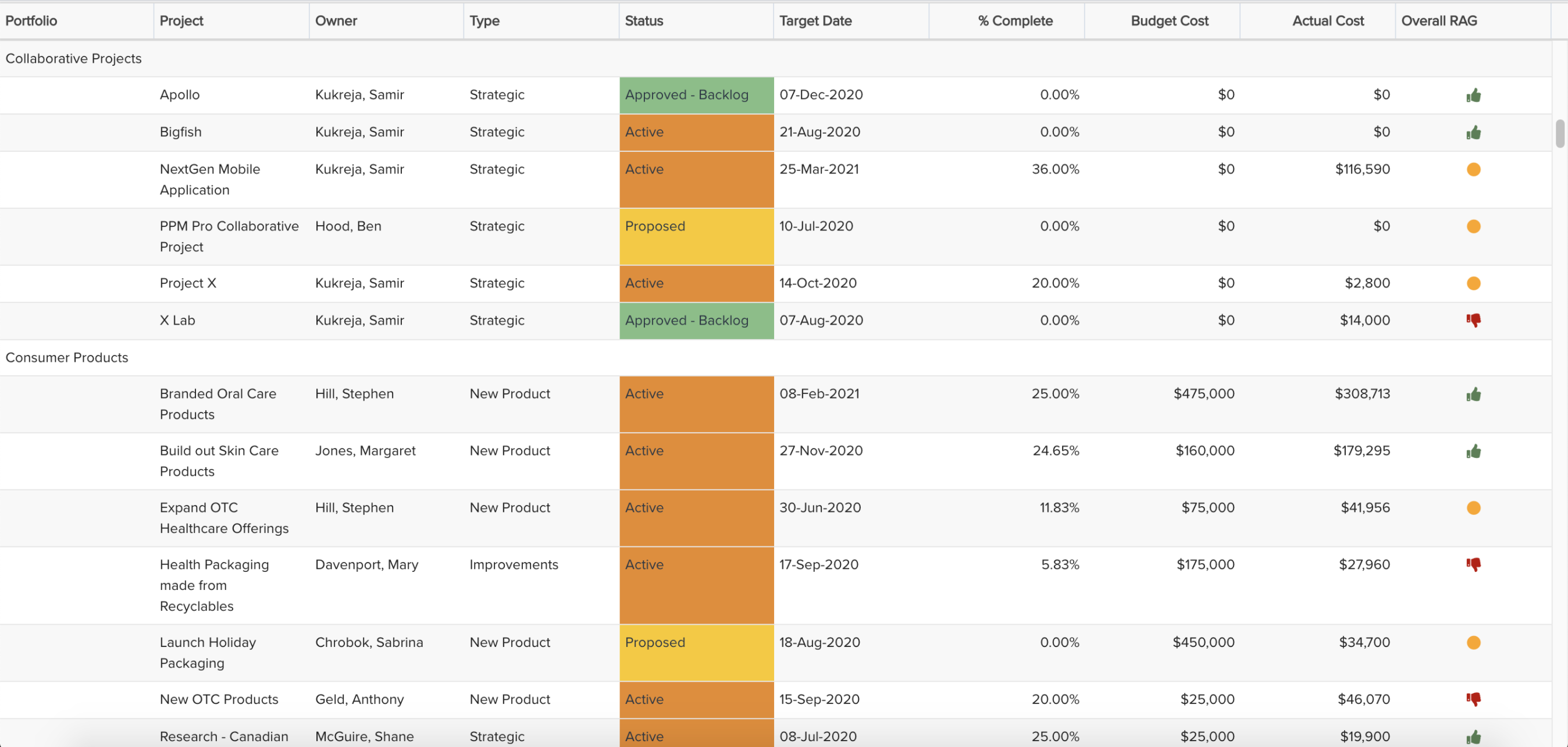
Similar type: List: Stacked See example: Portfolio Project Status |
|
List: Stacked |
 |
Some |
Detailed data |
Any |
Any data type |
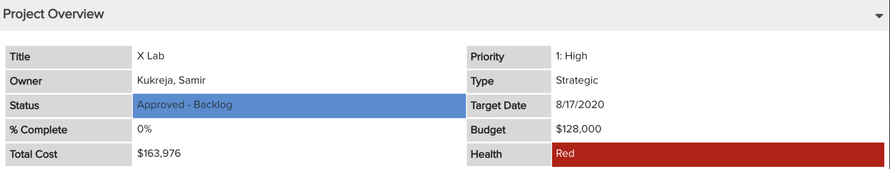
Similar type: List: Basic See example: Project Overview |
|
List: Time Series |
 |
Few to several |
Detailed data, time series data, aggregation |
Medium or large |
Any data type + Time |
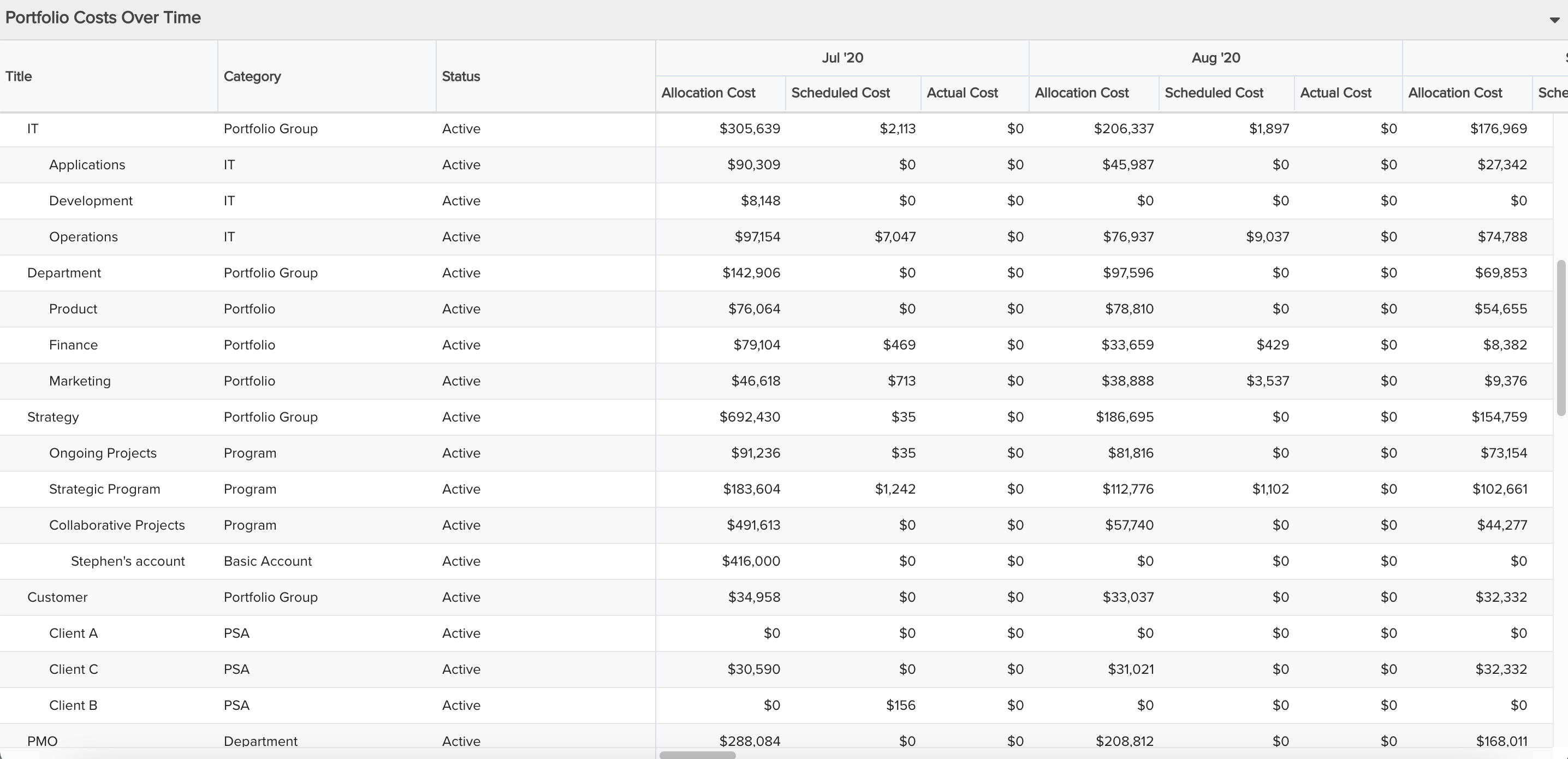
Similar types: List: Basic, Crosstab See example: Portfolio Costs Over Time |
|
Crosstab |
 |
Few to several |
Detailed data, tabular data (with or without time series), aggregation |
Medium or large |
Any data type, though note that for financial summary and financial entries reports, the List: Time Series works best (avoid the Crosstab) |
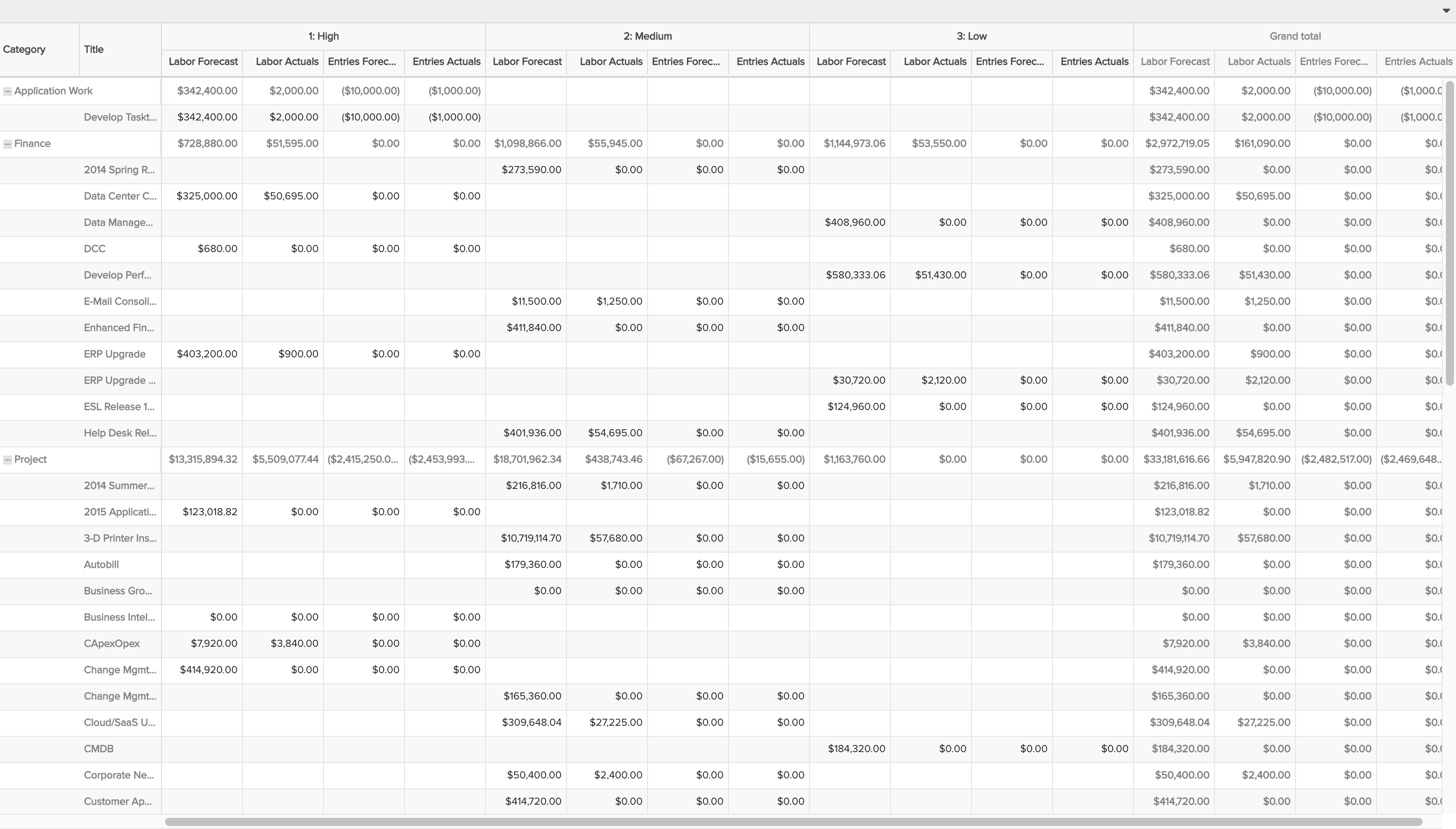
See example: Total Forecasts and Actuals |
- Within the General tab, consider both the Title and the Owner carefully.
- Title - You can always rename the Title after you've designed most of the report, as you'll likely have more inspiration. But whenever you name it, consider if the Title should include certain keywords or a naming convention meaningful to you and your organization so that you can easily search and find it as your number of reports grow. For example, you might include in the Title certain words referencing the audience or people being served by it.
- Owner - Being the Owner of the report will likely grant certain Owner permissions, so be careful when assigning someone other than yourself to the Owner field. If you do assign someone else, make sure you still have edit and other permissions too, because if you don't then you might find yourself giving up those rights!
- Within the Data tab, browse or search for the entity data fields and add them to the appropriate report type field section by selecting the field(s) and clicking an arrow key, double-clicking, dragging and dropping, or right mouse clicking and selecting a section from the context menu. Use the Field Path to see and add data fields that are not part of the entity Topic but have a relationship to it. For example, if the report Topic is Project, you can add Project data fields and then select the Tasks: Project field path option to see reportable data fields for tasks on that project.
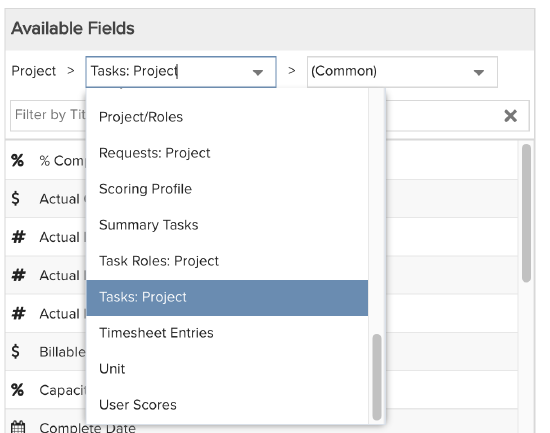
If you are having trouble determining what field path to take to find the data field you want to add to the report, first determine what specific entity the field belongs to. For example, if you want to find the Task 'Owner' field, it belongs to the Task entity, and you would want to build a field path to Tasks so that you can see the reportable available fields for Tasks which should include 'Owner'. So from a Project topic, you should be able to select 'Tasks: Project' (per the image above) and then search/browse the resulting available fields to find 'Owner'. If you aren't sure of the relationships between entities, take a look at the PPM Pro High-Level Data Model graphic on this Detailed Hierarchy topic. Note that the field path drop-down includes more than what is represented in this graphic; it includes all the topic's (or the prior field path selection's) reportable field entities that also have reportable fields, but the graphic should help for understanding key entity relationships. One last word of advice - take the most direct field path possible. You can often get to the same field through various field paths, but with each level you add to the field path, it creates another level in your report which particularly impacts how list reports render; so take the most direct field path with the fewest levels possible.
Once data fields are added, you can also adjust various properties of each field:
|
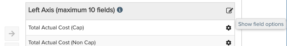
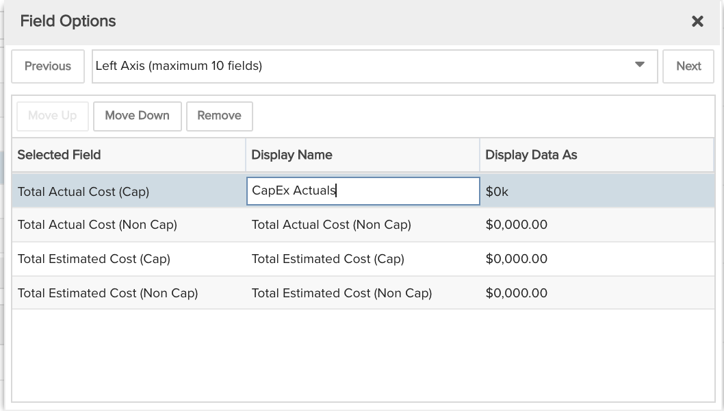
Field Options modal - Click the pencil and paper icon in the upper right of the section container to edit the field labels that are displayed in the report as well as change the data format for certain data types. For example, you can relabel the Total Actual Cost (Cap) field to CapEx Actuals and also change the Display Data As from $0,000.00 to $0k |
|
|
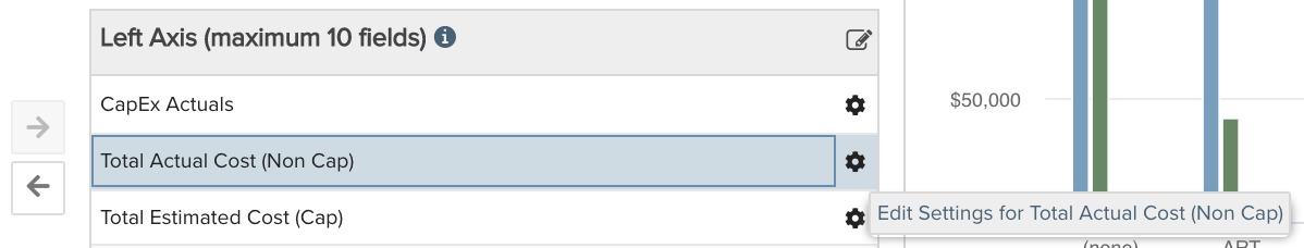
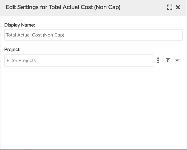
Field Settings modal - Click each individual selected field's gear icon to access field-level filters, and for certain Time Series fields other options such as staffed vs. unstaffed, as well as change the field label that is displayed. For example, if you had a report where the count of projects needed to be represented by priority, you could add the Count field multiple times to a report and then filter each field per priority (see Projects by Category with Priority Stacks report recipe example). Or, if you had a report where you wanted to differentiate Allocation Cost by Staffed or Unstaffed, you could add the Allocation Cost field twice to a report and then select Staffed for one field and Unstaffed for another (see Resource Planning by Allocated Role Time Series report recipe example). |
|
- Within the Display tab, and within the Preview pane for list report Types, set various display options according to the report Type. Not sure what a particular option will do? Simply try it out! The Preview pane will show you the impact of the majority of your changes, though do keep in mind that it uses dummy or sample data to ensure a snappy result for any fields that normally would take a long time to render - you can always click Save & Run to see the report render with live data (though note that when run from the report designer tab, the report will be run with an organization-wide scope), then return to the report designer browser tab to continue editing. Some helpful tips:
- Data Values - Many reports allow you to change the format of values or how they are shown. If you see a 'Data' section with 'Data values' droplist within the Display tab, be sure to open it to try out various options, such as how numbers and percentages can be shown. Note that some field data formats can also/instead be adjusted from within the Data tab's Field Options modal, and for List report types, from within the Preview pane's column menus.
- Sorting - Sorting isn't just for List report types! Be sure to try out the 'Sorting' section, especially for column, bar, donut, and pie report types. Sorting in Ascending or Descending order will cause the graphical elements to reorder in a progressive (or regressive?) direction, numerically or alphabetically. If the sort field is a lookup list, you can also order by lookup list option order.
- A word or two about colors. The colors that most often appear for your report visualizations usually will be based on certain settings:
- General graphical report type color selection - Graphical report types will use the colors configured in the Organization Color Palette lookup list, which an Admin can adjust for colors and order, except for the cases detailed in the bullets below which will always take precedence. The 'Default' color in this list will always be the 'null' or '(none)' value color. For example, if your column report uses a field that may not always have a value, the Default color will be used to represent the graphical element for no value. Otherwise the order of non-default values will be followed when rendering the report graphical elements.
- Lookup list colors - If your report type is graphical and based on a list field that points to a lookup list, and further if that lookup list has colors configured per option, then those colors will be used in the corresponding graphical element of your report. So if you want to control report colors based on lookup list values, make sure you have those colors configured in the lookup list. Keep in mind that if you change lookup list value colors, it will change colors across all reports and user interface elements that were using them. List report types (List: Basic, List: Stacked, Gantt) can similarly take advantage of lookup list colors using the 'Display Data As' column option (which can also include representing icons in the report if the lookup list has icons configured).
- Standard health colors - If your report includes standard health fields that are denoted as red, yellow/amber, or green, graphical report types will automatically pick up these colors for display. List report types can similarly take advantage of lookup list colors using the 'Display Data As' column option and Gantt types can also display these colors when the standard health field is selected as the 'Color By' option.
- Calculated field colors - If your report includes a calculated field that has a formula specifically using HTML colors (such as, 'If(([Project].[Target Date]<Today()) and ([Project].[Status]="Open"), "Red", "Green")'), then graphical report types will automatically pick up these colors for display. List report types can similarly take advantage of calculated field colors using the 'Display Data As' column option (though note that the Preview pane will NOT display the colors when you change Display Data As because it is not performant to do so; when you run the report, you will see the colors). Gantt types can also display these colors when the calculated field is selected as the 'Color By' option.
- Within the Variable Settings tab, set various options according to the report Topic, Specialty, and selected data fields. The two options common across all reports are Scope and Filters:
- Scope - The report "scope" determines the context in which to run the report - across one entity/data set or across multiple entities/data sets. For example, the Project scope allows you to report on any aspects of the project you specify - that individual project, its tasks, issues, team members, and so on. The Organization scope allows you to report on any aspects of the Organization - assets, portfolios, accounts, projects, and so on. One way the scope is set implicitly is by where the report is run. Within the Scope section you can select what entity grids the report should appear on based on the report Topic. Then when the report is run from within one of these grids, it automatically assumes that entity as its scope (see Put Report on Select Entity Report Grids for more details). In addition you can configure the report to allow changing scope manually before or after running the report (see Allow Changing Scope).
- Filters - Unlike the field-level filters which filter the specific data shown per field, the Variable Settings filter controls are for filtering report data as a whole. The filters that are available will be based on your report topic and any related attributes/fields that also can be filtered. For example, if your Topic is Project and you also have data selected from the Tasks field path, then you should see filter control sets for both Projects and Tasks.
- Within the Team tab, you can provide direct report access to individual users, groups, or units, given a selected permission profile that has a Team rule. These allow for report-specific permissions, as opposed to more general global permissions that other users may also have.
- Click Save or Save & Run the report. The rendered report will open in a new tab, though note that when run from the report designer it will assume an organization-wide scope; to run for a specific entity, select that scope before running (if you've selected to show before running) or go to the entity's Reports grid and run from there. When finished viewing, you can close the rendered report tab or leave it open and simply refresh it after making any further changes in the original report designer tab.
- Try running a report from a small screen device if applicable.
- Try different options and when you are happy with one, you can always save and then make a copy to try other options. For example, you can create one report that is a Donut, save and copy it, changing the copy to a Pie as an alternative visualization. Then when you review with your audience, present both alternative choices.
Example:
For the CFO and her team's goals, below are the initial set of created reports:
| Report 1: Capex vs. opex, forecasts vs. actuals, costs broken out by portfolio | 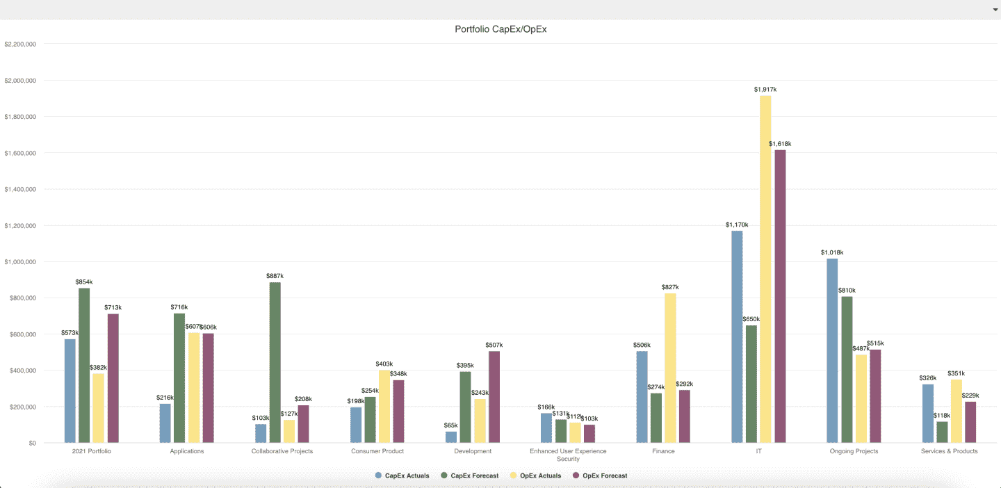 |
| Report 2: Forecasts vs. actuals costs broken out by spend category | 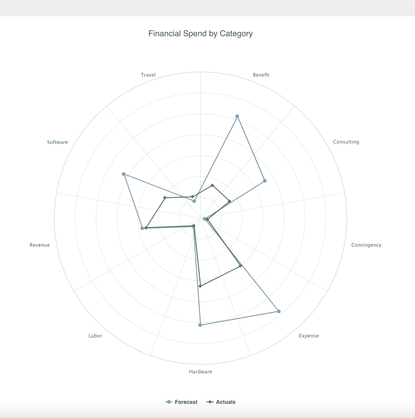 |
| Report 3: Forecasts vs. actuals costs broken out by corporate strategy | 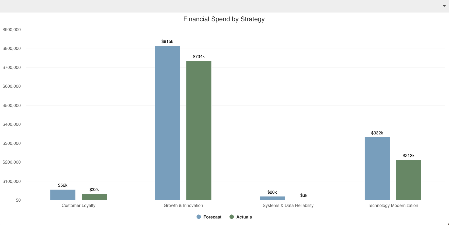 |
| Report 4: Project budget vs. forecast vs. actuals, month-over-month, including ETC and EAC | 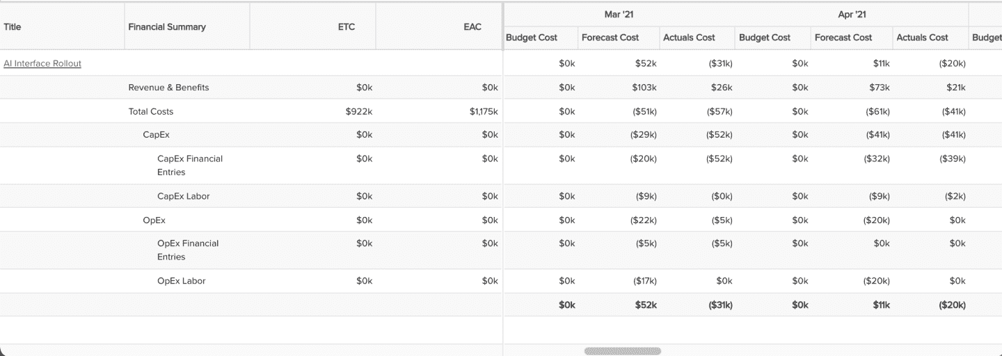 |
Step 4: Creating and organizing a dashboard
You can add one or more reports to a dashboard to meet your audience's access needs. Permitted users can create a dashboard from within the top-level Dashboards grid or from within an entity Dashboards grid. If you know that you will be running a dashboard for a specific entity, like a portfolio or project, creating from within one of those entity's Dashboards grids will automatically select that scope so that the dashboard will show up in that grid going forward; it's just a time saver for you, but not essential because you can still select entity scopes when creating a dashboard from any Dashboards grid.
The mechanics of creating a dashboard are detailed in the Creating, Editing, Deleting Dashboards topic. From a Dashboards grid choose New > New Dashboard, then make various selections on each of the dashboard Design pane's tabs, using the Preview pane to see the results of your selections and to reorganize and resize dashboard components. Below are some design considerations to help you decide what dashboard selections to make.
- Within the General tab, consider both the Title and the Owner carefully.
- Title - You can always rename the Title after you've designed most of the dashboard, as you'll likely have more inspiration. But whenever you name it, consider if the Title should include certain keywords or a naming convention meaningful to you and your organization so that you can easily search and find it as your number of dashboards grow. For example, you might include in the Title certain words referencing the audience or people being served by it.
- Owner - Being the Owner of the dashboard will likely grant certain Owner permissions, so be careful when assigning someone other than yourself to the Owner field. If you do assign someone else, make sure you still have edit and other permissions too, because if you don't then you might find yourself giving up those rights!
- Within the Content tab, browse, search, or filter to find the report components to be displayed on the dashboard. Then select and click the Add button, double-click, or simply drag and drop to add it to the Preview pane.
- Within the Display tab, simply provide a dashboard heading if desired and select if you want to display the run/published by and date footer info when the dashboard is viewed.
- Use the Preview pane itself to resize, organize, and edit the dashboard content further:
- Sample data - Keep in mind that just like the report designer's Preview pane, the dashboard designer's Preview pane uses dummy or sample data to ensure a snappy result for any reports that normally would take a long time to render - you can always click Save & Run to see the dashboard render with live data (though note that when run from the dashboard designer tab, the dashboard will be run with an organization-wide scope), then return to the dashboard designer browser tab to continue editing.
- Resizing and organizing content - Drag and drop to move content around within the dashboard. Hover over a report and then click and drag either the bottom right or bottom left drag icons to resize its height or width.
- In general, place the most important content at the top left of the dashboard and continue to add/place the next most important content to the right and below (assuming your audience is a western culture, middle-eastern and eastern cultures would progress from top right and to the left and below). The least important content should be at the very bottom.
- Balance the visualizations so that they are aesthetically pleasing. For example, if you have a Pie and a Donut near each other, consider making them the same type. Or, if you have a Pie, Pie, and Column chart within the same "row" of the dashboard, consider using the Pie reports as bookends, placing the Column in the middle of them.
- Feel free to collapse the Design pane so that your Preview pane has ample space for organizing the reports. It is also helpful to zoom out in your browser as you make adjustments.
- Changing content headings - The reports you place on the dashboard may have a heading that isn't quite right for your dashboard, or, might not have a heading at all and you would like them to for consistency with the other reports. Have no fear, you can change report headings without impacting the original reports! You can edit a dashboard report's headings individually by selecting Edit Headings from the report component's Actions menu, or, click the Preview pane's Edit Content Options pencil and paper icon in the upper right to open the Content Options modal and edit via the Headings H icon for each report. Note that for List reports, editing headings includes the ability to set whether or not column titles wrap and if the list report height should auto-size to fit the dashboard. See Editing Report Components in Dashboards for more details.
- Changing content variable settings - Similarly, you can adjust the variable settings - such as filters and whether or not a viewer is allowed to change them - for each report on your dashboard without impacting the original report. You can edit a dashboard report's variable settings individually by selecting Edit Variable Settings from the report component's Actions menu, or, click the Preview pane's Edit Content Options pencil and paper icon in the upper right to open the Content Options modal and edit via the Variable Settings gear icon for each report. See Editing Report Components in Dashboards for more details.
- Within the Scope tab, you can select what entity grids the dashboard should appear on as well as whether or not it can appear as a Home Overview dashboard or as a Project Overview dashboard. When the dashboard is run from within one of the selected grids, it automatically assumes that entity as its scope for all its reports (see Allow access on dashboard grids for more details). In addition you can configure the dashboard to allow changing scope when viewing the dashboard (see Allow Changing Scope when Viewing Dashboard). Finally, if your audience wants to see the dashboard from their Home view or within a project's Overview section, you can select to allow the dashboard to be accessed from the Home Overview or Project Overview sections (see Setting Up Overview Dashboards).
- Within the Team tab, you can provide direct dashboard access to individual users, groups, or units, given a selected permission profile that has a Team rule. These allow for dashboard-specific permissions, as opposed to more general global permissions that other users may also have.
- Click Save or Save & Run the dashboard. The rendered dashboard will open in a new tab, though note that when run from the dashboard designer it will assume an organization-wide scope; to run for a specific entity, go to the entity's Dashboards grid and run from there. When finished viewing, you can close the rendered dashboard tab or leave it open and simply refresh it after making any further changes in the original dashboard designer tab.
- Try running a dashboard from a small screen device if applicable. Keep in mind that the dashboard will resize responsively based on screen size; the dashboard will attempt to render per your designer layout, but when viewed from a small screen device, components may reorganize and wrap around.
- Try different options and when you are happy with one, you can always save and then make a copy to try other options. For example, you can create a dashboard with one set of organized reports, save and copy it, changing the copy to use alternative reports and/or organization. Then when you review with your audience, present both alternative choices.
Example:
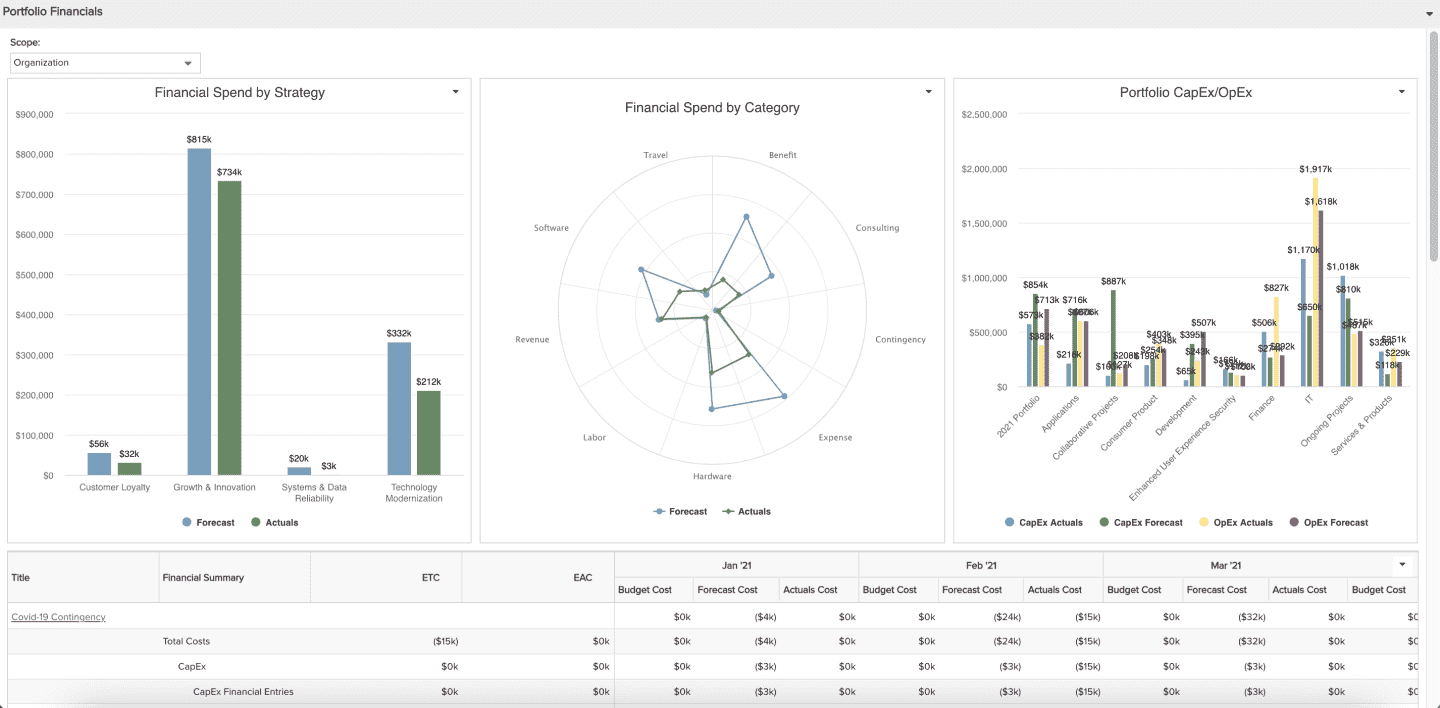
You created an initial dashboard for your CFO and her team, selecting Scopes for the Portfolio and Organization dashboard grids and including the ability to change Scope when viewing:
Step 5: Reviewing and iterating with your audience
You might be tempted to simply email or message your designs to your audience as you go through the process. While email and messaging can be useful to answer simple questions such as whether or not a particular data field matches what they need, they are no substitute with meeting in person to see how your audience reacts to the design; a puzzled frown or excited smile is much more telling for whether or not you have created an effective report or dashboard than a text reply. Therefore take the time and effort to schedule a meeting(s) to review the report or dashboard designs as you go. Doing so will allow you to:
- Discuss design alternatives
- Identify necessary changes and adjustments
- Determine if there are other needs and data that weren't originally communicated - it's a lot easier to envision additional needs when there is a starting visualization
If many changes or additions are necessary, update the design and review again, and again, and again...iterate until your audience is satisfied. There is no harm and no foul, your audience will appreciate the dedication and partnership.
Example:
Your CFO and her team loved the initial dashboard design but asked for the following:
- Some changes to report labels and data value formats
- If there was a way to include a visualization comparing labor versus non-labor costs across portfolios (yes!)
Step 6: Distributing and granting access to reports and dashboards
Only once your audience has approved the design should you ask how they would like to access the report or dashboard and how frequently they would like its data updated (don't discuss delivery of the car until it has been purchased!). You can do this as part of your last interview when your audience has given their approval and there are no or only very minor tweaks. As the audience tells you their preferences, it will help to be able to demonstrate their options so that they can make educated choices as well as understand how to access in the future, so be prepared to demonstrate...you might be able to set up access while in the meeting. Two questions to ask are:
- How does your audience want to access the report or dashboard?
- How frequently does the report or dashboard data need to be refreshed or updated?
Depending on the answers to these questions, there are various ways to accommodate your audience (keep in mind multiple ways may apply):
| Access Method | Configuration Needed | Frequency of Update | Other Considerations |
|---|---|---|---|
| Upon login - Home/Overview section |
If the audience wants to access just a report, add it to a dashboard. Your audience will see the dashboard immediately when they login to PPM Pro.
|
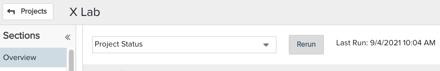
Home Overview dashboards are updated upon login. The audience will be able to see "Last Run: <date and time>" information at the top of the Overview page. Be sure to show this and that they can also click the Rerun button to refresh the data if significant time has passed since logging in:
|
|
| While viewing a project - Project/Overview section |
If the audience is accessing just a report, add it to a dashboard. Your audience will see the dashboard when they go into a project and click the Overview section.
|
Project Overview dashboards are updated upon viewing the project's Overview section. The audience will be able to see "Last Run: <date and time>" information at the top of the Overview page. Be sure to show this and that they can also click the Rerun button to refresh the data if significant time has passed since viewing the section while logged in:
|
|
| While viewing a specific entity's Reports or Dashboards grid (specific entity context/scope) |
Your audience will see the report or dashboard by selecting it from an entity's Reports or Dashboards section grid and clicking Run.
|
Reports and dashboards are updated upon running. Be sure to show the audience that refreshing the Browser tab/window will refresh the data. |
|
| By clicking a published dashboard email notification link |
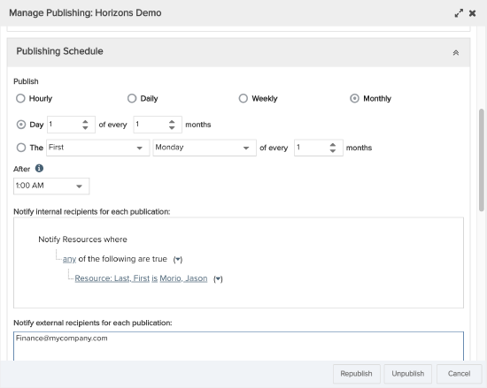
If the audience is accessing just a report, add it to a dashboard. Publish the dashboard, configuring:
|
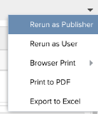
The published dashboard data will reflect the values at the time of the last scheduled publication, with email notifications sent at time of publication. So ensure that the publication schedule meets your audience's frequency needs: hourly, daily, weekly, monthly. To refresh a viewed published dashboard's data, from the published dashboard's Actions menu, the audience will need to either click:
|
|
| By clicking a published dashboard URL (for example, company website link that is the published dashboard URL) |
If the audience is accessing just a report, add it to a dashboard. Publish the dashboard, configuring:
Copy the Published dashboard URL and distribute per the audience's needs. A common way is to include it as a link on your company's intranet, using a screenshot of the dashboard as an image linked to the published dashboard URL. |
The published dashboard data will reflect the values at the time of the last scheduled publication, with email notifications sent at time of publication. So ensure that the publication schedule meets your audience's frequency needs: hourly, daily, weekly, monthly. To refresh a viewed published dashboard's data, from the published dashboard's Actions menu, the audience will need to either click:
|
A published dashboard is a snapshot that displays the data the publisher is permitted to see at the time of the publication. Scheduling the publication will take periodic snapshots such that whenever the audience clicks the email notification link, the published dashboard will be rendered given the most recent snapshot. For this reason, make sure that is okay for your audience to see the data permitted to the publisher, and further that the publisher can view permitted data that the audience needs to see. |

Exporting, Printing, or Referencing Historical Report or Dashboard Data
A third question you can ask your audience is whether or not they need to export, print, download, or historically reference the report or dashboard. Ensure that your audience understands how to do each of these:
- Exporting and Printing - The audience can export or print both reports and dashboards in various ways. Depending on the type of report, options may vary. For example, individual graphical report types (those that do not include lists) have the ability to Export to PowerPoint. Dashboards can Print to PDF directly provided one report per page is satisfactory, or, take advantage of the Browser print function to avoid page breaks or minimize white space as much as possible.
- Viewing Previously Published Dashboards - Provided that a) the dashboard is published, and, b) the audience are PPM Pro users with permissions to access the Dashboards section grids where a dashboard is published, they can access previously published dashboards for comparison or historical reference.
Example:
Your CFO and her team are thrilled with the new dashboard design, well done! They asked for the dashboard to be updated at the beginning of each month with an email notification sent to their distribution list so that any new members would automatically receive the notifications too. So you published the dashboard from the Organizations grid. You showed them that they could Browser bookmark the published dashboard link from an email and rerun the data as the publisher at any time. You also showed them how to export both individual reports on the dashboard as well as the dashboard itself...they are good to go! Oh, and you also met with your boss to show him the outcome, including him on the published dashboard notification at his request.
Step 7: Managing, monitoring and retiring reports and dashboards
Once you have effectively designed and distributed your first report or dashboard you can repeat this process for others. Take advantage of the reports and dashboards filter and group by options to help manage them as their numbers grow. You'll want to occasionally check in with your audiences to see if any new goals have arisen and if further modifications are needed, evolving them overtime. You can also periodically check a report or dashboard's usage to see if it's really being used - and if not, maybe it isn't as effective and you need to repeat the process - or if it is time to retire it. Again, check in with your audience and also take advantage of usage information available in PPM Pro to help monitor and retire reports and dashboards as needed.
Managing
Report and dashboard grids provide various functions and controls to help you find and manage them.
- Filter - The ad hoc filter control at the top of report and dashboard grids enable you to quickly search across Titles (simply enter partial text for the report or dashboard Title) or build filter criteria for filterable fields such as Topic, Type, Owner, Scopes, and others. You can also save any filter field contents if you find yourself repeatedly using the same criteria. If you or your organization use a specific naming convention - such as including in the title a reference to the audience the report or dashboard is for or the benefiting department - you and your users can quickly find specific reports and dashboards.
- Group By - The Group By and Show controls enable you to organize your reports and dashboards based on what grid columns are visible. For example, two frequent ways to Group By to help find a report is by Topic or Type, making use of the Collapse All toolbar button and then expanding just the topic or type group where your report is, and sorting on another column to further assist. Most grid columns can be Group By options, so if you don't see a Group By option that you want and you don't see a corresponding column, go into Configure Settings via the gear icon on the toolbar and add the column you need.
Monitoring
Report and dashboard grids provide several column Settings to help in monitoring who and how often they are being accessed. Admins can similarly monitor published dashboards within Admin/Publishing.
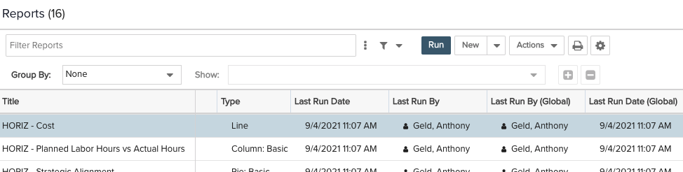
- Report Grids - Every report grid has column options that can be configured per user by clicking the gear icon in the the grid toolbar. Columns displaying last run information will help you to understand general report usage:
- Last Run By: The user who last ran the report from the current report grid
- Last Run Date: The date and time the report was last run from the current report grid
- Last Run By (Global): The user who last ran the report from any report grid within PPM Pro
- Last Run (Global): The date and time the report was last run from any report grid within PPM Pro
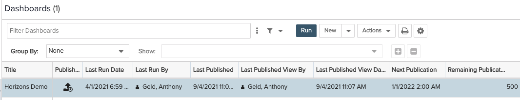
- Dashboard Grids - Every dashboard grid has column options that can be configured per user by clicking the gear icon in the the grid toolbar. The following column information will help you to understand general dashboard usage:
- Last Run By: The user who last ran the dashboard from the current dashboard grid
- Last Run Date: The date and time the dashboard was last run from the current dashboard grid
- Last Published View By: The user who last viewed the published dashboard - note that if the published dashboard was viewed by non-users or a user who wasn't logged in to PPM Pro then this grid cell will be empty because there is no way of knowing a user name to display
- Last Published: The date and time the dashboard was last published
- Last Published View Date: The date and time the published dashboard was last viewed
- Next Publication: The next date and time the dashboard will be published
- Published - The dashboard publish status, where an icon indicates if the dashboard is simply published (
 ), published with a schedule (
 ), published with an expired schedule (
 ), or unpublished (no icon)
 - Remaining Publications: The number of publications before the dashboard will no longer be published on a schedule (before the dashboard publishing schedule expires) - note that even when the remaining public
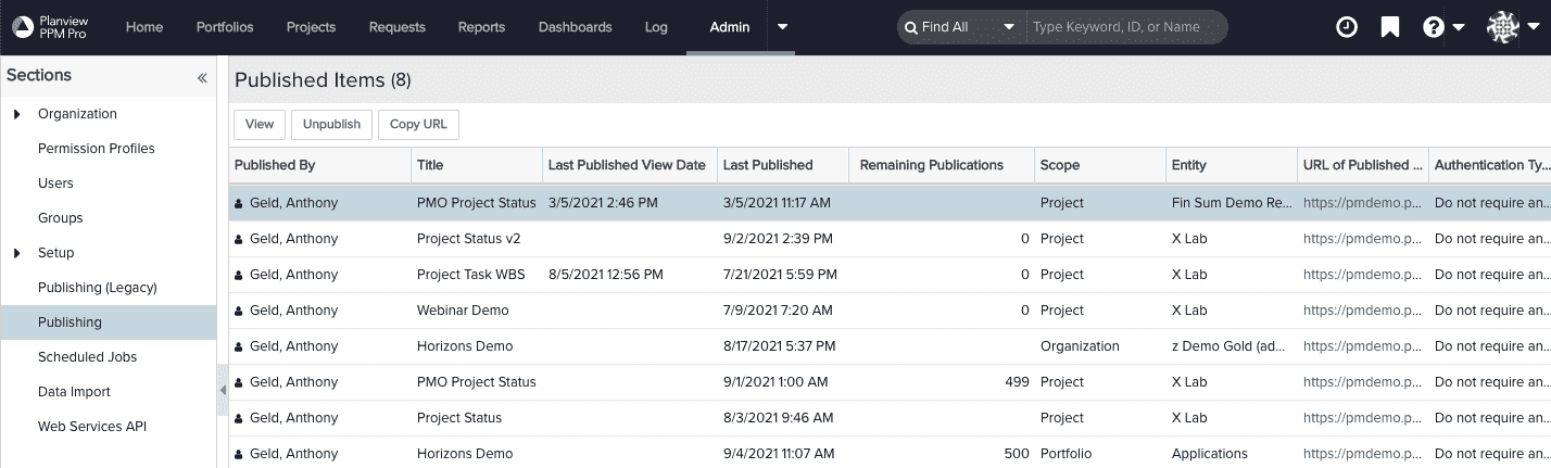
- Admin/Publishing - Admins can go to the Publishing section to see a list of currently published dashboards. This grid includes some of the same information as the individual dashboard grids as well as additional details about access/authentication methods, specific dashboard grid published from (Scope and Entity), and the published dashboard URL.
Retiring
When monitoring and your audience indicates that a report or dashboard is no longer needed, there are various ways you can "retire" it.
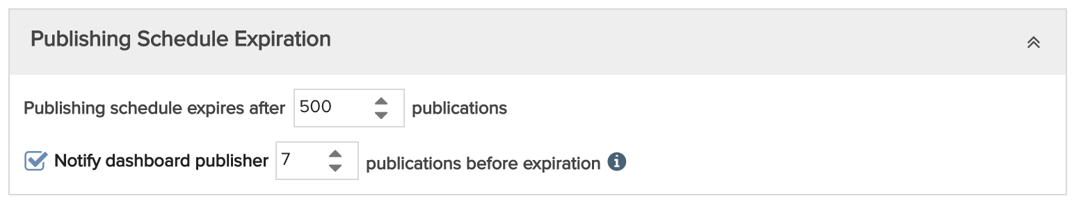
- Expiring published dashboards - If you want to keep a dashboard around and still accessible from within PPM Pro but no longer want it to be published on a schedule, you can update the expiration of the published dashboard. When you configure a dashboard to be published on a schedule, you can specify the number of publications until it will expire or no longer be published. For example, if you have a monthly publication schedule with the publishing set to expire after 500 publications, publication snapshots will be taken for 41 years and 8 months! Once the publication schedule expires the published dashboard URL will still be active, it just will no longer provide updated data per a schedule - to completely remove access from the published dashboard URL, you will need to Unpublish the dashboard. So consider the number or publications you would like to have before the schedule expires. You may want to select the schedule expiration notification message so you can have a reminder to check in with your audience and then republish.
- Unpublishing dashboards - If you want to keep a dashboard around and still accessible from within PPM Pro but no longer want it to be accessible by a published dashboard link, you can Unpublish it. A published dashboard, even one for which a publication schedule has expired, will have published dashboard URL that can be used to access it by authenticated viewers. The only way to remove the published dashboard URL and keep it from rendering the last published version is to Unpublish the dashboard.
- Removing permissions - If you want to keep a report or dashboard around and still accessible from within PPM Pro but no longer want certain audience member users to access it, you or your admin can adjust permission profiles and report team or dashboard team membership.
- Deleting reports or dashboards - If you simply no longer want a report or dashboard in the PPM Pro, you can delete the report or delete the dashboard. Keep in mind that deleting it will completely remove it from PPM Pro, from all reports or dashboards grids, and if the dashboard has been published then all of its previous publications will also be deleted. If you do not see a Delete option within a report Actions or context menu, it may not be able to be deleted because it is part of a dashboard - check out the report View References topic - or because you do not have permission to delete it. If you do not see a dashboard Delete option, you likely do not have permission to delete it. If you do not see a Delete option within a report Actions or context menu, it may not be able to be deleted because it is part of a dashboard - check out the report View References topic - or because you do not have permission to delete it. If you do not see a dashboard Delete option, you likely do not have permission to delete it.