Resource Management Dashboard
When designing your own Resource Management Dashboard, ask yourself and your intended audience what is most important to understand about the people and roles performing the work for your organization, and then create a dashboard with reports that will provide this information. The dashboard below is a sample summary of resource and role visualizations, including employee type breakdown, capacity versus demand or allocations versus actuals, costs by role, demand by project type, and project allocated hours; feel free to use it as a starting point and add other reports as helpful. Remember to include drill downs on individual reports for access to more details as appropriate.
| Design View | Selection | Comments |
|---|---|---|
| General |
Title: <enter a meaningful title>
|
|
| Content (general) |
Search or browse for the reports you want to add to the dashboard, then either drag and drop into the Preview area, or select and click the Add button. Once they appear in the Preview pane, click and drag to rearrange or hover and click a bottom corner to resize. For the specific Content reports listed below, ideally you will be able to identify corresponding fields to match the spirit of each report visualization you want to include on your own dashboard. If you do not have one or more fields, you can add them to your relevant entity details (standard fields, user defined fields, or calculated fields) and bulk edit or data import to provide field values as appropriate. |
|
|
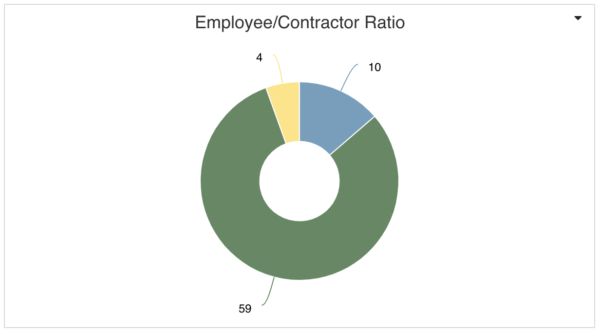
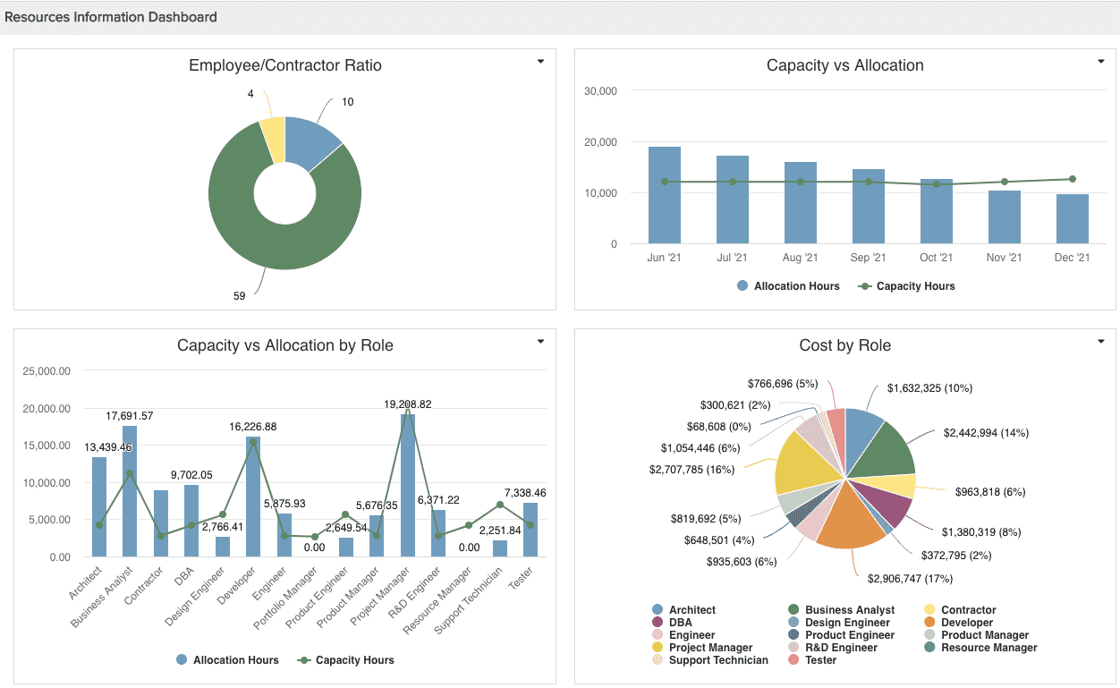
Content report - Employee/Contractor Ratio (Donut)
|
This is similar to the Project Logs donut report recipe, except for:
|
|
|
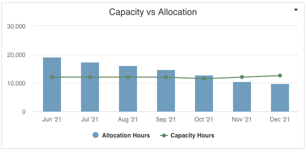
Content report - Capacity vs Allocation (Combination: Area, Column, Line)
|
This is the Resources - Allocated vs Capacity Hours Time Series report recipe, with appropriate Time Series option selections in Variable Settings. | |
|
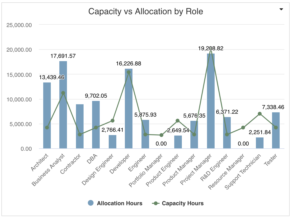
Content report - Capacity vs Allocation by Role (Combination: Area, Column, Line)
|
This is similar to the Portfolio Budget and Projects report recipe, except for:
|
|
|
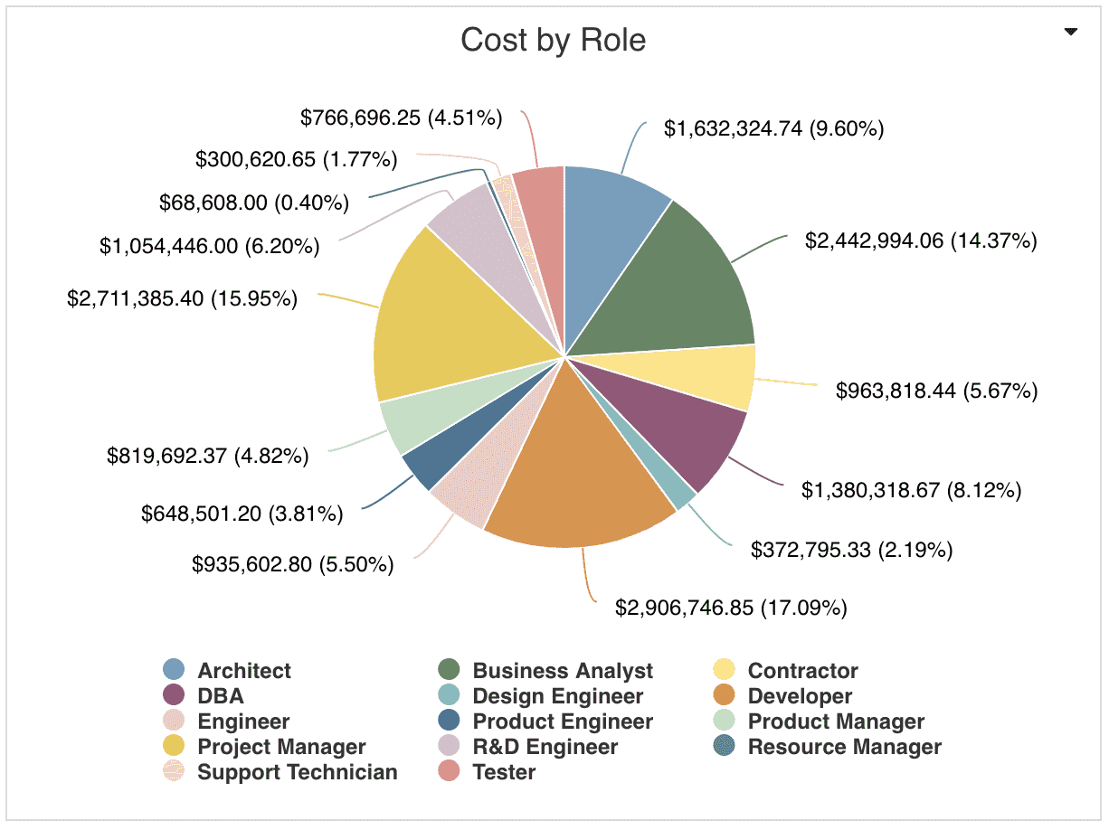
Content report - Cost by Role (Pie: Basic)
|
This is the Allocated Cost by Role report recipe. | |
|
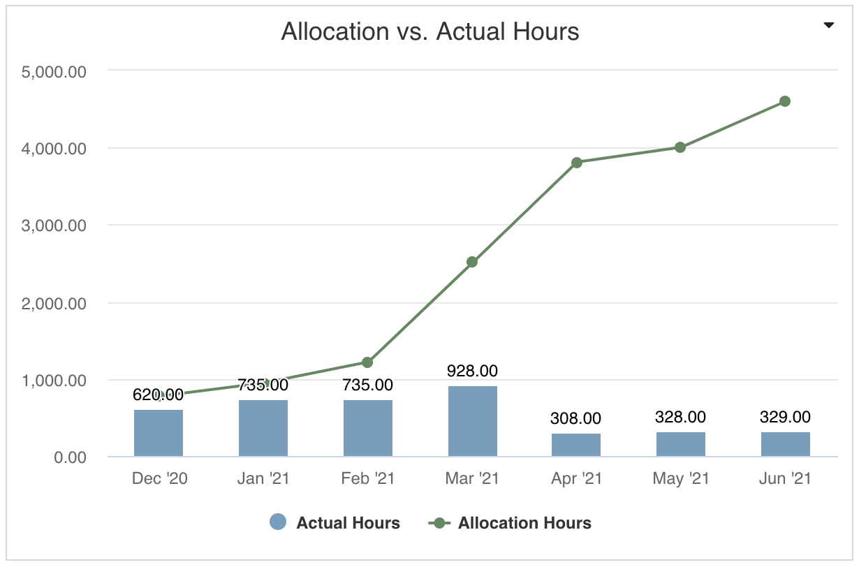
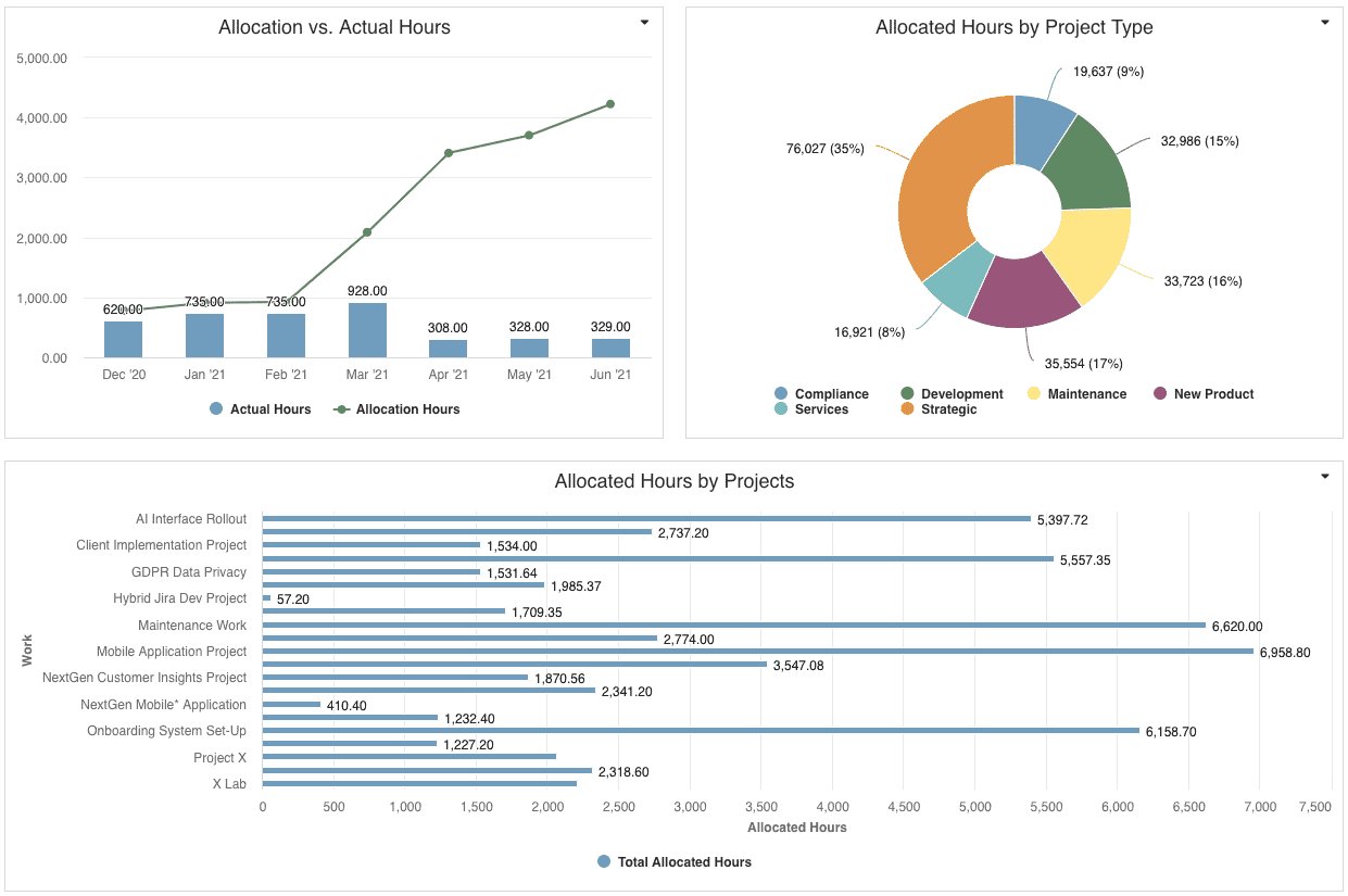
Content report - Allocation vs. Actual Hours (Combination: Area, Column, Line)
|
This is similar to the Resources - Allocated vs Capacity Hours Time Series report recipe, except:
|
|
|
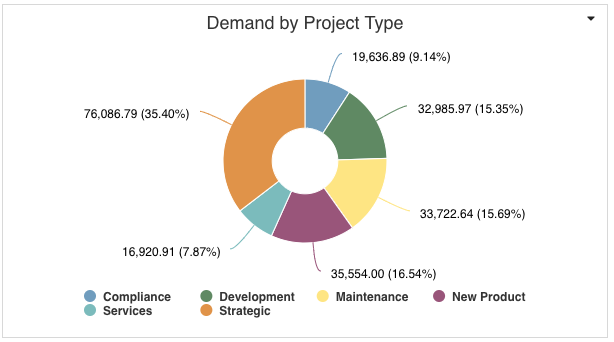
Content report - Allocated Hours by Project Type (Donut)
|
This is similar to the Project Logs report recipe, except:
|
|
|
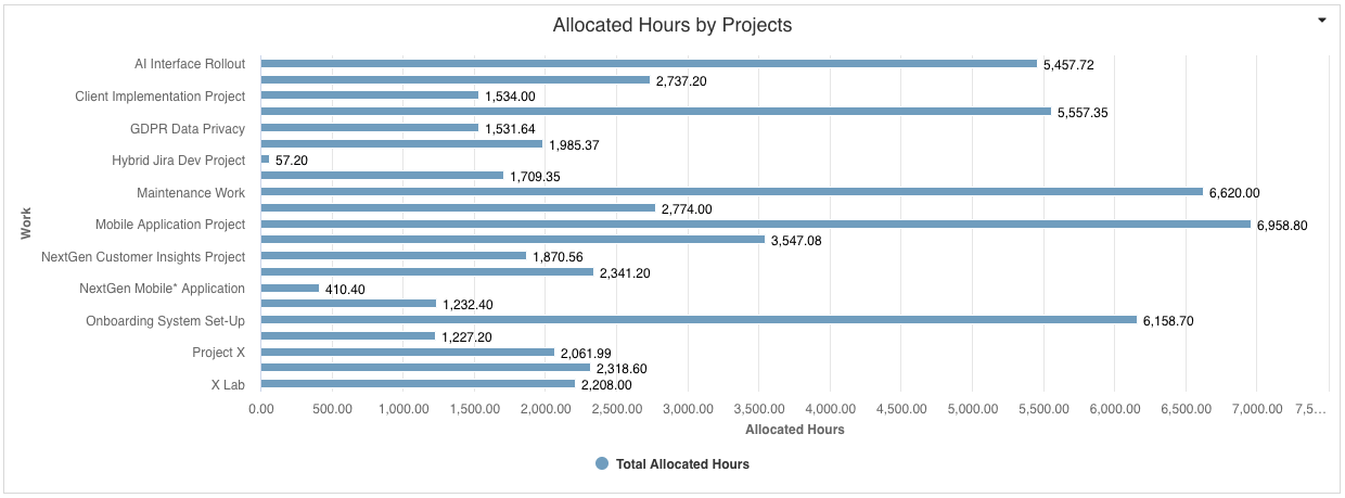
Content report - Allocated Hours by Project (Bar: Basic)
|
This is the Allocated Hours by Project report recipe. | |
| Display and Preview |
Provide a Container Title if you'd like specific text to appear on the dashboard title bar. Select to Show run/published as and date information at bottom to help users understand who the dashboard is viewed as and at what time. This is particularly helpful for published dashboards that are initially run as the dashboard publisher at an earlier day/time. |
|
| Scope |
Scope: Organization
|
If you want to allow the user to change to a different Scope when viewing, select the checkbox for Allow changing scope When viewing. Selecting the 'Organization' Scope will cause this dashboard to be available on the Organization dashboard grid so it can be run from there. Select other entity grids you'd like this dashboard to be available from as well. If you would like this dashboard to be available for selection from users' Home/Overview section, select Home Overview. |