
Bubble charts
This topic describes how to configure a Bubble chart (click here for example). You will be working with a screen like the one below. At this point you will have already selected a report source, clicked New, and filled out a preliminary Basic Details screen.
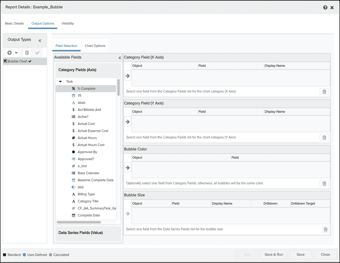
You can perform the following on the Output Options/Bubble Chart screen:
Field Selection tab
-
select the data for your report (X and Y axes, bubble size). You can pick one and only one category field for the X and Y axes, and one data field for bubble size and one data field for bubble color
-
configure a drilldown to another report
Chart Options tab
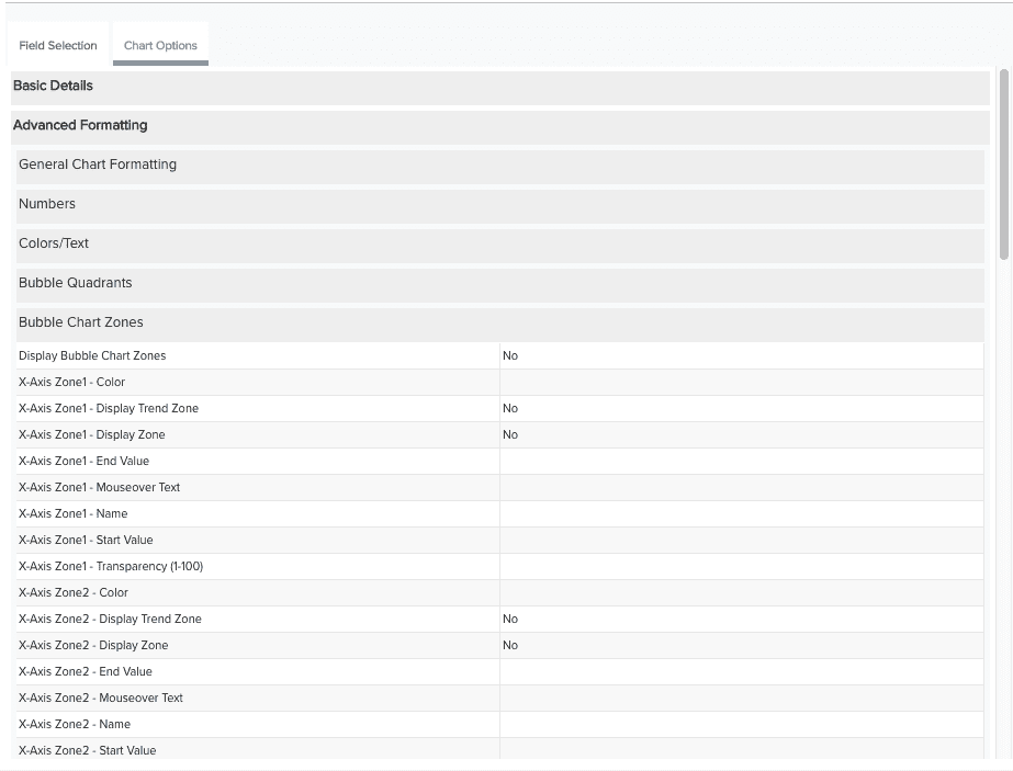
There are a variety of settings you can use to configure chart labels, legends, size, text format, bubble chart zones and a variety of visual affects. See Column Chart Options.
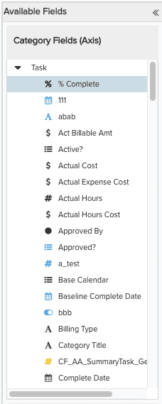
Select the data to be returned on the report
The Available Fields list shows all the Category fields and Data Series fields available for the report. These fields vary depending on the report source you are using.
To include fields in your report, locate them in the Available Fields list and drag them (or double-click them) to the Selected Fields table. If you include fields and then change your mind, simply select the field in Selected Fields table and click the Trash Can ![]() .
.
You must select fields for the X and Y Axes from the Category Fields (Axis) list; select a field for the Bubble Size from the Data Series Fields (Value) list. For example:
 |
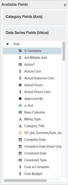 |
Note: If you try to place a field in the Selected Fields table and cannot, then you are choosing the field from the wrong list.
The table below describes the columns of the Category Field (X and Y Axes) tables:
|
Column Name |
Description |
|---|---|
|
Object |
The name of the entity to which the field belongs. |
|
Field |
The name of the category field. Object:Field Name is default X-axis title. |
|
Display Name |
You can enter a name here for the X and Y Axis titles that will override the value in the Field field. If Display Name is left blank, the Object:Field name is used for the axis labels. |
The table below describes the columns of the Bubble Size table:
|
Column Name |
Description |
|---|---|
|
Object |
The name of the entity to which the field belongs. |
|
Field |
The name of the data series field. Object:Field Name is default bubble label. |
|
Display Name |
You can enter a name for the bubble label that will override the default value. If Display Name is left blank, the Object:Field Name is used for the label. |
|
Drilldown |
Configure a drilldown for the bubble by clicking |
|
Drilldown Target |
Displays the report name for the drilldown you configured in the drilldown column. |
Configure chart title, axis labels, legend
Many text options get their default values from the Output Options screen. This allows you to quickly get your report generated in a readable fashion. You can further fine-tune your report by overriding the default values and adjusting additional settings on the Chart Options tab. See Chart options for a list of all bubble chart settings. Below is a description of some common settings.
-
The default chart title is the name you entered on the Basic Details screen. You can enter a sub-title on the Chart Options tab, Basic Details section.
-
Axis titles by default display the object name and the category field name, separated by a colon. For example, if the category field name is Priority and the category object is Project, the default axis title is Project:Priority. You can override the titles in the Display fields or on the Chart Option tab, Basic Details section.
-
The legend label displays the object name and the data series field name, separated by a colon. For example, if the data fields Est Hrs, then legend label is Project:Est Hours. You can override this default value by entering a new label in the Display Bubble Name field for the data field.
-
By default, axis titles and bubble names are displayed. To suppress the display of those items, use the Chart Options tab, Basic Details section.
Creating bubble chart zones
Bubble chart zones are visual indicators that you configure to help analyze the data on your chart. For example, imagine a scoring chart where the X axis represents value and Y axis represents risk, and your bubble sizes represent Hours to Completion. Placement of the bubbles on the chart is determined by the project score. The Y axis is divided into thirds - low, medium, and high risk. The X axis is divided in half - low value and best choice. Any bubble that appears in the lower part of the chart and towards the right represents a low-risk project (low risk and high value), and bubbles that appear high and left of center represent high-risk, low value projects. The size of the bubble provides additional data for analysis; for example, two projects might fall into the low-risk, high-value quadrant, but one might take twice as long to complete.
What next?
You can edit chart options, save and run your bubble chart, change the default visibility, or configure other output types: