Laying Out the Grid Columns for Financial Entries
The main content area of an entity is referred to as the "grid," which is a collection of rows and columns. The Financial Entries grid is a combination of fields for forecasts and actuals; each row/record on the grid contains a forecast or an actuals entry.
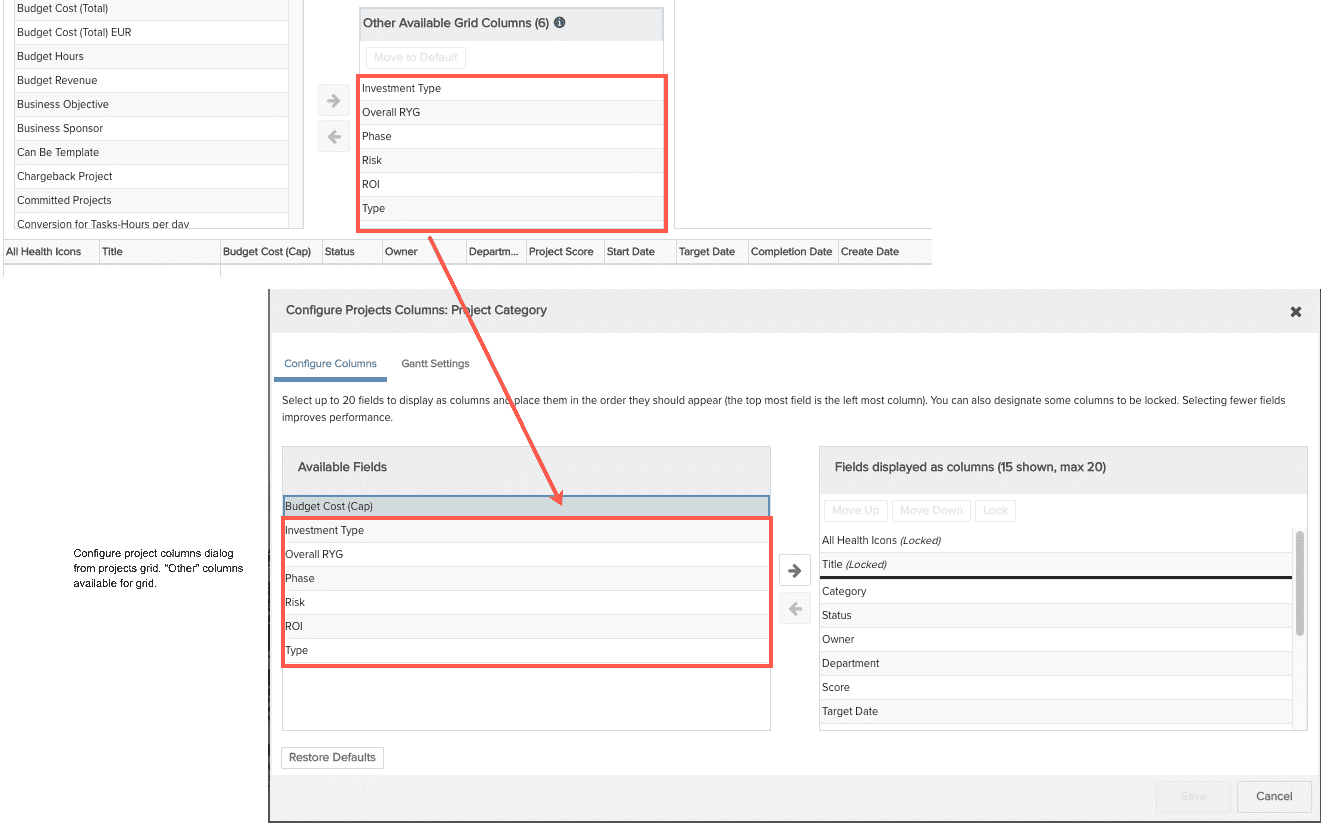
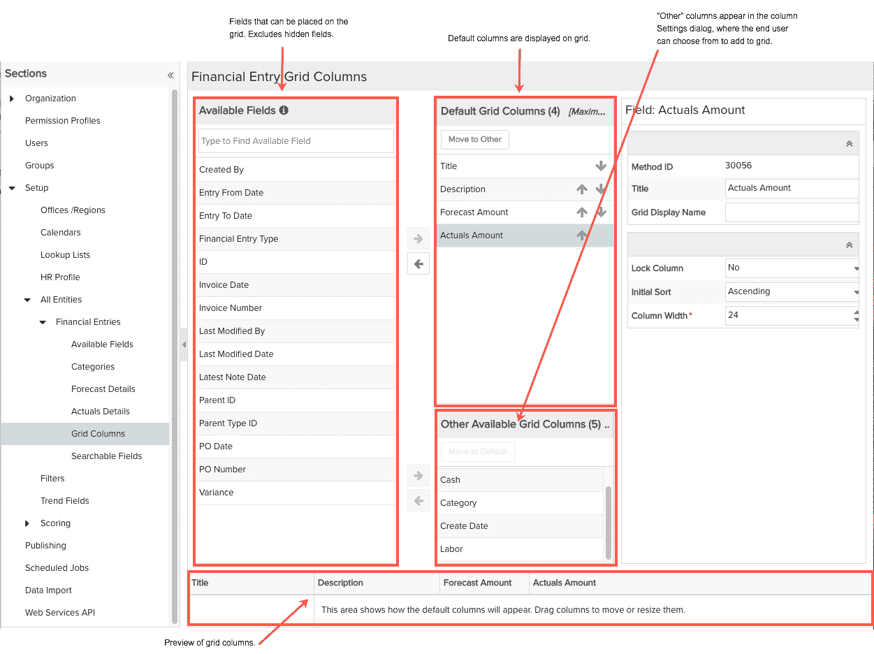
You use the Admin/Setup/All Entities/Financial Entries/Grid Columns page to specify a set of columns to display by default, as well as designate other columns that the user can choose to add to the grid. Default and "other" columns will all appear in the Configure Settings dialog that the user can access from the grid to organize grid columns.
Note: The grid might display entries that use different categories. Not all categories include the same fields. As a result, the grid might include fields that are relevant for one entry but not for another. In this scenario, the field will only display a value if the field is applicable to the entity category. Otherwise, the field is intentionally left blank if it does not apply to the category.
The screenshot below is an example of the Grid Columns page. The following columns are configured to display by default: Title, Description, Forecast Amount, Actuals Amount (and the required/built-in Info column, which is not configurable in SSA).
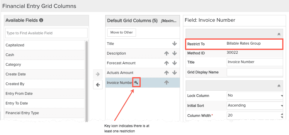
The key icon indicates that the field has one or more restrictions. Hover your mouse over the icon to view the restriction(s). The restrictions will also be displayed in the Properties pane.
Adjusting Field Properties
There are a few properties that you can adjust right from the Grid Columns page. Select the column in the grid and adjust the corresponding properties in the adjacent pane (property descriptions in table below).
|
Grid Column Property |
Description |
|---|---|
| Restrict To | This field appears only if you have created a field restriction for the selected field. It is read-only, and lists the group(s) that has access to the field. |
| Method ID | For internal use. |
|
Title |
The name of the field. This value serves as the column header label unless you override with Grid Display Name. |
|
Grid Display Name |
By default, this is the value of the Title property. Override the default value by entering a value for Grid Display Name |
|
Lock Column |
"No" indicates the column appears to the right of the non-scrolling region. "Yes" places the column in the non-scrolling region, which is left-most on the grid. There must be at least one locked column. |
|
Initial Sort |
Specify the default sort order for the column. Ascending, Descending. |
|
Column Width |
Adjust the column width. A width of 0 means the system will auto-size the column. |
Adding/Removing Columns
You can have a total of 20 columns displayed at one time in the default grid.
Use the upper set of arrow buttons to add/remove default fields to the grid. You can also drag and drop grid columns to reposition them. Use the Up/Down arrow buttons to rearrange field order.
Default Grid Columns
Default columns are columns that initially appear on the grid.
Other Grid Columns
The fields in the Other Available Grid Columns will be available to the end user in the Available Fields section of the Column Settings dialog. They will not initially appear on the grid, and will appear only after the end user has added them.
Use the lower set of arrows buttons to add/remove "Other" fields.