Formatting Gantt Reports
This topic describes how to use the Report Designer to build a Gantt chart report.
Overview
Gantt reports provide a visual summary of an entity's progress over time, along with a configurable set of columns that provide related data about the report topic/entity. You configure the columns exactly like you would a list report (add fields and configure display settings in column header menus). The graphical bars (one is required, 2 are available) are delimited by date fields (such as Start and Target) that control the width of the bars.
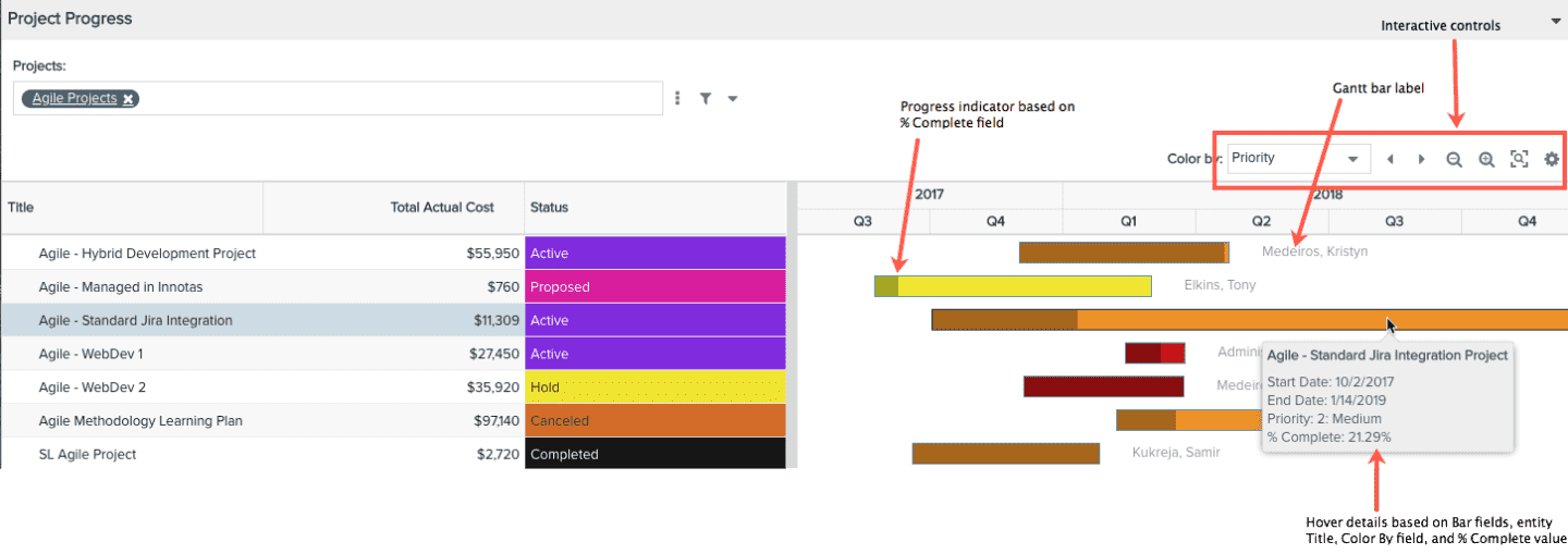
The screenshot below is an example Gantt report - it's like two reports in one. The left is is configured like a list report - see Adding Fields to a List Report - and right side is the Gantt (see Configuring the Gantt Bars). You can mouseover the Gantt bars to view the information the bars represent.
If you have ever created a list report, then you are halfway there. This topic covers:
- Creating the report from the Reports grid
- Adding fields to the Gantt List
- Configuring the Gantt Bars
- Formatting, Sorting, Hiding Gantt List Columns
- Interactive Gantt Controls and Settings
- Hover Details
- Task Milestones
- Dependencies
Bonus Feature: Default Tree Structure for Hierarchical Entities
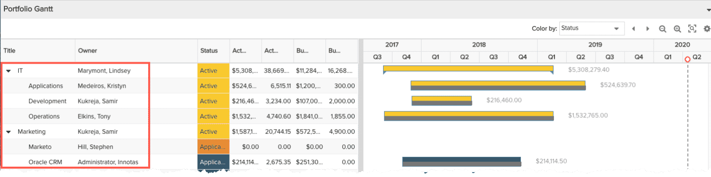
Portfolios, tasks, and financial entries are entities that can have hierarchical relationships with other instances of the same entity - portfolios and sub-portfolios, summary and child tasks, and financial entries (forecasts and actuals). When creating a Gantt chart report for one of these topics, note that the list on the left side of the report will be grouped automatically into sections that can be expanded/collapsed. You do not need to do any special configuring - see screenshot below.
Create the Report
Not covered in this topic but still part of the overall Gantt chart configuration are setting the Variable Settings, and adding users to the report Team. See also Creating, Editing, Deleting Reports.
As for any report type, start by doing the following.
- Navigate to Reports and click the New button. The report designer opens. (Remember you must have permission to create reports in order to see the New button.)
- In the General tab, select a Topic, and Type (Gantt), and enter a Title.
- Click the Data tab, and here we go:
Configure the Gantt Bars and Labels
The Gantt Bars section at the top of the Data tab (shown below) is where you configure the Gantt bars. You must have one bar in your report, and can optionally have two. Two bars are useful, if, for example, you want to use one bar to show a project's desired dates (start/target dates), and the second bar to show the actual dates (start date/complete date). Simply enter values for the Bar #2 fields if you want 2 bars, otherwise leave them blank.
To determine the range of measurement for the bars, select the field representing the start date by choosing it from the Bar #1 Start Date drop list. Do the same for the field representing the Bar #1 End Date. If you are using two bars, repeat for the Bar #2. Note that each date drop list will include any date available field relevant to the report topic, including standard, user-defined, and calculated date fields.
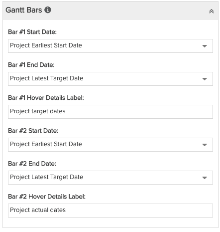 |
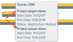
Hover Text LabelYou can optionally provide a meaningful label for the bar in the Bar #1 Hover Details Label field. This label will appear above the dates, like a heading. You can use it, for example, to describe the nature of the dates assigned to the bar. If using a second bar, add another label in Bar #2 Hover Text Details. In the screenshot below, the labels are "Project target dates" for bar 1, and "Project actual dates" for bar 2. See Hover Details for more information. |
Adding Fields to the Gantt List
The Available Fields section in the Data tab (shown below) provides a list of fields you can put on the report list to the left of the timeline. Simply double-click on each field you wish to include and it will automatically be dropped into the List Fields section.
Note that showing the Gantt list is not required, although Gantt reports do typically include the Title field for ease of interpreting the Gantt.
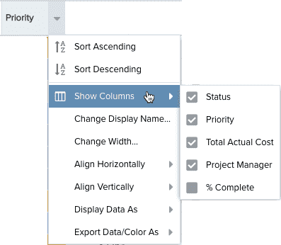
Formatting, Sorting, and Hiding Gantt List Columns
Remember that all formatting of list columns is done using the Column Header menus in the Preview Pane, as shown in the screenshot below. Please see Layout/Editing List Reports for details about formatting the list columns.
Some helpful hints:
- Hide Columns - If you wish to hide a grid column so you can use the value in the Gantt chart but not display it in the grid, simply open the Column Heading menu, choose Show Columns, and uncheck the column you wish to hide. If you want to hide ALL of the columns, set the Gantt Width property to 100% - this will cause the chart to render in the entire available space, and the columns won't be visible.
- Change Width - The Gantt does not allow its list column contents to wrap because it would throw off row heights making them inconsistent with each corresponding bar. So you may want to adjust column widths appropriately, particularly when the report topic is portfolios, tasks, or financial entries to accommodate that a hierarchy is displayed that would require more width.
Set Default Zoom to Fit Range for Chart Output
These settings determine the default date range for the Gantt chart range. You can also configure these settings in the Preview Pane, and they will stay in sync with the settings on the Display tab. However, once a user changes these settings on the rendered report, the defaults are longer enforced and the current settings become "sticky".
You can choose a specific range, a range relative to the current date, or a range centered over a specific date. The Zoom Center Date is offered only when one of the Zoom to N years is selected. Otherwise the zoom is centered over the current date.
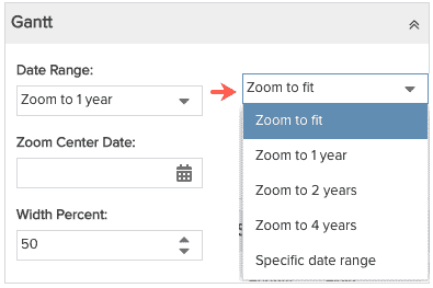
- Zoom to fit - Relative to the earliest task start date and the latest task target date, sets the range one year earlier than the earliest task start date, to one year beyond the latest task target date. After the report is run, report viewers can enter a different set of dates in the Settings dialog of the rendered report, and the chart will zoom to fit relative to those dates after saving. The dates in the dialog do not persist once you click a zoom control; re-enter dates if you want to zoom to fit again.
- Zoom to 1 year - Relative to the current date, sets the range from 6 months before the current date to 6 months beyond the current date (one year total)
- Zoom to 2 years - Relative to the current date, sets the range from 12 months before the current date to 12 months beyond the current date (two years total)
- Zoom to 4 years - Relative to the current date, sets the range from 24 months before the current date to 24 months beyond the current date (four years total)
- Specific date range - Sets the literal date range boundary.
- Width Percent - The initial width of the chart relative to the browser window.
Hiding the columns
Note that if you wish to just show the Gantt chart and not view the columns, specify a Width Percent = 100% and the columns will not display.
Interactive Gantt Controls and Settings
Interactive controls are clickable widgets on the Gantt chart that report consumers can use to customize chart settings. The same controls appear in the Preview Pane where you can experiment with them to get a sense of how the report consumer will interact with the report. You can set defaults for the rendered report either in the Display tab or the Setting dialog in the Preview Pane (they will stay in sync). Note that the "zoom" controls do not provide defaults for the rendered report; instead use the Gantt Date Range setting on the Display tab, as described above).
The table below describes the controls available on Gantt Reports. The Gantt chart controls are located on the upper-right corner of the report.
| Control | Description |
|---|---|
|
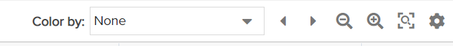
Color by |
Controls bar colors. Select a list field whose values drive the bar colors. The "Color by" droplist will include any field in your report derived from a list (see screenshot to the right). |
| Previous timespan | Moves the Gantt chart left to the previous timespan. |
| Next timespan | Moves the Gantt chart right to the next timespan. |
| Zoom in | Zooms in, to show a narrower range at more granular intervals (such as days, weeks) |
| Zoom out | Zooms out, to show wider date range at larger intervals (such as months, quarters, years) |
| Zoom to fit | Automatically adjusts the zoom level to fit the chart in the available space over the date range from the earliest task start date and the latest task target date. |
| Settings | Open the Gantt chart settings, which are described in the next table. |
Gantt Chart Settings
| Setting | Description |
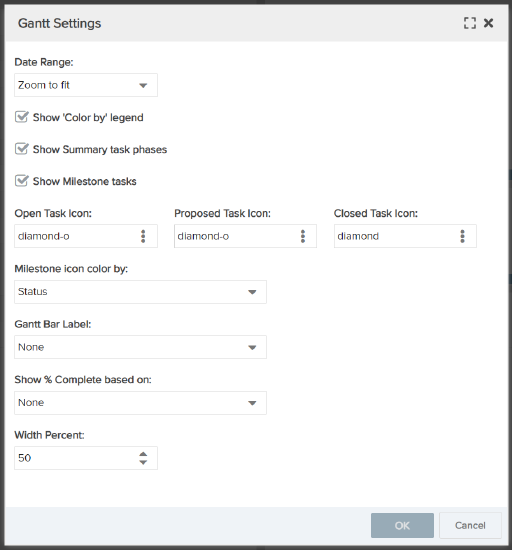
| Date Range |
Sets the time interval for data visible on the chart. This setting has the following options:
|
| Show 'Color by' legend | Check if you want a legend to appear below the project Gantt to show the value represented by each color. |
| Show Summary task phases |
Check to display summary task phases in the Gantt chart.
NOTE In order to see the task phases on the Gantt chart, the following prerequistes need to be met:
|
| Show Milestone tasks | Check to display Milestone tasks in the Gantt chart. |
| Open Task Icon | Select an icon to represent open milestone tasks in the chart. |
| Proposed Task Icon | Select an icon to represent proposed milestone tasks in the chart. |
| Closed Task Icon | Select an icon to represent closed milestone tasks in the chart. |
| Milestone icon color by: | Select a field to establish the color coding of the milestone icons. |
| Gantt Bar Label | Select a field whose value will appear as a label to the right of each bar. Use any column configured on the Gantt Columns tab. |
| Show % Complete based on: | Select any % field to display a darker shade on top of each Bar #1 to represent the % complete of that field's value. The darker shade gives each bar the appearance of a progress bar. This feature is specifically for treating the Gantt bar like a progress indicator, and can be based on any % field, in addition to Project % Complete. |
| Width Percent | Sets the percent of the report width that the Gantt chart occupies. Higher percents assign more space to the chart. |
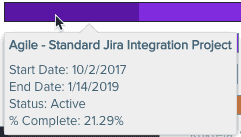
Hover Details
The bubble that appears when you hover your cursor over a bar is referred to as "hover details" and is generated automatically. It displays the entity Title, Start Date and End Date, the Color By field (if using), and % Complete field (if using). If you are displaying 2 bars, then you will get 2 sets of details. You can add a Bar Hover label (see Hover Text Label above) to provide group headings for your hover details. For example:
Hover details for single bar Gantt (no Hover Details Label configured):
Hover details for two-bar Gantt (Hover Details Labels configured as "Project target dates" and "Project actual dates"):