Getting Started with Reports
Reports vs Reports (Legacy) in the UI
Note: This section is relevant only to customers who are still using the legacy reports. This section was written in June 2021.
Currently you can view the new reports module AND leave the legacy reports active. Remember users must have permission to view at least one report in order to see the new Reports in the navigation - easiest thing is to create a global permissions profile and grant at least Reports > View permission to the appropriate users/groups/units. See Report Teams and Permissions for more information about setting up report permissions.
When both report "modules" are active in your environment, you will see two report navigation icons in the toolbar. Hover your cursor over each icon - you will see one labeled "Reports (Legacy)", and one labeled "Reports" (the new reports). See the screenshot below:
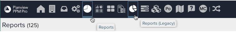
The "Reports" icon will take you to the new reports UI; the "Reports (Legacy)" icon will take you to the legacy reports UI.
We will leave the legacy reports active unless you specifically ask us to disable them (please submit a Support Case when you are ready to turn off legacy reports and dashboards). At some point in the future (with plenty of notice), the legacy reports will be deprecated.
Overview
The mechanics of creating a new report definition are the same across report types. See Creating, Editing, Deleting Reports. It's also a good idea to read "Understanding the Field Path," which describes how to find the fields you want to include in your reports. Using the Report Designer walks you through the mechanics of creating reports while Stepping into Reports and Dashboards provides a more general overview as well as a specific example use case for how you can design, create, and manage effective reports. And finally, the Reports Cookbook provides specific examples, both of interest thematically as well as visually.
This topic provides an overview of basic report creation and supported report types, helpful tips, and pointers to additional information or examples. We hope this overview will help you along your way to successful report design. Remember - the Preview Pane is the biggest tool in your toolbox. The Preview pane is the right-hand section of the report designer - as you design your report (particularly after you have selected the minimal required data), it automatically updates with sample data to show the impact of your selections. We encourage you to take advantage of this real-time feedback to experiment with types, data selection, and formatting. If you don't like what you see, change it!
For in-depth information on report capabilities, creation, and management from start to finish (just under 1.5 hours), please see this customer webinar on PPM Pro New Reports Enablement.
Creating a Report
To create any report, do the following.
- Click the Reports top-nav link to display the Reports list, or, go to an entity such as a project that has a Reports section where you want to create the report.
- Click the New button to open the report designer. (Remember you must have permission to create reports in order to see the New button.)
- In the General tab of the report designer, select a Topic, optionally a Specialty (available for certain Topics), Type, and enter a Title, and optionally enter a Description. Not sure what type to select? The table below contains an alphabetical listing of all report types with image, usage tips and links for further information and examples.
- In the Data tab, select the reportable available fields to be visualized in the report. Depending on the topic, specialty, and type of report, you will be able to traverse various field paths to find the data you want displayed, as well as have various sections or buckets for an available field to be placed in. You can also rename and specify some data format within the field options modal.
- In the Display tab, select various options for how you want your report to appear. Depending on the type of report, you will be able to see different display option sections relating to headings, data values, axes, legends, quadrant, Gantt (zoom settings), sorting, drill downs, and/or aggregations. For report types that include list columns (List: Basic, List: Time Series, Gantt), column display options can also be set within the Preview pane. And for the Gantt report type, additional Gantt display options can be configured in the Gantt portion of the Preview pane.
- In the Variable Settings tab, specify what entity level grids you want the report to appear in, whether or not you want to allow changing the scope (entity or entity level) before or after running the report, as well as any filters and whether or not they should be allowed to be changed before or after running the report.
- In the Team tab, you can provide direct report access to individual users, groups, or units, given a selected permission profile that has a Team rule. These allow for report-specific permissions, as opposed to more general global permissions that other users may also have.
- Click Save or Save & Run the report. The rendered report will open in a new tab. When finished viewing, you can close the rendered report tab or leave it open and simply refresh it after making any further changes in the original report designer tab.
TIP
You can also create a new report by uploading an existing report definition. The Reports Cookbook has pre-made reports the you can download and add to your PPM Pro instance to help you get started.
Choosing an Appropriate Report Type
Every report has a single 'Type' that must be selected to determines what the report output will be. While you are designing, you can switch between Types to find the visualization that you like best. For example, you can see whether you prefer a column, bar, pie, donut, or spiderweb visualization for your report.
The table below shows and describes the currently available report types with usage tips and links to examples:
| Report Type | Description and Usage Notes |
|---|---|
|
Area: Basic
Area: Stacked
|
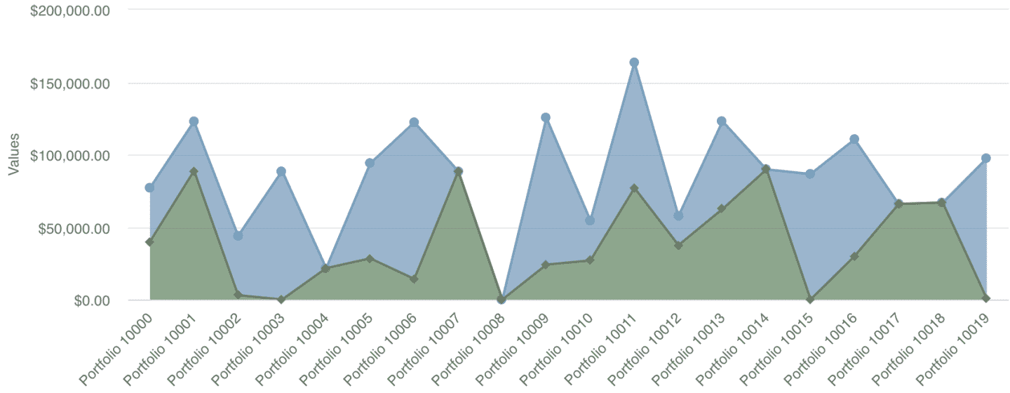
Area charts are similar to line charts - they simply have a color "fill" between the line and the axes. These reports are useful for displaying volume. Some people may find the area chart easier to read than a line chart. See example: Simple Project Financials Comparison |
|
Bar: Basic Bar: Stacked
|
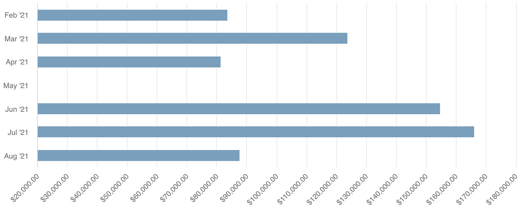
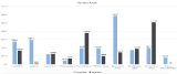
Bar charts are similar to column charts and are used to compare one or more values across a property set or category. The bar chart type is useful when you have a large data set and need to support viewing on a small screen device, because the viewer can scroll through and more easily read the vertical axis labels. Stacked bar charts display the value end-to-end, rather than side-by-side, which can be useful if vertical chart real estate is also tight. See example: Allocated Hours by Project |
|
Bubble
|
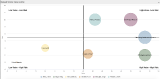
Bubble charts are great for comparing three or more dimensions of data. Each axis represents one data value with bubble size another. A field for color may also be specified to add yet another dimension. The varied size of bubbles is useful for quick visualization of the specific value per instance, such as cost per project (with a bubble representing each project). Note that users can hover over bubbles to view the details, including the bubble Size field value if not displayed. If you have large data sets such that there are simply too many bubbles, consider using a heatmap type instead. See example: Intake Request Risk vs. Value |
|
Column: Basic
Column: Stacked
|
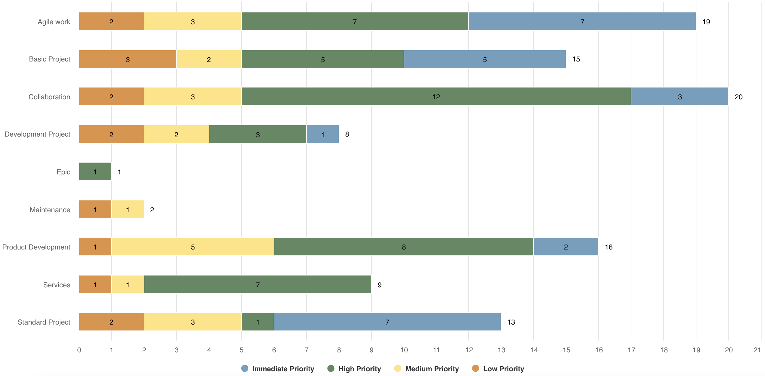
Column charts are basically the same as bar charts, with axes reversed. They are a good choice when wider screens are likely and there are numerous values to compare. For Column: Basic see example: Planned vs. Actuals For Column: Stacked see example: Projects by Category with Priority Stacks |
|
Combination: Area, Column, Line
Combination: Stacked Area, Stacked Column, Line
|
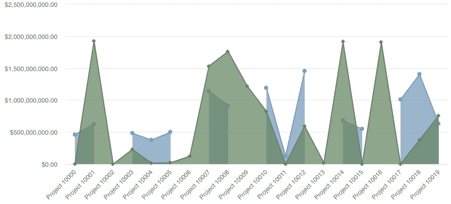
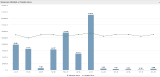
Combination charts allow you to overlay up to 3 report types on a single report. This is useful if you are comparing a lot of data and need to visually delineate the data, or, if you have data with different ranges of values that need to be presented together. Choose fields for areas, columns, and/or lines as appropriate. See example: Portfolio Budgets and Projects |
|
Crosstab
|
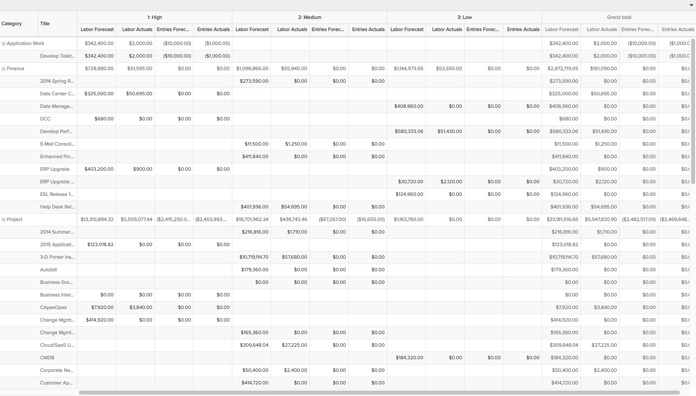
Crosstabs allow you to display a table of date with row fields, column fields, and the fields for which you want to report the intersecting values. For example, you could display project Title as rows (left axis), project Category as columns (top axis), and Actual Hours and Estimated Hours as the intersecting values (values). Depending on the topic, you might also be able to display time periods as columns, such as choosing Month, Quarter, or Year as top axis fields when creating a Timesheet Entry topic report. The crosstab also allows you sub-total and total rows and columns, and aggregate to show average, minimum, maximum, or summed values. NOTE: For financial summary and financial entries reports, the List: Time Series works best (avoid the Crosstab). See example: Total Forecasts and Actuals |
|
Donut
|
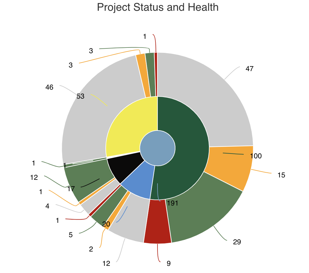
Donut charts are basically pie charts with a hollow center. They allow you to display numeric totals and/or percentages broken out by a particular set of fields. Like bar and column charts, they allow you to compare one or more values across a property set or category. It is better to use a donut (or pie) chart when you have small data sets, else a bar or column chart might be easier to read. You can select a single field to group by or select multiple fields, where each field is another dimension or ring within the report. For example, you could show a donut that shows the count/percentage of projects broken out by Status. Or, a donut that shows count/percentage of projects broken out by Status and also by Priority, where each of these are rings. See example: Project Logs |
|
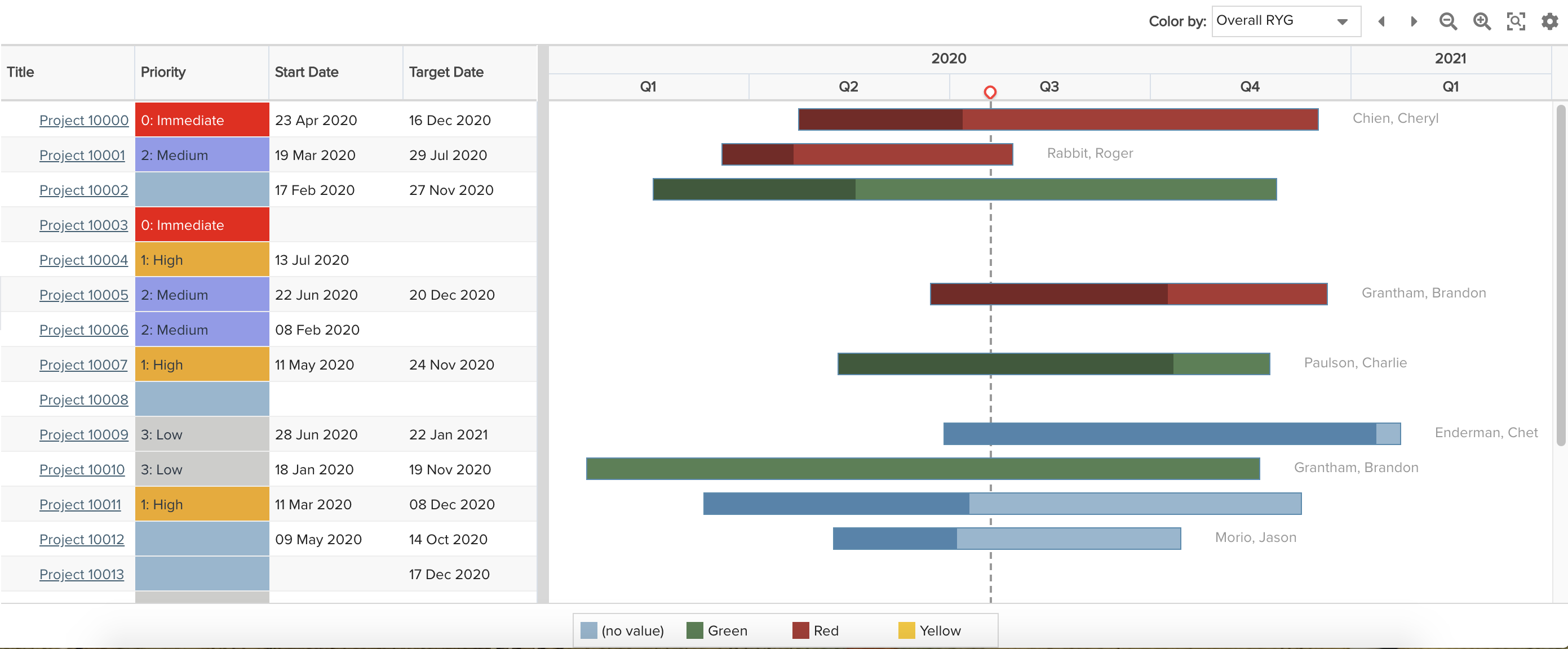
Gantt
|
Gantt reports provide a visual summary of an entity's progress over time (usually a task), along with a configurable set of columns that provide related data about the report topic/entity. These charts are useful if you want to combine text and graphics on a single report. See example: Portfolio Roadmap |
|
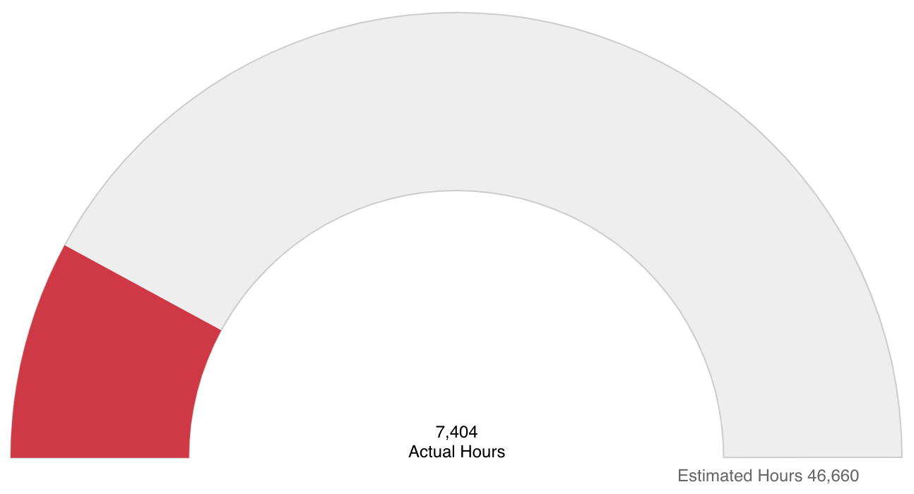
Gauge
|
Gauge charts provide a quick and simple visualization of the progress of one data value against a target value, or, the percent progress of a single value. See examples: Project % Complete, Project Actuals vs. Estimated Hours |
|
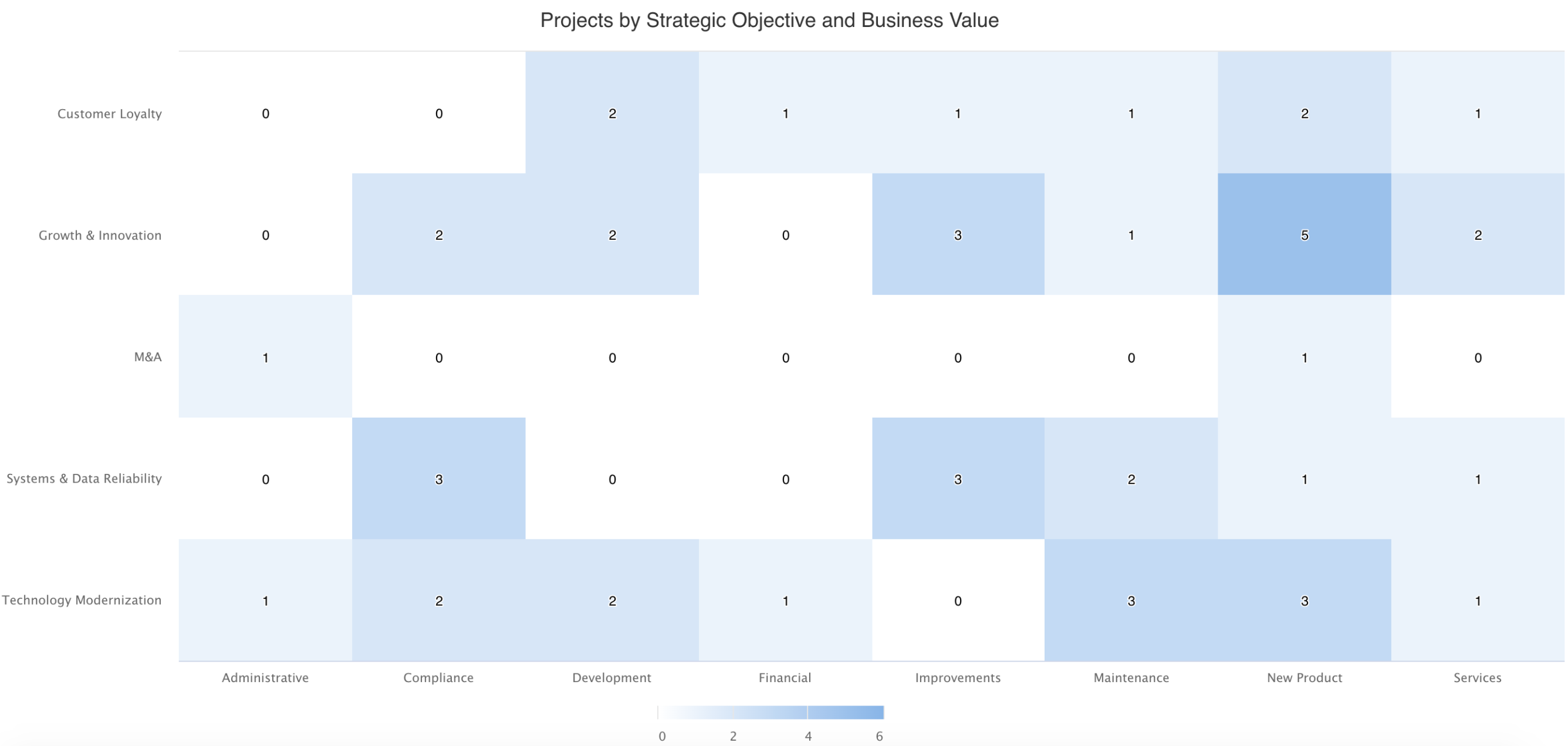
Heatmap
|
Heatmaps are great for comparing two properties of data and an intersecting value. They enable you to visualize hot spots as higher intersecting values appear with a darker color than lower values. Heatmaps show patterns or correlations and are particularly useful when you have large sets of data to visualize. See example: Projects by Type and Business Objective |
|
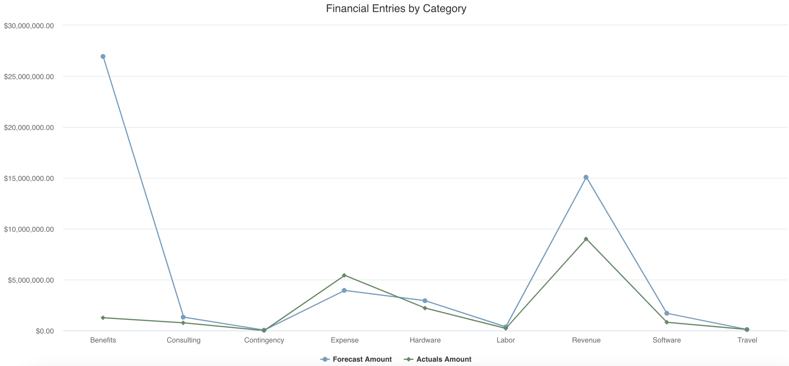
Line
|
Line charts are often used to show trends or comparisons of data, often reflecting changes over time by plotting points on a line. Line charts may be easier to read than area or column charts when there are numerous left axis fields to be visualized. See example: Financial Entries by Category |
|
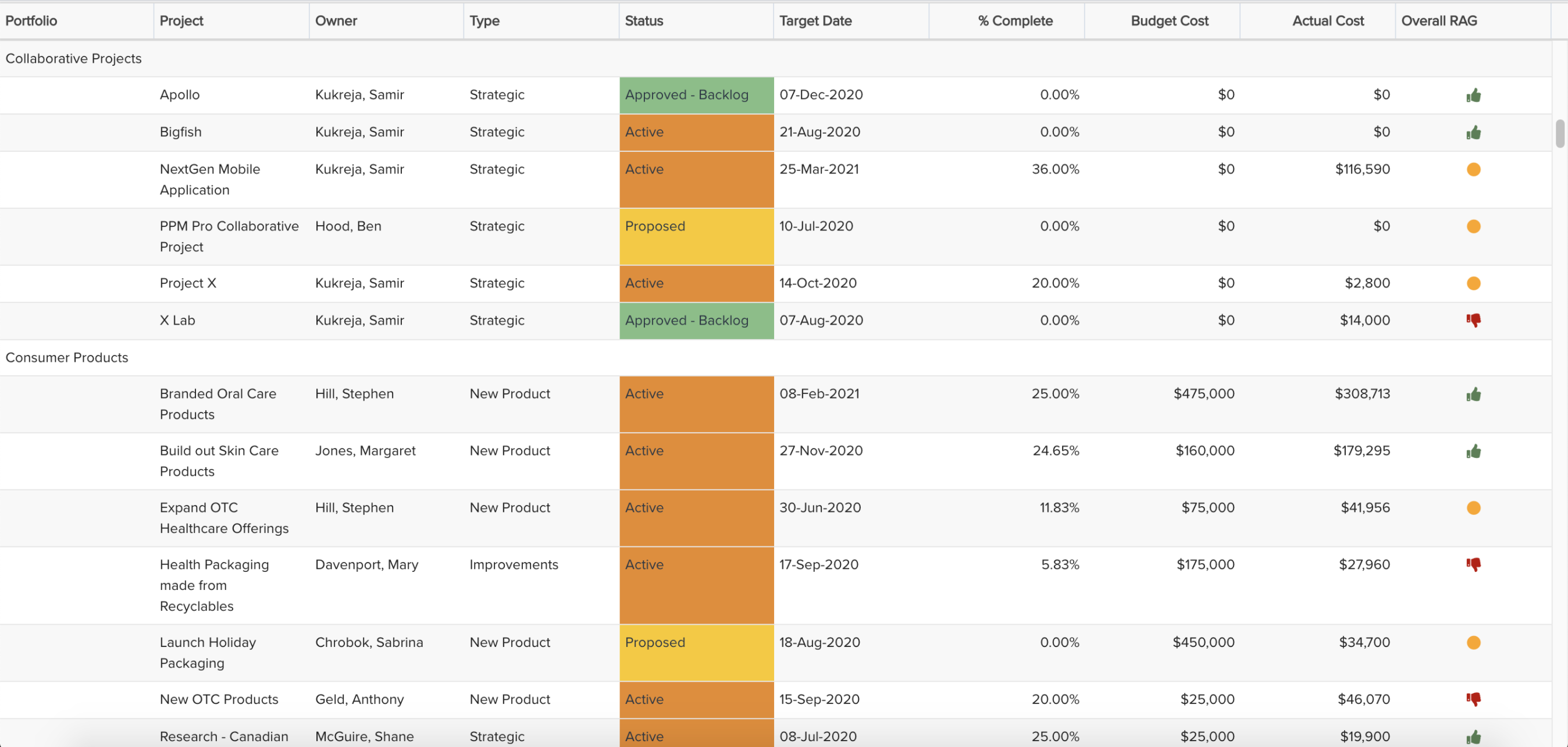
List: Basic
|
List: Basic reports are columns of data that can be sorted and grouped, and can include sub- and grand-totals. This type is good for data-intensive reports that would not be effective graphically. You can make a list report more visually appealing and readable by wrapping column titles (for lengthy field titles), specifying column widths, and if it will be used on a dashboard by choosing to auto-size the height of the report to avoid potential scrolling or unnecessary white space. You can also format certain column data and display lookup list values with their list colors and/or icons. See example: Portfolio Project Status |
|
List: Stacked
|
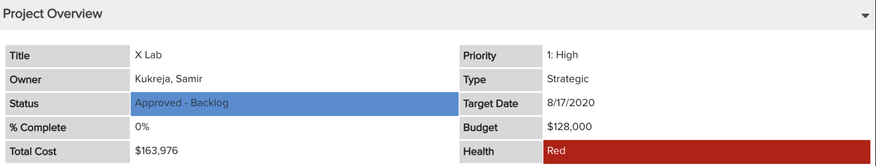
List: Stacked reports are sets of the same data grouped together by entity instance. Like List: Basic, this is good for data-intensive reports that would not be effective graphically. You can make a stacked list report more visually appealing by carefully choosing the number of 'stacks' and specifying their label and value widths, and if it will be used on a dashboard by choosing to auto-size the height of the report to avoid potential scrolling or unnecessary white space. You can also format the label font and background colors. See example: Project Overview |
|
List: Time Series
|
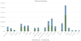
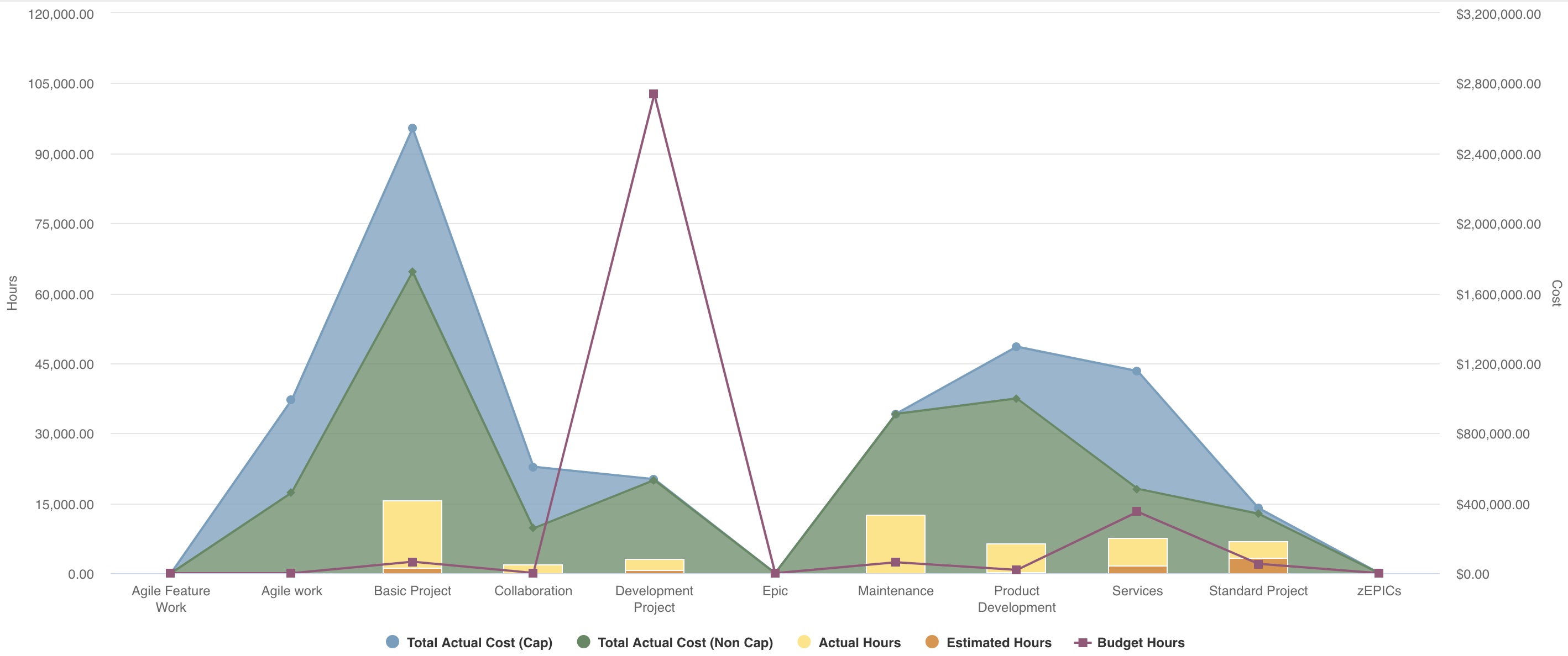
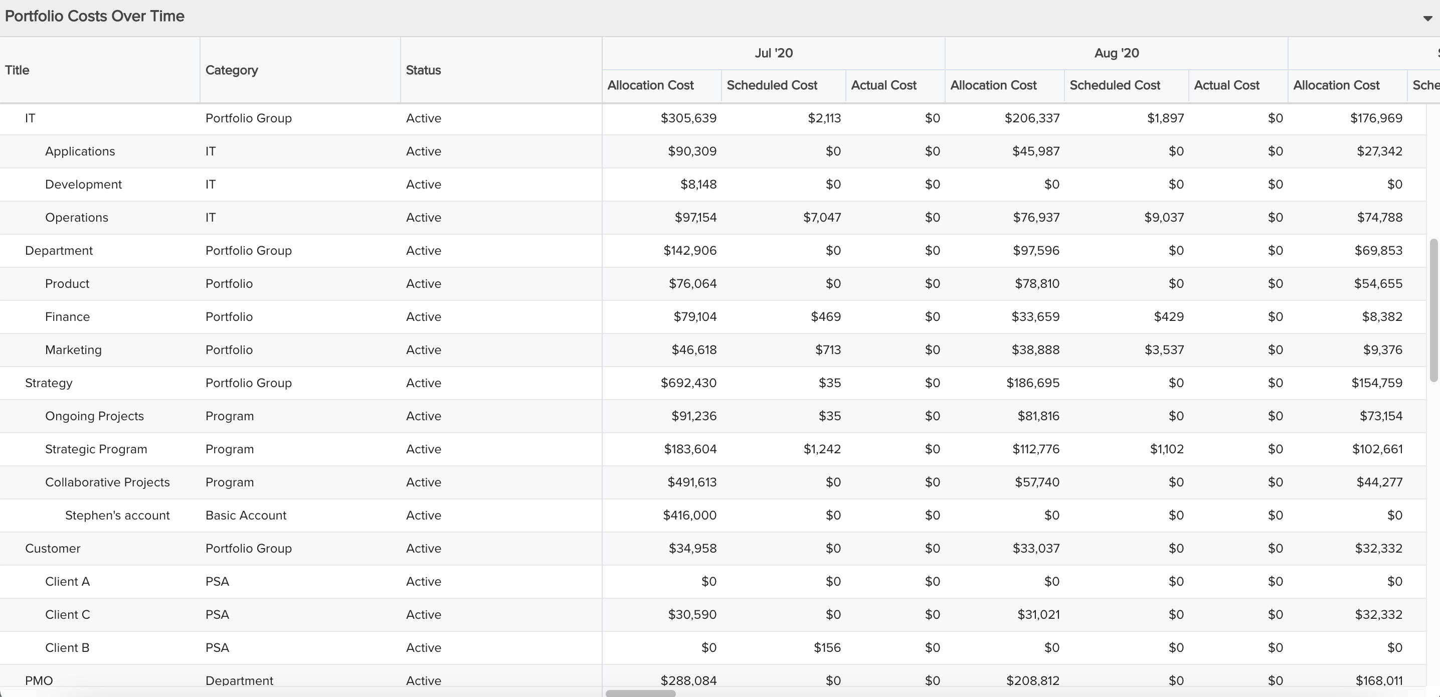
The List: Time Series report type is only available when the Time Series Specialty is selected. It is similar to a Gantt in that the left hand side of the report is a basic list, but the right hand portion displays time series field values (the available fields selected for the right hand values must be a '(Time Series)' field). The right hand side's time frequency and range is specified within the Time Series section of Variable Settings. This report type is particularly valuable if you have data-intensive reports for which you want to show values over a given time period, potentially broken up by properties such as capitalized versus non-capitalized or staffed versus non-staffed. See example: Portfolio Costs Over Time |
|
Pie: Basic
Pie: Crosstab
|
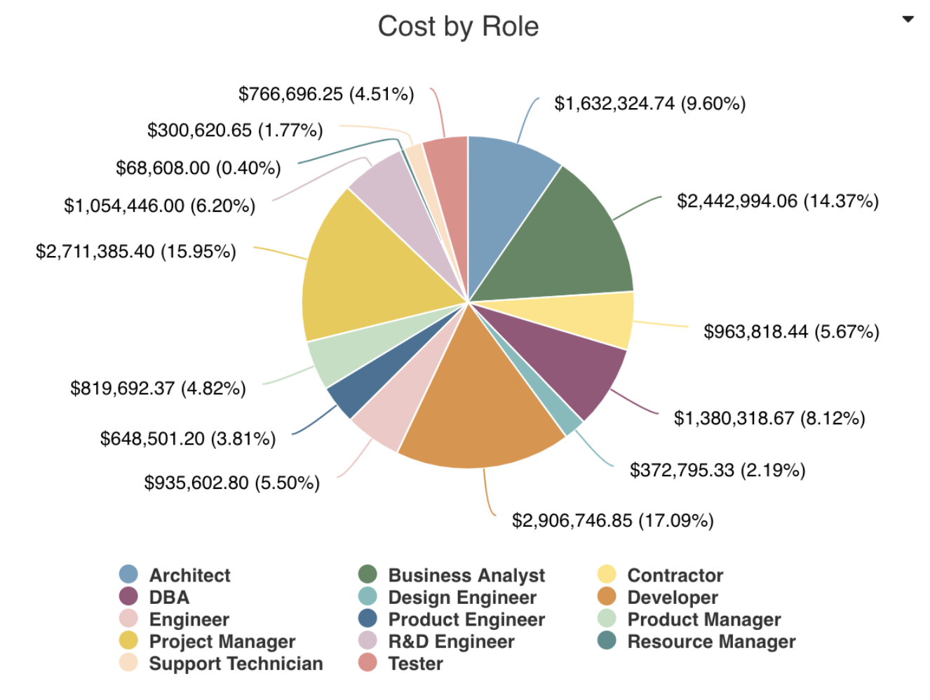
Pie charts are basically like donut charts with no hollow center. They allow you to display numeric totals and/or percentages broken out by a particular set of fields. Like bar and column charts, they allow you to compare one or more values across a property set or category. It is better to use a pie (or donut) chart when you have small data sets, else a bar or column chart might be easier to read. Pie: Basic only allows one field to be selected while Pie: Crosstab allows multiple fields to be selected, so that you can see other dimensions within the report. For example, you could display a basic pie that shows the count/percentage of projects broken out by Status. Or, display a crosstab pie that shows the count/percentage of projects broken out by Status and by Priority, with the center of the pie representing the overall total. See example: Allocated Cost by Role |
|
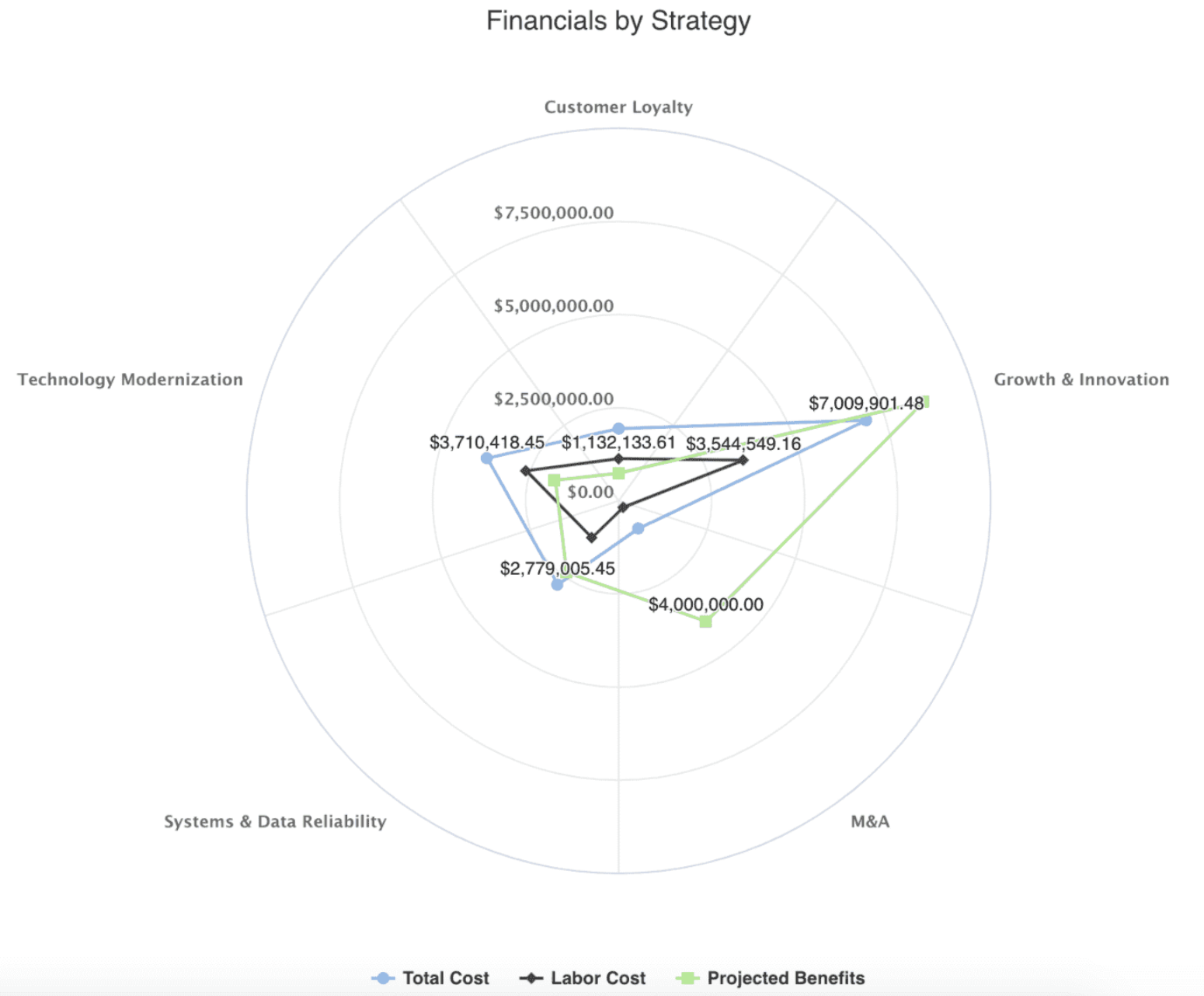
Spiderweb
|
Spiderweb charts (sometimes called radar or polar charts) are great when you need to compare multivariate data sets. It is similar to a line chart but instead of a bottom axis, the 'Group By' field's values appear in a radial axis, providing an engaging alternative visualization that can also show patterns. See example: Project Financials by Business Objective
|
|
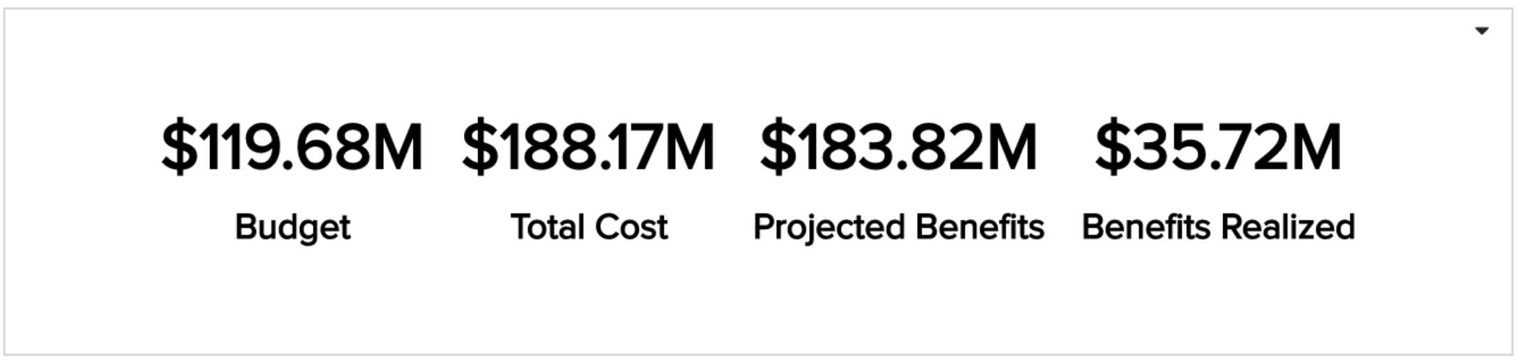
Tile
|
A tile report shows a numeric aggregated value for an entity field. Its simplicity can be quite impactful. You can show a single field in a tile or multiple fields in a tile, changing the value or label colors to provide even more visual impact. See example: Tiles |