
Gantt charts
This topic describes how to configure the data for a Gantt chart report. The report is interactive - that is, after you run the report you can adjust a variety of settings in the rendered output, such as:
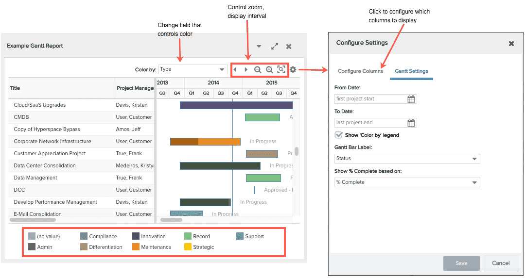
- the field that drives the bar color ("Color by" field)
- whether or not to display the "Color by" field legend
- date range to display
- the Gantt Bar Label that appears to the right of the bar
- zoom
- the columns that appear on the left side of the report (the "grid")
Note that these settings are part of the report definition but can be modified interactively (either on the report or from a component on a dashboard) on a per-user basis. The interactive settings are "sticky" until the report definition is edited again. At this point all per-user interactive settings are cleared and the values from the report definition are in affect. Also, if you wish to revert back to the original settings, you can clear local settings (Menu > Clear Local Settings on the user's resource record), or manually reset the fields.
The screenshot below shows a rendered gantt chart report - some of the interactive controls are on the report, some are in the Configure Settings dialog (note that the Gantt Settings tab is displayed below; click on the Configure Columns tab to adjust columns to display):
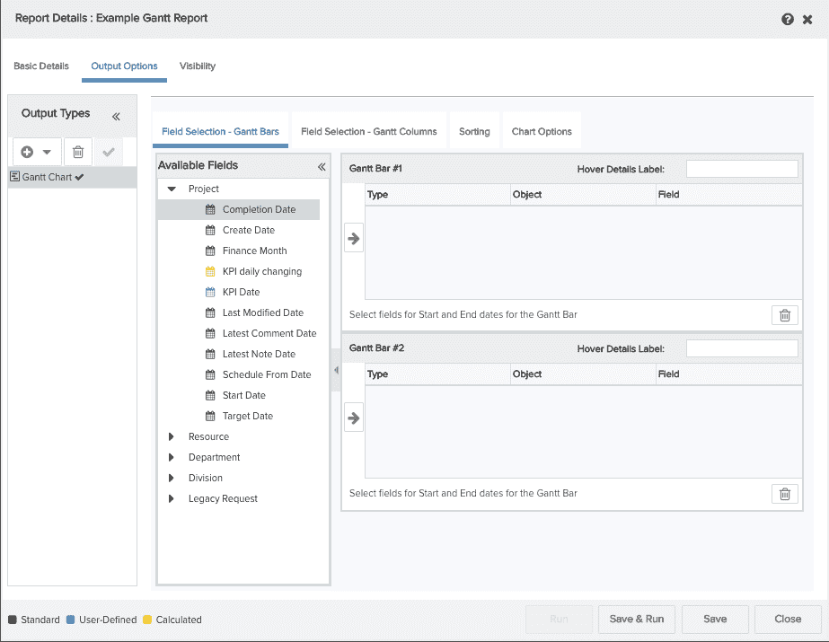
You will be working with a screen like the one below to configure your report. At this point you will have already selected a report source, clicked New, and filled out a preliminary Basic Details screen.
To configure a gantt report, you will:
- Configure the Gantt bars: Field Selection - Gantt Bars
- Configure Gantt columns: Field Selection - Gantt Columns
- Adjust Sorting: Sorting
- Configure additional options: Gantt Chart Options
Field Selection - Gantt Bars tab
To include fields in your report, locate them in the Available Fields list and drag them to Selected Fields table. These fields vary depending on the report source you are using. If you include fields and then change your mind, simply select the field in Selected Fields table and click the Trash Can  . If you choose a Task report source, the critical path is automatically displayed in red - it matches what is seen in the UI when the Gantt view is active in the tasks section on a project. Use the Start Date and End Date fields in the Gantt Bar tab to set the timeline.
You must have one bar in your report, and can optionally have two. Two bars are useful, if, for example, you want to use one bar to show a project's desired dates (start/target dates), and the second bar to show the actual dates (start date/complete date).
To determine the range of measurement for the bars, select the field representing the start date from the Available Fields list and drag it into the Gantt Bar table. Do the same for the field representing the end date. The first field you select will be assigned the Start Date Type; the second field the End Date Type. If you are using two bars, repeat for the second bar.
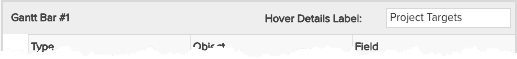
If you are using two bars you can optionally provide a label that describes the bars - this label will appear in the hover-over details bubble in the Hover Detail Label field (see Mouseover Legend Contents below).
Enter the text in the Hover Label Text field:
The table below describes the columns of the Gantt Bar table (#1 and #2 are the same):
|
Column Name |
Description |
|---|---|
|
Type |
Gantt charts need Start and End dates. This field automatically populates when you drag a field into place: the first field you select is the Start Date, the second field you select is the End Date. |
|
Object |
The name of the entity to which the data field belongs. This value fills in automatically depending on the field you select. |
|
Field |
The name of the data field. |
| Display Name | Do not use, feature no longer relevant. Will be removed from UI in upcoming release. |
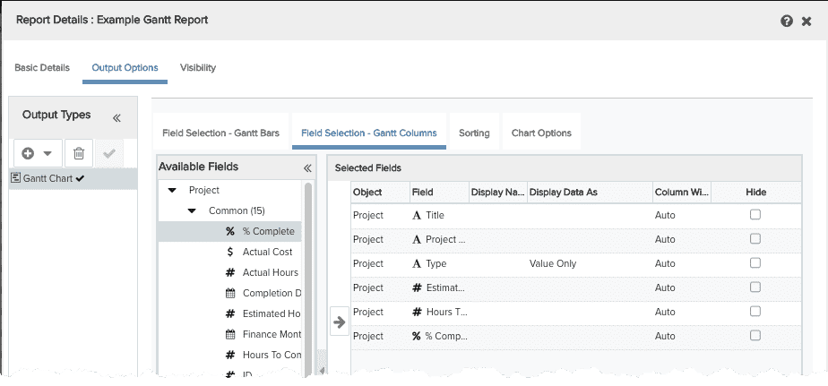
Field Selection - Gantt Columns
Click the Field Selection - Gantt Columns tab and select the fields you want on the report grid that will appear to the left of the timeline (max of 20 fields). After you add the fields to the Selected Fields table, you can reorder them by dragging them up or down or by clicking the up and down arrows at the bottom-right of the table. The order in which the fields appear in this table is the order in which they appear on the report. Note that you must put at least the Title field on this grid.
Note: If you include a calculated field on your interactive Gantt that contains HTML, you need to ensure the display type is set to "HTML". Otherwise the markup will show instead of the HTML you expected.
The table below describes the columns of the Gantt Columns table:
|
Column Name |
Description |
|---|---|
|
Object |
The name of the entity to which the field belongs. |
|
Field |
The name of the data field. This is the column name in the report. |
|
Display Name |
Use this field if you want a column name that is different than the Field name. If this field is blank, the Field name is used for the column name. |
| Display Data As | (List fields only) Choose how the field value will be displayed. Specific values are configured for the list in Admin/Setup/Lookup Lists. See Configuring Lookup Lists for more information. |
| Column Width | Specifies the width of the column in pixels. Default is Auto, which means the column is sized to fit the text. |
| Hide | Click the checkbox to prevent a field from displaying on the report. Hiding a field is useful if you would like to use a field for Color or Sort by but do not want it to actually show up as a column |
Sorting
Click the Sorting tab to configure sort fields for the grid. the Available Sort Fields list is the list of the fields that you selected for your grid on the Field Selection tab. You can move fields to the Sort Fields table by dragging them, double-clicking them, or selecting them or clicking the  . To remove fields from the table, click
  .
.
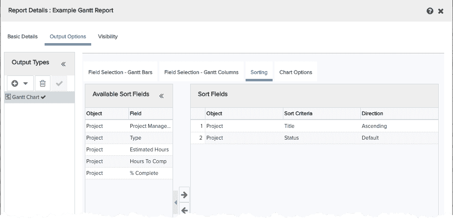
The table below describes the columns in the Sort Fields table:
|
Column Name |
Description |
|---|---|
|
# |
Indicates the priority of the sort field. In the screenshot above, the report will be sorted first by Project Type, then by Project Start Date, and then by Project Title. To change the priority, drag the fields up or down the list to change position, or use the up and down arrows in the bottom-right corner of the screen. |
|
Object |
The name of the entity to which the field belongs. |
|
Sort Criteria |
The field on which the report will be sorted. |
|
Direction |
Select Ascending or Descending for the sort order. |
Gantt Chart Options
The Chart Options tab is where you configure additional details for your report. Several of the options in this tab are also available in the rendered report output and can be adjusted interactively:
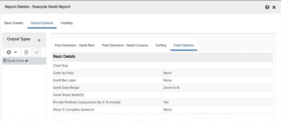
Each setting is described below:
|
BASIC DETAILS |
|
|---|---|
|
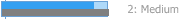
Chart Size |
Wide (400x700), Extra Small, Small, Medium, Large, Extra Extra Large, Wide, Extra Wide |
| Color By Field |
Select the field to drive the color coding of the Gantt bars. List is populated by all fields in the report, except for date fields. For example, if you color by Project:Type, then each project type is displayed in a different color. Use any column configured on the Gantt Columns tab. The "Color by Field" value is displayed in the rendered Gantt report to the left of the interactive controls - it shows the current setting, if any, and can be changed in the rendered report. See Specify the Field to Control Bar Color. |
| Gantt Bar Label | Select a field whose value will appear as a label to the right of each bar. Use any column configured on the Gantt Columns tab. |
| Gantt Date Range | Select the date interval to use on the rendered report. |
| Gantt Sheet Width (%) |
Determines how much relative space is initially given to the Gantt chart. Default is 50%. Note that after user manually adjusts, that spacing is sticky. |
| Prorate Portfolio Components By % To Include |
Yes, No Because a percentage of a project can be designated to a portfolio, this setting ensures that any aggregate fields in the report are prorated by the value of the "% to include" field. You can disable this setting if you wish to see the whole cost of a project, rather than just those values contributing to the portfolio. |
| Show % Complete based on | Select any % field to display a darker shade on top of each Bar #1 to represent the % complete of that field's value. The darker shade gives each bar the appearance of a progress bar. This is specifically for treating the Gantt bar like a progress indicator, and can be based on any % field in addition to the Project % Complete field. Note that the % field must be included as a column within the report, but it can be hidden by selecting 'Hide' if you only want to use it for showing % complete on the bars. |
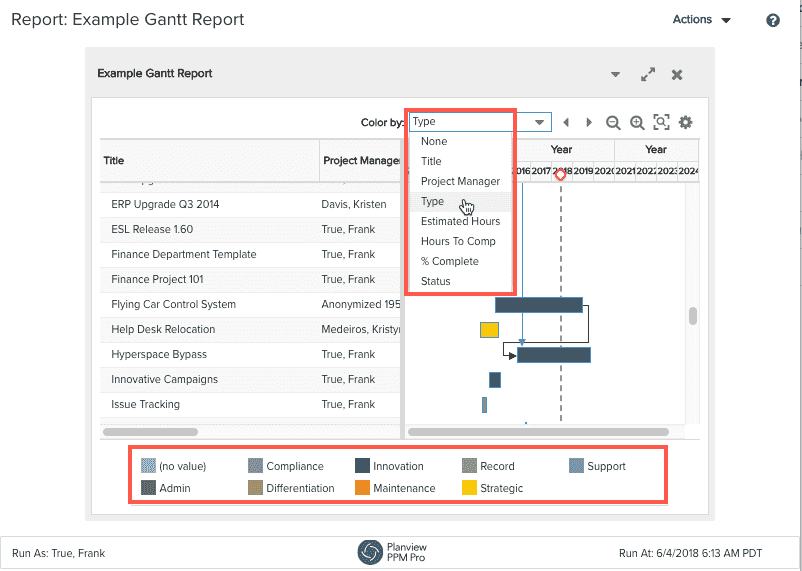
Specify the Field to Control Bar Color
The "Color by Field" droplist in the Chart Options tab controls the initial color coding of the Gantt bars. The field can be any field on the report, except for date fields. For example, if you color by Project:Type, then each project type is displayed in a different color. The "Color by Field" droplist in the rendered Gantt report (to the left of the interactive controls) shows the current selection, if any. You can change the Color by field in the rendered report.
A corresponding legend for the "Color by Field" appears below the chart when the Show 'Color by' legend setting is selected.
Mousever Legend Contents and Bar Examples
You can mouseover the Gantt bars to view the information the bars represent. By default, the hover text contains the start to end date range for each bar. Other settings that affect the contents of the hover details are:
- Hover Details Label
- "Color By" field
- % Complete field
|
Setting |
Legend |
Example Bars | |
|---|---|---|---|
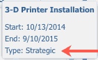
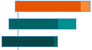
| Default hover details | 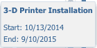 |
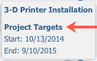
One bar, no label, no color
|
|
|
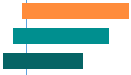
+ Color By field |
|
One bar, Color By field
Two bar, Color By field
|
|
|
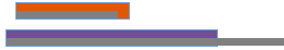
+ Hover Details Label |
 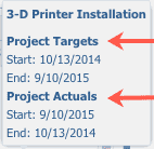 |
Two bars, Gantt Bar label
|
|
| + % Complete | 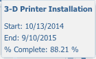 |
One bar, % complete
|
|
| All | 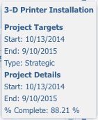 |
Two bars, Gantt bar label, % to complete
|

What next?
You can edit chart options, save and run your Gantt chart, change the default visibility, or configure other output types: