
Working with the Card View
The Card view is a "kanban" board that allows users to move cards (requests) from lane to lane, and generally provides a visual workflow that some users prefer. You can group the lanes by any list field.
You can toggle between the List view and the Card view as often as you like.
Whatever view is displayed prior to navigating away from the entity will persist. For example, if you choose the Card view for Projects, then navigate to Reports and then navigate back to Projects, the Card view will be displayed.
The cards that populate this view are determined by your permissions. If you do not see an entity that you were expecting to see, contact your adminstrator to adjust your permissions.
Anatomy of the Card View
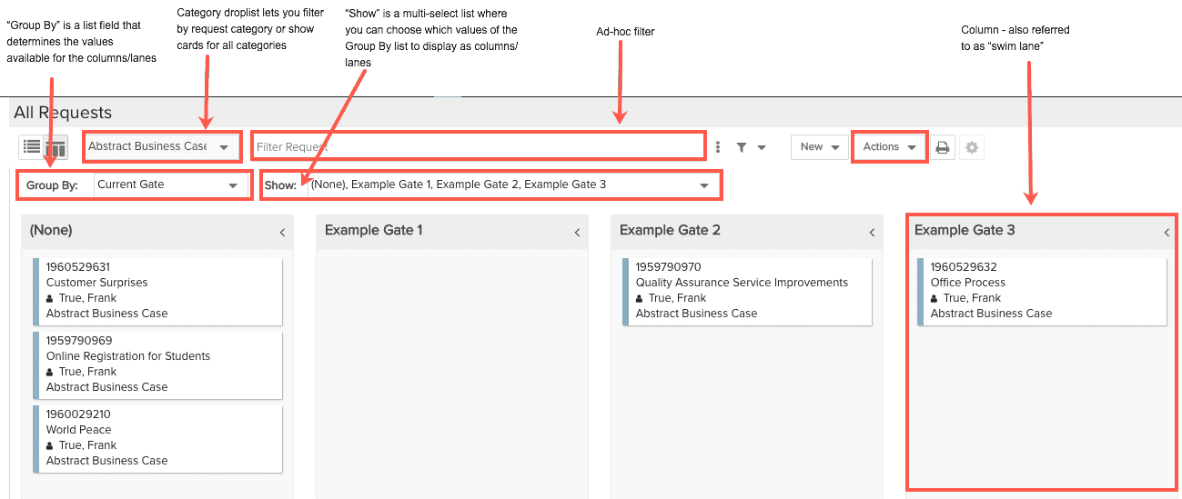
The Card view is divided into "lanes" which reflect a list field values - you can select which list values to show or hide (see Configuring the Columns/Lanes below for more information about configuring lanes). For example, the Gate Status list can represent the lanes. If you configured color for a status list, the color will be used along the left-hand edge of the card; if you have not configured colors, default colors will be used. You can use filters and the Category droplist to hide/show cards. Note that the Category droplist is not visible if only one category is defined.
Configuring the Columns/Lanes
Columns/lanes in the Card View are determined by the values you select for the Group By, Show, and Sub-Group By dropdown list values.
The Group By dropdown is populated with any single-selection lookup list fields that are available to be placed on the grid (this means your administrator has made them available by adding them to the Grid Columns page when configuring the entity). If you wish to remove certain fields from the Group By dropdown, remove them from the entity grid.
The Show dropdown is a multi-select list that lets you choose which values you want to appear as columns/lanes. The values shown in this list are dependent on the value you select in the Group By dropdown.
The Sub-Group By dropdown is populated with any single-selection lookup list fields that are available to be placed on the grid (this means your administrator has made them available by adding them to the Grid Columns page when configuring the entity). If you wish to remove certain fields from the Group By dropdown, remove them from the entity grid.
To configure the columns/lanes in the Card View:
- Select a field from the Group By dropdown.
- Select the value or values for the columns from the Show dropdown list.
- (Optional) Select a field from the Sub-Group By dropdown list.
Selecting Cards
Select single cards by single-clicking; use shift-click to select multiple cards (or hold down the shift key and hit the down arrow key repeatedly). When you select more than one record, the message "n items selected" is displayed (temporarily) in the footer of the page. This is useful if you want to select a range of records and want to know the count.
Number of Cards Displayed
The maximum number of cards displayed in the Card view for Requests, Projects, Issues/Project Logs, and Tasks is 1,000.