
Idea Activity Breakdown
Introduction
We have added a new idea activity visualization that displays the key idea metrics which each challenge uses to prioritise ideas. You can use this visualization to track ideas that are trending well on activity, highlighting where they are in comparison with their peers.
You should also consider using this visualization to track ideas that perhaps are receiving a lot of votes but a small number of comments. This can be very useful in moderating challenges and pushing the crowd to ideas that could be of interest. (This is a new section in the left Nav.)
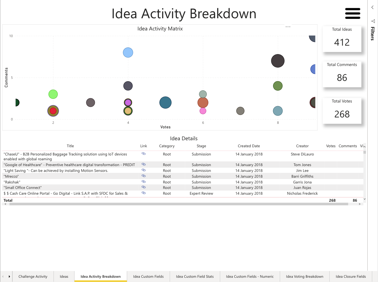
Figure 1 - Idea Activity Breakdown visualization
Idea Activity Chart
This visualization will display any idea that registers a vote (including stars) or comment. These are represented by the individual plots on the chart.
The size of each plot is dictated by the number of page views and idea has received. The result is that it becomes easy to see which ideas are being viewed but action is not being taken on and vice versa.
Idea Details Table
This table works in conjunction with the idea activity chart. If you click either the chart or the table, the other visualisation will adapt to highlight just the selected content.
The table itself contains key idea details such as the title, URL (now in an icon), category, stage, the created date and the creator. We also display the metrics that correspond with the table above.