
User: Accessibility Compliance/Section 508 Support
What is Section 508 Support? How do the Visible Object Focus/Keyboard Access/Screen Reader features work?
Section 508, an amendment to the United States Workforce Rehabilitation Act of 1973, is a federal law mandating that all electronic and information technology developed, procured, maintained, or used by the federal government be accessible to people with disabilities.
IdeaPlace supports 508 accessibility requirements. As part of these requirements, an interface object focus indicator is now visible as the user navigates between page elements. Focus indicators are available for:
• Input fields
• Hyperlinks
• Sub-menu items
• Main menu items
• Buttons
Also, keyboard navigation is enabled so menu and screen operations can be performed through keyboard actions. For example, tab to navigate sequentially through menus and page elements, press J/K keys to jump out of long lists, such as the Activity Stream, and use the left/right arrows keys to navigate between widgets.
In addition, IdeaPlace is enabled to support screen readers such as JAWS.
Contact your site administrator for details regarding additional IdeaPlace accessibility compliance.
Focus Indicators
Please refer to this Theme Editor article for current Release versions of the following features.
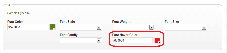
The focus indication color is set by changing the following Font Hover Color settings in the Administration > Theme Editor settings. Font hover color and focus indicator share the same setting. Focus indication is supported for:
- Typography: a (hyperlink)
- Image: User Navigation, Navigation, Buttons
NOTE
Focus indication for input fields and My Inbox Messages are only set by professional services.
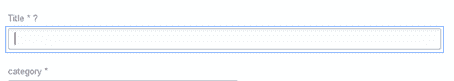
Input Fields
By default, a blue border indicates the current focus for input fields. This setting can be modified only by professional services. No configuration options for this focus indicator are available within Admin or other product settings.
NOTE
Different browsers may use a different border to indicate the input field. For example, browsers running Chrome always show orange for the focus indication of input fields; browsers running earlier versions of Internet Explorer show a dotted gray for the focus indication of input fields.
Example:

Hyperlinks
In the Typography section, the Font Hover Color setting controls the focus indication color for hyperlinks, including the More menu.

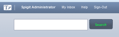
Sub Menu
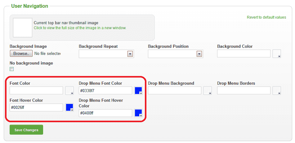
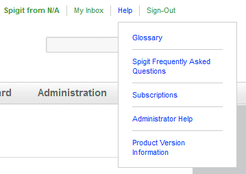
In the Image section under User Navigation, the Font Hover Color setting controls the focus indication color for the sub menus. A separator Drop Menu Font Hover Color controls the focus and hover color for the drop-down menu items in the Navigation links, such as the current user link, My Inbox, Help and Sign-Out.

Main Menu
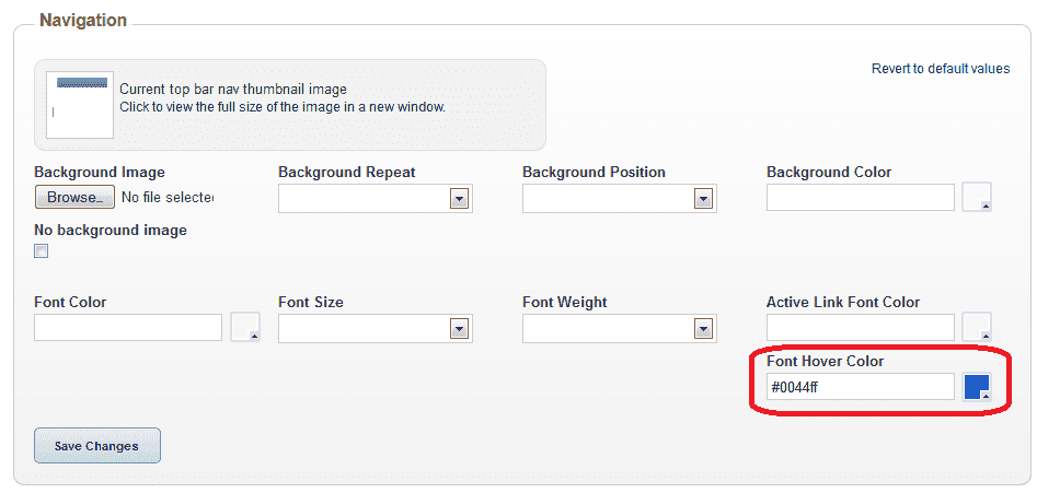
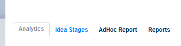
In the Image section under Navigation, the Font Hover Color setting controls the focus indication color for the main menu.

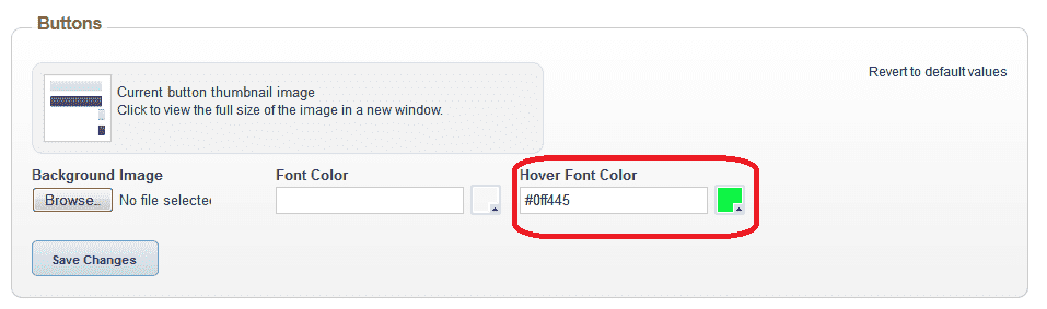
Buttons
In the Image section under Buttons, the Hover Font Color setting controls the focus indication color for the buttons.

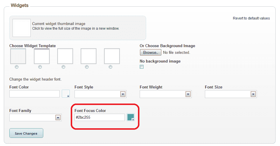
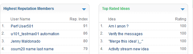
Widget Names
In the Image section under Widgets, the Focus Font Color setting controls the focus indication color for the widget titles.
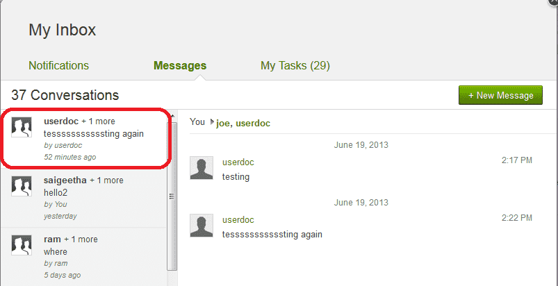
My Inbox Message List
The focus indication for the current message in the My Inbox Message list is set to a white background.
This setting can be modified only by professional services. No configuration options for this focus indicator are available within Admin or other product settings.