Administration User Experience
Overview
The Administration user experience for Planview IdeaPlace features an action-oriented design that resulted from feedback and suggestions gathered during User Experience sessions.
Key Features
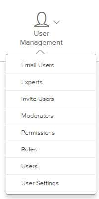
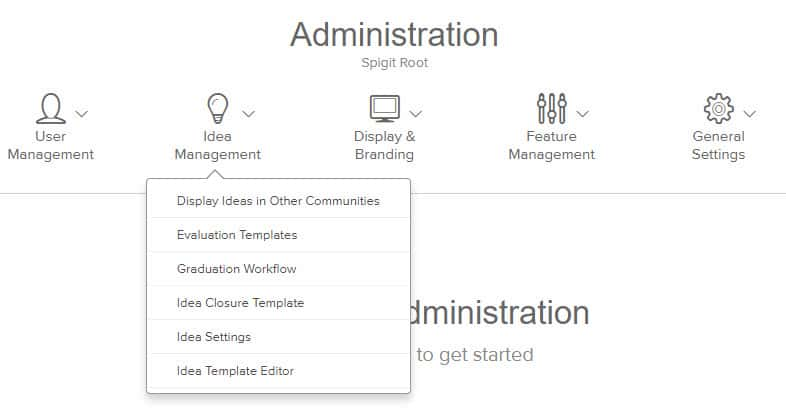
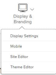
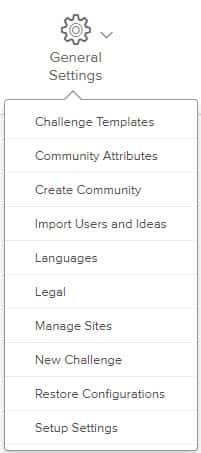
The Administration screen has a simple navigation bar at the top, enabling Administrators to easily move between different Administration pages. Administration pages are organized into five key areas:
- User Management
- Idea Management
- Display & Branding
- Feature Management
- General Settings
Individual Administration pages have help text tucked away in tooltips. When Administration pages are selected, they display beneath this navigation bar (#1 in Fig. 1) , so you remain in the Administration context, and never need to click the back button to navigate to a new area.
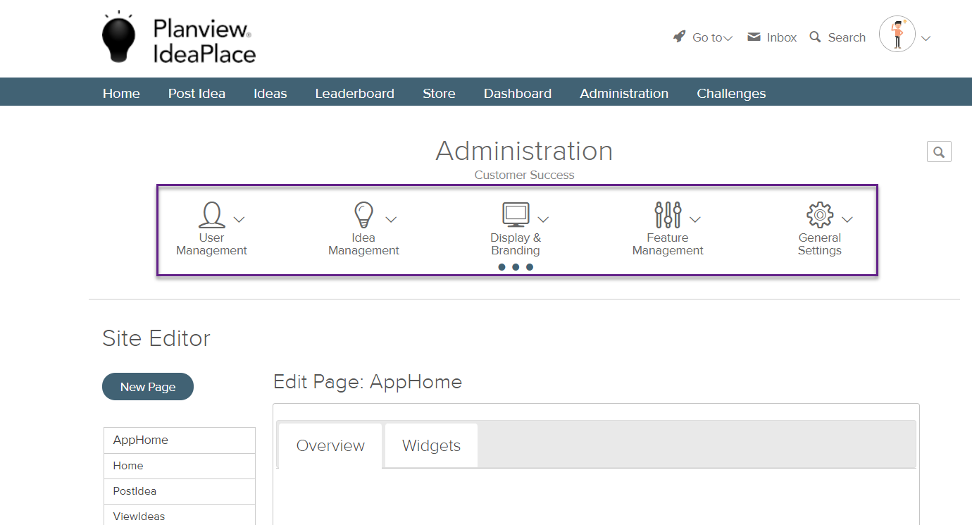
Fig. 1: Administration page elements
For added context, the name of the challenge or community currently in view (#2 in Fig. 1) is listed above the navigation bar. In addition, when selecting an Administration link, the menu displays a “...” indicator (#3 in Fig. 1), and the menu item selected is checked to indicate which area you are working in. The system will remember which Administration area you visited last during this session, and will return you to that screen when you revisit Administration during the same session.
For ease of use, a search (#4 in Fig. 1) enables you to quickly find the Administration page you are looking for. Selecting an option under the Match found in: menu (Fig. 2) will open the relevant page in the Administration area. Additional information is available about the Global Search feature.
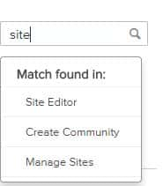
Fig. 2: Search result menu
NOTE
The setting to Show Idea Stats to All Users is set to On by default and does not appear in the Administration panel.
