Burn Down Chart
Note: This feature is no longer available for activation. It is still operating for customers who have it enabled.
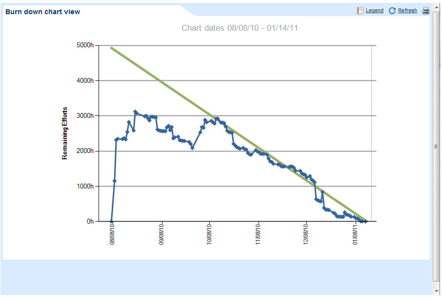
The burn down chart is a graphical representation of remaining effort over time. The outstanding work (backlog) displayed on the vertical axis, with time running along the horizontal.
It is useful for predicting when all of the work of the given project will be completed and is generally used with the Scrum (Agile) Project Management method.
Viewing the Burn Down Chart
To view the burnd own chart click on the "Burn down Chart" button within the Current Project screen.
You will then have to select the date from which the burn down chart will span (generally speaking the project start date, or the current iteration start date).
The burn down chart will then be displayed as seen below, where the green line represents the ideal burn rate of the remaining work, and the blue line represents the actual remaining effort at different points in time:
AdaptiveWork saves burn down chart data for two years.