
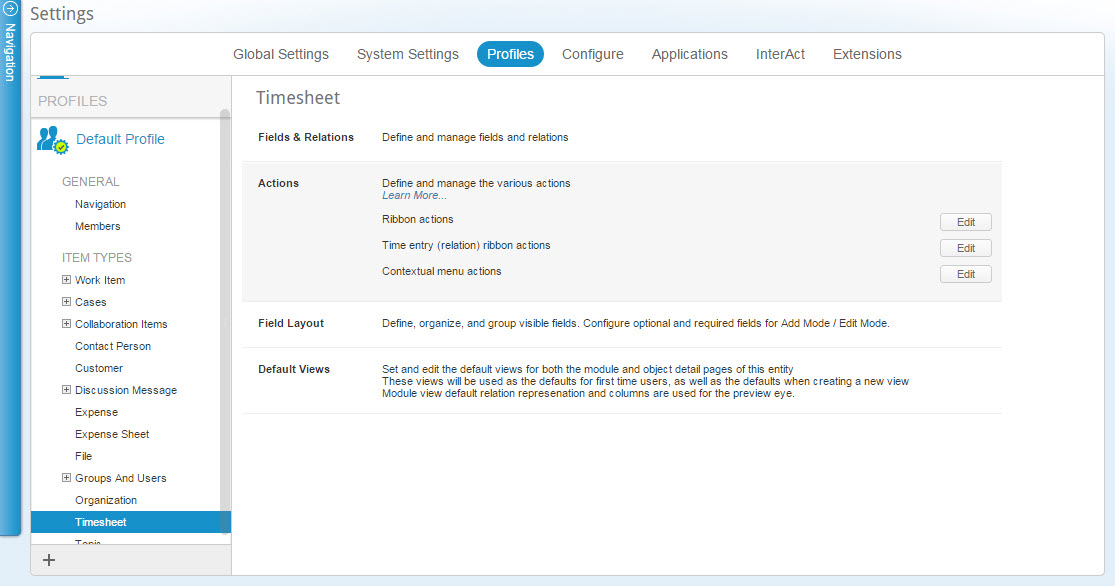
Profiles
AdaptiveWork Profiles Overview
This page describes AdaptiveWork Profiles and includes the following sections:
- About AdaptiveWork Profiles
- Key Benefits
- Key Features
- Items available for Configuration
- Profile Licensing options
- Defining your Organizational Profile Needs
- Accessing AdaptiveWork Profile Settings
- Create your Organization Vision
- Change your Profile View
About AdaptiveWork Profiles
AdaptiveWork Profiles allow you to manage and control the way the system is displayed for each user based on their association with a profile.
By creating multiple profiles, the administrator is further able to manage and control the way the system is displayed for each user based on their profile association to best tailor the system to your organizational needs.
The different display options allow you to control user access to various options, modules, field sets, and actions for better safety. It further permits you to create a better and more simplified work environment by allowing you to remove seldom-used actions and options as well as filter the available views to only those needed by a user for their work.
Each user can be associated with several profiles allowing the user to choose the view shown based on their current work assignment.
Note:
Profile Settings are only available to your AdaptiveWork Admin user.
Key Benefits
Increase User Adoption |
Make it LOOK easy
|
Secure Data |
Hide Fields which are SECURED
|
Support the Enterprise |
Unique user experience for each GROUP
|
Key Features
The following are the profile key features:
- Configure at User, Group, or Organizational Level
- Configure the complete look and feel for each profile, including modules, fields, actions, etc.
- Configure search settings, Gantt & resource calendar columns
- Configure actions (ribbon, bubble popup, contextual menus)
tip:
The bubble popup is the action menu that appears when you hover over an item that has associated actions.
- Use in Custom Actions & AdaptiveWork Panels
- New system settings to see aggregate field sets from all assigned profiles
Profile Licensing Options
The number of profiles available depends on the type of license your organization has:
|
Professional |
Enterprise |
Unlimited |
|---|---|---|
|
Out of the Box profiles only |
Up to 15 profiles on top of the default OOB profiles |
Unlimited number of profiles |
For more information regarding licensing, please see the licensing information in the User Manual and on our web site.
Defining your Organizational Profile Needs
To best utilize AdaptiveWork Profiles in your organization, we highly recommend that you first take the time to map out the way by which you wish to divide the various profiles and display options. This can be done based on the following examples or in any other way that fits your needs as you see fit.
- User types - Create profiles based on user type – e.g. Admin, Team Member, Financial users, External Collaborators, etc.
- User Role - Create profiles based on user role – e.g. program manager, project manager, resource, help desk, etc.
- Department - Create a profile for each of your organization’s departments with privileges and views based on the department a user is in
- Market Segment - Create profiles based on market segments based on region, project type and size, goals set, etc.
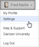
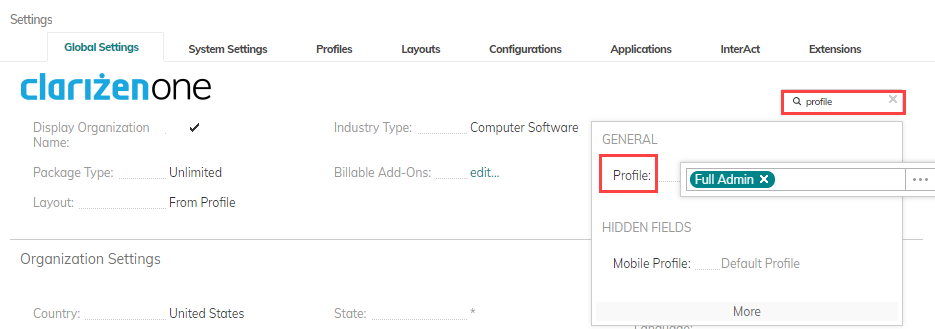
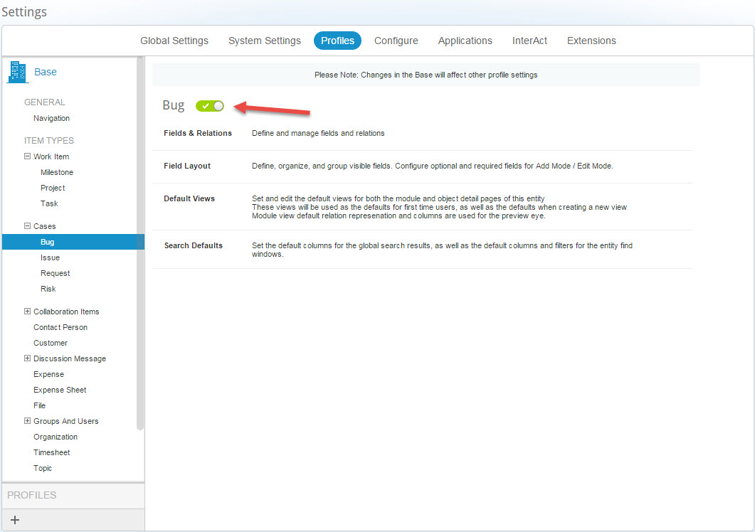
Accessing Profile Settings
- On the masthead , click the User Data menu , and select Settings .
OR
Click 
The Navigation Panel opens.
- Click
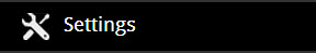
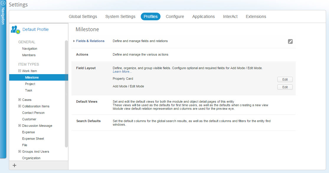
The Settings module opens, the Global Settings tab is selected (DEFAULT) .
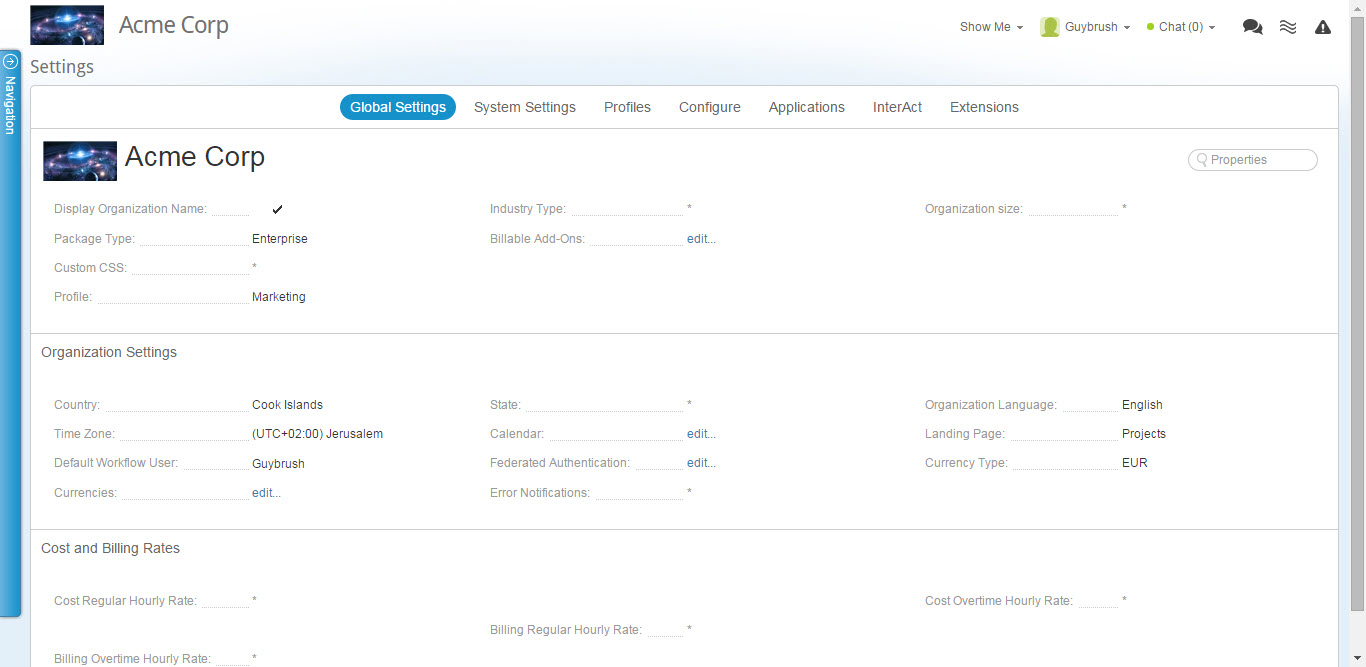
- Click Profiles
The Profiles tab opens.
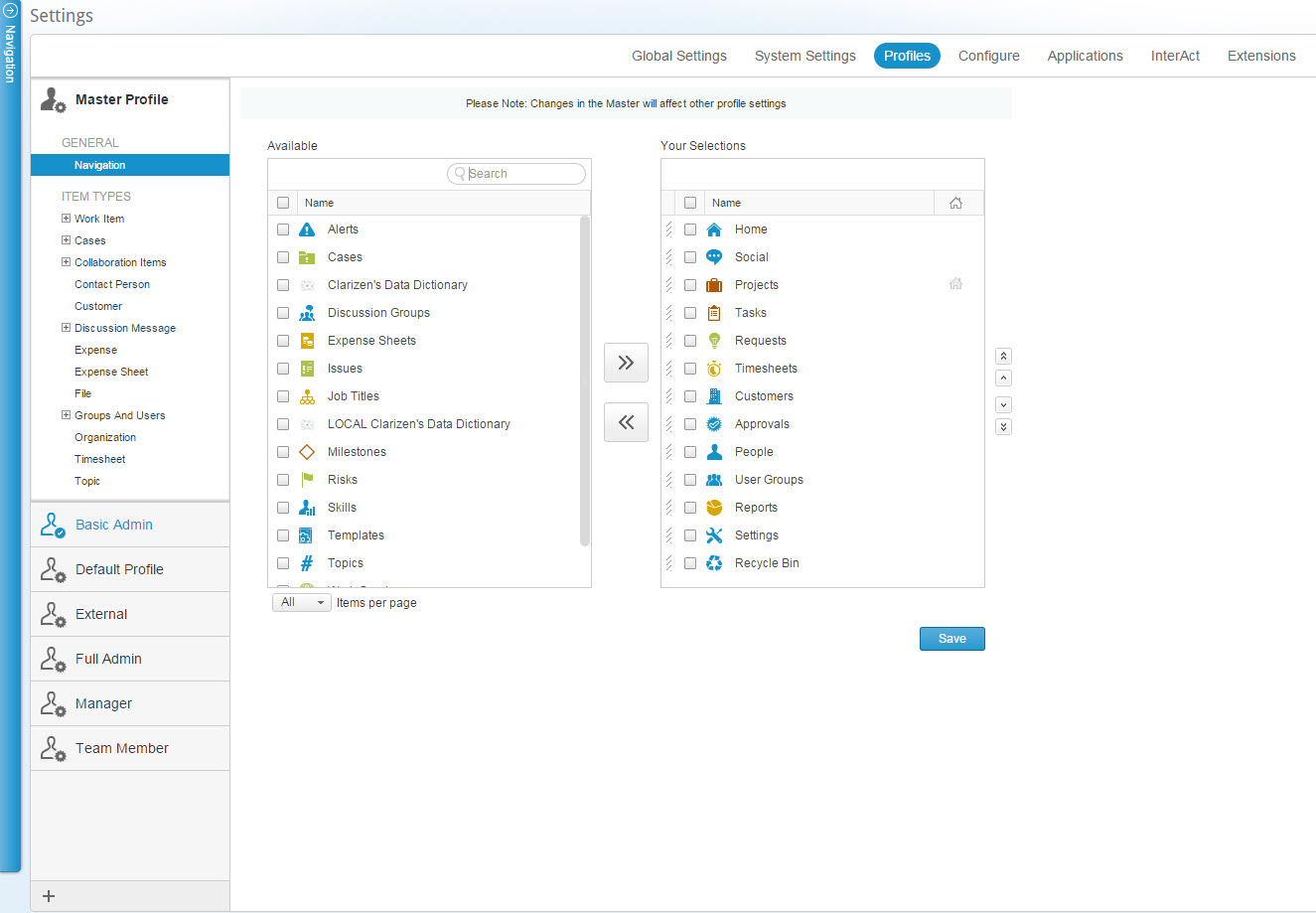
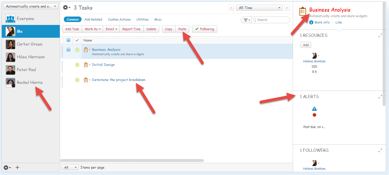
Figure 2: Profiles Tab
The profile panel on the left holds the organizations’ Master Profile settings as well as the organizational default and additional profiles, you also have the option to perform additional profile related actions.
Create your Organization Vision
-
Consider your organization and it’s current flow and usage of the system and create a detailed plan with a breakdown of the different profile types you wish to create
-
Define the system setting associated with ProfilesThere are two system settings that can affect the way that users interaction with Profiles, Aggregate field sets and Allow to set group membership
- Define the Organization's Master Profile
- Define the organization's Master Permission and Visibility Settings
- Define the organization's Master visible Simplicity Settings
- Create or Edit profiles available based on your license type
- Associate the Profile to Members
Change your Profile View
The administrator can associate a user to several profiles, either directly or by group association.
Users not associated to any profile, are automatically associated to the organizational default profile, they will not be able to switch the profile used as they are not associated with any profile.
An admin user has profiles access to all of the organizations available profiles and can always switch between any one of them.
Selecting your profile from your user menu
Users assigned to multiple profiles will see a list of available profiles under the “my profile” section in the user menu located on the masthead.
The profiles available under the “my profile” section are either profiles you were associated with directly or profiles assigned to a group that you are a member of.
Users assigned to only one profile will see the associated profile as well as the organizational default profile.
To switch between profiles:
- Open the user menu located on the Masthead
- A list of available profiles will be shown under the Profiles section
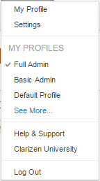
- Select the Profile you wish to use.
Selecting a profile from the user details screen
You can also switch between profiles in the “my details” screen.
To Select a profile from the user details screen:
- Open the User detail screen
- Click the Profile field, if the field is not visible, use the properties text box to search for it
- Click the
 adjacent to the profile name
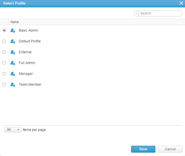
The Select Profile window opens
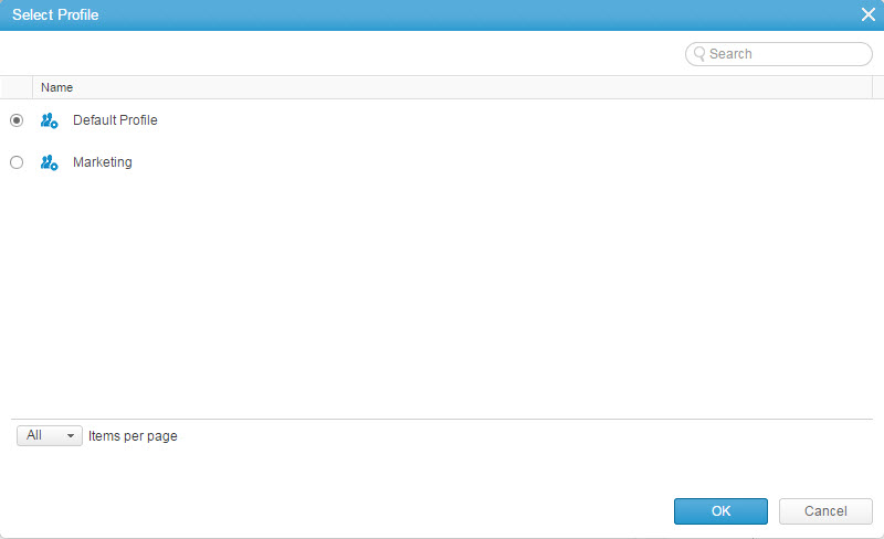
- Select the profile from the list of available profiles, and click

Note:
Administrators can set the active profile for other users from the user detail screen or a user’s property card
Defining the Organization's Master Profile
To remove fields or views from all of the profiles in the organization at once, use the Master profile setting definition
The master profile serves as a basis for the organization, all other profiles created inherit the basic settings from here
Making changes to the master profile after creating or editing additional profiles may affect the existing profiles
Note:
Since the master profile serves only as a platform to build from, it cannot be set as an active profile for a specific person or user group
To define the Organization Master Profile:
- Set the modules availability for the Organization in the navigation panel. see Navigation Panel Layout.
- Activate the relevant items.
- Define what field set will be available for each of the relevant features and modules
- Define the related items available for each of the relevant features and modules
- Define the field Layout for both the property card and if relevant, the New / Edit windows
- Set the default view for each of the relevant features and modules
For your convenience you can access the View Editor directly by clicking
- Set the search columns and other search-related search view settings for each of the relevant features and modules
- Define the Work Item’s Gantt and resource Calendar columns as well as the Gantt Widget columns
- Create and activate a Custom CSS for the entire organization
Create and Manage Profiles
This section describes the various options and action you can perform with Profiles and includes the following sections:
- Creating a new Profile
- Duplicating a Profile
- Editing a Profile
- Renaming a Profile
- Setting a Default Profile
- Deleting a Profile
Creating a new Profile
Note: The number of profiles you can create is dependent on the license type you have
To create a new profile:
- Access the Profile Settings
- Click the Add New button
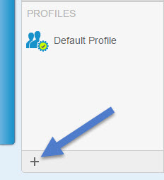
The New Profile window opens
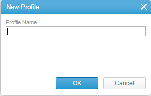
- Give the Profile a name that best describes the use of the profile and click

- A new Profile is created using the settings defined in the master profile
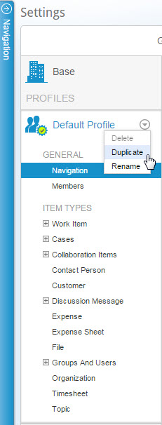
Duplicating a Profile
To create a new profile based on an existing one instead of the Master:
- Open the profile’s contextual menu by clicking the arrow located to the right of the profile name
- Select Duplicate
- The New Profile window opens
- Change the name of the Profile to best describes the use of the profile and click

Editing a Profile
Whether you are working on a newly created profile or editing an existing one follow the steps you need to best suit your needs
- Access the Profile Settings
- Select the Profile you wish to edit
- Set the modules that will be available for the specific profile. see Navigation Panel Layout .
- Associate members with the profile
- Activate specific features to enable their use for members of this profile, the features that can be activated or deactivated are:
- Cases in general or individual cases (bugs, Issues, Requests, and Risks)
- Customer (activates/deactivates Contact person as well)
- Expense Sheet (activates/deactivates Expenses in general as well)
- Timesheets
- Define what field set will be available for each of the relevant features and modules
- Define the related items available for each of the relevant features and modules
-
Define what actions will be available for each of the relevant features and modules
- Define the field Layout for both the property card and if relevant, the New / Edit windows
- Set the default view for each of the relevant features and modules
- Associate views to the profile
Once associated to the profile, all members of the profile will gain the "Viewer" role on the selected view
For your convenience you can access the View Editor directly by clicking
- Set the search columns and other search-related search view settings for each of the relevant features and modules
- Define the Work Item’s Gantt and resource Calendar columns as well as the Gantt Widget columns
- Create and activate a Custom CSS for the specific profile
Renaming a Profile
At any time you can rename the profile to better present what the profile is designed for (e.g. Management vs. Admin, Marketing vs. Internal, etc.)
To Rename a Profile:
- Open the profile’s contextual menu by clicking the arrow located to the right of the profile name
- Select Rename
The New Profile window appears - Change the name of the Profile to best describes the use of the profile and click

Setting a Default Profile
When you have multiple profiles, any of the available profiles can be assigned as the organizational default profile.
- Open the profile’s contextual menu by clicking the arrow located to the right of the profile name.
- Select Set as default.
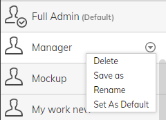
You can also set the default Profile in Global Settings.
Deleting a Profile
When deleting a profile, Users and User Groups associated to the deleted profile will revert to the organizational default profile
The assigned default profile cannot be deleted until a different profile is set to be the default
To Delete a Profile:
- Open the profile’s contextual menu by clicking the arrow located to the right of the profile name
- Select Delete
A warning will appear - Select the confirmation checkbox to indicate that you are aware of the risk
- Click Delete to proceed
Profiles - Assign Members to a profile
As part of the profile definition you need to determine what users are associated with each profile.
Depending on the organization mapping you can select individual users and/or user groups from within the system and associate them with the selected profile
Each User can be assigned to multiple profiles
To associate members to a profile:
- Access the Profile Settings
- Select the Profile you wish to associate members to
- Select Members
The member association multi-find window appears
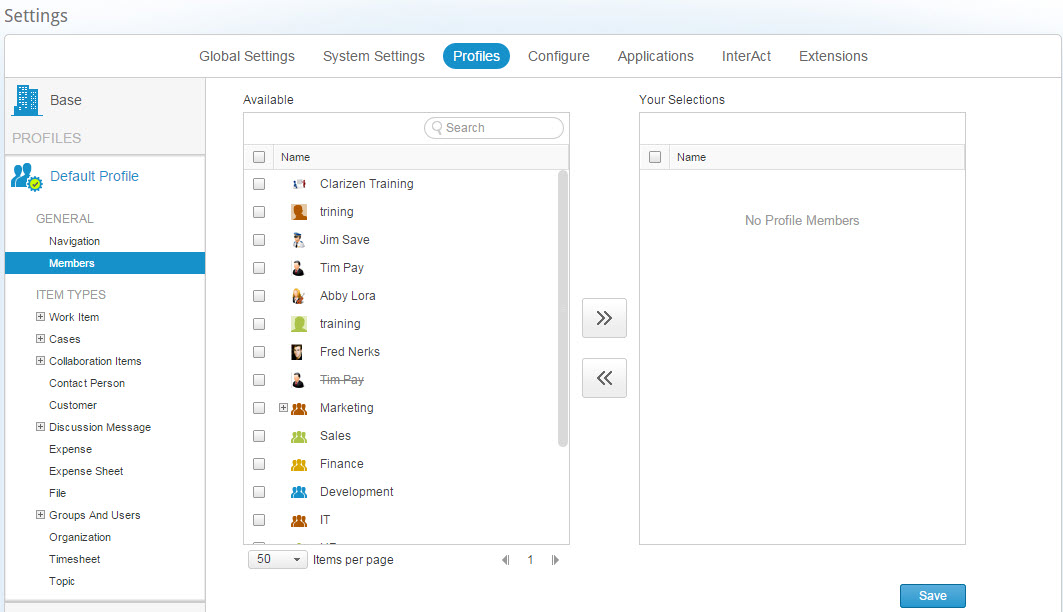
- Select users and / or user groups to add (or remove) them from the profile member association
Tip: 'Click and drag' for selecting list items is supported. - Click the
 and
and  controls to add or remove modules
Tip: Double-clicking to add or remove list items is supported. - Click

Permission & Visibility Settings
Profile definition is based on customizing the various item types for the organization (Master Profile setting) and for each of the available profiles.
The settings can be divided into two, permission & visibility settings described herein and simplicity based settings.
The settings included in the permission & visibility section are settings that define the layout of the system and have a bearing on the system behavior and includes:
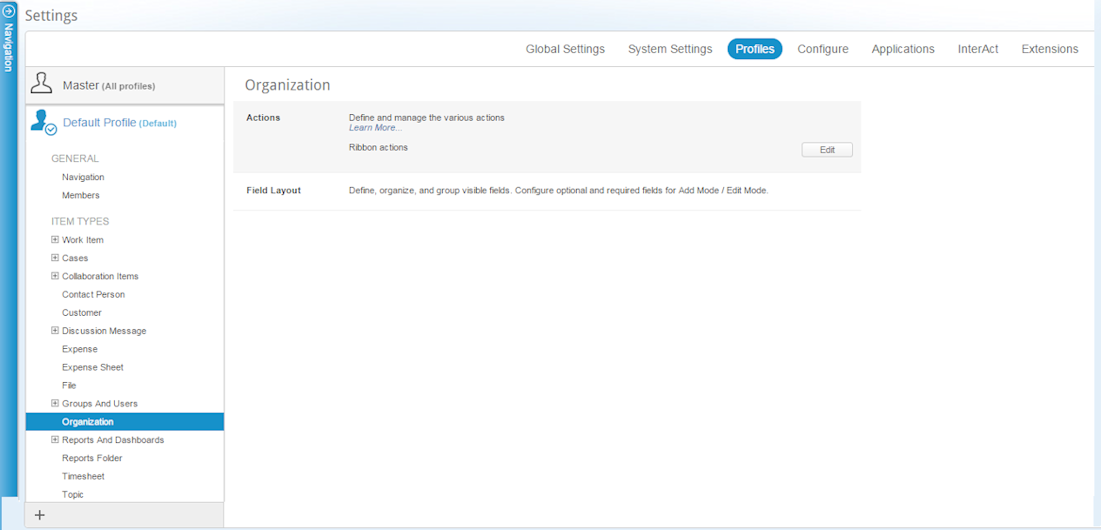
Profiles - Module Availability and Navigation Panel Layout
AdaptiveWork Admin users can add or remove modules to the system in general and to the Navigation Panel display.
The setting can be applied globally across the entire organization or specifically applied to specific profiles.
You also have the ability to configure the order of appearance on the panel.
To define Module availability:
- Access the Profiles tab .
The Profiles setting window opens. - Select either the Master or a specific Profile to edit
- Under General click Navigation
The Navigation Panel multi-find window opens on the right.
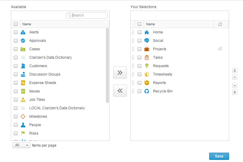
Figure 1: Navigation Panel Multi-Find Window
Available Modules are listed in the right-hand pane, 'hidden' modules are listed in the left-hand pane. - Select modules to add (or remove) module availability
Tip:'Click and drag' is supported.
- Click the
 and
and  controls to add or remove modules.
Tip:Double-clicking to add or remove list items is supported.
- In the right-pane, select modules to edit the order of appearance
- Use the
 controls to edit the module appearance order in te navigation panel
 - Click the Home icon to set the profile's default landing page
- Click

AdaptiveWork confirms your action.
Item Type Activation
Certain item type layouts can be enabled or disabled across the organization, when defined in the Master Profile, or for specific profiles.
The following item types have this feature:
- Program
- Cases in general or individual cases
- Currency Exchange Rate Card
- Customer (activates/deactivates Contact person as well)
- Expense Sheet (activates/deactivates Expenses in general as well)
- Timesheet
- Users And Resources > Groups And Users > Asset Type
- Version
- Work Items Snapshot
- Milestone Snapshot
- Project Snapshot
To activate / deactivate an item type:
- Access the Profiles setting
- Select either the Master or a specific Profile to edit
- From the Module tree hierarchy (left-hand pane) select one of the above item types
- Click
 to deactivate or
  to activate the selected item type
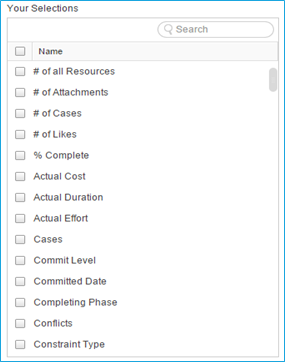
Field Set Definition
The Field Set allows you to determine exactly what fields are available for each item type to users associated to a given profile or across the organization if done on the Master Profile.
The field set availability can be defined in the following item types:
- Milestones, Projects and tasks (under Work Item)
- Bugs, Issues, Requests, and Risks (under Cases)
- Notes and V5 Posts (under Collaboration Items)
- Contact person and Customer
- Post and Reply (under Discussion Message)
- Expense and Expense Sheet
- Files
- Discussion and User Groups
- Job Title, Skills, and Users
- Timesheets
- Topics
To Define field set availability:
- Access the Profiles setting
- Select either the Master profile or a specific Profile to edit
- From the Module tree hierarchy (left pane) select one of the above item types
- In the module setting pane (right pane) open the Fields & Relations Section
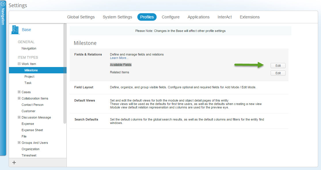
- Click
 adjacent to the Available Fields line
The Available Fields multi-find window opens.
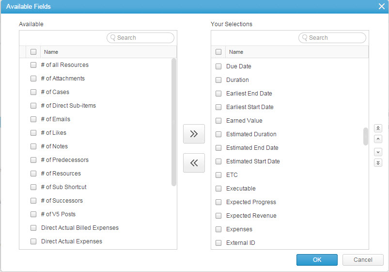
- Select Fields to add (or remove), use the search field to quickly locate the desired fields
Tip:'Click and drag' is supported.
- Click the
 and
and  controls to add or remove fields.
Double-clicking to add or remove list items is supported.
- In the right-pane, select fields to edit the order of appearance
- Use the
 controls to edit the field order of appearance
 - Click

Profiles Related Items
The Related Items allows you to determine exactly what relations are visible to users associated to a given profile or across the organization if done on the Master Profile as well as the i tem 's default order for relevant i tem types.
Related items that are not selected cannot be added or seen within the AdaptiveWork user interface.
The relation availability can be defined in the following item types:
- Work Item including all subsets (Milestones, Projects, and Tasks)
- Cases including all subsets (bugs, Issues, Requests, and Risks)
- Contact person and Customer
- Expense and Expense Sheet
- Files
- Discussion and User Groups
- Job Title, Skills, and Users
- Topics
To customize an item type's related items:
-
Access the Profiles setting
- Select either the Master or a specific Profile to edit
- From the Module tree hierarchy (left pane) select one of the above item types
- In the module setting pane (right pane) open the Fields & Relations Section
-
Click
 adjacent to the Related items line
The Related Items multi-find window opens.
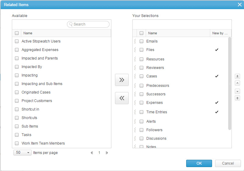
- Select Relations to add (or remove), use the search field to quickly locate the desired relations.
Tip:'Click and drag' is supported.
- Click the
 and
and  controls to add or remove fields.
Tip:Double-clicking to add or remove list items is supported.
- In the right-pane, select fields to edit the order of appearance
- Use the
 controls to edit the field order of appearance
 - Define whether to open the relation view on the Existing or New tabs by checking the New by... field adjacent to each relation
- Click

The item type's related items are customized.
Actions
The Actions section allows you to determine what actions will be available in the ribbon, contextual menu, and bubble popup for users associated to a given profile.
Tip:
The bubble popup is the action menu that appears when you hover over an item that has associated actions.
Removing an action from all locations will effectively render the action unavailable. Due to this fact actions can only be defined for specific profiles and not across the entire organization from the Master Profile.
- Work Item including all subsets (Milestones, Projects, and Tasks)
- Cases including all subsets (Bugs, Issues, Requests, and Risks)
- Contact person and Customer
- Expense and Expense Sheet
- Files
- Discussion and User Groups
- Job Title, Skills, and Users
- Licenses
- Timesheets
- Topics
- Organization
Notes:
- Certain entities, for instance, Work items/Cases, and organization, will not include some of the action settings – e.g. contextual menu, bubble popup, etc
- The Timesheet includes both the general ribbon actions and the Time entry (relation) ribbon actions separately
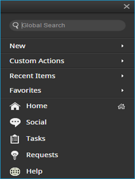
- The Organization action setting defines what actions are available in the Navigation pane (New, Custom Actions, Recent Items, and Favorites)
To define Action Availability:
- Access the Profiles tab.
The Profiles setting window opens. - Select a specific Profile to edit
- From the Module tree hierarchy (left pane) select one of the above item types/Modules
- In the module setting pane (right pane) open the Actions Section
- Perform the following for each of the available button locations:
- Click
 adjacent to the button location i.e. Ribbon, Contextual Menu, bubble popup, etc.
Note:
Timesheet as an example for multiple actions settings
Note:
Organization actions settings as an example for a single option definition
The Action setting window opens.
The available action depend on the item type and button location selected.
The following image is an example.
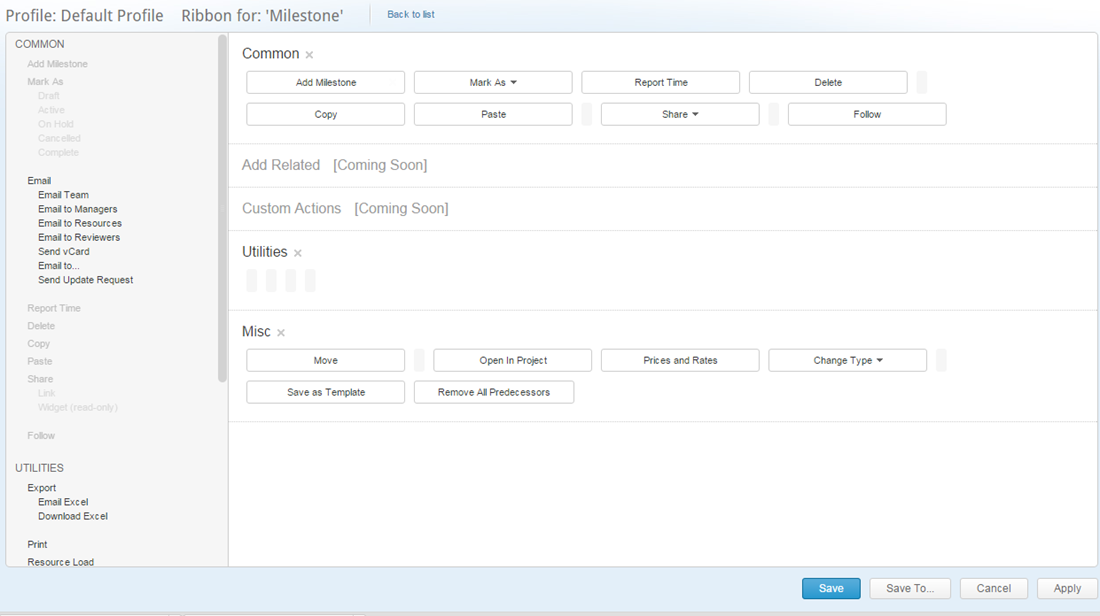
- Remove actions by clicking the X that appears when you hover over an action.
Add actions from the list in the available action pane
You can add or remove entire sections using the X adjacent to the action titleNote:
Removing actions from all locations will turn the action off entirely
- Click
 to save the changes and return to the previous window
Click to save the changes keeping the window open
Click to save the changes on a different profile, the Select profile window opens
- Click
- Repeat the process for all relevant locations
Simplicity Based Settings
Profile definition is based on customizing the various item types for the organization (Master Profile setting) and for each of the available profiles.
The settings can be divided into two, permission & visibility settings and simplicity based settings described herein.
The settings included in the Simplicity section are settings that define the layout of the system allowing you to create a clutter free environment and tailor the views to the user's needs and includes:
- Field Layout — Define, organize, and group an item type's Property Card and configure both optional and required fields for the Add Mode & Edit Mode windows.
- Default Views — Set and edit the default views for both the module and item detail pages of a default view.
The default views are used as defaults for first-time users, as well as the default views used when creating a new view.
Module view default relations, representation and columns are also used for the Quick Peek.
- Search Default — Set the default columns for Global Search results as well as the default columns and filters for the item type find windows.
- Gantt Columns — Set both the Gantt and Resource Calendar work item columns, available on the grid left-hand side.
- Custom CSS - Create a custom CSS to define the colors and layouts of the view shown either to a specific profile or across the entire organization
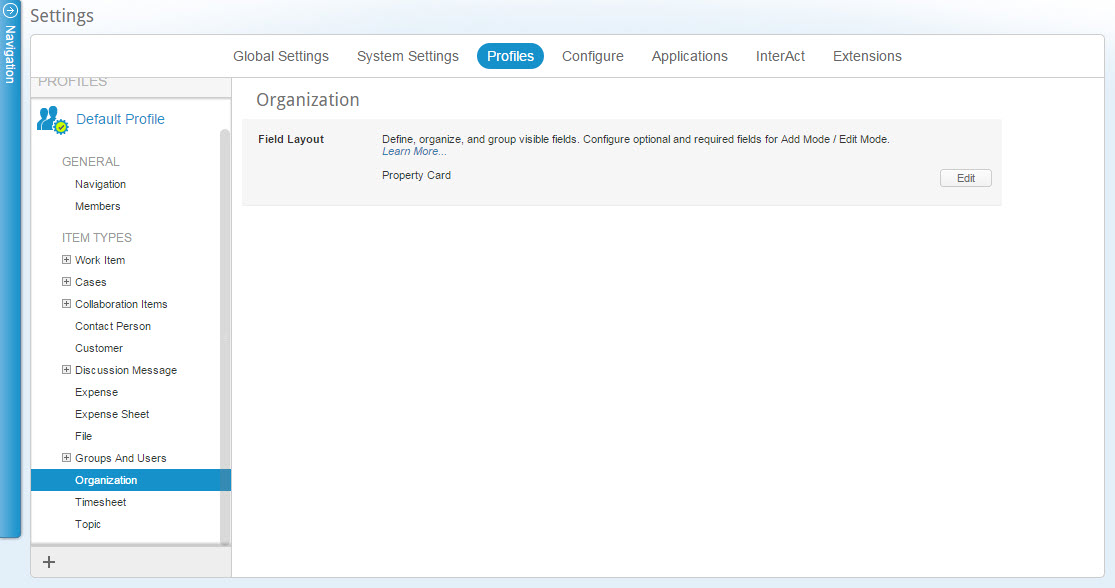
Field Layout
The Field Layout allows you to define how Property Cards Page Layout and Add/Edit modes of items are displayed to users associated to a specific profile, or across the organization if done on the Master Profile.
Define, organize, and group an item type 's visible fields. Configure optional and required fields for the Add mode and/or Edit mode.
Field Layout definitions is available for the following item types:
- Milestones, Projects and tasks (under Work Item)
- Bugs, Issues, Requests, and Risks (under Cases)
- Contact person and Customer
- Expense and Expense Sheet
- Files
- Discussion and User Groups
- Job Title, Skills, and Users
- Organization
- Timesheets – Add/Edit Mode card only
- Topics
To customize an item type Layout:
- Access the Profiles tab .
- The Profiles setting window opens.
- Select either the Master or a specific Profile to edit
- From the Module tree hierarchy (left-hand pane) select one of the above item types
- In the module setting pane (right pane) open the Field Layout section
- Define the Property Card Layout
- Click
 for Property Card options
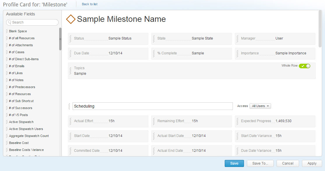
- Click and drag fields from the Available Fields panel to the item type pane
- Click and drag to arrange filed positions within the the item type pane
- Edit column names
- Define the Access from the drop-down list
- Remove sections; hover the mouse pointer over a section to expose the
 , and click on it
 - Add sections; click

- Click
 to save the changes and return to the previous window
Click to save the changes keeping the window open
Click to save the changes on a different profile, the Select profile window opens

- Click
- Define the layout for the Add Mode / Edit Mode windows:
- Click
 for Add Mode / Edit Mode options
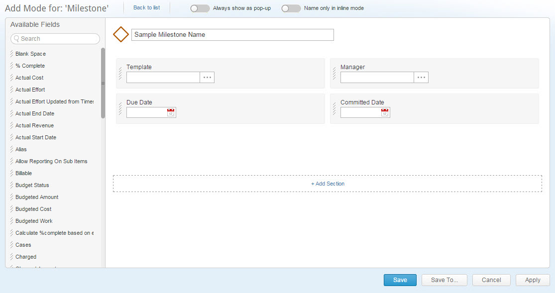
- Define the Always Show as a pop-up control
- Define the Name Only in Inline Mode control
- Click and drag fields from the Available Fields panel to the Item Type pane
- Click and drag to arrange filed positions within the the Item Type pane
- Remove sections; place the mouse pointer over a section to expose the
 , and click on it
 - Add sections; click

- Click
 to save the changes and return to the previous window
Click to save the changes keeping the window open
Click to save the changes on a different profile, the Select profile window opens

- Click
- Repeat the process for each of the Item Types you wish to define
The Field Layout is customized
Default & Associated Views
Set the default and associate views for both the module and item detail pages for the entire organization under Master and for each individual profile.
The default views are used as defaults for first-time users, as well as the default views used when creating a new view.
Module view default relations, representation and columns are also used for the Quick Peek .
Default views are available for the following modules and item types:
- Work Item including all subsets (Milestones, Projects, and Tasks)
- Cases including all subsets (bugs, Issues, Requests, and Risks)
- Contact person and Customer
- Expense and Expense Sheet
- Files
- Discussion and User Groups
- Job Title, Skills, and Users
- Licenses
- Timesheets
- Topics
To customize an item type's default view:
-
Access the Profiles tab.
- The Profiles setting window opens.
- Select either the Master or a specific Profile to edit
- From the Module tree hierarchy (left-hand pane) select one of the above item types
- In the module setting pane (right pane) open the Default Views section
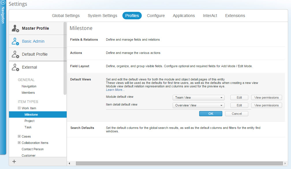
- From the drop down menu select a default view for the Module default view
- From the drop down menu select a default view for the Item detail default view
- For your convenience you can access the view settings by clicking

Note:A special case is the discussion group where you can also create new Item detail views.
Discussion item detail view creation can only be done by an admin from the profiles
- If editing a specific profile (Not Master ), click
 to define the view sharing for the various views associated with the profile
The View permissions window opens
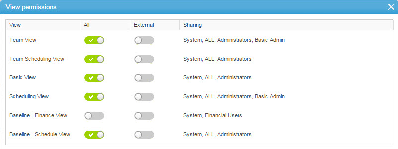
- For each of the available views activate/deactivate the All and/or profile sharing
- Under Sharing select a view to define the sharing level for each of the selected entities
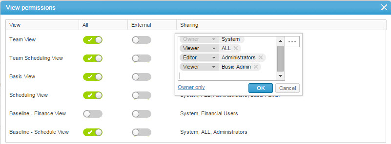
- Click
 to open the Share With multi-find window
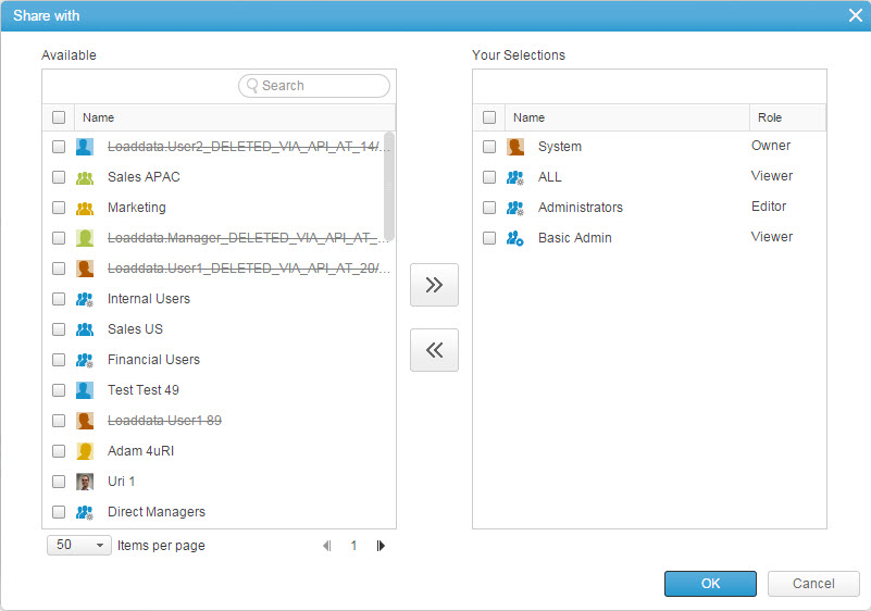
- Select users, groups or virtual groups to add (or remove), use the search field to quickly locate the desired views
'Click and drag' is supported.
- Click the
 and
and  controls to add or remove views
Tip:
Double-clicking to add or remove list items is supported. - In the right-pane, select views to edit the order of appearance
- Use the
 controls to edit the order of appearance
 - Click
 to close the Share With multi-find window
Once associated to the profile, all members of the profile will gain the "Viewer" role on the selected view(s) - Click
 to save the view sharing settings
Search Defaults
Set the default columns for Global Search results, as well as the default columns and filters for the item type find windows.
Search default settings are available for all of the item types with the exclusion of Posts, Replies, Organization, and Timesheets
To customize an item type's search defaults:
- Access the Profiles tab
- The Profiles setting window opens
- Select either the Master or a specific Profile to edit
- From the Module tree hierarchy (left-hand pane) select a module or item type
- In the module setting pane (right pane) open the Search Defaults section
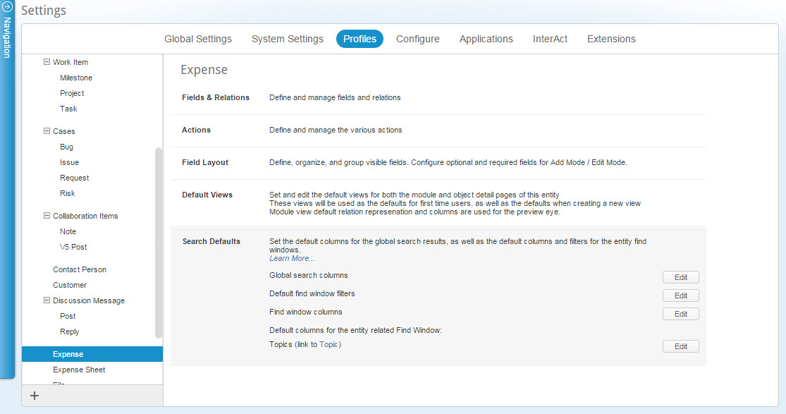
- The list of relevant columns and filters that are definable as search defaults is displayed.
- Click
 adjacent to the column or filter type to be edited.
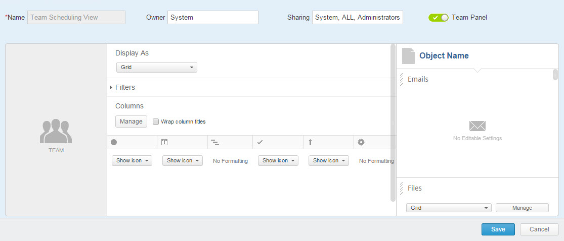
The relevant multi-find window for that column or filter type opens. For Example:
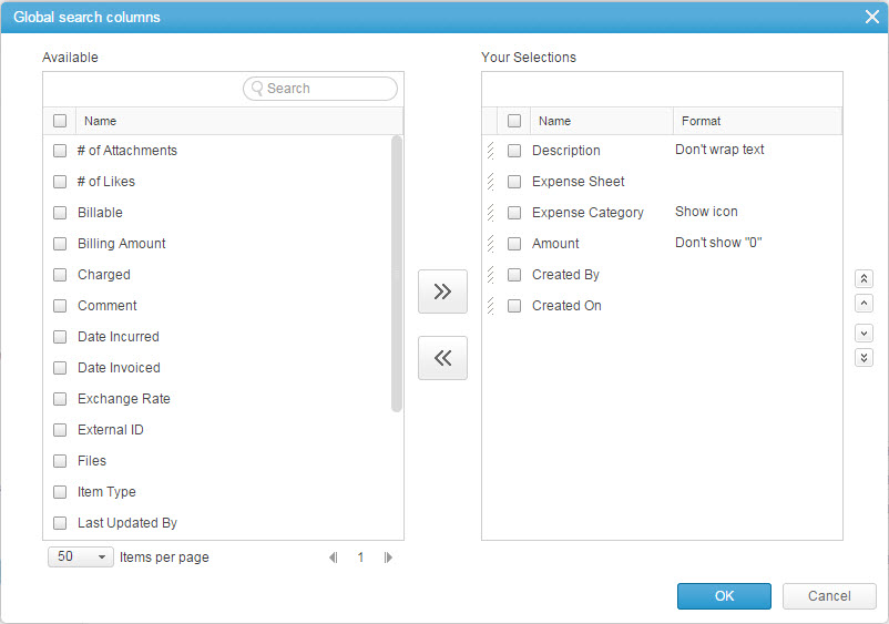
The Available (left) pane lists available relevant column or filter types. Search defaults already set for Item Types are listed in the right pane. - Select column or filter type s to add (or remove)
- Click the
 and
and  controls to add or remove column or filter type s
 - Define the column or filter type Format
- Select column or filter type s to edit the order of appearance
- Click the
 controls to edit the column or filter type s appearance order
 - Click

The item type's search defaults are customized.
Calendar Columns
Define the Work Item’s Resource Calendar columns either the entire organization using Master or for specific profiles.
To customize a work item's Calendar columns:
- Access the Profiles tab
- The Profiles setting window opens
- Select either the Master or a specific Profile to edit
- From the Module tree hierarchy (left-hand pane) select the Work Item module
- In the module setting pane (right pane) open the Calendar Columns section
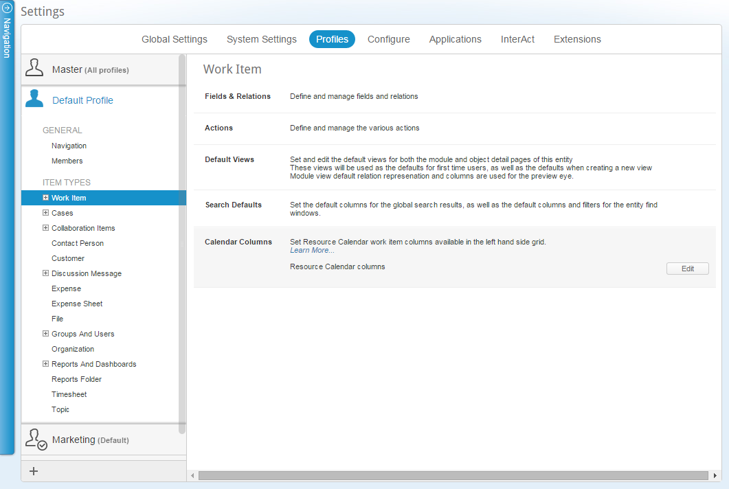
- Click
 for Resource Calendar options
 - The relevant multi-find window opens.
The Available (right-hand) pane lists the available relevant columns
The Resource calendar columns already available for work items are listed in the right-hand panes
- Select columns to add (or remove)
- Click the
 and
and  controls to add or remove columns
 - Define the column Format
- Select columns to edit the order of appearance
- Click the
 controls to edit columns appearance order
 - Click

The work item Resource Calendar columns are customized
Custom CSS
AdaptiveWork offers organizations the ability to customize the applications CSS (style sheet) to suit their organizations need.
Custom CSS allows you to have custom colors, fonts, icons and even backgrounds and can be applied across the entire organization using Base or for specific Profiles .
Below are detailed instructions on how to access the Custom CSS field and some examples of how you can update your organizations fonts, colors, and background.
Adding the Custom CSS Field to the Layout
To begin to customize the CSS of your AdaptiveWork account, you must first add the "Custom CSS" field into the Organizations profile card.
To add the Custom CSS field:
- Access the Profiles tab
- The Profiles setting window opens
- Select either the Base or a specific Profile to edit
- From the Module tree hierarchy (left-hand pane) select Organization
- In the module setting pane (right pane) open the Field Layout section
- Click

- Drag & Drop the Custom CSS field into the layout
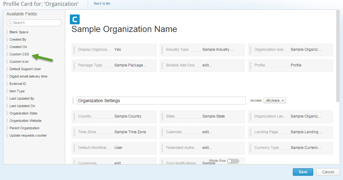
- Click

- Click the Global Setting Tab
- Begin creating your CSS
Profile specific CSS
To configure and brand the user interface for a profile:
- As a System administrator, navigate to Settings > Profiles > Properties.
- Turn the toggle next to each property as desired.
- To apply custom branding, add the desired styles in the Custom CSS text area.
- Click Save.
Custom CSS Examples
- Changing Background Image
- Header Fonts
- Changing Colors and Fonts Across the Application
- Changing the Navigation Panel
Changing the background image
You can change the background image that will be used in the application by adding the following:
{
background: #000 url("http://www.hdwallpapers.in/walls/abs..._8016-wide.jpg") no-repeat right top;
-webkit-transition: none;
-moz-transition: none;
transition: none;
box-shadow: 0 3px 3px rgba(0, 0, 0, 0.1)inset;
}
Within the parenthesis after url you can enter an image hyperlink
To apply this setting on a specific profile (for example marketing) the code should be:
{
background: #000 url("http://www.hdwallpapers.in/walls/abs..._8016-wide.jpg") no-repeat right top;
-webkit-transition: none;
-moz-transition: none;
transition: none;
box-shadow: 0 3px 3px rgba(0, 0, 0, 0.1)inset;
}
Changing the header font colors
You can change the header font colors by adding the following:
#HeaderWrapper,
#headerWrapperWizard,
#TitleView {padding-left:0;}
#header {margin-left: 50px;}
#logo {margin-left: 0;}
.header-view-fl h2 {color:#FF00FF;}
Where:
#orgName strong {color:#800000;} - will change the org name color - in this case to maroon
.header-view-fl h2 {color:#FF00FF;} - will change the title of the subsystem (e.g. settings) - in this case to magenta
.hd-btn {color:#FFA500 !important;} - will change the masthead button colors - in this case to orange
You can also change the font and font size for each item, simply by adding "font-family" and "font-size" after the color, as indicated below:
The above changes will make the header look like this:

Changing colors and fonts across the application
You can change the colors and font across by doing the following:
color: #CA1650 !important;
font-family: cursive;
font-size:15px !important }
font-size: 18px;
color: #F10000;
padding-right: 20px;
margin-bottom: 2px;
font-family: cursive;
}
color: #999;
font-family: cursive;
}
font-family: cursive;
}
background: #CA1650;
color: #fff;
}
font-size: 28px;
font-family: cursive;
}
font-family: cursive;
}
color: #333;
font-family: cursive;
}
color: #333;
font-family: cursive;
}
font-family: cursive;
}
font-family: cursive;
}
font-family: cursive;
}
font-family: cursive; }
background: #CA1650; }
color: #CA1650;}
In the above, each element has to be specified and can have a different font/color as needed.
In this example, fonts were changed to "cursive" across the app, and the colors of certain elements, for example, the field names in property cards (.field-name) was changed to a maroon like color:
color: #CA1650 !important;
font-family: cursive;
font-size:15px !important }
Button colors for Ok, Save, etc., are also changed in the above example by entering:
background: #CA1650; }
Adding the above, will change the application's fonts and colors to look like the image below:
Changing the navigation panel
You can change the navigation panel so that it will be a button on the masthead rather than a side bar by adding the following:
.global-nav
{
left: -240px;
-webkit-transition: left .3s;
-moz-transition: left .3s;
transition: left .3s;
}
.nav-caption
{
width: 36px;
height: 36px;
bottom: auto;
box-shadow: none;
top: 5px; left:5px;
border-radius: 3px;
background: #fff;
transition-delay: 0s;
-webkit-transition: none;
transition: none;
}
.nav-caption:hover {background:#d2ebfc;}
.nav-caption-arr:before,
.nav-caption-arr:after
{
background:#666;
width:20px; height:4px;
position:absolute;
display:block;
line-height:0;
content: ' ';
border-radius:5px;
}
.nav-caption-arr {top: 16px; left: 8px;}
.nav-caption-arr:before {top:-8px; left: 0;}
.nav-caption-arr:after {top:8px; left: 0;}
.nav-caption .flip-v {display:none;}
/* OPEN NAVIGATION */
.nav-op .global-nav
{
left: 0;
box-shadow: 3px 0 5px rgba(0, 0, 0, 0.3);
}
.nav-op #siteWrapper
{
left: 0;
filter: gray;
-webkit-filter: grayscale(0%);
z-index: 0;
overflow: hidden;
}
.nav-op #TitleView,
.nav-op .container
{
padding-left: 0;
}
.nav-op #contentWrapper,
.nav-op #glAdminContent
{
left: 0;
}
.nav-op #logo,
.nav-op .obj-details
{
margin-left: 0;
}
.pop-content {color:#333;}
#contentWrapper
{
left: 0;
bottom: 0;
right: 0;
box-shadow: none;
border-top: 1px solid #333;
background: rgba(255, 255, 255, 0.8);
}
This code is a bit more complex and should be taken as is. Please note that you can change the colors of the button background and the like as needed. Once updated, the navigation panel access will look like this:
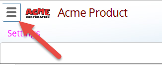
Changing the Navigation Panel to a button will also require you to make changes to the header in order to move the logo on the top left to the right. Specifically you can add this piece of css, or update the existing header css (if already changed) as follows: