
Mobile Module & Detailed Views
Mobile Module & Detailed Views
The module view and layout is defined by your web app profile definition.
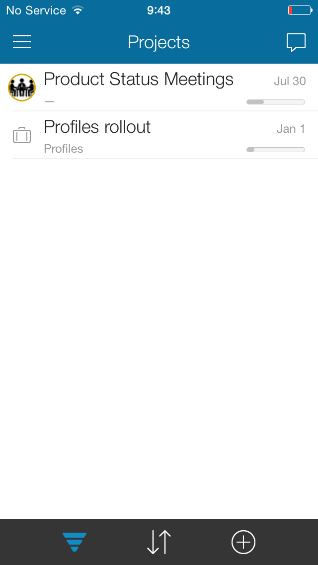
Module view
Each module consists of a title bar containing the Navigator access button, the module name, and the Social access button.
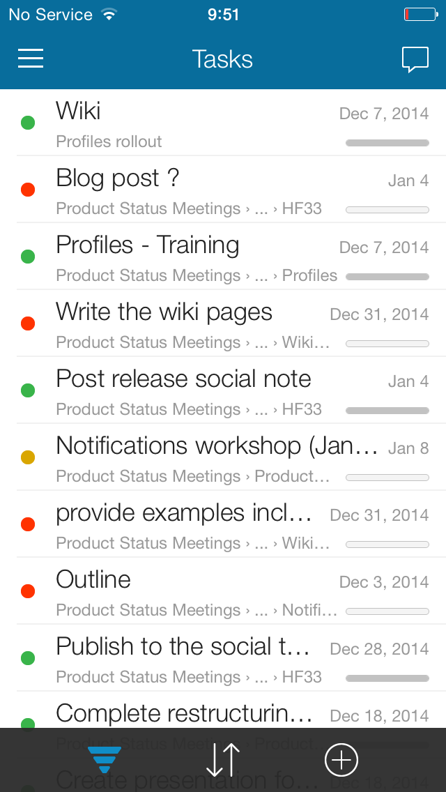
Under the title bar you will find a list of all available items associated with the module, swipe down to reveal the search field which allows you to quickly locate the item you seek.
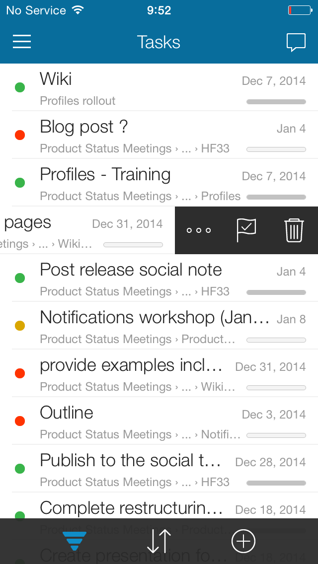
Click an item to drill down to the item's detailed view, you can also swipe left to open the Action menu.
Bottom tool bar
The bottom bar contains the Sort, Filter, and Add new buttons.
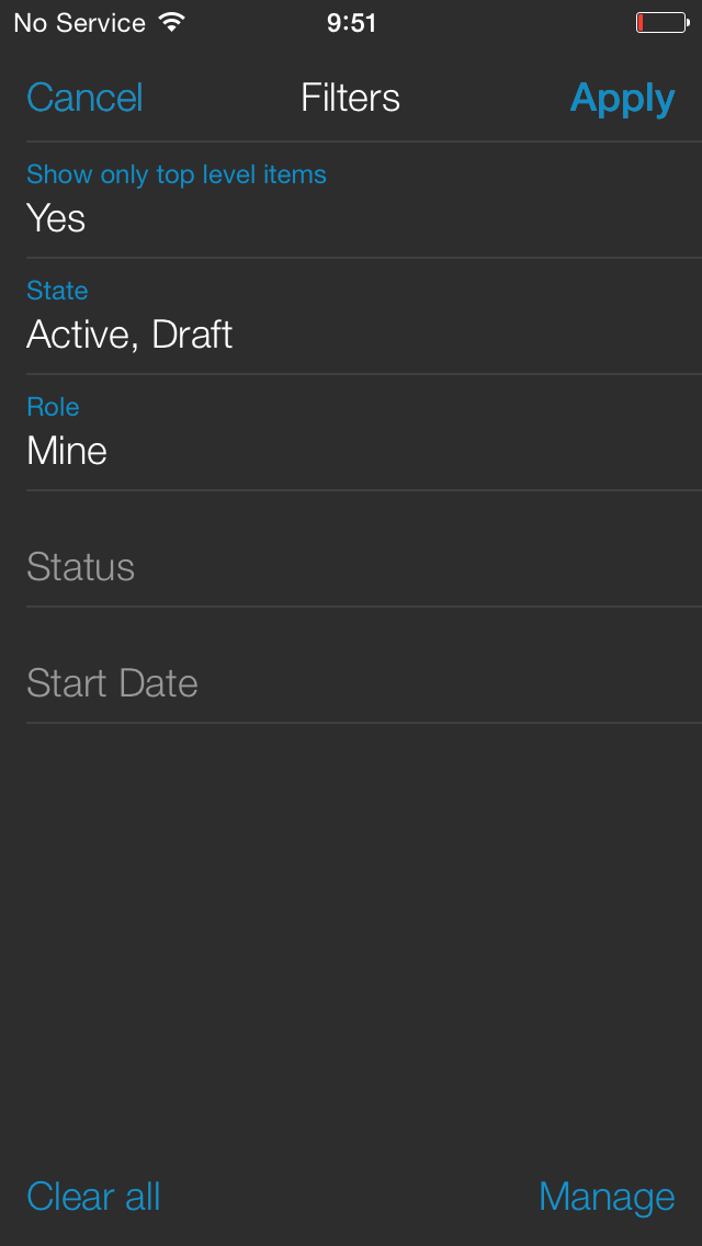
Filters
The mobile app provides complete filter functionality, just like the web app, filters assigned are remembered even if you logout of the app, you will know that filters are active when the filter icon is marked in blue.
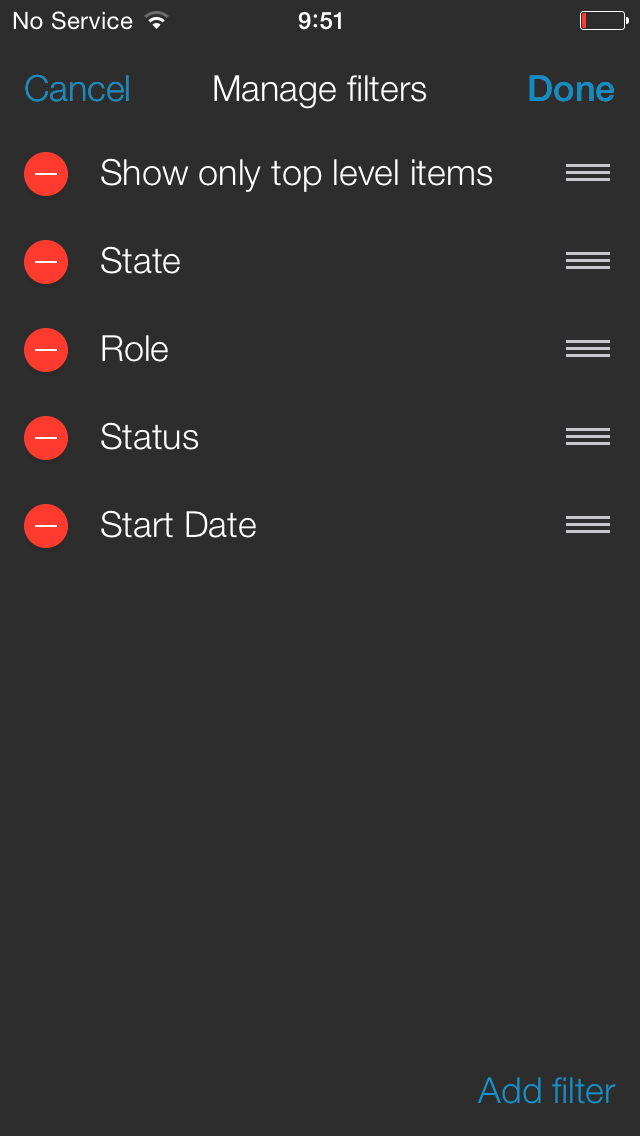
Tap the filter icon to open the filter option page, tap an hold the icon to open the filter management screen.
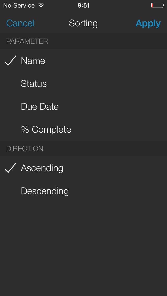
Sort
You can sort the data viewed in ascending or descending order based on any field in the module view, sorting used are remembered even if you logout of the app.
Tap the Sort icon to open the sorting option screen.
Add New
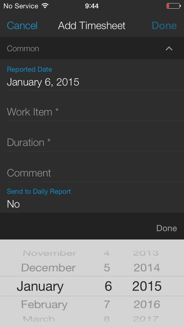
To add new items:
- Tap the New icon
- The add new screen opens, the form layout depends on the "add form layout" derived from the use's current profile
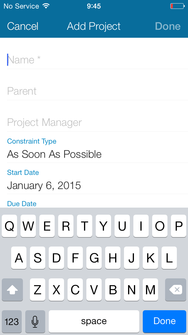
- Once you entered all of the details, tap Done to save or tap and hold for the Save and New option
Detailed view
The detailed view consists of the top bar containing the back button, title, and the social access button. below it are the detailed view title and icon.
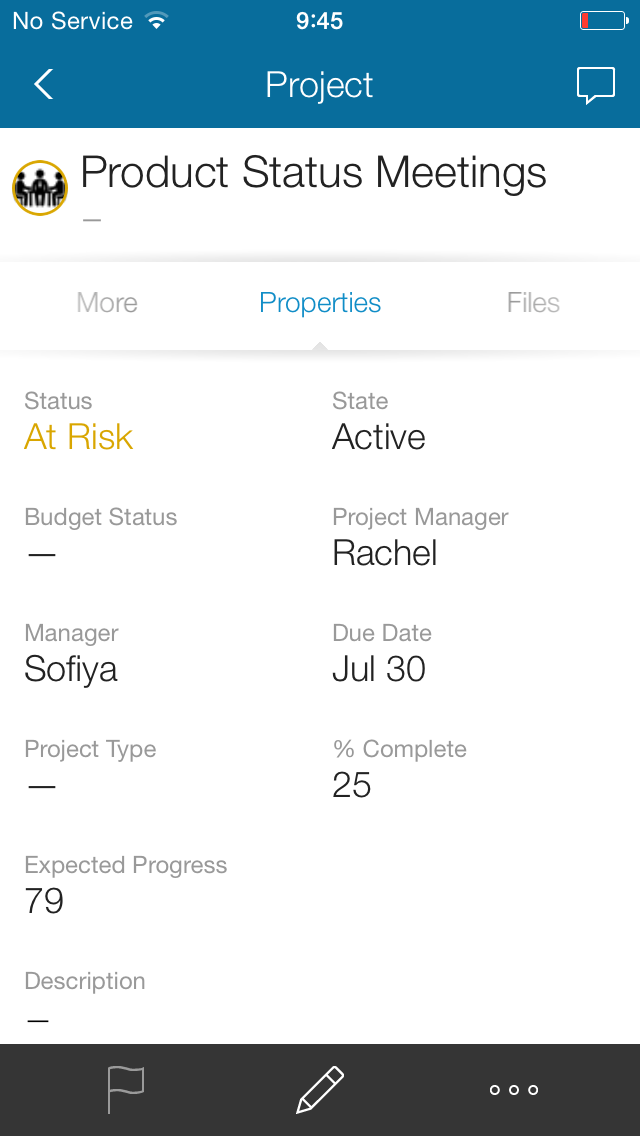
Spinner Bar
Under the detailed title is a spinner bar normally opened on the Property card, the content depends on the layout setting of the user's current profile.
The view consists of a bottom panel containing the Pencil icon, which provides access to the property editing options, one main action (different for each of the various modules), and access to a list of all actions on the right (…)
Swipe the spinner left and right to move between relations or tap and hold the spinner for direct access to the entire Relations/Action menu.
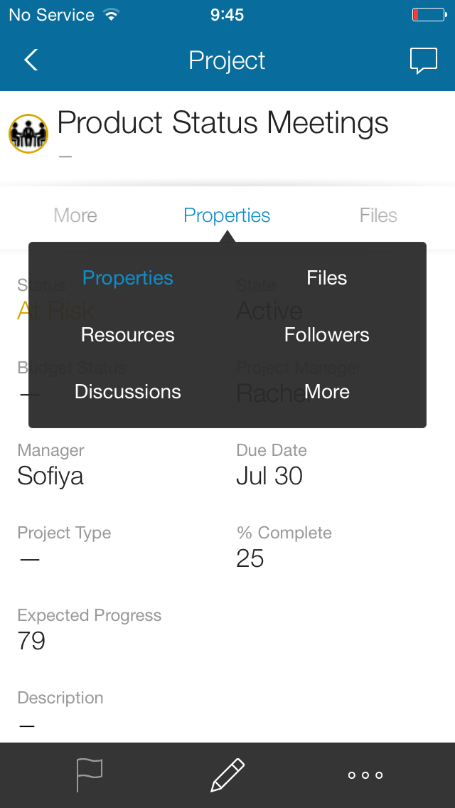
The main relations can be accessed directly from within the spinner, all other relations are under the ‘more’ panel
Note:
Empty panels are also shown in the spinner.
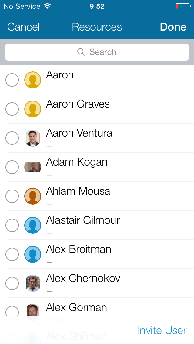
Avatars and Icons
Avatars and Icons can be replaced with an image from your mobile's image library or with a picture taken using the mobile's camera.
Note:
You can replace the avatar/icon in all relevant modules including user photo, group icons, customer avatars, project icons, etc. provided that you have permission to do so.
To replace the avatar/icon:
- Click the Avatar/Icon
- From the opened menu, select whether you wish to use a new photo or an existing file, you can also choose to revert to the default icon
- After taking a photo or selecting a file, click Use Imgae
A preview of the image will be shown - Click Done to update the avatar/icon
Special Modules
There are several modules that are considered special and behave a little differently:
- Time Sheets
- Files
- People
Time Sheets
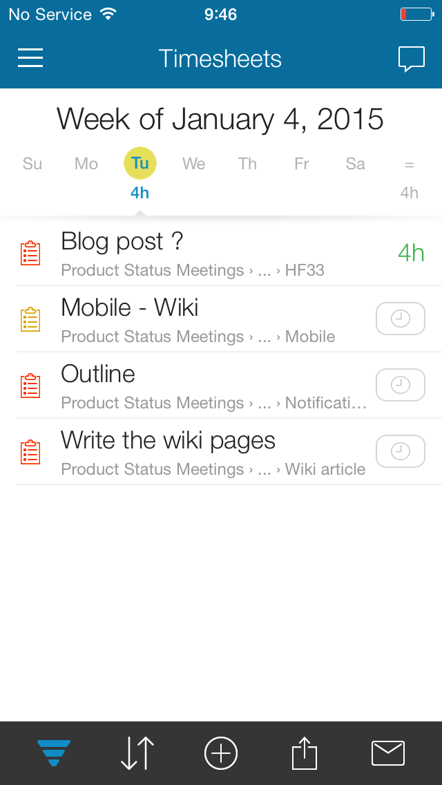
The Timesheet module's top bar contains a Week title and selector, beneath is a Day selector and a summary of the reported hours.
A list of my reportable items, with the ability to drill down or to the actual report time, is listed below it. The actual time report form depends on the layout of the user's current profile.
Swipe left to access the Action menus which includes:
- Stopwatch – will appear at the top of the app as a green icon
- Duplicate
- … for other actions such as 'Mark as' and 'Delete'
Besides the standard module icons, the timesheet bottom toolbar contains the report time button, submit report icon, and the update timesheet request icon.
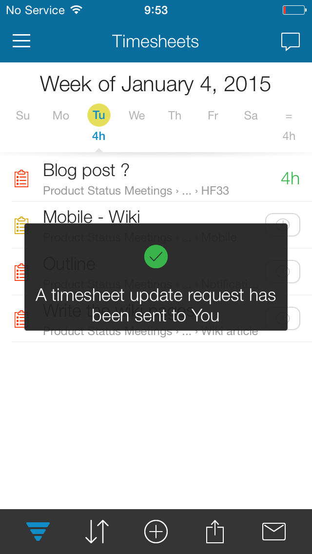
Timesheet items are color coded:
- Un-submitted items are in black
- Submitted items are marked yellow
- Approved items are in green
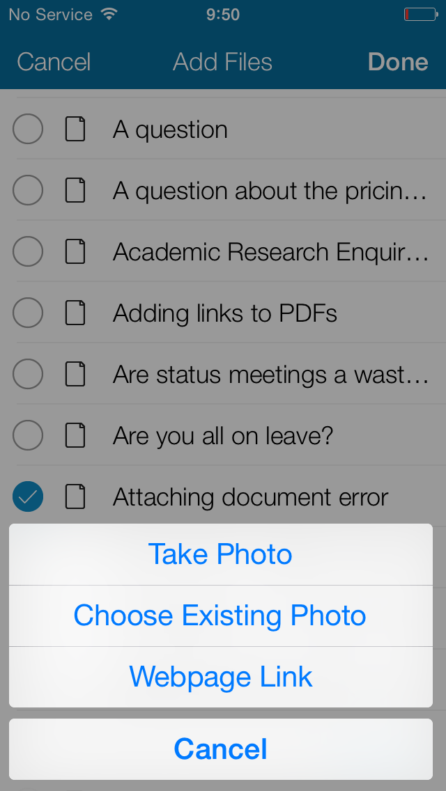
Files
Another special module is the File viewer, the mobile app supports a File viewer that gives the user complete in context access to associated files, including files associated with Box and/or Google drive, the module will open with the default relation in drill down. You also have the option to add files from your mobile's memory, webpage links, and even photos taken by your mobile camera.
Note:
Anywhere you see a camera icon tap it to to take a photo or choose an existing photo from the mobile phone memory.
People
The People detailed view works much like any other detailed view with the exception that it also provides collaboration actions at the top bar which includes
- Call work
- Call mobile
- Send a text message