
Creating and Using Reports
In this section you will learn how to:
- Access the Reports Module
- Create a Basic Report
- Copy a Report
- Include Related Data
- Add Filters to a Report
- Add Business Highlights
- Add Report Highlights
- Add Charts to the Report
- Work with Advanced Formula Fields
- Exporting & Sending Reports (Excel and PDF)
- Scheduling Reports and Creating Snapshots
- Use the Results Table
- Work With the Results Table
- Create Multiple Pivot Reports
- Working with Multiple Currencies
To learn about sharing, related panels (discussions and emails), and permissions, see Getting Started with Reports.
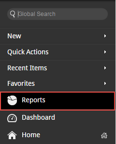
Accessing the Reports Module
To access the reports and dashboards:
- Open the Navigation Panel.
- Select Reports.
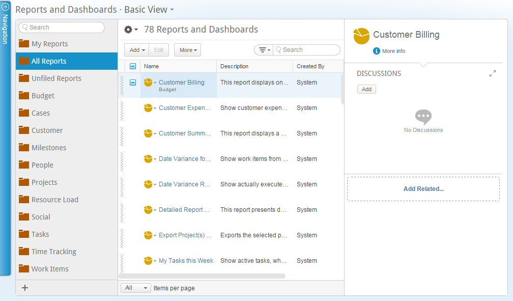
The Reports and Dashboards main view opens.- My Reports – each user in the organization has a private folder that can be used to save personal reports & dashboards
- All Reports – displays a list of all the reports & dashboards that you have permissions to view
- Unfiled – a public folder available to everyone in the organization
- Predefined reports organized in folders - to be used as is, or as templates
Creating a Basic Report
- From the main navigation menu, click New > Report, or select the Reports module and click New Report in the ribbon.
- In the Report Name field, give your report a name. By default, the report will be saved in the folder you are in. To change the folder in which the report is saved, click Change...
- Add report owners if needed.
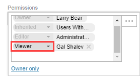
- Set the sharing permission level:
Note: Users who have access to the folder are inherited into the newly created report.
- Click Permissions.
- Click

The Share With window opens
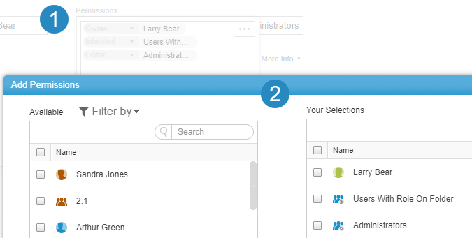
- Select specific users, user groups, profiles, and special groups (such as super user, administrators, etc.) to add them.
- Click the arrows to add or remove from the list.
Tip: Double-click to add or remove list items. - Set the Role (Viewer or Editor) for each of the selected entities.
- Click Save.
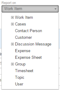
- Set the Data you wish to report on from the Report On list.
- Enable the Editable Report option if you want to edit this report after running it. Once enabled you will be able to edit data of the first selected Data Set only (related data fields will be read-only). If disabled the report will be read-only.
- Click Apply to save the report or Save and Run to save and run the report.
Copying a Report
To copy a report, open the report for editing and save the report as a new report.
- In the Reports list, select the report and click Edit. You can also open a report and click Edit.
- Click Save As...
- Enter a new name for the report, and then you can continue to edit the report or save it.
Including Related Data
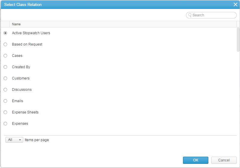
Add related data in the Include related data field.
In the Select Class Relation window, select the desired data relation and click OK.
You can set up to three levels of related data, which will be related to the previously added related data.
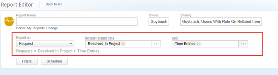
In the screenshot, you see a report created for Request, with two related data objects:
- Resolved in Project – Shows projects referenced in Requests
- Time Entries – Displays timecard entries on Resolved In Project
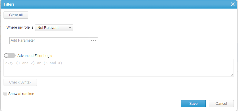
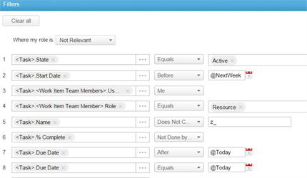
Adding Filters to a Report
Add filter parameters either on the report entity or the related data.
- Click Filters.
-
For objects with a role (work items, cases, etc.) you can set the role filter.
By default the role is set to Not Relevant, which shows all objects. The role can be filtered for a specific role - such as project manager, reviewer, etc. or to any role the user has. -
Add filter parameters and set their conditions and values.
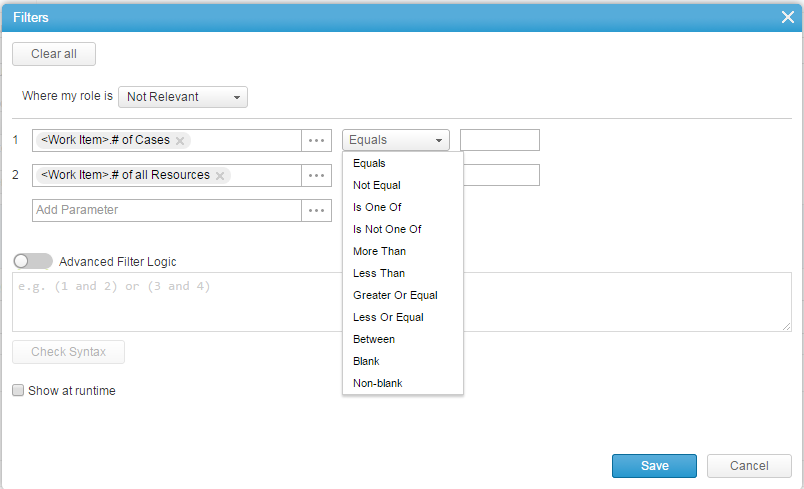
- Filters can be simple or advanced.
Simple filters simply mean that each filter criteria is separated by an “and” condition while advanced allows you to add an “or” between parameters.
- Click Advanced.
- Define the filer logic.
- Click Check Syntax to check the filter logic you created.
-
Select Show at runtime to allow the user to set/edit filter values on running the report.When Show at runtime is selected, you can leave filter values blank or set a default value.
- Click Save to save the filter settings and close the window.
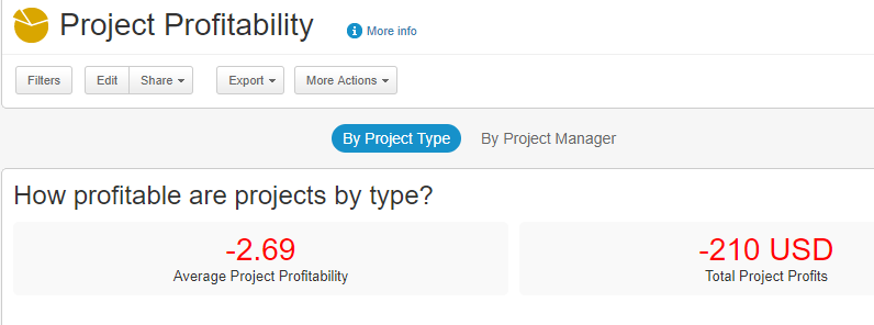
Adding Business Highlights
Add business questions to clearly define what the pivot tab represents.
For example, in a Project Profitability report, you can add the question (highlight) - How profitable are projects by type? This can appear before highlights and charts.
Adding Report Highlights
AdaptiveWork reports allow you to create on-the-fly KPIs or highlights onto each pivot tab of a report. These highlights allow you to quickly view the most critical data of a report.
You can add up to three highlights per pivot tab.
To add a highlight:
- Click Add Highlight.
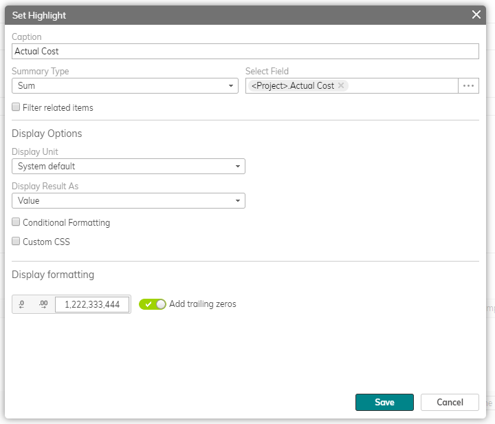
- Enter the highlight's name in the Caption field.
- Select the field or formula you wish to highlight.
- Define the Summary Type. You can also add formulas by selecting Other from the Field Type drop-down menu.
- Filter related items
- Activate the filter option by selecting the checkbox.
- Define the filter formula values.
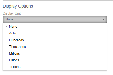
- Set the Display options.
- Define the display units to use.
- Select whether to display results as values or as a gauge chart.
- With results as Values you can add conditional formatting or use custom CSS as a visual aid.
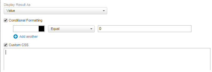
- With results as a gauge chart define the different values and colors.

- Define the display units to use.
- Display formatting - enable or disabling rounding of amounts and the number of trailing zeros.
- Click Save to save and close the window or Save and New to save the highlight and immediately add another one.
Adding Charts
AdaptiveWork offers different charts with multiple options:
- Bar – includes stacked and cluster bar chart
- Horizontal-bar – includes stacked and cluster horizontal bars
- Pie
- Starburst – a unique radial scatter chart
- Scatter
- Bubble
- Gauge
- Line
- Mixed - Use different display styles in a single chart, including different types and combinations such as Area, Line/Bar, Stacked Area and Percent Stacked charts. Learn more.
Drilling down in reports
The charts can be drilled into, providing a better view on specific information. Select a wedge in the pie chart, use the zoom slider in the Starburst, Scatter, and Bubble charts, or select a region in the various bar and line charts.
To add a chart:
- Click Add Chart, and define the display options, different for each of the charts.
- Standard Vertical and Horizontal Bar charts
- Set the X-axis (mandatory)
- Add an optional Y-axis
- Stacked and Clustered Vertical and Horizontal Bar charts chart types:
- Set the X-axis (mandatory)
- Define the Grouping parameters (mandatory)
- Set either the optional Y-Axis,
or - Enable Multi-Dimension grouping
- Pie chart
- Set the X-axis (mandatory)
- Set the Y-axis (mandatory)
- Startburst and Scatter charts
- Set the X-axis (mandatory)
- Set the Y-axis (mandatory)
- Select the optional color field
- Enable data point grouping by selecting the Allow grouping data points checkbox
- Bubble Chart
- Set the X-axis (mandatory)
- Set the Y-axis (mandatory)
- Select the optional color field
- Select the optional size field
- Gauge Chart (all fields are mandatory except Display Units)
- Set the Gauge Value
- Define the display color for the Low, Medium and High ranges
- Define the minimum and maximum values
- Define the first and second break points
- Define the optional display unit
- Line Chart
- Set the X-axis (mandatory)
- Enable Multi-Dimension grouping
- Set either the optional Y-Axis,
or
Define the multi-line parameters
See also:
- Display options for data in charts and report results for relations and multi-select picklists
- Cumulative Time-Series Line Charts - include cumulative ("s-curve") data in line and simple bar charts
- Working with Mixed charts
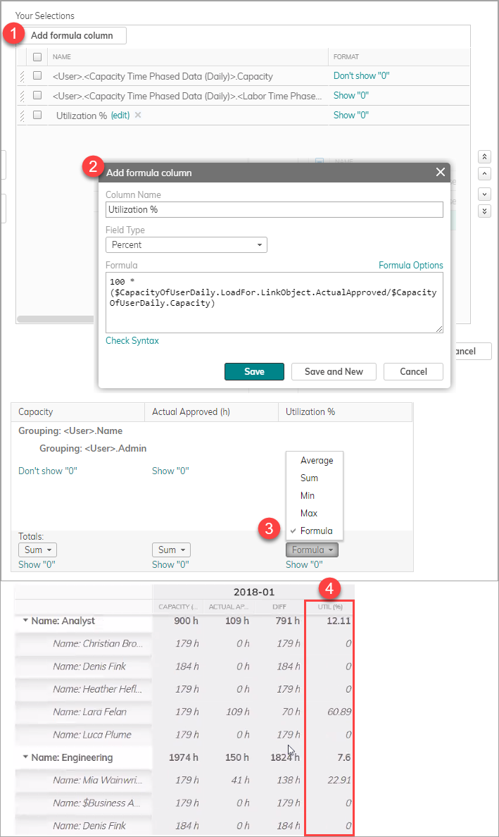
Working with Advanced Formula Fields
AdaptiveWork enables you to create on-the-fly formula fields for any report allowing you to easily analyze the required data without creating custom fields.
These formulas can even be used to check the number of items that fit a certain criteria by using the count summary type.
Formula fields can be used as a filter, as a chart parameter, and can be displayed in the results table.
To create a formula column:
- In the filter parameter window or the Manage Column window, click Add formula column.
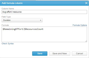
- Give the column a name.
- Select the field type.
- Either write the formula or use the formula options popup window to define the formula.
- Be sure to check the formula validity by clicking the Check Syntax link.
- Click Save to save the filter column and close the window or Save and New to immediately create another formula field.
Once created the field is available for use as a table column, as a chart parameter or as a filter.
Notes:
- The Grouping and Total values for source fields used in formula columns on report tables (in this case Task Assignment and Capacity) are calculated by applying the Totals aggregate function (Average/Sum/Min/Max) selected in the report table.
- The use of the Totals "Formula" aggregate function on a Formula Column means that the aggregate group and total values of the source fields used in a formula column are calculated before the formula is applied.
- If the Totals aggregate function selected for the formula column is anything other than "Formula", the value shown in the formula column is calculated by operating on the underlying records retrieved by the report query (not the table) before the selected aggregate function is applied.
- If the source fields used in a formula column are not selected in the report table, the SUM aggregate function will be used to calculate the grouping and total values of the fields used in the formula calculation.
To create formula fields for use in highlights:
- Define the summary type. You can even add formula functionality by selecting Other.
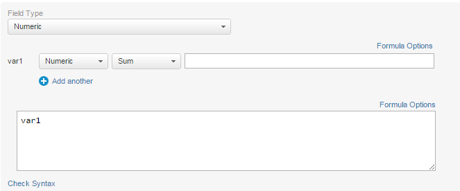
- Set the field type.
- Add one or more calculation variants.
- Use the Formula Options to create advanced formulas
- Click Check Syntax to test your formulas and variants.
Exporting and Sending Reports (Excel and PDF)
You can export and/or send the report in PDF or Excel from the Reports list or from within the report.
Click Export, and select one of the options, which includes downloading and sending the report.
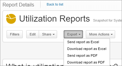
Note: Reports exported to Excel with more than 100,000 rows, and up to 999,970 rows, can be sent via email, but cannot be downloaded. This option does not apply to scheduled reports.
When you export a report that includes duration-type fields, you can also split duration fields into separate duration and unit columns, and convert the units to minutes, hours, days, weeks, or months. Learn more.
Scheduling Reports and Creating Snapshots
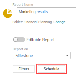
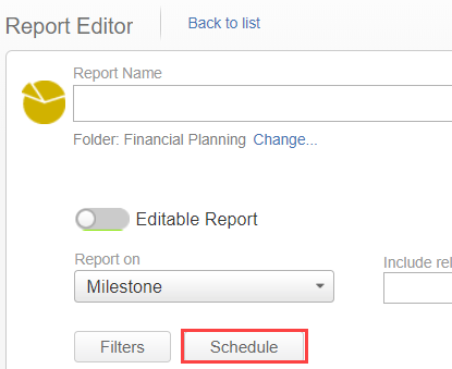
Only admins can schedule a report to run based on a predefined schedule. For these users the Schedule button is available in the ribbon.
You can specify whether to share the output in a discussion post (Social) or via email. You can also select a report format, Excel or PDF.
Snapshots
You can choose to save a report's output every time the report is generated, thereby preserving previous results or snapshots as related data. Users with appropriate viewing permissions will be able to access the data and use it for analysis and comparisons.
Note: Scheduled reports are available in enterprise and unlimited license editions.
- Enterprise accounts can have up to one scheduled report in a selected hour
- Unlimited accounts can have up to two scheduled report in a selected hour
- In the report editor, click Schedule.
- In the Reports Scheduler, toggle on Enable scheduler.
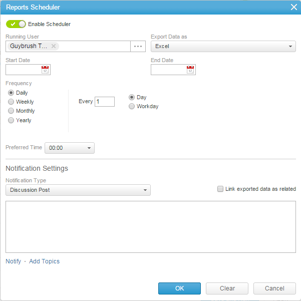
- Select the Running User – since the scheduler can only be accessed by an Admin, the running user determines under who’s permission the report will run. For example, if you want to run the report on all organization data, then you would use a super user. If you want to run on a specific user that only has access to certain information, you would select that user.
- Define the export data type:
- Excel – will export only the highlights and the grid (not including charts)
- PDF – will export everything
- Add an optional start and end date – if not selected, the report will run for the first time in the next frequency period.
- Define the Frequency of the scheduled report.
- Set the Preferred time to determine when the report will run.
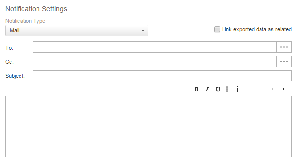
- Define the Notification Settings:
- Select the notification type:
- Select Discussion Post to notify followers using Social. You can add users using the Notify or Add Topics options. You can also define the default message to appear on every scheduled post.
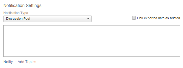
- Select Mail to send out email notifications with the scheduled report. Define the recipients of the email, the email subject, and the default message body of the email (optional).
You can also split duration fields into separate duration and unit columns, and convert the units to minutes, hours, days, weeks, or months. Learn more.
Note: Splitting and converting options are not available in crosstab reports.
- Select Discussion Post to notify followers using Social. You can add users using the Notify or Add Topics options. You can also define the default message to appear on every scheduled post.
- Select the notification type:
- To create a snapshot for every time the report is generated, select Link exported data as related. The snapshots will be accessible in the Snapshots relation panel. This allows people with access to view a repository of past reports.
The Snapshots panel with a previously generated Excel report
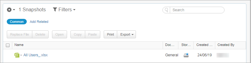
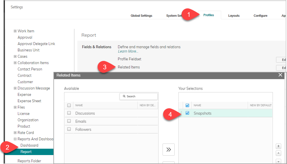
Note: To include the Snapshots panel in the report/dashboard view, you must add the panel in Profile settings, under Reports and Dashboards >Report / Dashboard > Field and Relations > Related Items, and add Snapshots to the view.
- Click OK.
Tip: To see which reports have schedules, add the scheduling-related columns to the reports list.
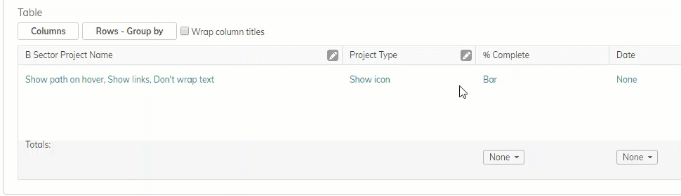
Working With the Results Table
You have complete control over the display layout of the result table columns.
- Display Table - When enabled, the table is displayed by default. When disabled the table does not load by default, but can be displayed by clicking Show table when viewing the report.
Notes:- This option only appears if you have charts or highlights in the report.
- This feature is recommended when you do not need the table details, and to improve performance (load time) when you have a large amount of data.
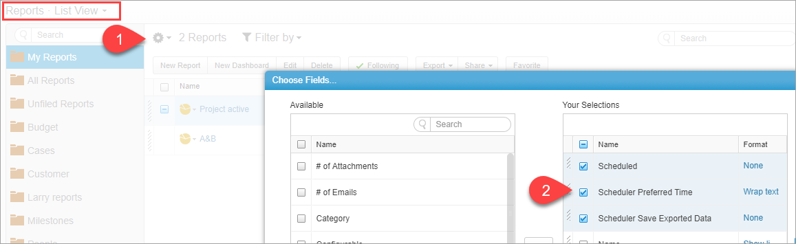
- Click Columns.
The Choose Fields window opens.- Select the field columns to include in the table.
- Use the controls to edit the fields' order of appearance.
- You can even create custom formula based columns to be added to the result table.
- Click OK.
- Define the view for each of the fields based on the field type:
- Choose to see a Value, Icon, or both
- Conditionally format any fields
- Show or hide fields with ‘0’ value
- Show different path options
- And much more
- Select the Wrap column titles checkbox to wrap column titles.
- Drag and drop fields in the editor to set their order.
- Click on a column header to set the sorting.
Tip: For multi sort, hold the CTRL key (Windows) or Apple/Command key (Mac) on your keyboard while clicking on a column header.
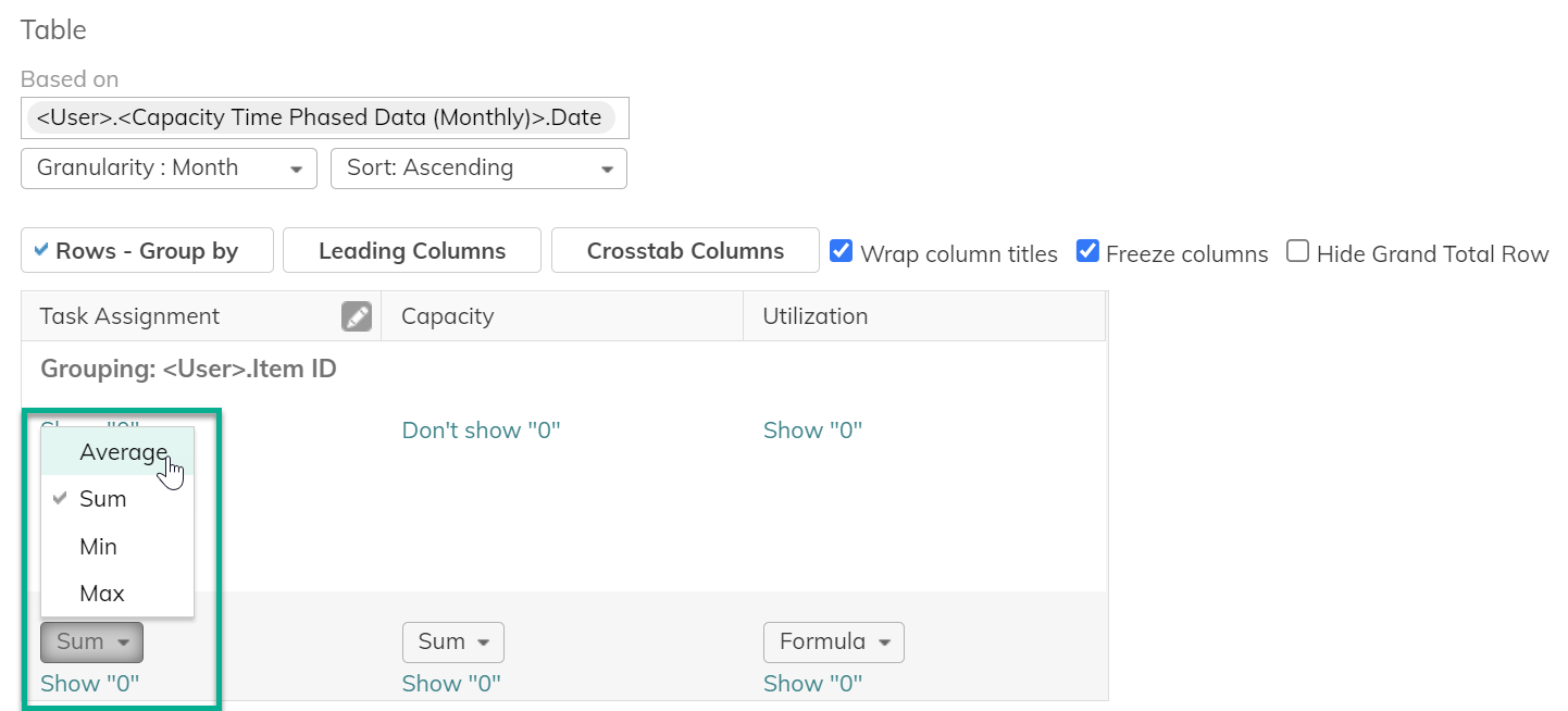
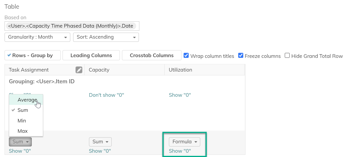
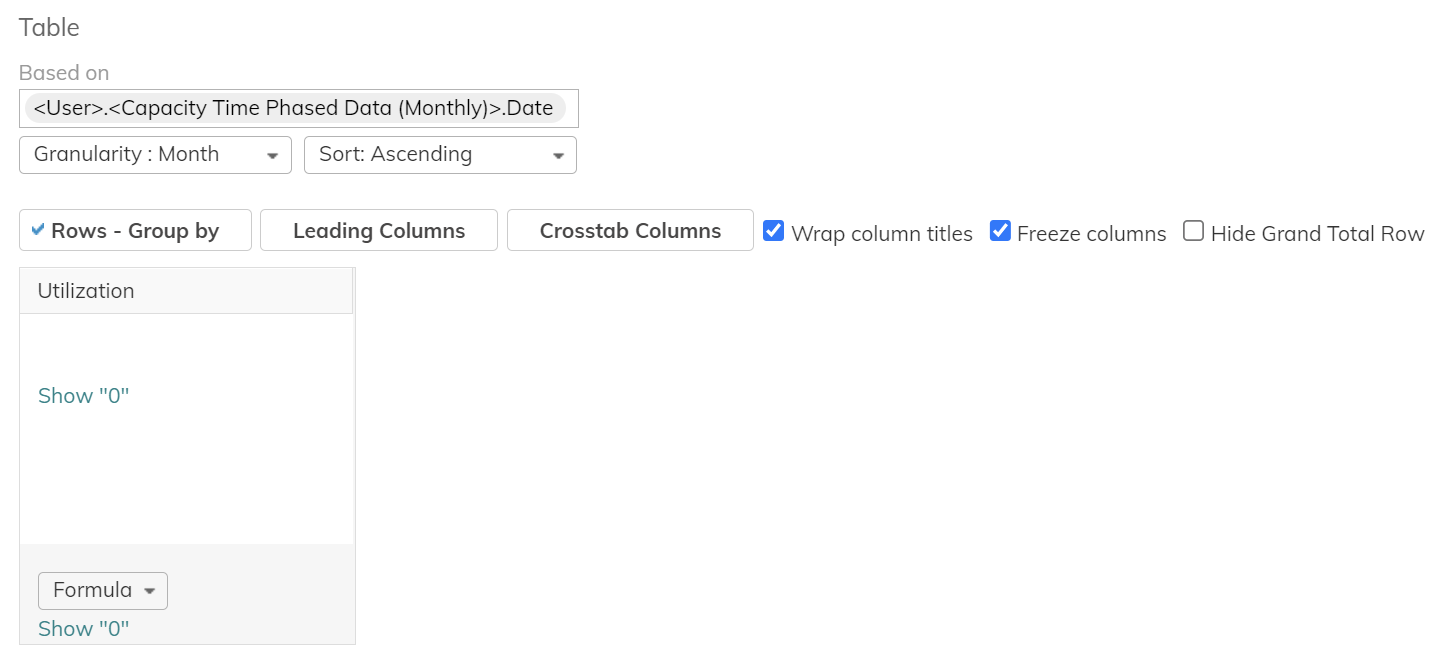
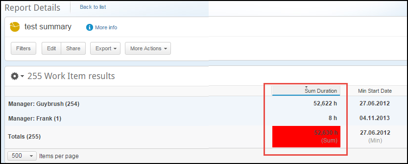
In the Totals row for each of the relevant columns select the relevant value from the list:
- None
- Average
- Sum
- Minimum
- Maximum
- Formula
Add formula-based totals to the columns in your report tables. Formula-based totals work in regular and crosstab tables. Click here for more about creating formulas.
These summaries are shown in the grand totals and if groups are defined, for each individual group level.
Notes:
- In the Totals row for each of the relevant columns the following values can be conditionally formatted: Average, Sum, Minimum, and Maximum.
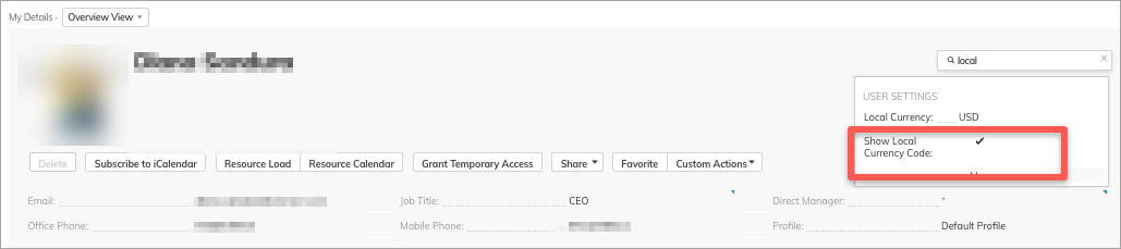
- When multiple currencies are enabled, you can choose to display or hide the local currency. If you are reporting with a single currency, you can choose to hide the currency code (suffix). You can find the Show Local Currency Code setting in the user properties.
Define Groupings
The Rows - Group by functionality allows you to group data in the result table for better analysis.
Select up to three levels of groups in the results table.
- Click Rows - Group By.
The Grouping window opens.
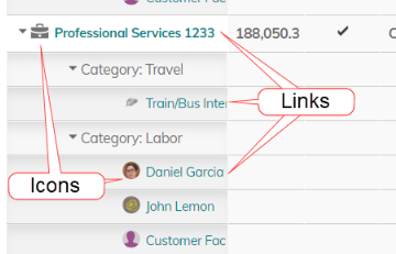
Note: Use the item's Item ID attribute if you want standard and custom icons, and links on the item names that take you to the related item in a new tab.
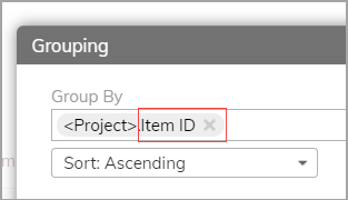
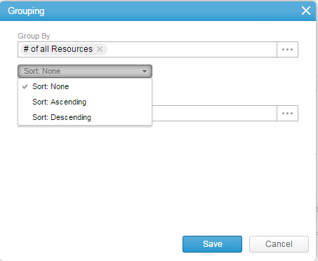
- Select the field you wish to group by.
- Define the sorting order for the group.
- Repeat Steps 2 & 3 again to add additional grouping settings.
- Click Save to save your settings and close the window.
- Once a group is set, click Show Summary to view only a summary for each group.
Notes:
- In the report results you can switch Show Summary on and off from by clicking th ecog icon.
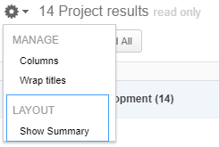
- When not in Show Summary mode, the report results will enable you to expand and collapse individual groups.
- In the report results you can click on the Sum column to sort ascending or descending, when using groups and Show Summary mode.
Example

Renaming Fields for Columns and Charts
This feature is in controlled availability. Contact your AdaptiveWork Customer Success Manager to request access.
Rename column headers in report tables. The renamed fields appear in the report's column headers and chart axes, and in dashboards using the same report.
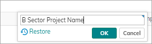
- To rename report column headers, open the report for editing.
- Hover over the column header to reveal the pencil icon. Click the pencil to rename the column header. Rename the column and click OK.
After you rename the column, the pencil icon remains in view, to use for renaming or restoring the original label.
Notes:
- You can rename original field labels as well as fields that were relabeled on the organization level
- Renaming applies to all tabs in the report, so you do not need to rename the same label in each tab
You can rename calculated fields as well - Field pickers in charts and filters display the original names
- Renamed fields appear in exported Excel and PDF reports
Creating Multiple Tabs in a Report
One report can contain several pivots or dimensions on the same data, allowing you to quickly view the data from different perspectives, for instance, a report on running projects can be viewed grouped by project manager in one pivot, profitability in another, and overall success rate on the third.
To add an additional pivot:
- Click Add new tab.
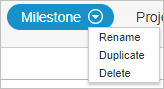
Once created, click the menu icon to:- Rename – allows you to rename the selected tab
- Duplicate - Duplicate the existing tab. All data, charts, highlights and conditional formatting is copied over to the new tab.
Note: If you are on the first tab, click Duplicate tab.
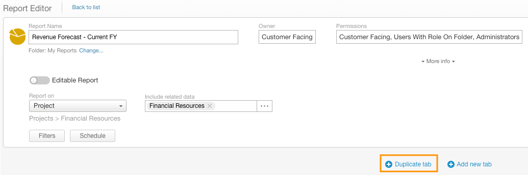
- Delete – allows you to delete the selected tab
- You can also reorder the various tabs using drag and drop
To learn about sharing, related panels (discussions and emails), and permissions, see Getting Started with Reports.
Working with Multiple Currencies
Reports support the following multi-currency features:
- Multi-Currency in Totals/Summaries
- Multi-Currency in Filters
- Conditional Formatting for Matching Currency
To learn more, click here.