Reports and Charts for Following up on Work Progress
There are a number of ways you can stay updated with the progress of work in ProjectPlace - on different detail levels and just when you need it.
Workspace Reports
Workspace administrators can use workspace reports to monitor and share progress of their projects with internal and external stakeholders. Widgets on the Reports page are fully customizable, so you can control how reports look for specific project workspaces. Widgets marked with Default next to their name in the list below, means that these widgets are visible on the page when a new workspace is created.
The following widgets are available:
- Workspace Description (Default) – The name and description of the workspace as shown in the Workspace Overview.
- Notes (Default) – Project managers can add custom notes to the report to include additional information, which can be shared with both internal and external stakeholders.
- Milestones (Default) – Displays the start and the end date of all the milestones in the project workspace over the life of the project.
- Activities Progress (Default) – Displays the status of activities as a pie chart, so you can easily see how many activities are planned, started, overdue, and finished. Finished activities are separated according to whether or not they were completed by the planned finish date, so you can assess if work is being completed on time.
- Cards Progress (Default) – Displays the status of cards in the workspace as a pie chart, so you can easily see how much work is planned, started, and overdue. Done cards are separated according to whether or not they were completed by their due date, so you can assess if work is being completed on time.
- Public Documents (Default) – Displays a list of the files that have been added in the Public Documents folder. The files can be downloaded from the list.
- Document Reviews Progress (Default) – Displays the status of document reviews as a pie chart, so you can see the ratio of pending document reviews versus overdue document reviews.
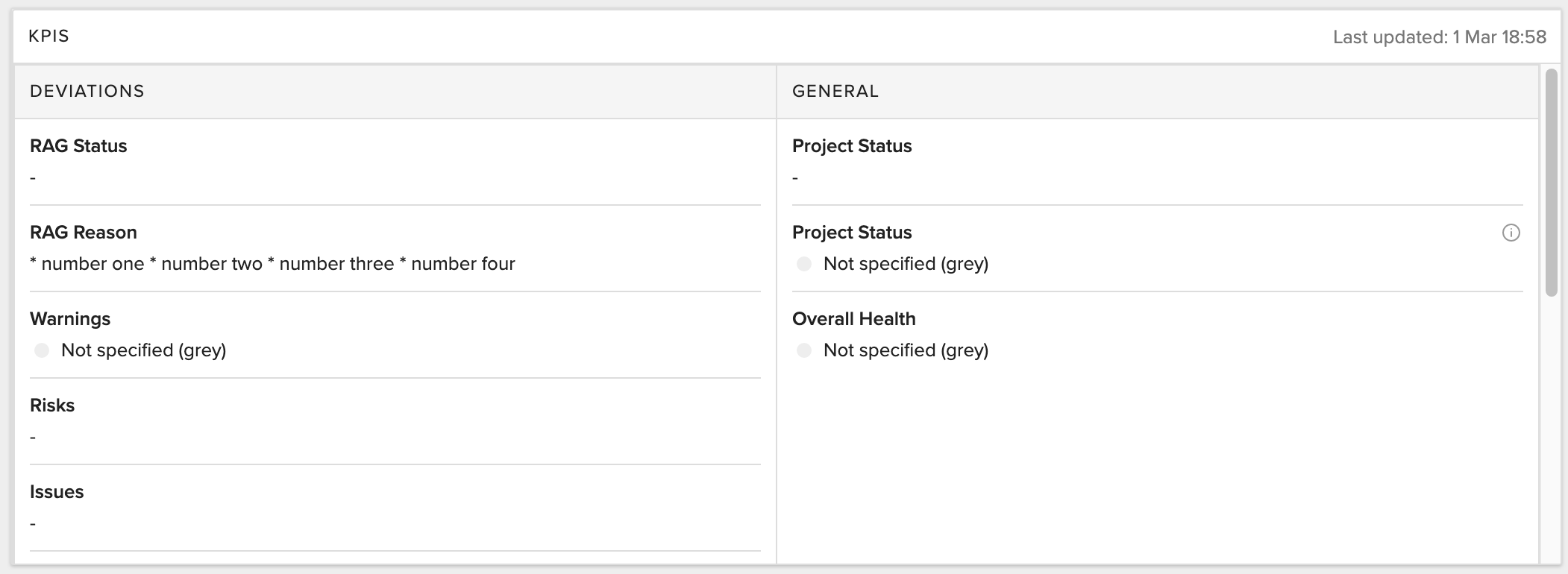
- KPIs – Captures the values from the Status tab and merges it with the rest of the reports to display information about how on schedule or off schedule your project is at the moment.
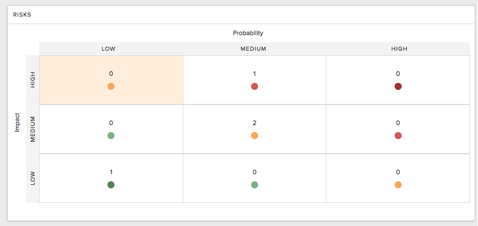
- Risks – Displays all risks and their categorizations (such as impact and probability) reported for the workspace.
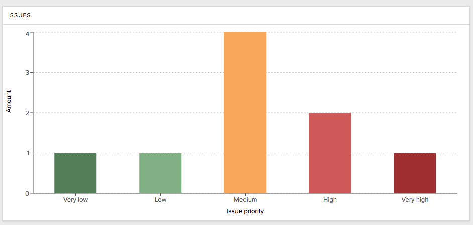
- Issues – Displays information about the volume and priority of issues reported for the workspace.
- Overdue Activities – Displays the distribution of overdue activities as a histogram. For more detailed information, hover your cursor over a bar on the bar graph and click. A popup will appear with a list of the activities that are affected.*
- Delayed Activities – Displays the distribution of delayed activities as a histogram.
- Overdue Cards – Displays the distribution of overdue cards as a histogram.
- Delayed Cards – Displays the distribution of delayed cards as a histogram. For more detailed information, hover your cursor over a bar on the bar graph and click. A popup will appear with a list of the cards that are affected.*
- Card Deviations – Displays the key deviations of cards (such as cards without dates, cards not associated with an activity, cards without estimations, or blocked cards) in your workspace. For more detailed information, hover your cursor over any of the cells on the grid and click. A popup will appear with a list of the cards that are affected.*
- Overdue Milestones – Displays the distribution of overdue milestones as a histogram. For more detailed information, hover your cursor over a bar on the bar graph and click. A popup will appear with a list of the milestones that are affected.*
- Delayed Milestones – Displays the distribution of delayed milestones as a histogram.
* This information about the affected activities, milestones, and cards is only available within the workspace and not shared in the read-only version of the Reports page.
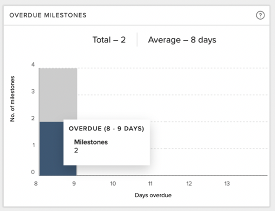
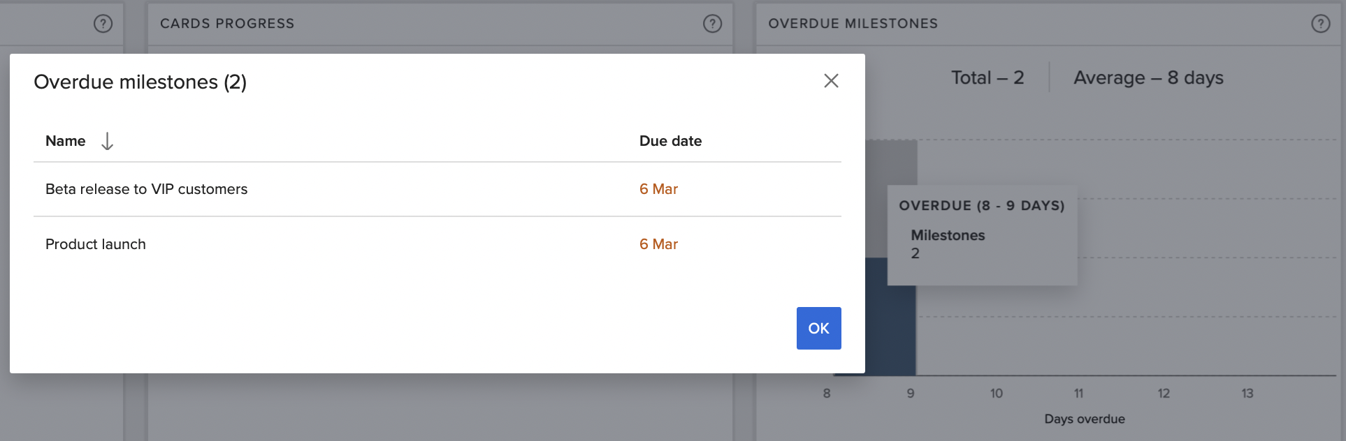
Hover cursor over bar, then click on it. Additional information in a popup will appear. With correct access you can navigate directly to the activity, milestone or card to learn more. Available for the widgets Overdue activities, Overdue Milestones, Delayed cards and Card deviations.
NOTE
"Overdue" means the activities, cards, or milestones have either not started on the planned start date or finished on the planned finish date. "Delayed" means the activities, cards, or milestones have completed after the planned finish date.
About Milestones
Milestones Detail Pane:
- Users can view the detail pane by selecting a milestone.
- Clicking on a milestone will open the detail pane with the corresponding information.

Milestones Filter by Date:
Users can choose between Week and Month views for filtering milestones.
1. In Month view, the widget will display all milestones in a monthly format throughout the project's duration.
2. In Week view, the widget will present all milestones in a weekly format throughout the project's duration.

List View of Milestones:
1. The milestone widget has been updated to allow users to switch between Timeline view and List view.
2. By default, the Milestones widget will display in Timeline view when accessed.
3. Users can toggle between Timeline view and List view as needed.
4. In List view, milestones are shown in a list format. Clicking on any row will open the details pane in the same tab.

Customize Workspace Reports

Workspace administrators can customize the widgets layout on the Reports page. To edit the Reports page, click the More options  menu and then select Customize view. In this view you can:
- Select which widgets you want to appear on the page by dragging them on or off the dashboard
- Arrange widgets on the page by dragging and dropping them to the desired position
- Resize individual widgets by clicking the lower right corner and dragging and dropping to the desired size
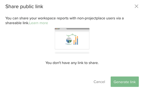
Share Workspace Reports
Workspace Administrators can share information on the Reports page with workspace members and external stakeholders by generating a link and sharing it. With the link, users can view a read-only version of the Reports page, and at the top right corner, select which language they want to read the report in.
TIP
To easily make workspace reports available to all workspace members, we recommend posting the link to the shared report in the workspace description (so the link is displayed on the Workspace Overview page) or in the Conversations tool.
To share a link to the Reports page:
- Click the More options menu and select Share.
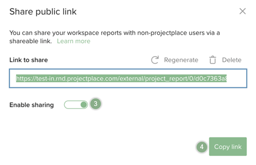
- In the window that appears, click Generate Link.
- Switch the Enable sharing toggle to the on position.
- Click Copy link. The link is copied to the clipboard and can be pasted in the desired location (document, email, webpage, etc.)
NOTES
- To disable sharing, switch the Enable sharing toggle to the off position. You can also disable the current link by clicking Delete.
- To create a new link, click Regenerate. The current link expires, and you will need to re-share it with your stakeholders.
- If you can't see the Share Reports feature, it is due to an account setting. This feature might not be enabled for a user if an account administrator has turned this feature off for the account.
Charts
There are various charts available in the board chart view. Select the Boards tool and in the toolbar you will find three different views you can switch between: Board view  , List view
  , and Chart view
  , which is outlined in green in the image below. Additionally, to switch between the different types of charts, select from the down arrow dropdown menu below, when in Chart view.
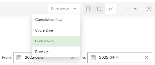
Cumulative Flow Chart
The cumulative flow chart gives an aggregated view of the number of cards in each column for a selected period of time, or the total number of story points estimated for these cards. Cards on hidden boards are not included in the chart.
NOTE
The chart is displayed only if the Boards tool is used, at least one board has more than two columns, and there is data from at least two days.
The number of cards or points are displayed in the Y axis and the time in the X axis. You can specify the date range of the activity to be included. The color-coded bands in the chart correspond to the columns in the board.
The width of the bands indicates the number of cards or points per column over time.The total number of cards or points for a specific point in time is the accumulation of the cards from each column, which makes it easy to identify when scope has changed (cards have been added or removed).
You can see how smoothly the work is flowing through your process. Variations in the width of the colored bands in the chart indicate more or less work in that column on a given date. Widening bands represent an increase in the number of cards or points in a column, which could indicate a bottleneck or constraint in your workflow process. The amount of work in process is also a good predictor of the remaining cycle time. Narrowing bands indicates the productivity in one stage is higher and should be distributed to other areas to allow for improved flow.
To focus on a specific time period or card criteria:
- Click the filter icon to display the Filter pane.
- To filter the date range, select the From and To dates.
- To filter by status, label, activities, or tags, click the corresponding check boxes.
- To view all of the filter options in a section, click Show all.
- To reduce the number of filter options that are displayed in a section, click Hide.
Cycle Time Chart
The cycle time chart reveals the average number of days required for a card to be finished and is an indication of the team efficiency. It displays both the cycle time (time from starting to work on a card until it is done) and the lead time per card (time from a card is created until it is done). It shows how the average cycle time and average lead time changes during the selected period. The chart is most useful when all cards on the board requires approximately the same amount of effort to be completed.
You can also choose to see the chart by story points instead of cards, which reveals the cycle time for each estimated story point. You can also use the filter panel options to filter on activities, labels, or tags.
NOTE
The chart is displayed only if the Boards tool is used, at least one board has more than two columns, and there is data from at least two days.
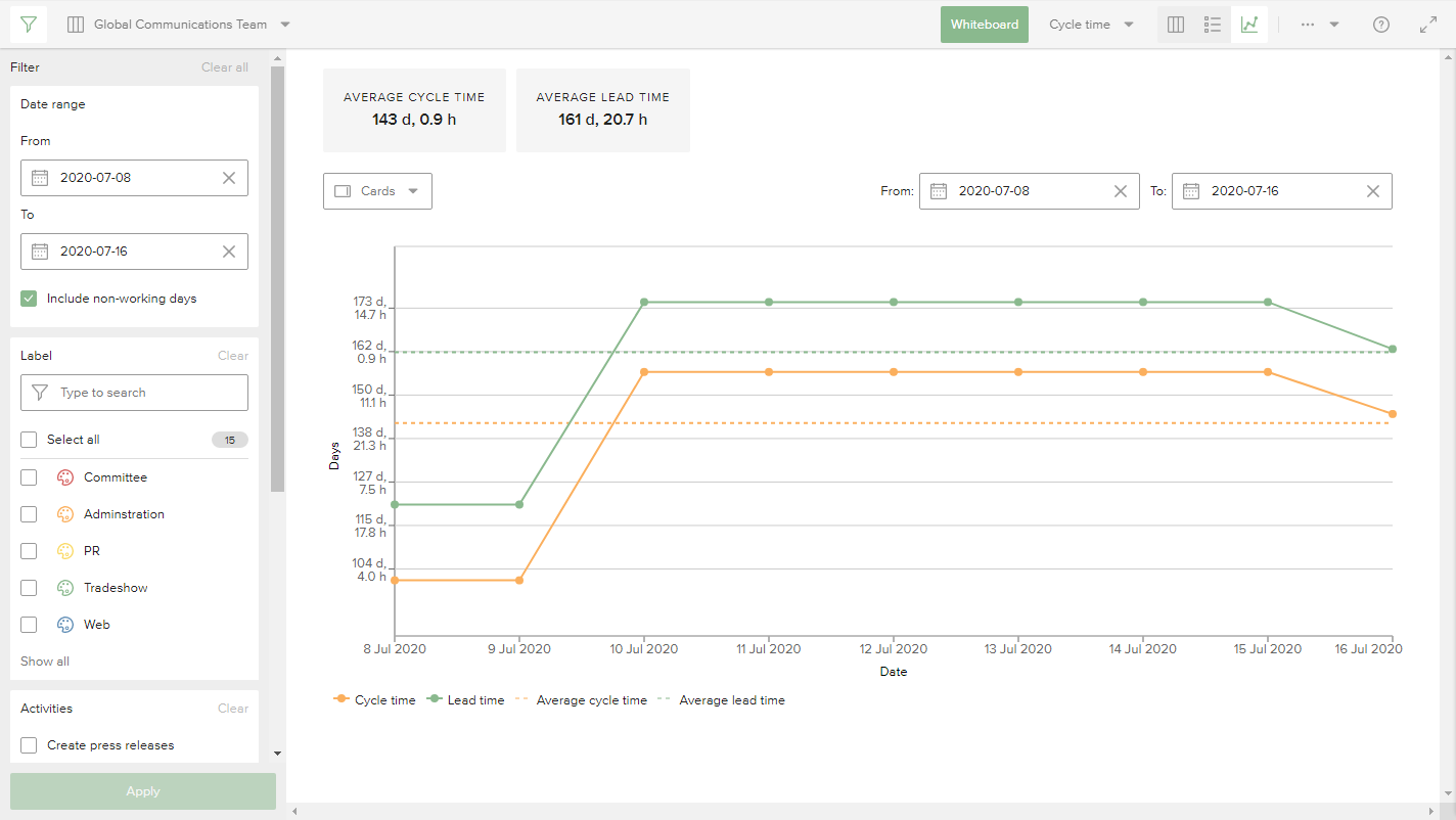
The chart shows the time in the Y axis and the dates in the X axis. Whenever a card is moved to done, it plots the average cycle time per card and the average lead time per card for that point in time.
Burn Down Chart
The burn down chart shows the remaining work as a plotted line over time. The quantity of work is displayed on the Y axis, and time on the X axis. Use the burn down chart to help teams that have a set amount of work to complete in a specific period of time visualize their progress, and get a better idea of whether they're on schedule to complete their work before the deadline. You can also use the burn down chart retrospectively to understand past performance.
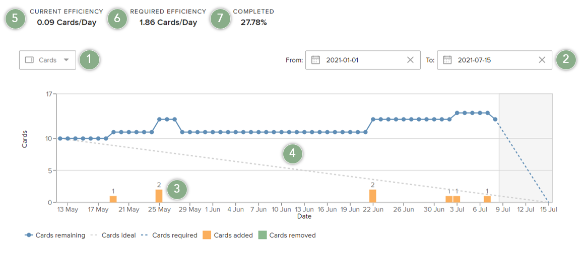
- Use the dropdown menu to display the scope as the number of cards, points, or estimated time defined on the cards. If no points or estimated hours has been set on a card, the scope of work will be counted as 0 for that card.
- Date range selector. The date range defines the scope of work and how efficiency is calculated. Only cards and their data that exist within the date range selection and the filtered items are included in the scope of work displayed.
- Bars at the bottom of the chart visualize how the scope of work (the number of cards) increases and/or decreases during the selected period of time.
- Lines indicate the ideal pace that cards need to be completed in order for work to be completed by the end date, versus the required minimum daily average rate cards should be finished in order for work to be completed by the end date.
- Current efficiency is the average amount of work done each day for the selected time period.
- Required efficiency is the ideal efficiency (burn down rate) to reach the defined end date.
- Completed is the percentage of work (cards, points or estimated time) completed out of the total scope (starting scope + added scope - removed scope) for the selected time period.
TIP
Use the filter section to focus on certain aspects of work, such as status, activities, tags, and more. When one or more filter options has been selected and the Apply button has been pressed, the chart and metrics are recalculated based on the selected filter options.
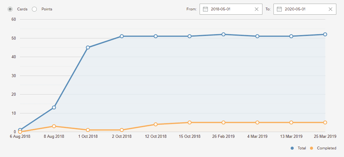
Burn-up Chart
The burn-up chart shows the work done in relation to the total work.
If you use point estimation, you can get a good overview of the progress if you choose to base the burn-up chart on points.