
FastTrack Power BI Showcase Dashboards - Work
|
The below content provides examples of interactive Power BI dashboards created using data from Work portfolio column sets. These dashboards showcase a wide range of out-of-the-box Power BI visualizations which present project-level data in an engaging and meaningful way and aid detailed analysis through drill-down functionality. Detailed information is provided for each visualization, which highlights the configuration steps required to recreate the visual; examples of the types of Enterprise One Portfolio and Resource Management data that can be used; and the business outcomes supported by each example. |
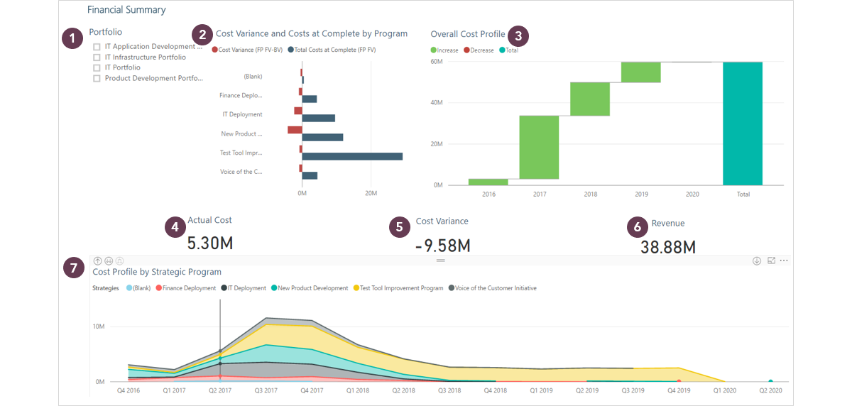
Tab 1 - Financial Summary |
 |
| Report Level and Page Level Filters |
| Description | Example |
| Report Level Filters: filters that apply to all pages in the report |
Report Level Filters: Parent Description, 'Depth' = 5. In this example, '5' ensures that data is taken only from project-level within the WBS, not parent levels (the column set tabular model used as a data source will include all data relating to the WBS hierarchy on the portfolio screen, which may potentially include rolled up financial data from higher levels). The correct 'depth' to select will depend upon the customer configuration. |
| Page Level Filters: filters that apply to all visualizations on a page | Page Level Filters: no page level filters have been applied in this report |
Widget 1. Slicer by Portfolio |
 |
| Description | Example | |
| Goal | Provides a visual element to filter the data on the page | Ability to slice data by Portfolio |
| Fields |
Field: One work dimension (project-level attribute e.g. alternate structure, lifecycle role) |
Field: Portfolio_Name |
| Formatting Suggestions |
Can be vertical or horizontal, Title can be added, multi-select option can be enabled |
Title: On (‘Portfolio’) |
| Microsoft Help (will open in new tab) |
https://docs.microsoft.com/en-us/power-bi/power-bi-visualization-slicers |
|
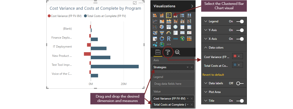
Widget 2. Clustered Bar Chart showing Cost Variance and Costs at Complete by Program |
 |
|
|
Description |
Example |
|
Goal |
Use Case 1: Visualizes a single dimension against multiple measures |
Visualize Strategies against Total Costs at Complete and Cost Variance Business outcome: Identify strategic initiatives / programs that are at risk of exceeding approved budget |
|
Fields |
Axis: Work dimension (project-level attribute e.g. alternate structure, lifecycle role) to group the data in the visual A further dimension can be added to facilitate drill-down of the data |
Axis: Strategies EntityName could be added as a second dimension, which would enable the user to drill-down and identify the projects that are contributing to the cost variance |
| Value: Two or more time-phased financial measures or PVE measures (financial subtotal, calculated attribute, numeric field), the data for which will be grouped by the chosen dimension/s | Value: Cost Variance (FP FV-BV), Total Costs at Complete (FP FV) | |
|
Formatting Suggestions |
Legend: Adds a legend to the visualization, providing a key for the different data groups The position of the legend within the visualization can be changed if required |
Legend: On (positioned at the top) |
|
X Axis: Adds the category names to the X Axis based on the dimension chosen in the Axis field Y Axis: Adds the value range to the Y Axis based on the measure chosen in the Value field |
X Axis: On Y Axis: On |
|
| Data Colors: Applies color-coding to the data groups | Data Colors: Total Costs at Complete (FP FV) = Blue, Cost Variance (FP FV-BV) = Red | |
| Data Labels: Adds data labels to each column in the visualization | Data Labels: Off | |
|
Title: Adds a title to the visualization The title is created automatically based on the data being displayed - it is often sensible to amend this to something more meaningful to the report audience |
Title: On ('Cost Variance and Costs at Complete by Strategies') | |
| Filters |
Visual Level Filters: Filters that can be applied to the data in the individual visual. The dimensions / measures added to the Axis, Legend and Value fields will automatically appear as filter options. If there are lots of categories to be displayed (e.g. if you are using EntityName as your dimension), filters can be applied to only show the top / bottom number of projects for the chosen measure |
Visual Level Filters: Strategies, Cost Variance (FP FV-BV), Total Costs at Complete (FP FV) |
| Microsoft Help (will open in new tab) |
https://docs.microsoft.com/en-us/power-bi/power-bi-visualization-basic-area-chart |
|
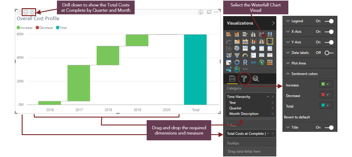
Widget 3. Waterfall Chart showing Total Costs at Complete by Year |
 |
| Description | Example | |
| Goal |
Displays a running total as values are added or subtracted. It can visualize how an initial value is affected by a series of positive or negative changes It is able to show the value for each time slice, as well as the cumulative value |
Visualizes how the Total Costs of the selected portfolio/s changes year on year and provides an overall total for the planning horizon |
| Fields |
Category: One or more time dimensions (Year, Quarter, Month) by which you want to drill down into the data |
Category: Year, Quarter, Month Description |
| Y Axis: One time-phased financial measure (financial subtotal or calculated attribute). An interesting use case would be to select a measure that could be either positive or negative (e.g. Cost Variance) | Y Axis: Total Costs at Complete (FP FV) | |
| Formatting Suggestions | Legend: Adds a legend to the visualization, providing a key for the different data groups (the position of the legend within the visualization can be changed if required) | Legend: On |
|
X Axis: Adds the category names to the X Axis based on the dimension chosen in the Axis field Y Axis: Adds the value range to the Y Axis based on the measure chosen in the Value field |
X Axis: On Y Axis: On |
|
| Data Labels: Adds data labels to each columns in the visualization | Data Labels: Off | |
| Sentiment Colors: Applies color to each sentiment (i.e. Increase, Decrease, Total) | Sentiment Colors: Increase = Green, Decrease = Red, Total = Blue | |
| Title: Adds a title to the visualization | Title: On ('Total Costs at Complete by Year') | |
| Filters |
Visual Level Filters: Filters that can be applied to the data in the individual visual. The dimensions / measures added to the Category and Y Axis fields will automatically appear as filter options |
Visual Level Filters: Year, Quarter, Month Description, Total Costs at Complete (FP FV) |
| Microsoft Help (will open in new tab) |
https://docs.microsoft.com/en-us/power-bi/power-bi-visualization-waterfall-charts |
|
Widgets 4, 5 & 6. Cards showing Actual Cost, Cost Variance & Revenue |
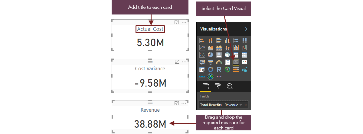 |
| Example | Description | |
| Goal | Displays the sum of the chosen measure, based on the filters selected |
Widget 4: Shows the sum of the actual costs to date for the portfolio/s selected in the slicer Widget 5: Shows the sum of the total cost variance (between baseline and forecast / actual costs) for the portfolio/s selected in the slicer Widget 6: Shows the sum of the total revenue for the portfolio/s selected in the slicer Business outcome: Identify portfolios that are exceeding approved budget, in relation to the expected revenue |
| Fields | Field: One time-phased financial measure or PVE measure (e.g. financial subtotal, calculated attribute, numeric field) that will be displayed as a single value, determined by the filters applied |
Widget 4: Actual Costs to Date (FP FV) Widget 5: Cost Variance (FP FV-BV) Widget 6: Total Benefits Revenue (FP FV) |
|
Formatting Suggestions |
Data Label: allows you to specify the display units (thousands, millions etc.) and the number of decimal places These can also be defined automatically based on the data being display |
All: On, Display - Auto |
|
Category Label: this will automatically add the label for the measure being displayed (this will reflect the name of the financial subtotal / calculated attribute / field in PVE and cannot be updated) |
All: Off | |
|
Title: adds a title to the visualization It is recommended that this option is chosen over Category Label as the title can be re-named to something more meaningful to the report audience |
Widget 4: Actual Costs Widget 5: Cost Variance Widget 6: Revenue |
|
| Other formatting options: apply border, background, fonts, colors etc. | All: None applied | |
| Microsoft Help (will open in new tab) |
https://docs.microsoft.com/en-us/power-bi/power-bi-visualization-big-number |
|
Widget 7. Stacked Area Chart showing Cost Profile by Strategic Program |
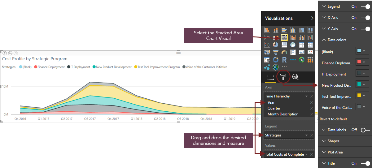 |
| Example | Description | |
| Goal |
Visualizes the magnitude of change for the chosen measure over a period of time Highlights the total value across a trend |
Provides a breakdown of the total costs per month by Strategy for the selected portfolio/s Business outcomes: Identify the trend of costs by Strategy Compare strategic investment costs over time |
| Fields |
Axis: One or more time dimensions (adding further dimensions facilitates drill-down of the data - the level of drill-down should be appropriate for the customer data being displayed) | Axis: Time Hierarchy (Year, Quarter, Month Description) |
| Legend: One work dimension (project-level attribute) to group the data in the visual | Legend: Strategies | |
| Values: One time-phased financial measure (e.g. financial subtotal), the data for which will be grouped by the chosen dimension/s | Values: Total Costs at Complete | |
| Tooltips: Can be used to display further information for each slice of data. However, this may end up being difficult to read on a stacked area chart if there is a large number of categories for each dimension used | Tooltips: None | |
| Formatting Suggestions | Legend: Adds a legend to the visualization, providing a key for the different data groups (the position of the legend within the visualization can be changed if required) | Legend: On |
|
X Axis: Adds the category names to the X Axis based on the dimension chosen in the Axis field Y Axis: Adds the value range to the Y Axis based on the measure chosen in the Value field |
X Axis: On Y Axis: On |
|
| Data Colors: Applies color-coding to the data groups | Data Colors: Different colors have been applied to each Strategy (e.g. Finance Deployment = Green, IT Deployment = Grey etc.) | |
| Title: Adds a title to the visualization | Title: On ('Strategic Breakdown - Costs by Strategy') | |
| Filters | Visual Level Filters: Filters that can be applied to the data in the individual visual.
The dimensions / measures added to the Axis, Legend and Values fields will automatically appear as filter options |
Visual Level Filters: Month Description, Strategies, Total Costs at Complete |
| Microsoft Help (will open in new tab) |
https://docs.microsoft.com/en-us/power-bi/power-bi-visualization-basic-area-chart |
|
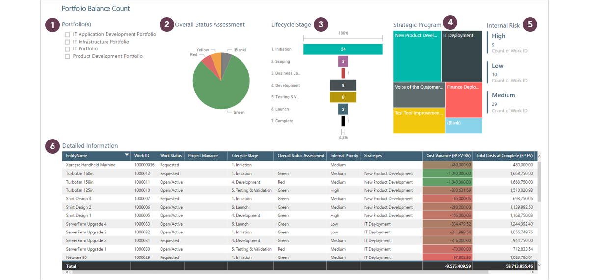
Tab 2 - Portfolio Balance Count |
 |
Widget 1. Slicer by Portfolio |
|
| Description | Example | |
| Goal | Provides a visual element to filter the data on the page. | Ability to slice data by Portfolio |
| Fields |
Field: One work dimension (project-level attribute e.g. alternate structure, lifecycle role) |
Field: Portfolio_Name |
| Formatting Suggestions | Can be vertical or horizontal, Title can be added, multi-select option can be enabled | Title: On (‘Portfolio’) |
| Microsoft Help (will open in new tab) |
https://docs.microsoft.com/en-us/power-bi/power-bi-visualization-slicers |
|
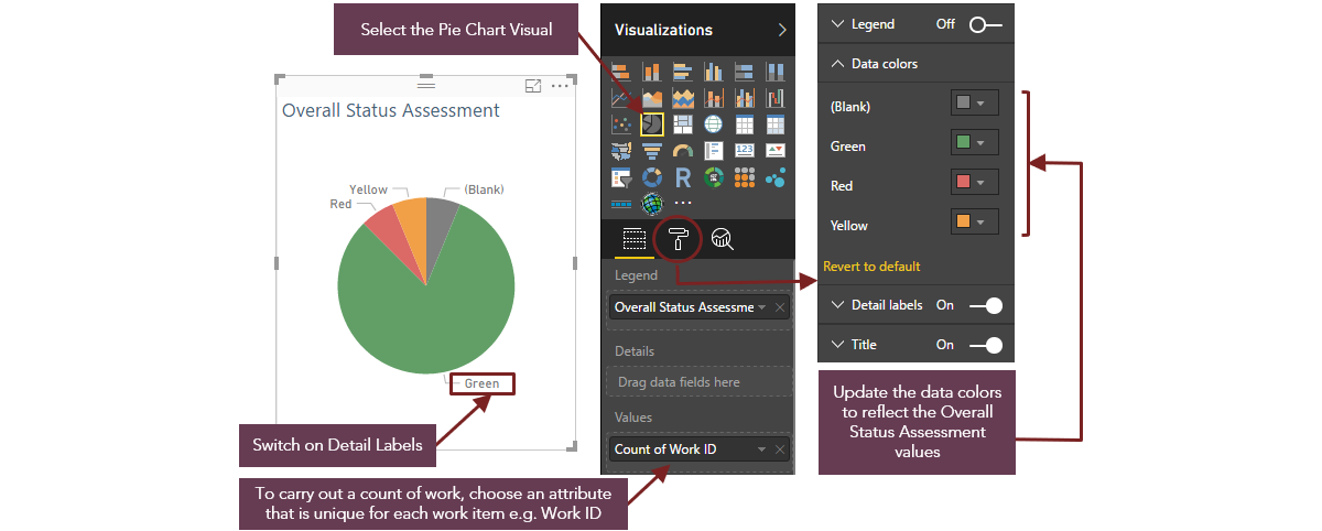
Widget 2. Pie Chart showing Overall Status Assessment |
 |
| Description | Example | |
| Goal | Illustrates numerical proportion |
Provides a count of the projects in the selected portfolio/s by Overall Status Assessment Business Outcome: Aids analysis of portfolio balance |
| Fields |
Legend: Work dimension (project-level attribute e.g. alternate structure, Lifecycle role) to group the data in the visual | Legend: Overall Status Assessment |
| Details: A further work dimension can be displayed as a sub-category | Details: None | |
| Values: Time-phased financial measure, PVE measure or count of a dimension, the data for which will be grouped by the chosen dimension/s | Values: Count of Work ID | |
| Formatting Suggestions |
Legend: Adds a legend to the visualization, providing a key for the different data groups | Legend: Off |
| Data Colors: Applies color-coding to the data groups | Data Colors: Colors chosen to reflect the Overall Status Assessment categories (i.e. Red, Yellow, Green) | |
| Data Labels: Adds data labels to each slice in the Pie Chart | Data Labels: On (showing 'Category' only) | |
| Title: Adds a title to the visualization | Title: On ('Work by Overall Status Assessment') | |
| Filters |
Visual Level Filters: Filters that can be applied to the data in the individual visual. The dimensions / measures added to the Legend, Details and Values fields will automatically appear as filter options. |
Visual Level Filters: Overall Status Assessment, Count of Work ID |
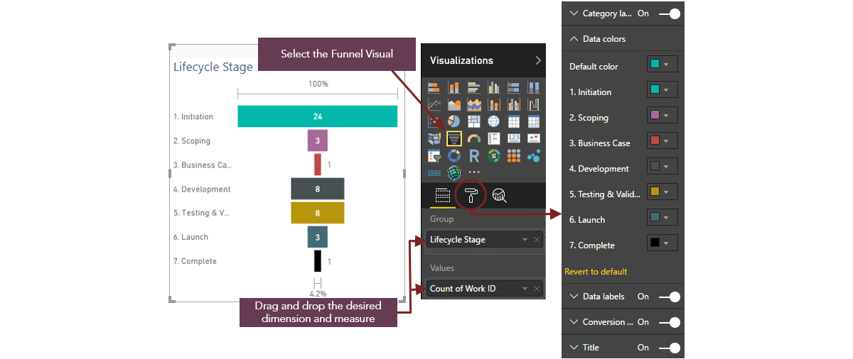
Widget 3. Funnel Chart showing Work by Lifecycle Stage |
 |
| Description | Example | |
| Goal | Funnel charts are similar to a simple bar chart - they are useful to help visualize a dimension for which the categories follow a chronological order (e.g. Lifecycle Stage) |
Provides a count of the projects in the selected portfolio/s by Lifecycle Stage Business Outcome: Track the progress of the portfolio and can help identify any potential bottlenecks within the lifecycle Aids analysis of portfolio balance |
| Fields |
Group: One work dimension (project-level attribute - typically Lifecycle Stage) or time dimension by which to group the data in the visual Note: if Lifecycle Stage is used, it is recommended that a numerical prefix is used for each of the values to ensure that they display in a logical order |
Group: Lifecycle Stage |
| Values: One time-phased financial measure, PVE measure or count of a dimension, the data for which will be grouped by the attribute selected in the Group field | Values: Count of Work ID | |
| Color Saturation: One measure (generally the one used in the Values field) - this can be used to display a gradient of color | Color Saturation: None | |
| Formatting Suggestions | Category Label: Adds the relevant category name to each column in the chart | Category Label: On (1. Initiation, 2. Scoping etc.) |
| Data Colors: Applies color-coding to the data groups | Data Labels: All data groups = Green | |
|
Conversion Rate Label: Applies a conversion rate label to the top and bottom of the visualization which displays the highest and lowest values as percentages (the highest value always equals 100%, with the lowest value being the relevant % thereof) - this demonstrates the conversion rate between stages. Hovering over each column will provide further information on this - showing each column as a % of the first and also as a % of the previous column (i.e. the drop rate) |
Conversion Rate Label: On | |
| Title: Adds a title to the visualization | Title: On ('Work by Lifecycle Stage') | |
| Filters |
Visual Level Filters: Filters that can be applied to the data in the individual visual. The dimensions / measures added to the Group, Values and Color Saturation fields will automatically appear as filter options |
Visual Level Filters: Lifecycle Stage, Count of Work ID |
| Microsoft Help (will open in new tab) |
https://docs.microsoft.com/en-us/power-bi/power-bi-visualization-funnel-charts |
|
Widget 4. Treemap showing Work by Strategies |
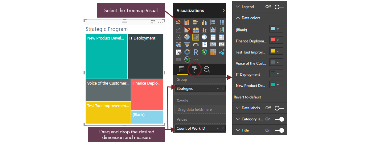 |
| Description | Example | |
| Goal |
Illustrates numerical proportion Each value of the chosen dimension is represented by a colored rectangle- the size of which is determined by the quantitative value being measured |
Provides a count of projects in the selected portfolio/s by strategic objective / program Business outcome: Aids analysis of portfolio balance |
| Fields | Group: Work dimension (project-level attribute e.g. alternate structure) to group the data in the visual | Group: Strategies |
| Details: A further work dimension which can be displayed as a sub-category | Details: None | |
|
Value: Time-phased financial measure, PVE measure or a count of a dimension, the data for which will be grouped by the attributes chosen in the Group / Details fields |
Value: Count of Work ID | |
| Formatting Suggestions | Data Colors: Applies color-coding to the data groups (rectangles) | Data Colors: Different colors have been applied to each Strategic objective / program (e.g. Finance Deployment = Green, Test Tool Improvement = Red etc.) |
| Data Labels: Adds data labels to each rectangle in the visualization | Data Labels: Off | |
| Category Labels: Adds the relevant category name to each rectangle in the Treemap | Category Labels: On | |
| Title: Adds a title to the visualization | Title: On ('Strategic Program') | |
| Filters |
Visual Level Filters: Filters that can be applied to the data in the individual visual. The dimensions / measures added to the Group, Details and Value fields will automatically appear as filter options. |
Visual Level Filters: Strategies, Count of Work ID |
| Microsoft Help (will open in new tab) |
https://docs.microsoft.com/en-us/power-bi/power-bi-visualization-treemaps |
|
Widget 5. Multi-row Card showing Work by Internal Risk |
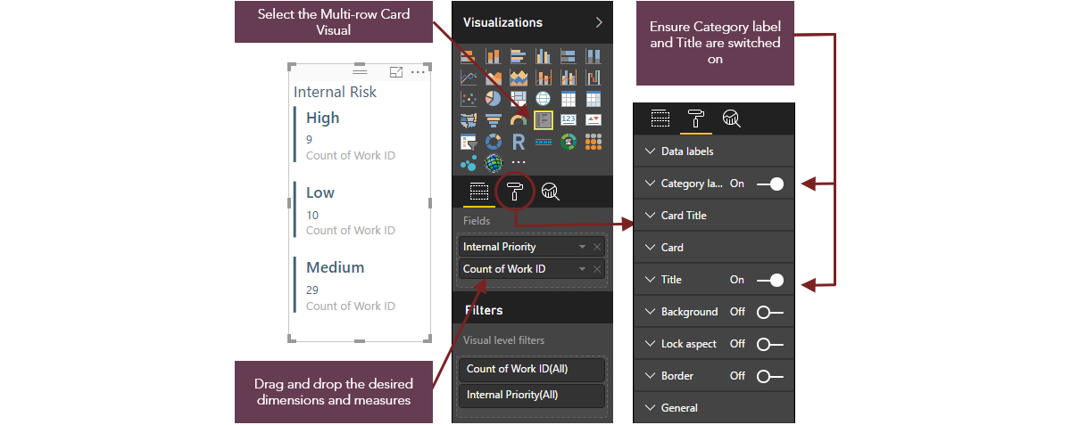 |
| Description | Example | |
| Goal | Displays multiple rows of data - one row of data is created for each combination of the different selected dimensions / measures |
Provides a count of the projects in the selected portfolio/s by Internal Priority Business Outcomes: Aids analysis of portfolio balance |
| Fields |
Fields: Preferably one work dimension (e.g. Parent Name) or Time Dimension (e.g. Month Name) One or more time-phased financial measure or PVE measure. A count of a dimension can also be used. |
Fields: Internal Priority, Count of Work ID |
| Formatting suggestions |
Data Labels: Formats the data labels (color, font etc.)
|
Data Labels: Font and colors have been updated |
| Category Labels: Adds the relevant category name to each row in the card | Category Labels: On | |
| Card Title: Formats the title for each row | Card Title: Fonts and colors have been updated | |
| Title: Adds a title to the visualization | Title: On ('Internal Risk') | |
| Microsoft Help (will open in new tab) |
https://docs.microsoft.com/en-us/power-bi/power-bi-visualization-big-number |
|
Widget 6. Table displaying Detailed Information for Tab 2 |
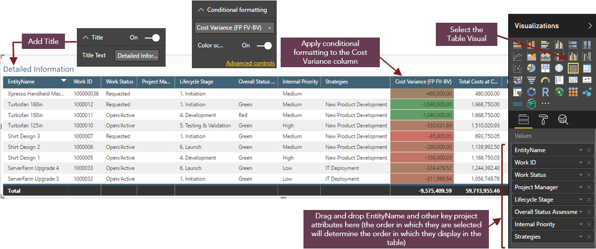 |
| Description | Example | |
| Goal |
Tabular display of information Sorting is available on all columns |
Provides the detailed information behind each of the visualizations, breaking down the data by project. Allows the user to sort the data to better aid the analysis of portfolio balance and make informed decisions on next steps |
| Fields |
Values: Combination of dimensions and measures Groups are automatically created based on the values of all selected dimensions. E.g. if the table contains Lifecycle Stage, Project Manager and Total Baseline Effort, there will be a row for each combination of Lifecycle Stage and Project Manager |
Values: EntityName, Work ID, Work Status, Project Manager, Lifecycle Stage, Overall Status Assessment, Internal Priority, Stategies |
| Formatting Suggestions | General > Totals: Adds a row to the bottom of the table showing the totals for each column containing a measure | General > Totals: Off |
| Conditional Formatting: Applies conditional formatting to those columns containing measures - useful for applying a color gradient for financial columns to easily identify the highest / lowest values | Conditional Formatting: Applied to cost variance column (Highest value = Red, lowest value = Green) | |
| Title: Adds a title to the visualization | Title: On ('Detailed Information') | |
| Other formatting options: Select desired table style, format column headers, enable vertical and / or horizontal grid lines as needed, update other formats as necessary to improve the readability and impact of the visualization / to reflect a customer's branding | Other formatting options: Formatting on column headers (blue background, white font) | |
| Filters |
Visual Level Filters: Filters that can be applied to the data in the individual visual. The dimensions / measures added to the Values field will automatically appear as filter options. |
Visual Level Filters: EntityName, Work ID, Work Status, Project Manager, Lifecycle Stage, Overall Status Assessment, Internal Priority, Stategies |
| Microsoft Help (will open in new tab) |
https://powerbi.microsoft.com/en-us/guided-learning/powerbi-service-tutorial-tables/ |
|
Tab 3 - Portfolio Balance Cost |
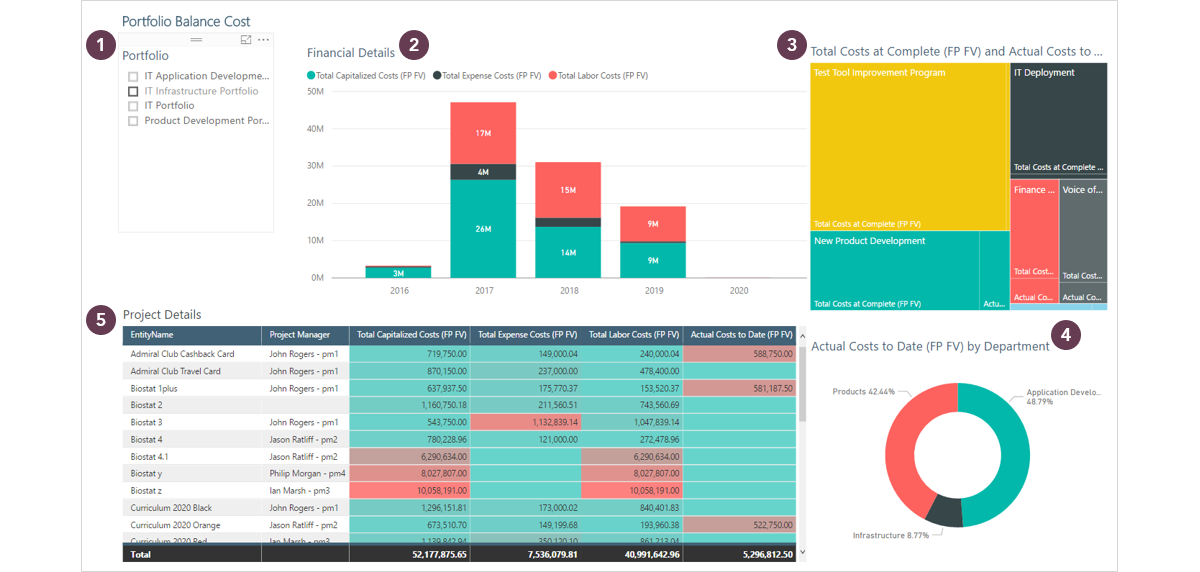 |
Widget 1 - Slicer by Portfolio |
|
| Description | Example | |
| Goal | Provides a visual element to filter the data on the page. | Ability to slice data by Portfolio |
| Fields |
Field: One work dimension (project-level attribute e.g. alternate structure, lifecycle role) |
Field: Portfolio_Name |
| Formatting Suggestions | Can be vertical or horizontal, Title can be added, multi-select option can be enabled | Title: On (‘Portfolio’) |
| Microsoft Help (will open in new tab) |
https://docs.microsoft.com/en-us/power-bi/power-bi-visualization-slicers |
|
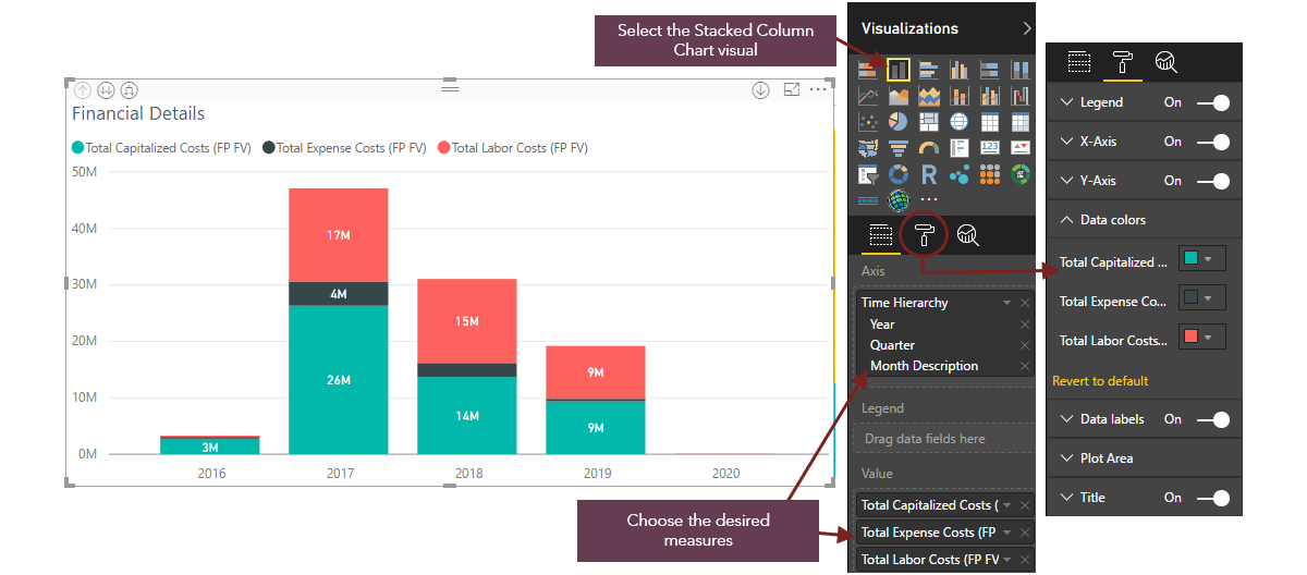
Widget 2 - Stacked Column Chart showing Financial Details by Month |
 |
| Description | Example | |
| Goal | Use Case 1: Visualizes a single dimension with multiple measures |
Visualize the total costs per month (split by Capital, Expense & Labor) for the selected portfolio/s Business outcome: understand the spend profile for each month Ensure the costs are smoothed out across the planning horizon |
| Fields |
Axis: Work dimension (project-level attribute e.g. alternate structure, lifecycle role) or time dimension (Year, Quarter, Month) to group the data in the visual A further dimension can be added to facilitate drill-down (e.g. Quarter and Month) |
Axis: Time Hierarchy (Year, Quarter, Month Description) |
|
Value: Two or more time-phased financial measures or PVE measures (financial subtotal, calculated attribute, numeric field), the data for which will be grouped by the chosen dimension/s Note: Time-phased financial measures must be chosen if a time dimension is selected in the Axis field |
Value: Total Capitalized Costs (FP FV), Total Expense Costs (FP FV), Total Labor Costs (FP FV) | |
| Formatting Suggestions |
Legend: Adds a legend to the visualization, providing a key for the different data groups The position of the legend within the visualization can be changed if required |
Legend: On |
|
X Axis: Adds the category names to the X Axis based on the dimension chosen in the Axis field Y Axis: Adds the value range to the Y Axis based on the measure chosen in the Value field |
X Axis: On Y Axis: On |
|
| Data Colors: Applies color-coding to the data groups | Data Colors: Total Capitalized Costs = Green, Total Expense Costs = Grey, Total Labor Costs = Red | |
| Data Labels: Adds data labels to each column in the visualization | Data Labels: On | |
|
Title: Adds a title to the visualization The title is created automatically based on the data being displayed - it is often sensible to amend this to something more meaningful to the report audience |
Title: On ('Financial Details') | |
| Filters: |
Visual Level Filters: Filters that can be applied to the data in the individual visual. The dimensions / measures added to the Axis and Value fields will automatically appear as filter options. |
Visual Level Filters: Year, Quarter, Month Description, Total Capitalized Costs (FP FV), Total Expense Costs (FP FV), Total Labor Costs (FP FV) |
| Microsoft Help (will open in new tab) |
https://docs.microsoft.com/en-us/power-bi/power-bi-visualization-basic-area-chart |
|
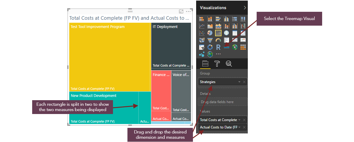
Widget 3 - Treemap showing Total Costs at Complete and Actual Costs to Date by Strategies |
 |
| Description | Example | |
| Goal | Illustrates numerical proportion |
Visualizes the proportion of total costs at complete and actual spend to date by strategic objective / program Business outcome: Aids analysis of portfolio balance by cost - ensures that investment costs are balanced across strategic initiatives |
| Fields | Group: Work dimension (project-level attribute e.g. alternate structure) to group the data in the visual | Group: Strategies |
| Details: A further work dimension which can be displayed as a sub-category | Details: None | |
| Value: Time-phased financial measure, PVE measure or a count of a dimension, the data for which will be grouped by the attributes chosen in the Group / Details fields | Value: Total Costs at Complete (FP FV), Actual Costs to Date (FP FV) | |
|
Tooltips: Can be used to display further information for each slice of data This is useful when displaying financial data (e.g. if the chosen value is 'Total Costs at Complete' then Tooltips could be used to display 'Total Capitalized Costs', 'Total Expense Cost', Total Labor Costs) |
Tooltips: None | |
| Formatting Suggestions | Data Colors: Applies color-coding to the data groups (rectangles) | Data Colors: Different colors have been applied to each Strategic objective / program (e.g. Finance Deployment = Red, Test Tool Improvement = Yellow etc.) |
| Data Labels: Adds data labels to each rectangle in the visualization | Data Labels: Off | |
| Category Labels: Adds the relevant category name to each rectangle in the Treemap | Category Labels: On | |
| Title: Adds a title to the visualization | Title: On ('Total Costs at Complete and Actual Costs to Date by Strategies') | |
| Filters |
Visual Level Filters: Filters that can be applied to the data in the individual visual. The dimensions / measures added to the Group, Details and Value fields will automatically appear as filter options. |
Visual Level Filters: Strategies, Actual Costs to Date (FP FV), Total Costs at Complete (FP FV) |
| Microsoft Help (will open in new tab) | https://docs.microsoft.com/en-us/power-bi/power-bi-visualization-treemaps | |
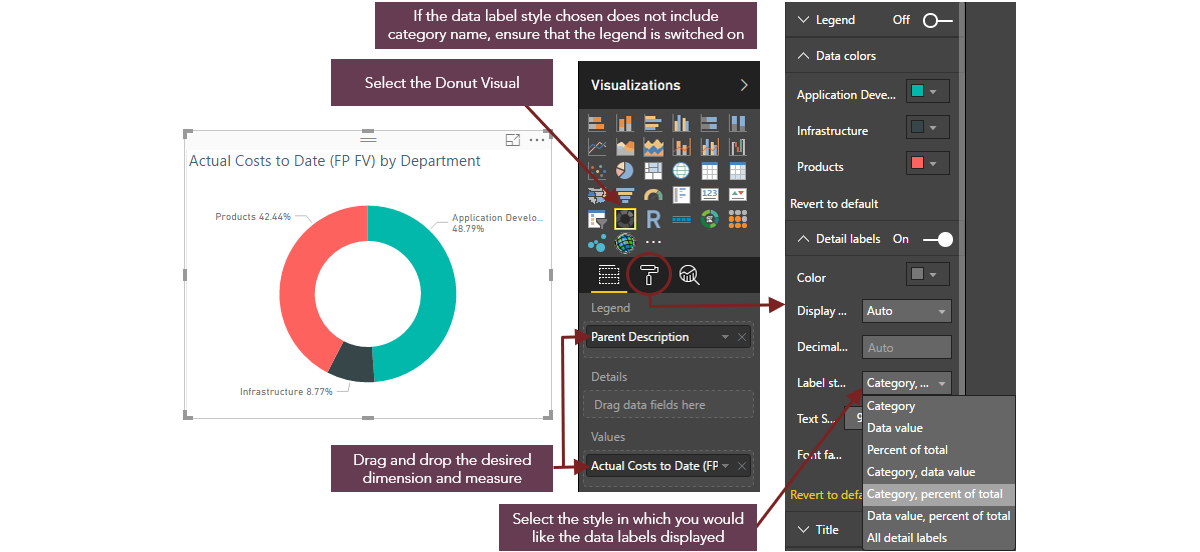
Widget 4 - Donut Chart showing Actual Costs to Date by Department |
 |
| Description | Example | |
| Goal | Illustrates numerical proportion |
Visualizes the proportion of actual spend to date by Department Business Outcome: Aids the analysis of portfolio balance by cost - ensures that investment costs are balanced across departments |
| Fields | Legend: Work dimension (project-level attribute e.g. alternate structure, Lifecycle role) to group the data in the visual | Legend: Parent Description |
| Details: A further work dimension can be displayed as a sub-category | Details: None | |
| Values: Time-phased financial measure, PVE measure or count of a dimension, the data for which will be grouped by the chosen dimension/s | Values: Actual Costs to Date (FP FV) | |
| Formatting Suggestions | Legend: Adds a legend to the visualization, providing a key for the different data groups
The position of the legend within the visualization can be changed if required |
Legend: Off |
| Data Colors: Applies color-coding to the data groups | Data Colors: Products = Red, Application Development = Green, Infrastructure = Grey | |
| Detail Labels: Adds data labels to each slice in the visualization (label style can also be changed e.g. Category Name, Data Value, Percent of total etc.) | Detail Labels: On, Style = Category, percent of total | |
| Title: Adds a title to the visualization | Title: On ('Actual Costs to Date by Department') | |
| Filters |
Visual Level Filters: Filters that can be applied to the data in the individual visual. The dimensions / measures added to the Legend, Details and Value fields will automatically appear as filter options. |
Visual Level Filters: Parent Description, Actual Costs to Date (FP FV) |
| Microsoft Help (will open in new tab) |
https://docs.microsoft.com/en-us/power-bi/power-bi-visualization-doughnut-charts |
|
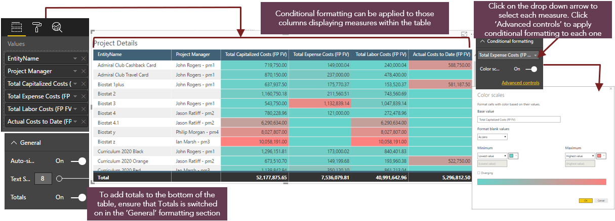
Widget 5. Table displaying Detailed Information for Tab 3 |
 |
| Description | Example | |
| Goal |
Tabular display of information Sorting is available on all columns |
Provides the detailed information behind each of the visualizations, breaking down the data by project Highlights the projects with the highest Capitalized, Expense, Labor and Actual costs |
| Fields |
Values: Combination of dimensions and measures Groups are automatically created based on the values of all selected dimensions. E.g. if the table contains Lifecycle Stage, Project Manager and Total Baseline Effort, there will be a row for each combination of Lifecycle Stage and Project Manager |
Values: EntityName, Project Manager, Total Capitalized Costs (FP FV), Total Expense Costs (FP FV), Total Labor Costs (FP FV), Actual Costs to Date (FP FV) |
| Formatting Suggestions | General > Totals: Adds a row to the bottom of the table showing the totals for each column containing a measure | General > Totals: On |
| Conditional Formatting: Applies conditional formatting to those columns containing measures - useful for applying a color gradient for financial columns to easily identify the highest / lowest values | Conditional Formatting: Applied to all columns containing measures (highest value = Red, lowest value = green) | |
| Title: Adds a title to the visualization | Title: On ('Project Details') | |
| Other formatting options: Select desired table style, format column headers, enable vertical and / or horizontal grid lines as needed, update other formats as necessary to improve the readability and impact of the visualization / to reflect a customer's branding | Other formatting options: Formatting on column headers (blue background, white font), horizontal grid lines enabled | |
| Filters |
Visual Level Filters: Filters that can be applied to the data in the individual visual. The dimensions / measures added to the Values field will automatically appear as filter options. |
Visual Level Filters: EntityName, Project Manager, Total Capitalized Costs (FP FV), Total Expense Costs (FP FV), Total Labor Costs (FP FV), Actual Costs to Date (FP FV) |
| Microsoft Help (will open in new tab) |
https://powerbi.microsoft.com/en-us/guided-learning/powerbi-service-tutorial-tables/ |
|
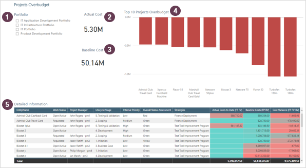
Tabs 4 & 5 - Projects Overbudget & Projects Underbudget |
 |
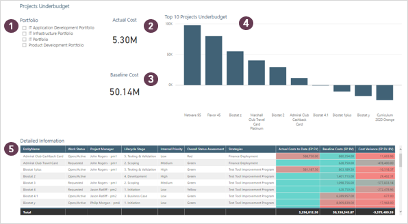 |
Widget 1. Slicer by Portfolio |
|
| Description | Example | |
| Goal | Provides a visual element to filter the data on the page. | Ability to slice data by Portfolio |
| Fields |
Field: One work dimension (project-level attribute e.g. alternate structure, lifecycle role) |
Field: Portfolio_Name |
| Formatting Suggestions | Can be vertical or horizontal, Title can be added, multi-select option can be enabled | Title: On (‘Portfolio’) |
| Microsoft Help (will open in new tab) | https://docs.microsoft.com/en-us/power-bi/power-bi-visualization-slicers | |
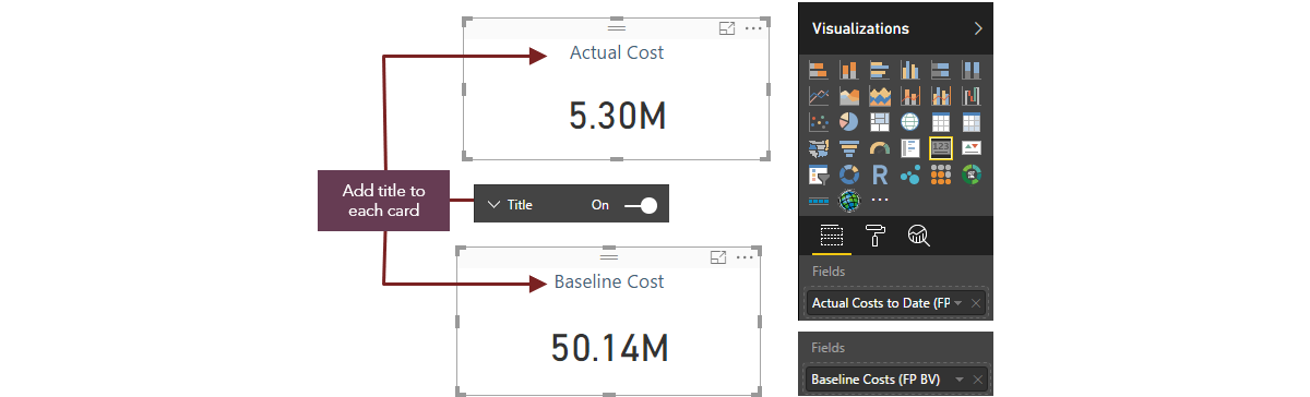
Widget 2 & 3. Cards showing Actual Costs & Baseline Costs |
 |
| Description | Example | |
| Goal | Displays the sum of the chosen measure, based on the filters selected |
Widget 2: Shows the sum of the actual costs to date for those portfolios selected in the slicer, based on the current working versions of the financial plans Widget 3: Shows the sum of the baseline costs for those portfolios selected in the slicer |
| Fields | Fields: One time-phased financial measure or PVE measure (financial subtotal, calculated attribute, numerical field) that will be displayed as a single value based on the filters applied |
Widget 2: Actual Costs to Date (FP FV) Widget 3: Baseline Costs (FP BV) |
| Formatting Suggestions |
Data Label: allows you to specify the display units (thousands, millions etc.) and the number of decimal places These can also be defined automatically based on the data being display |
Both: On, Display - Auto |
| Category Label: this will automatically add the label for the measure being displayed (this will reflect the name of the financial subtotal / calculated attribute / field in PVE and cannot be updated) | Both: Off | |
|
Title: adds a title to the visualization It is recommended that this option is chosen over Category Label as the title can be re-named to something more meaningful to the report audience |
Widget 2: On ('Actual Cost') Widget 3: On ('Baseline Cost') |
|
| Other formatting options: apply border, background, fonts, colors etc. | Other formatting options: None applied | |
| Microsoft Help (will open in new tab) |
https://docs.microsoft.com/en-us/power-bi/power-bi-visualization-big-number |
|
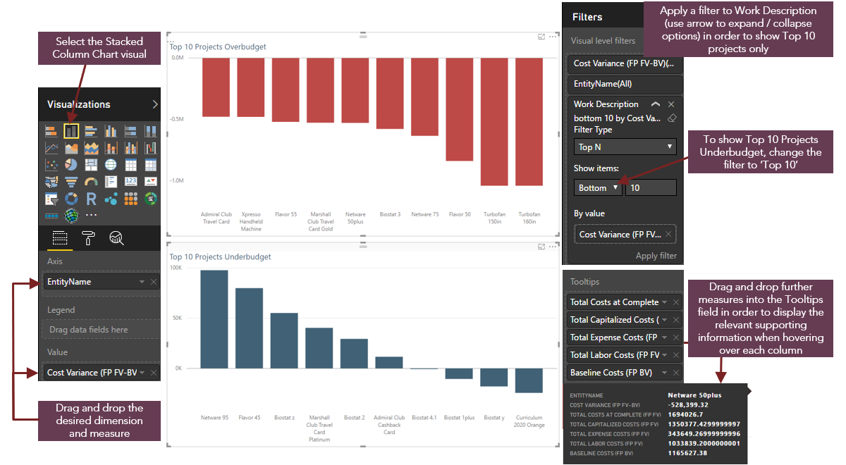
Widget 4 - Stacked Column Chart showing the Top 10 Projects Overbudget / Underbudget |
 |
| Description | Example | |
| Goal | Visualize a single dimension with a single measure (this will produce the same result as a Clustered Bar Chart as only one dimension and one measure is in use) |
Shows the top 10 projects over and under-budget. Business outcome: Highlights those projects that are due to exceed their baseline costs so that corrective action can take place Highlights those projects that are due to fall short of their baseline costs, enabling decisions to be made re: cost re-distribution |
| Fields |
Axis: Work dimension (project-level attribute e.g. alternate structure, Lifecycle role). To show individual project information in this visualization, EntityName should be selected | Axis: EntityName |
| Value: One time-phased financial measure or PVE measure (financial subtotal, calculated attribute, numerical field) | Value: Cost Variance (FP FV-BV) | |
|
Tooltips: Can be used to display further information for each slice of data This is useful when displaying financial data (e.g. if the chosen value is 'Total Costs at Complete' then Tooltips could be used to display 'Total Capitalized Costs', 'Total Expense Cost', Total Labor Costs) |
Tooltips: Total Costs at Complete, Total Capitalized Costs (FP FV), Total Capitalized Costs (FP FV), Total Expense Costs (FP FV), Total Labor Costs (FP FV), Baseline Costs (FP BV) |
|
| Formatting Suggestions |
X Axis: Adds the category names to the X Axis based on the dimension chosen in the Axis field Y Axis: Adds the value range to the Y Axis based on the measure chosen in the Value field |
X Axis: On Y Axis: On |
| Data Colors: Applies color-coding to the data groups | Data Colors: All columns are displaying as blue | |
| Data Labels: Adds data labels to each column in the visualization | Data Labels: Off | |
| Title: Adds a title to the visualization | Title: On ('Top 10 Projects Overbudget', 'Top 10 Projects Underbudget') | |
| Filters |
Visual Level Filters: Filters that can be applied to the data in the individual visual. The dimensions / measures added to the Axis, Legend and Value fields will automatically appear as filter options. If there are lots of categories to be displayed (i.e. if you are using EntityName as your dimension), filters can be applied to only show the top / bottom number of projects for the chosen measure |
Visual Level Filters: Cost Variance (FP FV-BV), Entity Name A more detailed filter has been applied to Work Description: Filter Type = Top N, Show Items = Top / Bottom 10, By Value = Cost Variance (FP FV-BV) |
| Microsoft Help (will open in new tab) |
https://docs.microsoft.com/en-us/power-bi/power-bi-visualization-basic-area-chart |
|
Widget 5. Table displaying Detailed Information for Tabs 4 & 5 |
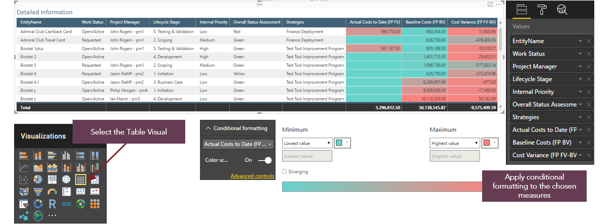 |
| Description | Example | |
| Goal |
Tabular display of information Sorting is available on all columns |
Provides the detailed information behind each of the visualizations, breaking down the data by project |
| Fields |
Values: Combination of dimensions and measures Groups are automatically created based on the values of all selected dimensions. E.g. if the table contains Lifecycle Stage, Project Manager and Total Baseline Effort, there will be a row for each combination of Lifecycle Stage and Project Manager |
Values: EntityName, Work Status, Project Manager, Lifecycle Stage, Internal Priority, Overall Status Assessment, Strategies, Actual Costs to Date (FP FV), Baseline Costs (FP BV), Cost Variance (FP FV-BV) |
| Formatting Suggestions | General > Totals: Adds a row to the bottom of the table showing the totals for each column containing a measure | General > Totals: On |
| Conditional Formatting: Applies conditional formatting to those columns containing measures - useful for applying a color gradient for financial columns to easily identify the highest / lowest values | Conditional Formatting: Applied to all columns containing measures (highest value = Red, lowest value = green) | |
| Title: Adds a title to the visualization | Title: On ('Detailed Information') | |
| Other formatting options: Select desired table style, format column headers, enable vertical and / or horizontal grid lines as needed, update other formats as necessary to improve the readability and impact of the visualization / to reflect a customer's branding | Other formatting options: Formatting on column headers (blue background, white font), horizontal grid lines enabled | |
| Filters |
Visual Level Filters: Filters that can be applied to the data in the individual visual. The dimensions / measures added to the Values field will automatically appear as filter options. |
Visual Level Filters: EntityName, Work Status, Project Manager, Lifecycle Stage, Internal Priority, Overall Status Assessment, Strategies, Actual Costs to Date (FP FV), Baseline Costs (FP BV), Cost Variance (FP FV-BV) |
| Microsoft Help (will open in new tab) |
https://powerbi.microsoft.com/en-us/guided-learning/powerbi-service-tutorial-tables/ |
|