
Using the Settings Pane
The settings pane allows you to adjust how data is displayed in a report or grid. After making changes, you can Save your settings.
Displaying the Settings Pane
By default, the Settings pane is collapsed when you are viewing a grid or a report. To display the Settings pane, click ![]()

Group By Settings
Most reports use Group By settings to group components by a specific attribute.
- In the Settings pane, click (none) to expand the Group By menu.
- Select the property you want to group by.
- The report is updated to reflect the selected Group By setting.
Group By Settings
Most reports use Group By settings to group components by a specific attribute.
- In the Settings pane, in the Group By list, select the property you want to group by. The report is updated to reflect the selected Group By setting.
Saving Settings
As of the September 2020 release, you can save and revert settings for your visualizations.
Click the  icon in the Settings pane to access saving options.
- To update the current tile with the settings you have changed, click Save.
- To save a copy of your current tile with the settings you have changed, click Save as New Tile to save your settings. Enter a new name for the tile and click Save.
- To revert any changes you have made to the last saved version of the visualization, click Revert Changes.
NOTE
The Save as New Tile and Revert Changes options are not available when creating a new tile or when editing a tile in Manage Tiles.
Size By Settings
About Size By Settings
The size of each bar in a bar chart or segment in a donut chart is determined by the Size By setting. The size of each bar or segment is based on the sum of that value for all components in the group. For example, a Size By setting of Count sizes each bar or segment based on the number of components in the group.
When selecting a Size By option, be aware that not every possible Group By and Size By combination provides useful information. To avoid confusion:
- Make sure that the Size By and Group By selections work together to answer a specific business question.
-
A bar or donut chart should include a maximum of two component types: the portfolio's component type, and (optionally) a second type used for grouping. Avoid selecting a Size By option that introduces a third component type.
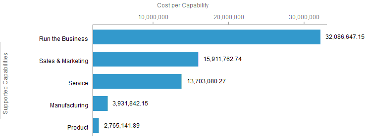
For example, the bar chart below shows applications grouped by Supported Capabilities. You can size by Count to compare the number of applications supporting each capability. Or you can size by Total OpEx to compare the cost of the applications that support each capability. In either case, your selections work together to provide information about the applications supporting a capability. The chart is limited to two component types.
Selecting a Size By Setting
- In the Settings pane, click (none) to expand the Size By menu.
- Select the property you want to size by.
- The report is updated to reflect the selected Size By setting.
- In the Settings pane, in the Size by list, select the property you want to size by.
- The report is updated to reflect the selected Size By setting.
How Size Is Calculated
When the size of a bar or segment is calculated:
- Values are always summed.
- For bar charts, if the same component is in multiple child groups, the size of a parent bar will not equal the sizes of its child bars.
- When Size By values are aggregated at the parent level in hierarchies, only distinct instances are counted.
Color By/Color Settings
About Color By/Color Settings
Tree maps, bubble charts, hierarchy maps, timelines, and node diagrams use Color By or Color settings to represent either of the following:
-
Specific values in a predefined list of values (e.g., values for Status property on a Capability).
-
Ranges of numeric values.
-
Lifecycle phases shown on the timeline.
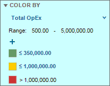
A legend on the settings pane shows what each color represents. For numeric values, the Range field indicates the highest and lowest values in the current data set.
Selecting a Color By/Color Setting
To choose a Color By/Color setting:
- In the Settings pane, click (none) to expand the Color By/Color menu.
- Select the property you want to color by. The report is updated to reflect the selected Color By/Color setting.
- In the Settings pane, in the Color By/Color list, select the property you want to color by. The report is updated to reflect the selected Color By/Color setting.
Changing Colors Used to Represent a Range or Value
- Click the colored box that represents the associated range or value. The color selection box opens.
- Select the new color by doing one of the following:
-
Click a color in the palette provided.
-
Enter the hexidecimal color code in the Hex field.
-
Click More colors to open the popup color selector and enter an RGB value or select the color you want. To select a color:
-
- Click a location on the bar to select a hue.
- Click or drag the selector within the box to specify the color saturation.
- Click a blank area within the popup to close it.
- Click Apply to apply your selection and close the box.
Redefining Numeric Ranges
When colors represent ranges of numeric values, you can redefine the range that each color represents.
The number to the right of each color is the highest number in the associated range. No upper limit is defined for the highest range.
- Green represents values up to and including 20
- Yellow represents values 21 through 100
- Red represents values greater than 100

To change a numeric range:
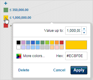
- Click the number you want to change. The color selection box opens.
- In the Value up to field, enter the new value.
NOTE
You cannot define overlapping ranges. If you enter an upper limit for one range that causes it to overlap with the next range (e.g., if you enter 25 as the upper limit for the first range in the example above), the ranges are automatically redefined. To avoid entering overlapping ranges, define the ranges from highest (on the bottom) to lowest (on the top).
- Click Apply.
Adding a Range or Value
If the colors are based on a numeric value, two ranges by default. One range is less than or equal to zero and one range is greater than zero. You can add a range to display more granular information.
If the colors are based on a predefined list of property values (e.g., lifecycle phases), these values can be removed and then re-added if necessary.
To add a range or value:
- In the Settings pane, click the
 above the Color By legend.
 -
NOTE
If the colors represent a list of predefined values or lifecycle phases, you cannot add another value if all possible values are currently displayed (the default). If all possible values are displayed,
 appears when you mouse over the icon.
If you previously removed a value, you can use the
icon to add it back. -
In the color selection box, either:
- Enter the upper limit of the range in the Value up to field to add a range.
- Select an option in the Property value drop-down menu to add a value (e.g., lifecycle phases). The menu lists only the values that are not already included.
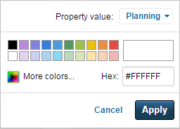
- Choose a color to represent this range or value.
- Click Apply to add the range or value.
Deleting a Range or Value
- In the Settings pane, click the color that represents the range or property you want to remove.
- In the color selection box, click Delete. The range or value is removed.
Please sign in to see this content.