Defining output options
After you have filled out the Basic Details screen, you are ready to choose the output type(s) and define the data for the report. The Output Options screen of the Report wizard is where you configure different output types by specifying (for each type) which fields to use and how to use them.
Notice the red box in the screen shot below - it highlights a list of the available output types (you may not see all six). For each output type there is a Field Selection and Options tab. List and Gantt reports include an additional Sorting tab. The List report Output Options screen is shown below.
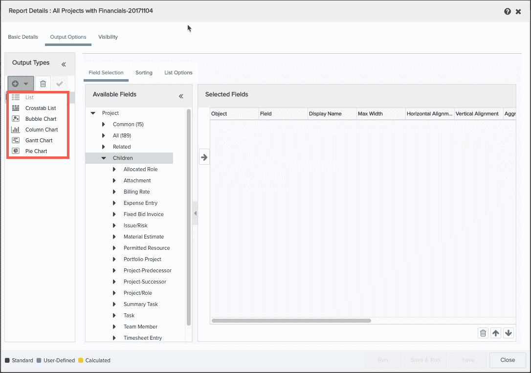
For each output type you specify, you must configure which fields you will use in your report.
Choose Output Type(s)
1. Click the Output Types droplist and select an output type. You can select as many output types as you like.
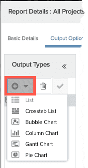
2. You can indicate the default output - the first type of output to generate when you run the report - by selecting the type and clicking the checkmark.
Note that if you define one output type only, say List, then when you run the report you will not see the Change Output menu option
Select the data to be returned on the report
The Output Options screen is divided into two sections: the available fields area on the left, and the selected fields area on the right. The Available Fields list shows all the categories of fields available for the report. These fields vary depending on the report source you are using; while the List report has only one Available Fields list, most of the other report types have Category Fields and Data Series Fields. For example, here is the Available Fields for a column chart - you click the plus and minus icons to open and close the field lists:
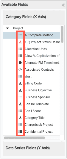
Available fields are presented in folders; each folder contains a sub-folder called "Common" that contains a subset of the entity's fields that are commonly used. The "All" folder contains all of the entity's fields. If you have created any calculated fields, these fields will appear in the folder representing the entity on which the field was created.
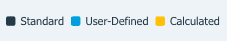
Note: Each field is accompanied by a color-coded, field-type icon, as shown in the legend below:
Field origin legend:
To include fields in your report, locate them in the Available fields list and drag them to Selected Fields area by doing any of the following
-
double-clicking the field
-
selecting the field and dragging it (you can multi-select by holding down the Shift key)
-
selecting the field(s) and clicking

-
dragging a whole folder
If you include fields and then change your mind, simply select the field in Selected Fields area and click the Trash Can ![]() .
.
Each output type's Field Selection tab has a slightly different structure, but the technique for selecting fields is the same in all cases.
Configure the Visual Treatment of Lookup List Values
If you include list values in your report, you will have two additional fields to configure (note this feature does not apply to multi-select lists as there is no way to color multiple items in one cell):
 and
and 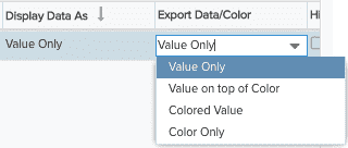
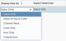
The admin who created the lookup list had the option to assign colors and icons. The Display Data As field offers a variety of presentation options (multi-select lists will offer only Value Only as there is no way to color multiple items in one cell). Your exact results will depend on how the lookup list was configured. Here are examples of each Display Data As selection:
| Value Only | 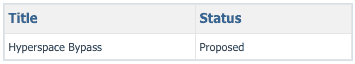 |
| Value on top of Color | 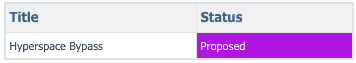 |
| Colored Value | 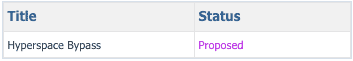 |
| Color Only |  |
| Icon Only | |
| Colored Icon |
The Export Data/Color field determines how to treat the values if you export them to Excel. You cannot export icons to Excel, so the options are for value and color combinations.
For example, if your list value is configured for 'Colored Icon' for the report, and your Export Data/Color is configured for 'Value on Top of Color', you will get visuals like the following:
Colored Icon: ![]() vs. Exported Value on Top of Color:
vs. Exported Value on Top of Color: ![]()
What do I do next?
Click on the appropriate link to learn how to configure a particular output type: